widget_utils 0.1.8  widget_utils: ^0.1.8 copied to clipboard
A widget boilerplate which has fetures like responsive support, mediaquery short-cuts, navigator short-cuts and so on.
widget_utils #
An widget extension like a boilerplate which extends your widgets with helpful functions to equip it some benefical features; such as, responsive support, mediaquery short-cuts, navigator short-cuts and so on.
Getting Started #
Mainly the package contains responsive benefits. But in the future, I will add new functions in it.
Features #
- Responsive support
- Mediaquery shortcuts
- Navigator shortcuts
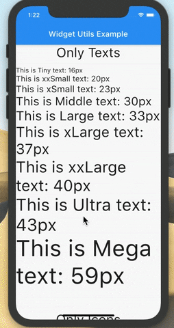
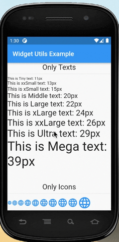
Screens #
Responsive for every device


To initiate library #
You need to run init function with Buildcontext.
WidgetUtils.init(context: context);
I suggest the you should call the init function in onGenerationTitle event in the MaterialApp widget.
  Widget build(BuildContext context) {
    return MaterialApp(
      onGenerateTitle: (context) {
        // Here
        WidgetUtils.init(context: context);
        return "Widget Utils Demo";
      },
      debugShowCheckedModeBanner: false,
      theme: ThemeData(
        primarySwatch: Colors.blue,
      ),
      home: HomePage(),
    );
  }
}
Functions #
SizeType enum is used for detemining font, icon... vb size types.
enum SizeType {
  Tiny,
  xxSmall,
  xSmall,
  Middle,
  Small,
  Large,
  xLarge,
  xxLarge,
  Ultra,
  Mega
}
getHeight is short way the calculate height by context
  double getHeight(BuildContext context, {double percent = 1}) {
    return MediaQuery.of(context).size.height * percent;
  }
getWidth is short way the calculate width by context
  double getWidth(BuildContext context, {double percent = 1}) {
    return MediaQuery.of(context).size.width * percent;
  }
getFontSize method accepts the SizeType parameter, and return the size according to the Parameter
  double getFontSize(SizeType sizeType) {
    return _widgetUtils.getFontSize(sizeType);
  }
getIconSize method accept the SizeType parameter, and return the size according to the Parameter
  double getIconSize(SizeType sizeType) {
    return _widgetUtils.getIconSize(sizeType);
  }
convertSize converts given size by the user device size via basic math operations. You can use it height, weight or padding sizes.
  double convertSize(double size) {
    return _widgetUtils.convertToDeviceSize(size);
  }
navPush is short way the push widget on the route.
  void navPush(BuildContext context, Widget widget) {
    Navigator.of(context).push(
      MaterialPageRoute(builder: (_) => widget),
    );
  }
navPop is short way the pop route
  void navPop(BuildContext context) {
    Navigator.of(context).pop();
  }
doDelayedTask run the code after some minute...
  void doDelayedTask(Function function, {Duration duration: Duration.zero}) {
    if (function == null) return;

    Future.delayed(duration, function);
  }
Example #
main.dart #
import 'package:flutter/material.dart';
import 'package:widget_utils/widget_utils.dart';

void main() {
  runApp(MyApp());
}

class MyApp extends StatelessWidget {
  @override
  Widget build(BuildContext context) {
    return MaterialApp(
      onGenerateTitle: (context) {
        /// We initiate the [WidgetUtils] where we first get the [buildContext]
        WidgetUtils.init(context: context);
        return "Flutter Demo";
      },
      debugShowCheckedModeBanner: false,
      theme: ThemeData(
        primarySwatch: Colors.blue,
      ),
      home: HomePage(title: 'Flutter Demo Home Page'),
    );
  }
}

class HomePage extends StatelessWidget {
  final String title;

  Text createText(SizeType sizeType) {
    return Text(
      "This is " +
          sizeType.toStringCustom() +
          " text: " +
          (getFontSize(sizeType).toInt()).toString() +
          "px",
      style: TextStyle(fontSize: getFontSize(sizeType)),
    );
  }

  Icon createIcon(SizeType sizeType) {
    return Icon(
      Icons.language,
      color: Colors.blue,
      size: getIconSize(sizeType),
    );
  }

  Row createTextWithIcon(SizeType sizeType) {
    return Row(
      mainAxisSize: MainAxisSize.min,
      crossAxisAlignment: CrossAxisAlignment.start,
      children: [
        Icon(
          Icons.home,
          size: getIconSize(sizeType),
          color: Colors.blue,
        ),
        Expanded(
          child: Text(
            sizeType.toStringCustom() + " Text and Icon",
            style: TextStyle(fontSize: getFontSize(sizeType)),
          ),
        ),
      ],
    );
  }

  const HomePage({Key key, this.title}) : super(key: key);
  @override
  Widget build(BuildContext context) {
    return Scaffold(
      appBar: AppBar(
        title: Text("Widget Utils Example"),
      ),
      body: Container(
        child: SingleChildScrollView(
          child: Column(
            crossAxisAlignment: CrossAxisAlignment.start,
            children: [
              Center(
                child: Text(
                  "Only Texts",
                  style: TextStyle(fontSize: getFontSize(SizeType.Large)),
                ),
              ),
              Divider(),
              createText(SizeType.Tiny),
              createText(SizeType.xxSmall),
              createText(SizeType.xSmall),
              createText(SizeType.Middle),
              createText(SizeType.Large),
              createText(SizeType.xLarge),
              createText(SizeType.xxLarge),
              createText(SizeType.Ultra),
              createText(SizeType.Mega),
              SizedBox(
                height: convertSize(50),
              ),
              Center(
                child: Text(
                  "Only Icons",
                  style: TextStyle(fontSize: getFontSize(SizeType.Large)),
                ),
              ),
              Divider(),
              SingleChildScrollView(
                scrollDirection: Axis.horizontal,
                child: Row(
                  crossAxisAlignment: CrossAxisAlignment.center,
                  children: [
                    createIcon(SizeType.Tiny),
                    createIcon(SizeType.xxSmall),
                    createIcon(SizeType.xSmall),
                    createIcon(SizeType.Small),
                    createIcon(SizeType.Middle),
                    createIcon(SizeType.Large),
                    createIcon(SizeType.xLarge),
                    createIcon(SizeType.xxLarge),
                    createIcon(SizeType.Ultra),
                    createIcon(SizeType.Mega),
                  ],
                ),
              ),
              SizedBox(
                height: convertSize(50),
              ),
              Center(
                child: Row(
                  mainAxisSize: MainAxisSize.min,
                  children: [
                    Icon(
                      Icons.home,
                      size: getIconSize(SizeType.Large),
                      color: Colors.blue,
                    ),
                    Text(
                      "Text And Icon",
                      style: TextStyle(fontSize: getFontSize(SizeType.Large)),
                    ),
                  ],
                ),
              ),
              Divider(),
              createTextWithIcon(SizeType.Tiny),
              createTextWithIcon(SizeType.xxSmall),
              createTextWithIcon(SizeType.xSmall),
              createTextWithIcon(SizeType.Middle),
              createTextWithIcon(SizeType.Large),
              createTextWithIcon(SizeType.xLarge),
              createTextWithIcon(SizeType.xxLarge),
              createTextWithIcon(SizeType.Ultra),
              createTextWithIcon(SizeType.Mega),
              SizedBox(
                height: convertSize(50),
              ),
              Center(
                  child: Text(
                "Mediaquery and Responsive padding",
                style: TextStyle(fontSize: getFontSize(SizeType.Large)),
              )),
              Divider(),
              Row(
                children: [
                  Container(
                    color: Colors.red,
                    width: getWidth(context, percent: 0.6),
                    height: convertSize(200),
                    padding: EdgeInsets.symmetric(
                        horizontal: convertSize(16), vertical: convertSize(8)),
                    child: Container(
                      width: double.infinity,
                      height: double.infinity,
                      color: Colors.white,
                      child: Container(
                        width: double.infinity,
                        height: double.infinity,
                        color: Colors.white,
                        child: Center(
                          child: Column(
                            mainAxisSize: MainAxisSize.min,
                            children: [
                              Text(
                                "%60 width",
                                style: TextStyle(
                                    fontSize: getFontSize(SizeType.xxSmall)),
                              ),
                              Text(
                                "Padding -> h: " +
                                    convertSize(16).toInt().toString() +
                                    "px" +
                                    " v: " +
                                    convertSize(8).toInt().toString() +
                                    "px",
                                style: TextStyle(
                                    fontSize: getFontSize(SizeType.Tiny)),
                              ),
                            ],
                          ),
                        ),
                      ),
                    ),
                  ),
                  Container(
                    color: Colors.yellowAccent,
                    width: getWidth(context, percent: 0.4),
                    height: convertSize(200),
                    padding: EdgeInsets.symmetric(
                        horizontal: convertSize(16), vertical: convertSize(8)),
                    child: Container(
                      width: double.infinity,
                      height: double.infinity,
                      color: Colors.white,
                      child: Center(
                        child: Column(
                          mainAxisSize: MainAxisSize.min,
                          children: [
                            Text(
                              "%40 width",
                              style: TextStyle(
                                  fontSize: getFontSize(SizeType.xxSmall)),
                            ),
                            Text(
                              "Padding -> h: " +
                                  convertSize(16).toInt().toString() +
                                  "px" +
                                  " v: " +
                                  convertSize(8).toInt().toString() +
                                  "px",
                              style: TextStyle(
                                  fontSize: getFontSize(SizeType.Tiny)),
                            ),
                          ],
                        ),
                      ),
                    ),
                  ),
                ],
              )
            ],
          ),
        ),
      ),
    );
  }
}
Metadata
Publisher
unverified uploader
Metadata
A widget boilerplate which has fetures like responsive support, mediaquery short-cuts, navigator short-cuts and so on.
Repository (GitHub)
View/report issues
License
 unknown (LICENSE)