touch_to_expand_container 0.1.1  touch_to_expand_container: ^0.1.1 copied to clipboard
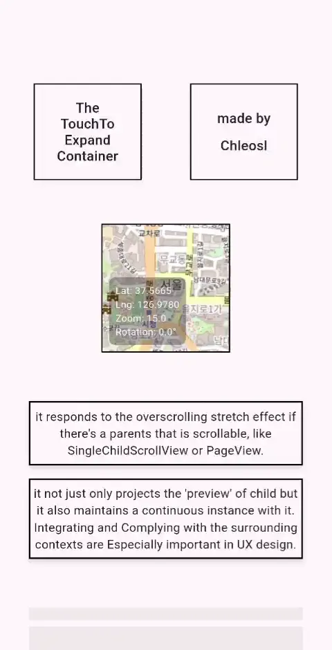
A container that maintains a single/continuous child instance while expanded, which Overlay widget in Flutter doesn't and cannot. All UX-oriented customizables are API-supported.
An Overlaying/Expandable container that maintains a single instance: TouchToExpandContainer #
An expandable container that maintains a single/continuous child instance while expanded (in every expanded and collapsed state), which Overlay widget in vanilla flutter doesn't and cannot, by placing 'targeter' - TouchToExpandContainer widget in wherever specific widget tree you want and rendering real contents in the background 'wrapper' by connecting both using CompositedTransformTarget and CompositedTransformFollower Widgets. like Hunter-Killer tactics in military term. the TouchToExpandContainer sets and receives all the properties and specifics for Conatiner and Overlay like location, child, decorations, behavior when expanded etc, then TouchToExpandOverlayWrapper wrapper 'deploys' or 'renders' it with all the propertes it set and have.
A package for UX-Oriented programmers. Vertical Integrations are important - which accomplished by single instance maintaining architecture that manages the attention focus cycle of user.
Huge credit to Claude and Anthropic PBC; I learned Dart and Flutter very fast with the help of Claude, and this code is the result of architecture designed by me, and content/code written by Claude Opus 4 and Me.
Zero Dependencies: I used only import 'package:flutter/material.dart';.
Usage #
- a container that projects the 'preview' of Overlay but it also maintains a continuous child instance between it.
- a PC window GUI-like UI or similar product.
Demonstration/Showcase #
All this acheived by:
SingleChildScrollView - or something any fancy widget you want(
  TouchToExpandOverlayWrapper(
    // anywhere in the widget tree..
      TouchToExpandContainer(
        h/w
        child: MapView(),
      ),
  ),
),
Try The demo yourself #
🎮 Interactive Demo (or click the video above!)
How to use #
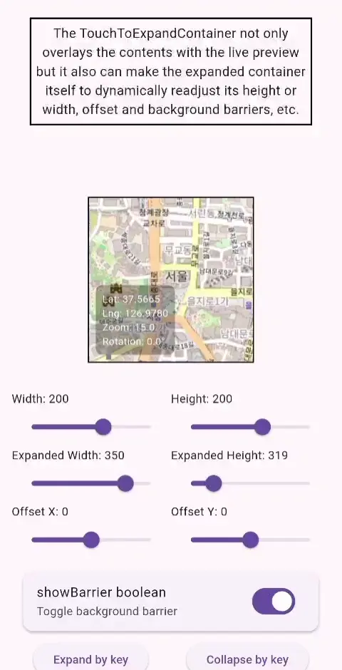
You place the two Components: the wrapper TouchToExpandOverlayWrapper and the container in widget tree TouchToExpandContainer.
wrapper could be placed 'inside' the scrollable widgets like SingleChildScrollView or PageView if you want to maintain and align the screen effects like overscroll stretch with scrollable contexts within. I don't recommend to put it on the root level of your app, because It's NOT UX-oriented. it should be 'comply and integrated' with the surroundal contexts of your widgets, i.e 'scrollable' and 'that group seems like a integrated column'. that's the key essence and Idea-Value of the UX-orientative.
the TouchToExpandContainer receives parameters of:
| Parameter | Type | Required | Description |
|---|---|---|---|
| width | double | Yes | Width of the container |
| height | double | Yes | Height of the container |
| child | Widget | Yes | The child widget to display on the Overlay and perview (to render) on the container |
| expandedWidth | double | No | Width when expanded (defaults to screenSize.width > 800 ? 700.0 : screenSize.width * 0.82) |
| expandedHeight | double | No | Height when expanded (defaults to 55% of screen height) |
| showBarrier | bool | No | Whether to show the modal barrier when expanded |
| duration | Duration | No | Duration of the expand/collapse animation |
| curve | Curve | No | Animation curve for expansion |
| reverseCurve | Curve | No | Animation curve for collapse |
| decoration | BoxDecoration | No | BoxDecoration for the collapsed container (defaults to 1.5px black border) |
| expandedDecoration | BoxDecoration | No | BoxDecoration for the expanded container (defaults to 1.5px black border and a little shadow effect) |
| isOutlineDisplayed | bool | No | Whether to display the container box decoration/outline in collapsed location in expanded state |
| expandedOffset | Offset | No | Offset in expanded state |
| isLiveAlways | bool | No | Whether this container should 'ignore' the barrier effects from other containers |
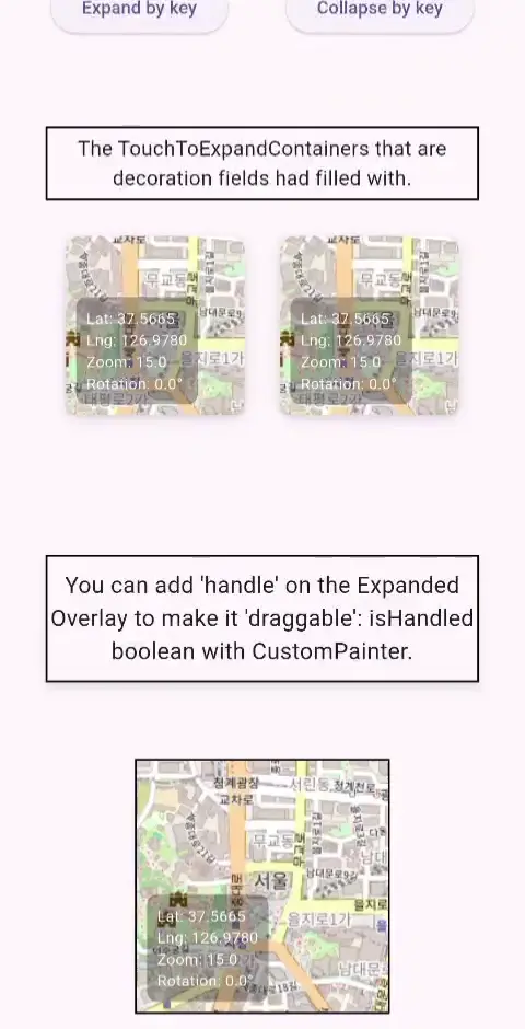
| isHandled | bool | No | Whether to show a drag handle when expanded |
| customHandlePainter | CustomHandleFunction(Canvas canvas, Size size), Size |
No | A drawable custom handle drawer that receives CustomPainter.paint function and Size. You can make Windows and Mac window GUI with this parameter |
| handlebarOffset | Offset | No | Offset for the handle position relative to the expanded container location |
| barrierColor | Color | No | The color of the modal barrier that appears behind expanded containers |
| isScrollActivated | bool | No | Whether scrolling the background is allowed when this container is expanded |
| key | Key | no | I added a method to expand and collapse specific TouchToExpandContainer using <yourKey>.currentState?.expand() in the wrapper. pro tip: or you can collapse whatever expanded container using the State Classes. |
Of course you can just give only w/h and child. It just magically works like that.
Also, inside a contianer,
you can access some states with ExpandedStateProvider:
isExpanded(bool)/animationValue(0.0-1.0)/currentWidth/currentHeight
License #
MIT license
touch_to_expand_container made by @Chleosl


