timeline_date_picker_plus 0.0.3  timeline_date_picker_plus: ^0.0.3 copied to clipboard
A Flutter package for a horizontal scrollable date picker with support for custom styling and dots on the days.
timeline_date_picker_plus #
A beautiful and customizable horizontal scrollable date picker for Flutter.
Supports custom styling, dots to represent events/schedules, and more!
Easily scroll through dates horizontally, customize colors, shapes, fonts, and highlight specific dates with schedule dots!
✨ Features #
- Horizontal scrolling date picker.
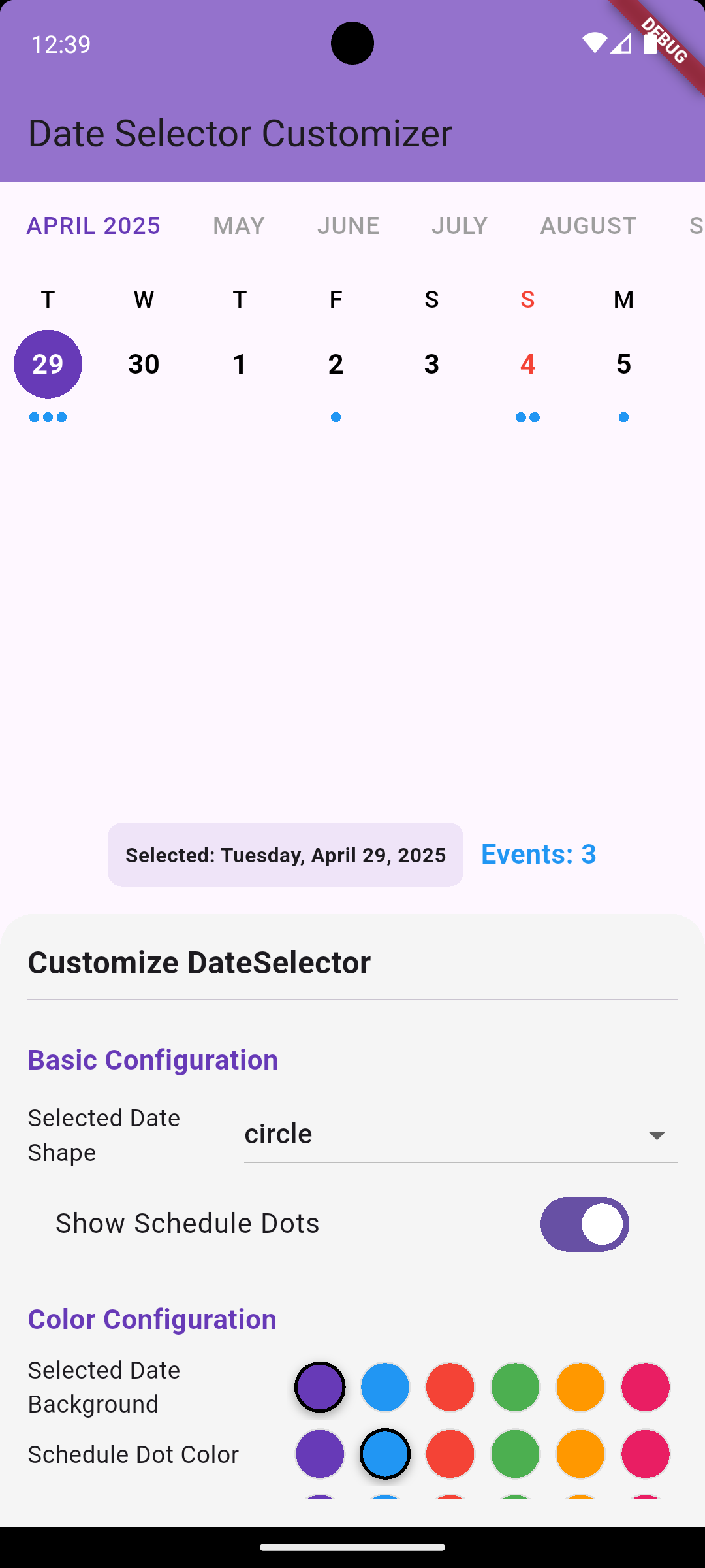
- Show dots under specific dates (e.g., for events, tasks).
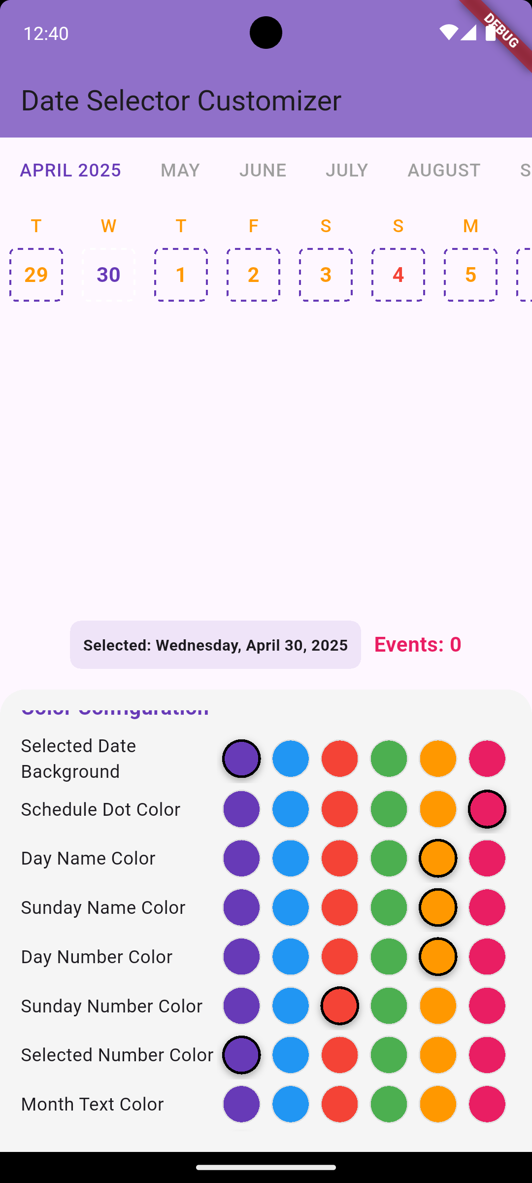
- Customize colors, font sizes, and selected date styles.
- Easily configurable selected date shape: circle or rounded rectangle.
- Supports month labels and dynamic updates.
- Built with
scrollable_positioned_listfor smooth performance.
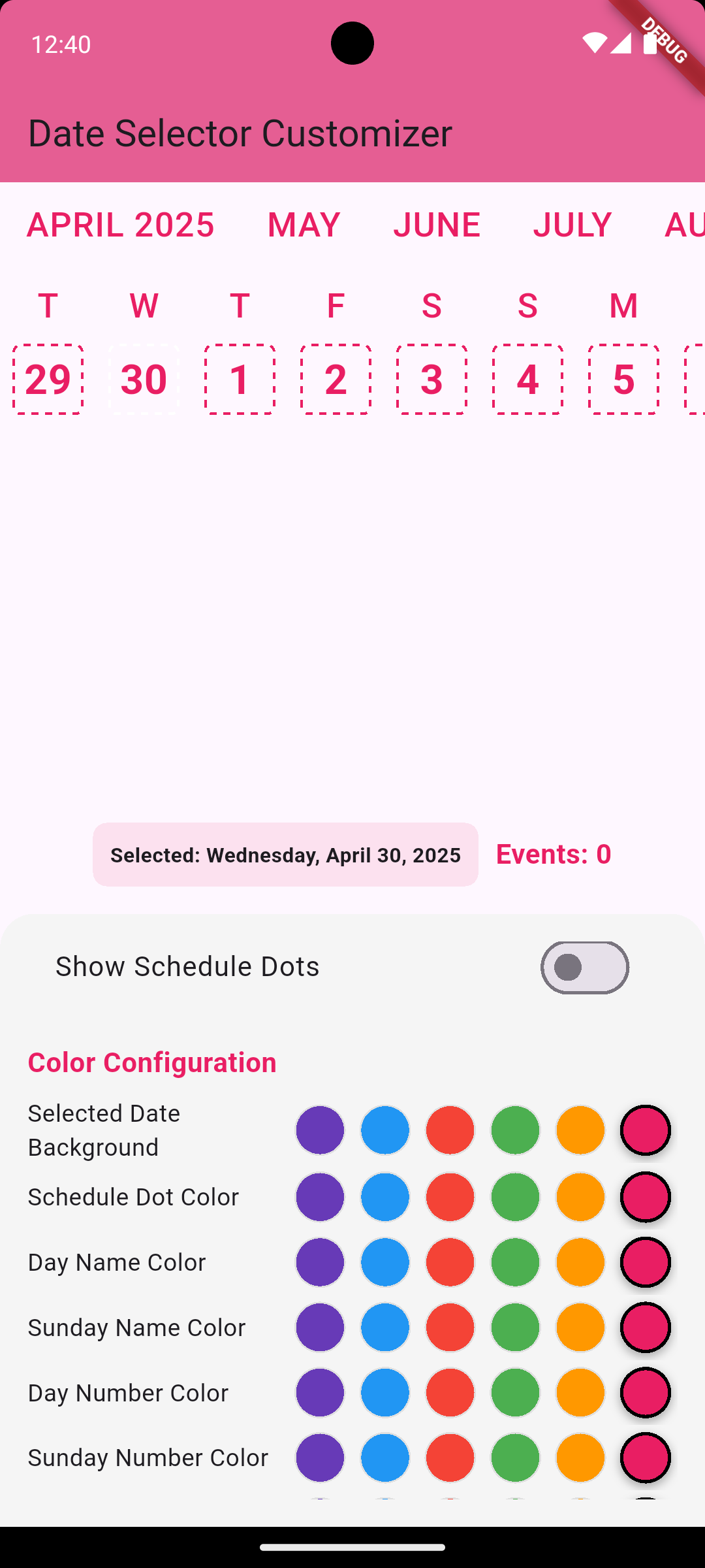
📸 Screenshots #
| Basic Picker | Schedule Dots | Custom Styling |
|---|---|---|
 |
 |
 |
🚀 Getting Started #
1. Install #
Add to your pubspec.yaml:
dependencies:
  timeline_date_picker: ^0.0.1
Then run:
flutter pub get
2. Import #
import 'package:timeline_date_picker_plus/timeline_date_picker_plus.dart';
3. Basic Usage #
DateScroller(
  initialDate: DateTime.now(),
  lastDate: DateTime.now().add(const Duration(days: 365)),
  selectedDate: DateTime.now(),
  onDateSelected: (date) {
    // Handle date selection
  },
)
🛠 Full Example #
DateScroller(
  initialDate: DateTime.now(),
  lastDate: DateTime.now().add(const Duration(days: 365)),
  selectedDate: selectedDate,
  onDateSelected: (date) {
    setState(() {
      selectedDate = date;
    });
  },
  showScheduleDots: true,
  scheduleCounts: {
    DateTime(2025, 4, 29): 3,
    DateTime(2025, 4, 30): 1,
  },
  selectedShape: DateSelectedShape.circle,
  selectedDateBackgroundColor: Colors.deepPurple,
  dayNameColor: Colors.black,
  dayNameSundayColor: Colors.red,
  dayNumberColor: Colors.black,
  dayNumberSundayColor: Colors.red,
  dayNumberSelectedColor: Colors.white,
  scheduleDotColor: Colors.blue,
  monthTextColor: Colors.grey,
  activeMonthTextColor: Colors.deepPurple,
  dayNameTextStyle: const TextStyle(fontSize: 14, fontWeight: FontWeight.w500),
  dayNumberTextStyle: const TextStyle(fontSize: 16, fontWeight: FontWeight.bold),
  monthTextStyle: const TextStyle(fontSize: 14, fontWeight: FontWeight.w500),
)
⚙️ Parameters #
| Parameter | Type | Description |
|---|---|---|
initialDate |
DateTime |
Starting date of the picker |
lastDate |
DateTime |
Last selectable date |
selectedDate |
DateTime |
Currently selected date |
onDateSelected |
Function(DateTime) |
Callback when user selects a date |
scheduleCounts |
Map<DateTime, int> |
Optional. Map of dates with event counts (dots) |
showScheduleDots |
bool |
Show or hide dots below dates |
selectedShape |
DateSelectedShape |
Shape of the selected date (circle or rounded rectangle) |
selectedDateBackgroundColor |
Color |
Background color for selected date |
dayNameColor |
Color |
Color of weekday names |
dayNameSundayColor |
Color |
Color of Sunday name |
dayNumberColor |
Color |
Color of day numbers |
dayNumberSundayColor |
Color |
Color of Sundays' numbers |
dayNumberSelectedColor |
Color |
Color of selected date number |
scheduleDotColor |
Color |
Color of schedule dots |
monthTextColor |
Color |
Color of month labels |
activeMonthTextColor |
Color |
Color of currently active month label |
dayNameTextStyle |
TextStyle |
Text style for day names |
dayNumberTextStyle |
TextStyle |
Text style for day numbers |
monthTextStyle |
TextStyle |
Text style for month text |
📅 Schedule Dots #
You can highlight dates with dots by providing a Map<DateTime, int> to the scheduleCounts parameter.
Each entry corresponds to the number of dots shown under a date.
scheduleCounts: {
  DateTime(2025, 4, 29): 3,
  DateTime(2025, 4, 30): 1,
}
📦 Example App #
Check the example/ folder for a complete demo on how to customize Timeline Date Picker!
📄 License #
This project is licensed under the MIT License.
