ticketcher 0.1.0  ticketcher: ^0.1.0 copied to clipboard
 qomrah.ly
A Flutter package for creating beautiful ticket-style cards with customizable borders, dividers, and patterns. Perfect for event tickets, boarding passes, and coupons.
Ticketcher #
Ticketcher is a powerful Flutter package for creating beautiful, highly customizable ticket-style cards and widgets. Effortlessly design event tickets, boarding passes, coupons, and more with support for unique border patterns, gradient backgrounds, custom notches, and flexible section layouts. Ticketcher makes it easy to add professional, interactive ticket designs to your Flutter apps with just a few lines of code.
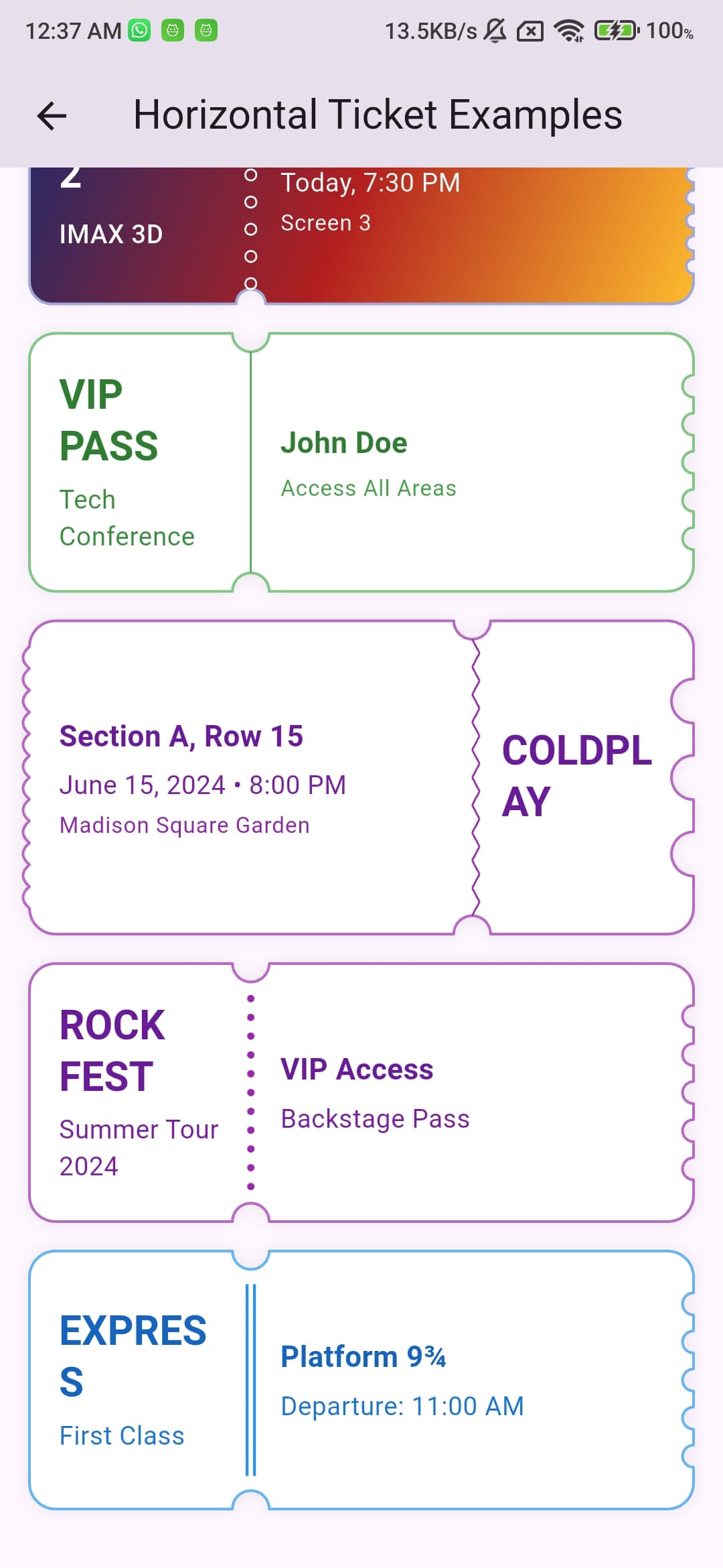
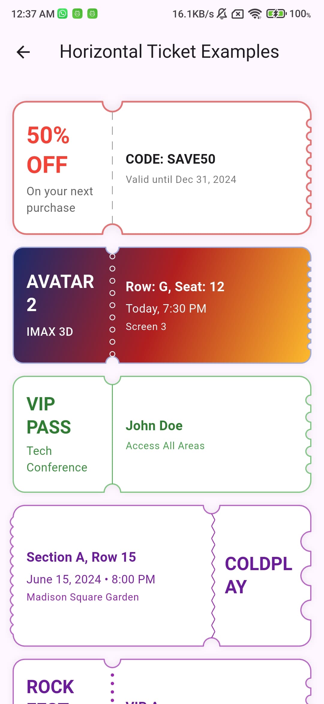 Concert Wave Divider |
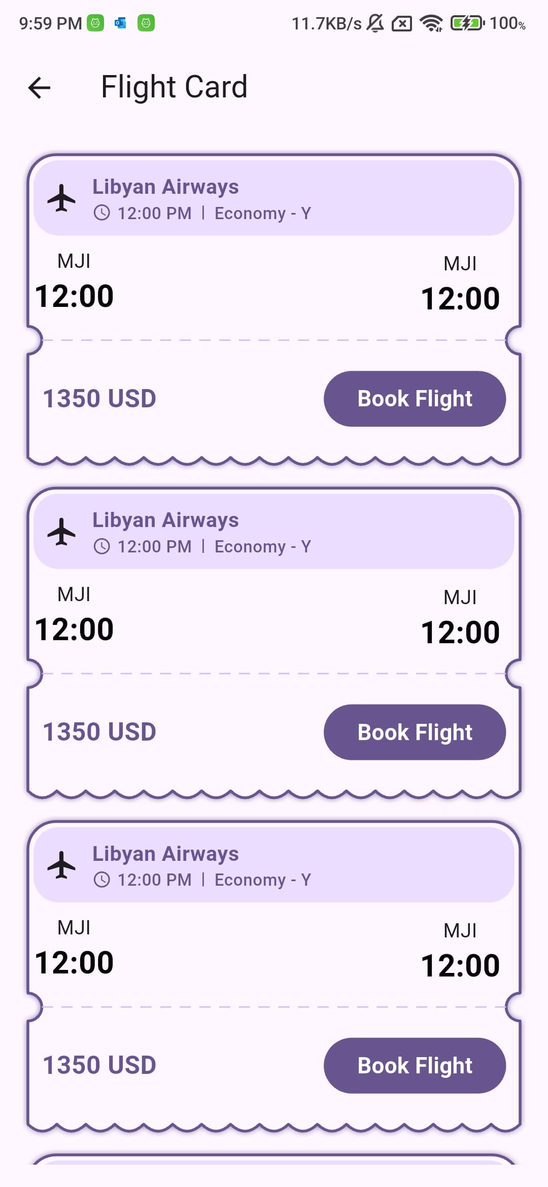 Flight Dashed Divider |
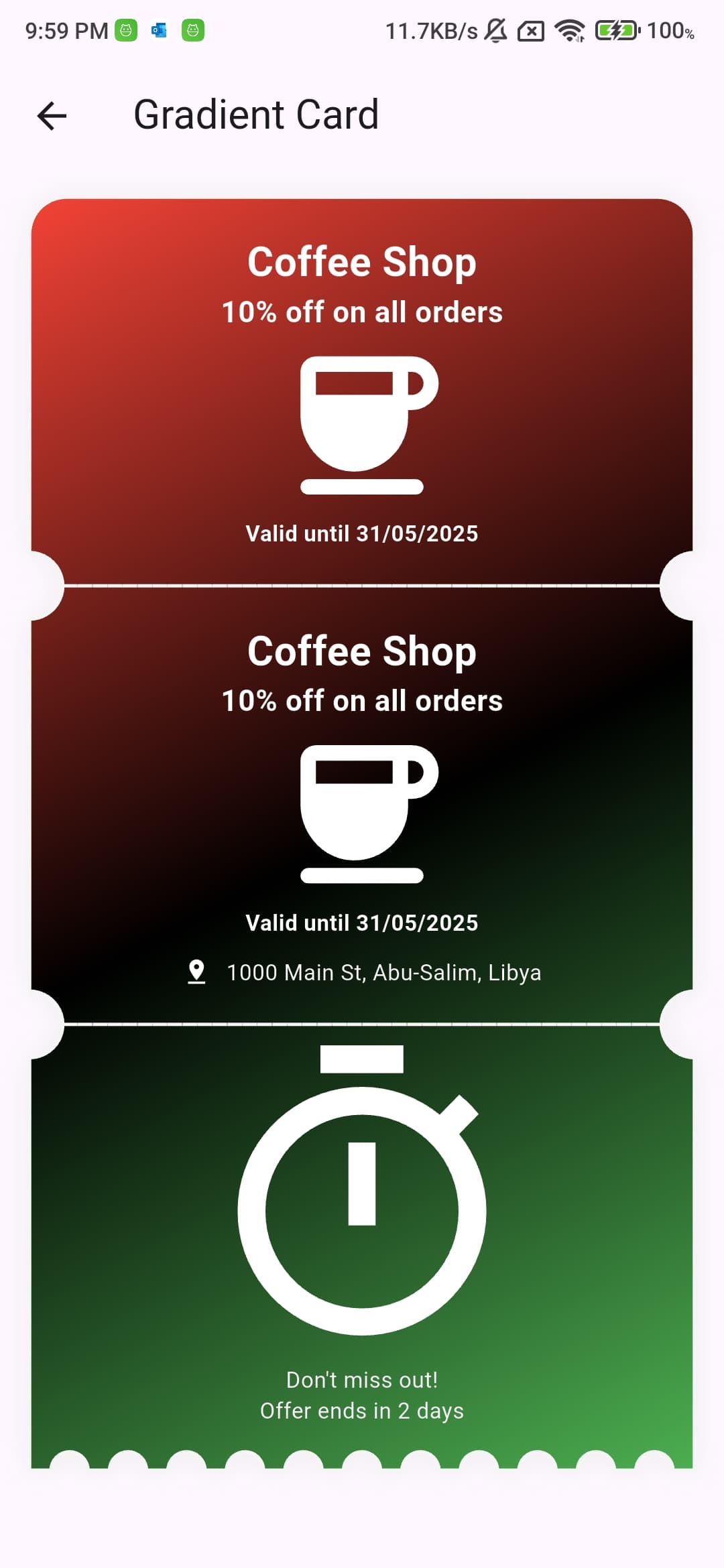 Gradient Background |
 Train Solid Divider |
|---|---|---|---|
 Circle Pattern |
 Wave Pattern |
 Smooth Wave |
 Multiple Sections |
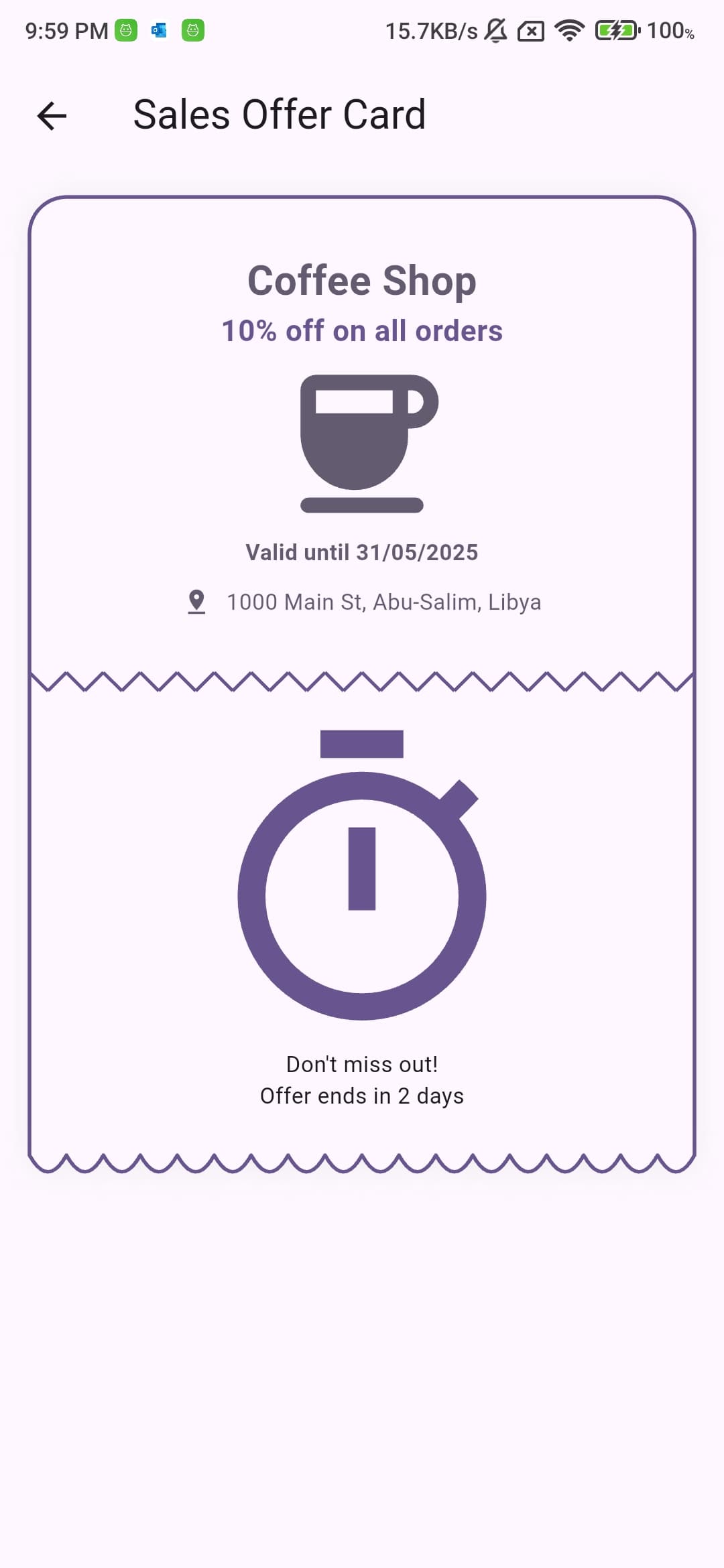 Coffee Sales |
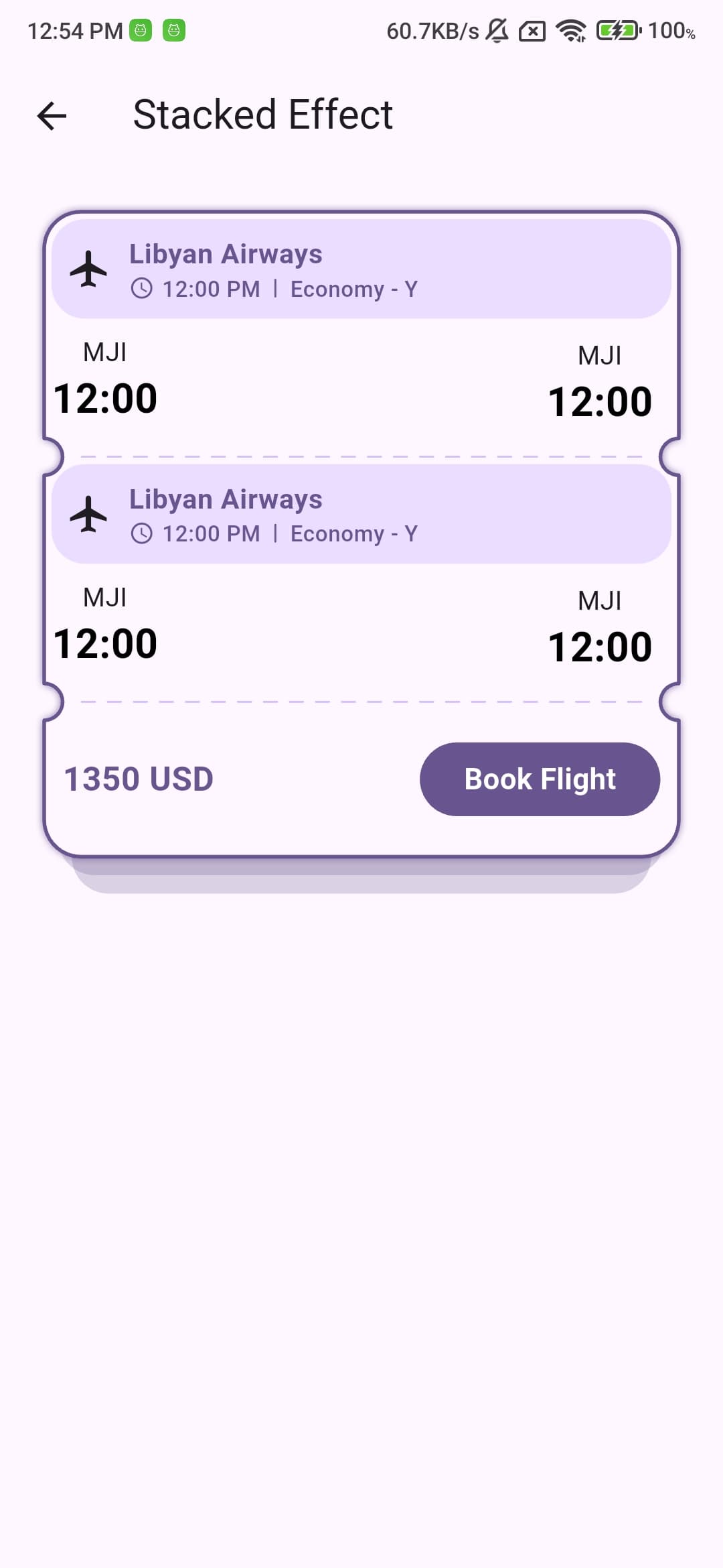 Stacked Layers |
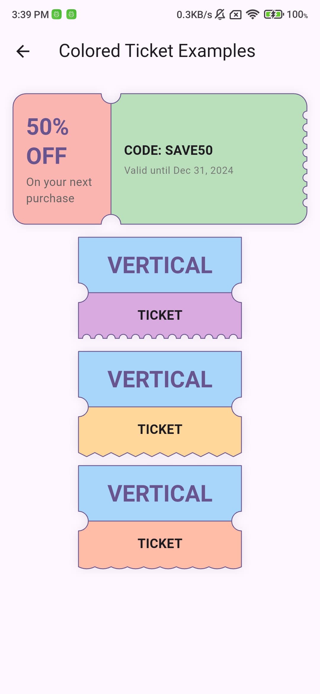 Colored Sections |
Table of Contents #
- Features
- Installation
- Usage
- Important Usage Notes
- Examples
- Contributing
- License
Features #
- Create both vertical and horizontal ticket layouts
- Customizable border patterns (wave, arc, sharp)
- Multiple divider styles (solid, dashed, circles, wave, smooth wave, dotted, double line)
- Gradient backgrounds
- Custom border radius for any corner
- Shadow effects
- Section padding control
- Width and height control
- Notch radius customization
- Stacked effect for vertical tickets (creates a layered appearance in the last section)
- Individual background colors for each section
Installation #
Add this to your package's pubspec.yaml file:
dependencies:
  ticketcher: ^0.1.0
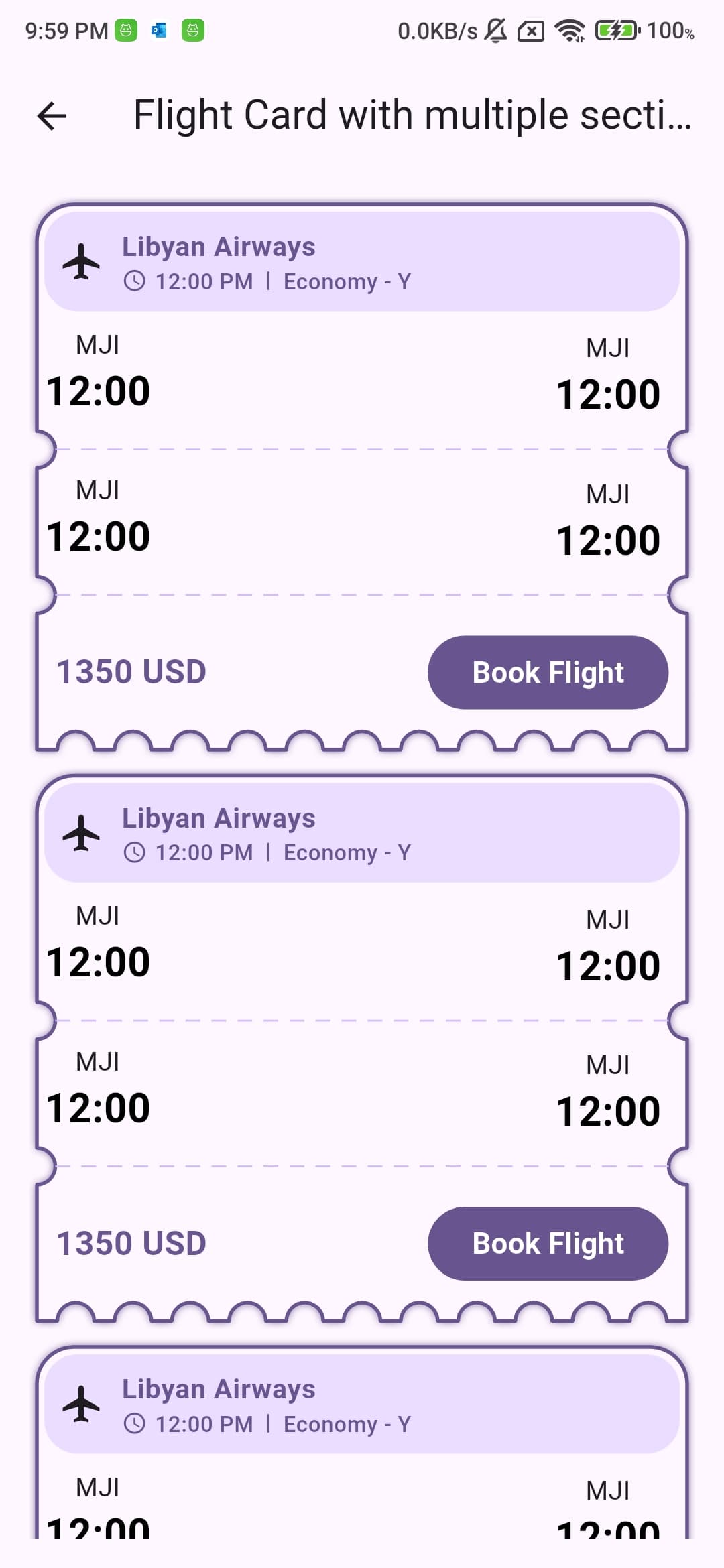
Usage #
Basic Usage #
The default mode is vertical. Here's a basic example:
Ticketcher(
  sections: [
    Section(
      child: Text('First Section'),
    ),
    Section(
      child: Text('Second Section'),
    ),
  ],
)
Horizontal Mode #
For horizontal layout, use the horizontal constructor:
Ticketcher.horizontal(
  height: 160,
  sections: [
    Section(
      widthFactor: 1,
      child: Text('Left Section'),
    ),
    Section(
      widthFactor: 2,
      child: Text('Right Section'),
    ),
  ],
)
Vertical Mode #
For vertical layout, you can use either the default constructor or the explicit vertical constructor:
Ticketcher.vertical(
  sections: [
    Section(
      child: Text('Top Section'),
    ),
    Section(
      child: Text('Bottom Section'),
    ),
  ],
)
Border Patterns #
Add decorative patterns to the edges of your ticket.
Ticketcher(
  decoration: TicketcherDecoration(
    bottomBorderStyle: BorderPattern(
      shape: BorderShape.wave, // or sharp, arc
      height: 8.0,
      width: 20.0,
    ),
  ),
)
Available patterns:
BorderShape.wave: Creates a wavy patternBorderShape.sharp: Creates a zigzag patternBorderShape.arc: Creates a series of connected arcs
Dividers #
Add dividers between sections with various styles.
Available divider styles:
DividerStyle.solid- A simple straight lineDividerStyle.dashed- A line made of dashesDividerStyle.circles- A series of circlesDividerStyle.wave- A zigzag wave patternDividerStyle.smoothWave- A smooth curved wave patternDividerStyle.dotted- A series of evenly spaced dotsDividerStyle.doubleLine- Two parallel lines
Ticketcher(
  decoration: TicketcherDecoration(
    divider: TicketDivider(
      color: Colors.grey,
      thickness: 1.0,
      style: DividerStyle.solid, // or dashed, circles, wave, smoothWave, dotted, doubleLine
    ),
  ),
)
Solid Divider
Ticketcher(
  decoration: TicketcherDecoration(
    divider: TicketDivider.solid(
      color: Colors.grey,
      thickness: 1.0,
      padding: 8.0, // Add padding on both sides
    ),
  ),
)
Dashed Divider
Ticketcher(
  decoration: TicketcherDecoration(
    divider: TicketDivider.dashed(
      color: Colors.grey,
      thickness: 1.0,
      dashWidth: 10.0,
      dashSpace: 7.0,
      padding: 8.0, // Add padding on both sides
    ),
  ),
)
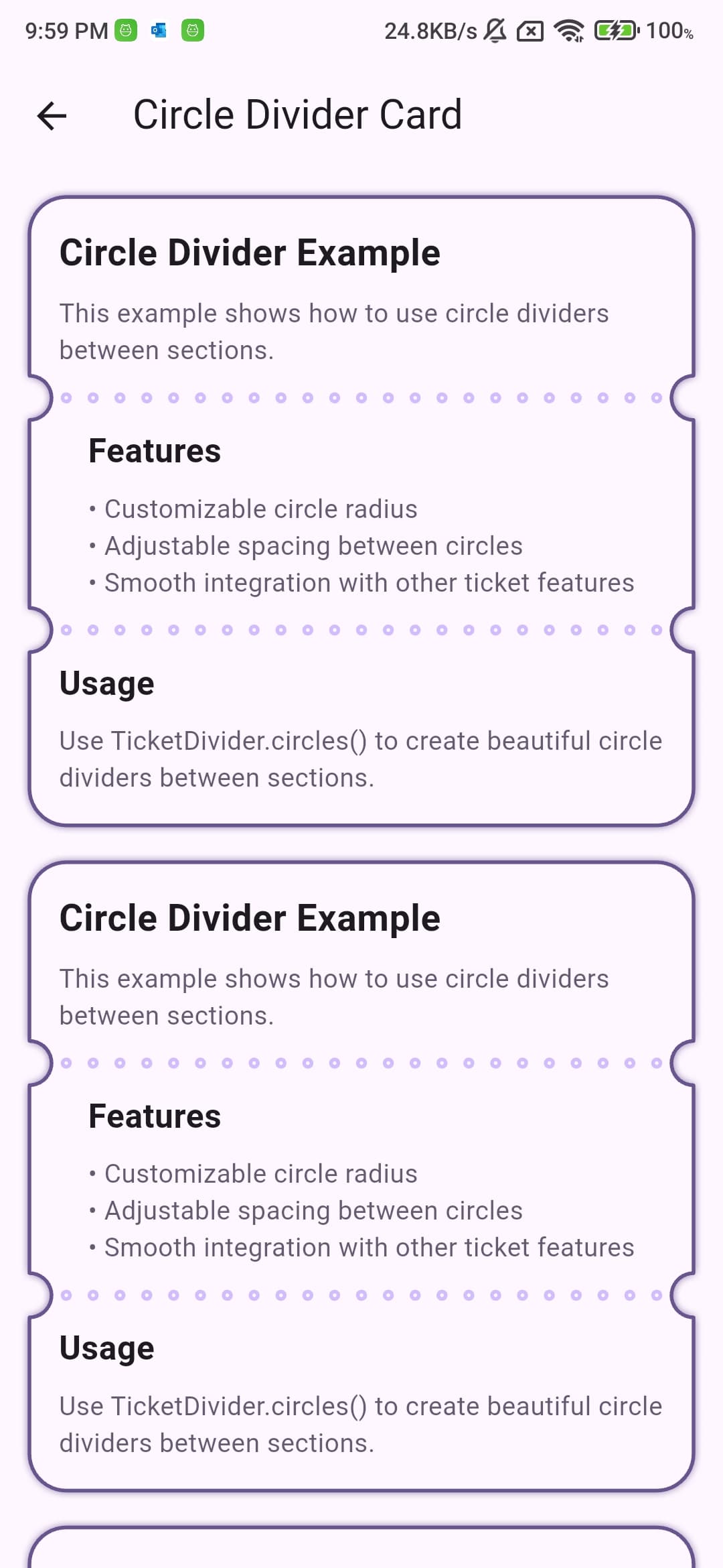
Circle Divider
Ticketcher(
  decoration: TicketcherDecoration(
    divider: TicketDivider.circles(
      color: Colors.grey,
      thickness: 2.0,
      circleRadius: 4.0,
      circleSpacing: 8.0,
      padding: 8.0, // Add padding on both sides
    ),
  ),
)
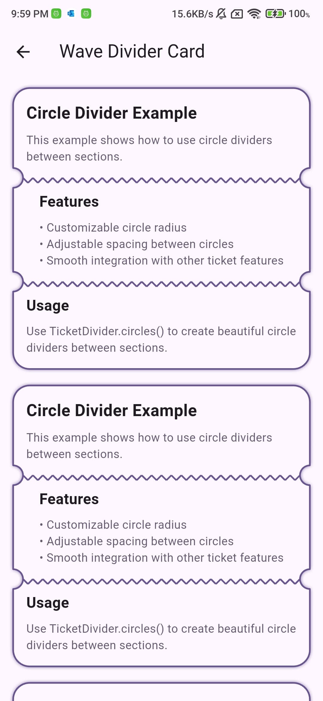
Wave Divider
Ticketcher(
  decoration: TicketcherDecoration(
    divider: TicketDivider.wave(
      color: Colors.grey,
      thickness: 2.0,
      waveHeight: 6.0,
      waveWidth: 12.0,
      padding: 8.0, // Add padding on both sides
    ),
  ),
)
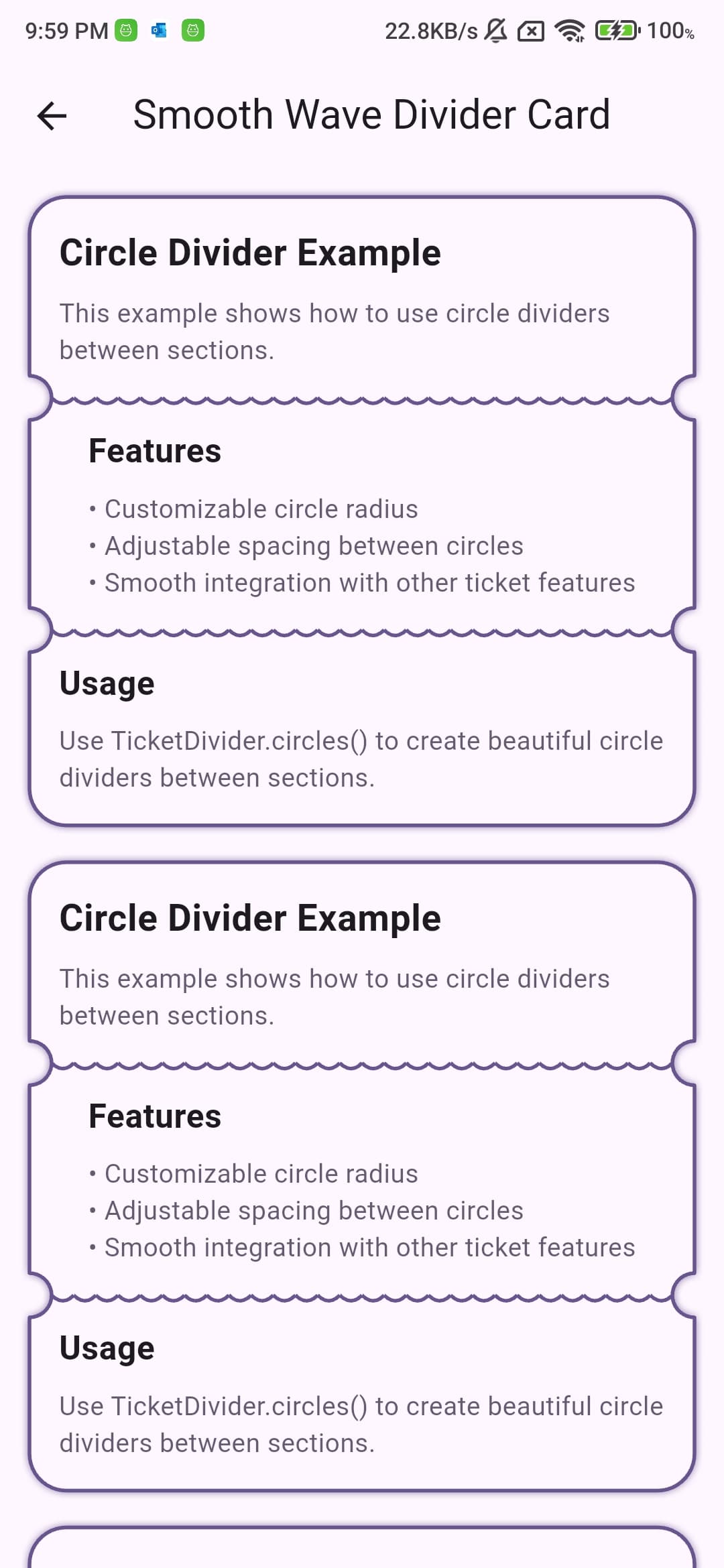
Smooth Wave Divider
Ticketcher(
  decoration: TicketcherDecoration(
    divider: TicketDivider.smoothWave(
      color: Colors.grey,
      thickness: 2.0,
      waveHeight: 6.0,
      waveWidth: 12.0,
      padding: 8.0, // Add padding on both sides
    ),
  ),
)
Dotted Divider
Ticketcher(
  decoration: TicketcherDecoration(
    divider: TicketDivider.dotted(
      color: Colors.grey,
      thickness: 2.0,
      dotSize: 2.0,
      dotSpacing: 8.0,
      padding: 8.0, // Add padding on both sides
    ),
  ),
)
Double Line Divider
Ticketcher(
  decoration: TicketcherDecoration(
    divider: TicketDivider.doubleLine(
      color: Colors.grey,
      thickness: 1.5,
      lineSpacing: 4.0,
      padding: 8.0, // Add padding on both sides
    ),
  ),
)
The padding property adds equal spacing on both sides of the divider. This is useful when you want to create some space between the divider and the edges of the ticket. The padding is applied symmetrically, meaning the same amount of space is added to both the left and right sides in vertical mode, or top and bottom sides in horizontal mode.
Background Styling #
Solid Color
Ticketcher(
  decoration: TicketcherDecoration(
    backgroundColor: Colors.white,
  ),
)
Gradient
Ticketcher(
  decoration: TicketcherDecoration(
    gradient: LinearGradient(
      colors: [Colors.blue, Colors.purple],
      begin: Alignment.topLeft,
      end: Alignment.bottomRight,
    ),
  ),
)
Colored Sections #
Customize the background color of individual sections. If a section color is provided, it overrides the backgroundColor and gradient from TicketcherDecoration for that specific section. This allows for creating tickets with multi-colored parts.
Ticketcher(
  sections: [
    Section(
      color: Colors.blue.shade100,
      child: Text('First Section'),
    ),
    Section(
      color: Colors.green.shade100,
      child: Text('Second Section'),
    ),
  ],
)
Border #
Add a border around your ticket.
Ticketcher(
  decoration: TicketcherDecoration(
    border: Border.all(
      color: Colors.grey,
      width: 1.0,
    ),
  ),
)
Shadow #
Add a shadow effect to your ticket.
Ticketcher(
  decoration: TicketcherDecoration(
    shadow: BoxShadow(
      color: Colors.black.withOpacity(0.2),
      blurRadius: 4.0,
      offset: Offset(0, 2),
    ),
  ),
)
Stacked Effect #
Add a stacked effect to your vertical ticket's last section. This creates a layered appearance that adds depth to your ticket design.
Ticketcher(
  decoration: TicketcherDecoration(
    stackEffect: StackEffect(
      count: 2, // Number of stacked layers
      offset: 8.0, // Vertical offset between layers
      widthStep: 4.0, // Width reduction for each layer
      color: Colors.grey.withOpacity(0.2), // Color of the stacked layers
    ),
  ),
)
The stacked effect is only supported in vertical tickets and will be applied to the last section. You can customize:
count: Number of stacked layers (1-3)offset: Vertical offset between each layerwidthStep: How much each layer is reduced in widthcolor: Color of the stacked layers (defaults to a light grey if not specified)
Example with a more pronounced effect:
Ticketcher(
  decoration: TicketcherDecoration(
    stackEffect: StackEffect(
      count: 3,
      offset: 12.0,
      widthStep: 8.0,
      color: Colors.blue.withOpacity(0.1),
    ),
  ),
)
Note: The stacked effect is only available in vertical tickets and will be ignored in horizontal tickets.
Section Padding #
Customize the padding for each section.
Ticketcher(
  sections: [
    Section(
      child: Text('First Section'),
      padding: EdgeInsets.all(16.0),
    ),
    Section(
      child: Text('Second Section'),
      padding: EdgeInsets.all(16.0),
    ),
  ],
)
Width Control #
Set a specific width for your ticket.
Ticketcher(
  width: 300.0,
  // ... other properties
)
Notch Radius #
Customize the radius of the notches that connect the sections.
Ticketcher(
  notchRadius: 12.0,
  // ... other properties
)
Important Usage Notes #
Assertions #
The package includes several assertions to prevent invalid configurations:
-
Minimum Sections
- Both vertical and horizontal tickets must have at least 2 sections
- Error message: "Vertical/Horizontal Ticketcher must have at least 2 sections"
-
Border Style and Radius Conflicts
- In vertical mode, you cannot use
bottomBorderStylewhen there's a bottom border radius - Error message: "Cannot use bottomBorderStyle when there is a bottom border radius"
- This applies to any bottom corner radius (bottom, bottomLeft, bottomRight, or all corners)
- In vertical mode, you cannot use
Best Practices #
-
Section Width Factors
- In horizontal mode, use
widthFactorto control section widths - The total of all width factors determines the relative sizes
- Example:
widthFactor: 1andwidthFactor: 2creates a 1:2 ratio
- In horizontal mode, use
-
Border Patterns
- Border patterns work best with straight edges
- Avoid using border patterns on edges with rounded corners
- For best results, use patterns on edges without radius
-
Dividers
- Choose divider styles that complement your border patterns
- Consider using matching colors for borders and dividers
- Adjust thickness and spacing for better visual balance
-
Performance
- Use
widthandheightproperties when you know the exact dimensions - This helps avoid unnecessary layout calculations
- For dynamic content, let the widget calculate its own size
- Use
Examples #
Check out the example directory for more detailed examples of different ticket styles and configurations.
Contributing #
Contributions are welcome! Please feel free to submit a Pull Request.
License #
This project is licensed under the MIT License - see the LICENSE file for details.
Metadata
Publisher
Weekly Downloads
Metadata
A Flutter package for creating beautiful ticket-style cards with customizable borders, dividers, and patterns. Perfect for event tickets, boarding passes, and coupons.
Repository (GitHub)
View/report issues
License
 unknown (license)