textfield_plus 0.3.0  textfield_plus: ^0.3.0 copied to clipboard
 sanalparakkal.blogspot.com
A highly customizable and easy-to-use text field widget for Flutter.
Text Field Plus for Flutter #
A customizable and feature-rich text field widget for Flutter applications. This package provides a TextFieldPlus widget with various styling and validation options.
Features #
- Customizable appearance (filled background, border styles, icons, etc.).
- Input validation (phone numbers, emails, required fields).
- Support for different input types (text, number, email, phone).
- Prefix icons and currency support.
- Read-only and selectable text fields.
- Focus management and auto-selection of text.
- ✨ Option to switch UI into a brand new aesthetic look.
- ✨ Highly customizable styling and behavior.
Installation #
Add this package to your pubspec.yaml:
dependencies:
  textfield_plus: ^latest_version
Usage #
Import the package and use the TextFieldPlus widget in your Flutter application:
import 'dart:developer';

import 'package:flutter/material.dart';
import 'package:textfield_plus/textfield_plus.dart';

class TestFields extends StatelessWidget {
  const TestFields({super.key});

  @override
  Widget build(BuildContext context) {
    return Scaffold(
      appBar: AppBar(
        title: Text("Example"),
        backgroundColor: Colors.blueGrey,
        foregroundColor: Colors.white,
      ),
      body: Padding(
        padding: const EdgeInsets.all(8.0),
        child: Column(
          spacing: 10,
          children: [
            TextFieldPlus(controller: TextEditingController(), title: "Name"),
            TextFieldPlus(
              controller: TextEditingController(),
              title: "Name",
              filled: true,
              fillColor: Colors.grey.withAlpha(100),
            ),
            TextFieldPlus(
              icon: Icons.person,
              controller: TextEditingController(),
              title: "Name",
              showTitle: false,
              center: true,
            ),
            SizedBox(height: 10),
            TextFieldPlus(
              readOnly: true,
              onTap: () {
                showDatePicker(
                  context: context,
                  firstDate: DateTime(2000),
                  lastDate: DateTime(2100),
                );
              },
              icon: Icons.calendar_view_week_rounded,
              controller: TextEditingController(),
              title: "Date",
              showTitle: false,
            ),
            TextFieldPlus(
              icon: Icons.phone,
              isBold: true,

              controller: TextEditingController(),
              title: "Mobile",
            ),
            TextFieldPlus(
              onChanged: (p0) {
                log(p0);
              },
              maxLines: 5,
              isBold: true,
              controller: TextEditingController(),
              title: "Address",
            ),
          ],
        ),
      ),
    );
  }
}
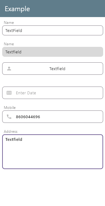
Screenshot #
Below is a screenshot of the TextFieldPlus widget in action:
Metadata
2
likes
160
points
2
downloads
Publisher
Weekly Downloads
Metadata
A highly customizable and easy-to-use text field widget for Flutter.
Repository (GitHub)
View/report issues
Documentation
License
 MIT (license)