tabbed_view 0.5.0  tabbed_view: ^0.5.0 copied to clipboard
 caduandrade.net
Flutter widget inspired by the classic Desktop-style tab component. Supports customizable themes.
tabbed_view #

Flutter widget inspired by the classic Desktop-style tab component. Supports customizable themes.

The TabbedView renders the presentation of the model.
The TabbedViewModel stores the tab data as name, content, buttons or any dynamic value.
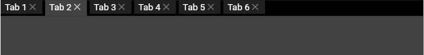
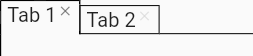
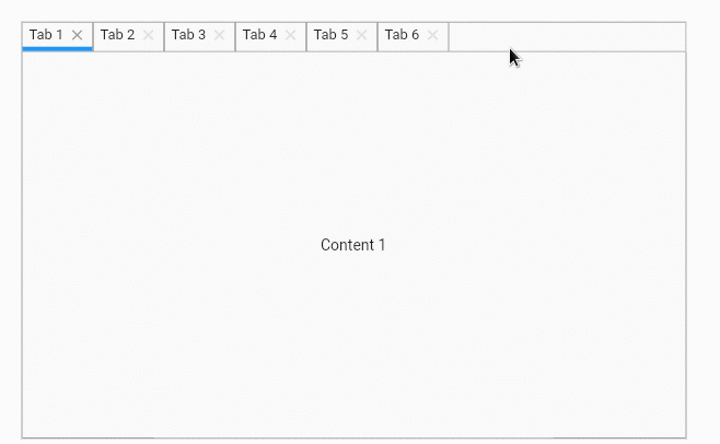
Get started #
The default theme is TabbedViewTheme.light().
    List<TabData> tabs = [];
    for (var i = 1; i < 7; i++) {
      Widget tabContent = Center(child: Text('Content $i'));
      tabs.add(TabData(text: 'Tab $i', content: tabContent));
    }
    TabbedWiew tabbedView = TabbedWiew(controller: TabbedWiewController(tabs));

Content builder #
It allows creating the contents of the tab dynamically during the selection event.
    List<TabData> tabs = [
      TabData(text: 'Tab 1'),
      TabData(text: 'Tab 2'),
      TabData(text: 'Tab 3')
    ];

    TabbedWiew tabbedView = TabbedWiew(
        controller: TabbedWiewController(tabs),
        contentBuilder: (BuildContext context, int tabIndex) {
          int i = tabIndex + 1;
          return Center(child: Text('Content $i'));
        });
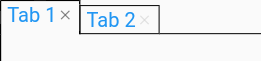
Close button tooltip #
    List<TabData> tabs = [
      TabData(text: 'Tab 1'),
      TabData(text: 'Tab 2'),
      TabData(text: 'Tab 3')
    ];
    TabbedWiew tabbedView = TabbedWiew(
        controller: TabbedWiewController(tabs),
        closeButtonTooltip: 'Click here to close the tab');
Tab #
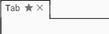
Extra button #
    TabData tab = TabData(text: 'Tab', buttons: [
      TabButton(icon: Icons.star, onPressed: () => print('Hello!'))
    ]);
    TabbedWiew tabbedView = TabbedWiew(controller: TabbedWiewController([tab]));
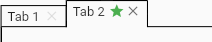
Extra button - overriding theme color #
    var tabs = [
      TabData(text: 'Tab 1'),
      TabData(text: 'Tab 2', buttons: [
        TabButton(
            icon: Icons.star,
            color: Colors.green,
            onPressed: () => print('Hello!'))
      ])
    ];
    TabbedWiew tabbedView = TabbedWiew(controller: TabbedWiewController(tabs));
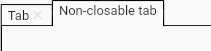
Removing the close button #
    var tabs = [
      TabData(text: 'Tab'),
      TabData(text: 'Non-closable tab', closable: false)
    ];
    TabbedWiew tabbedView = TabbedWiew(controller: TabbedWiewController(tabs));
Tab close listener #
    bool _onTabClosing(int tabIndex) {
      if (tabIndex == 0) {
        print('The tab $tabIndex is busy and cannot be closed.');
        return false;
      }
      print('Closing tab $tabIndex...');
      return true;
    }

    List<TabData> tabs = [
      TabData(text: 'Tab 1'),
      TabData(text: 'Tab 2'),
      TabData(text: 'Tab 3')
    ];
    TabbedWiew tabbedView = TabbedWiew(
        controller: TabbedWiewController(tabs), onTabClosing: _onTabClosing);
Themes #
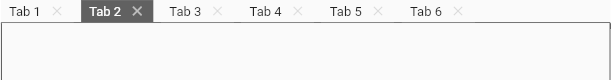
Tab #
Text style
    var tabs = [
      TabData(text: 'Tab 1'),
      TabData(text: 'Tab 2'),
    ];

    TabbedViewTheme theme = TabbedViewTheme.light();
    theme.tabsArea.tab.textStyle = TextStyle(fontSize: 20, color: Colors.blue);

    TabbedWiew tabbedView =
        TabbedWiew(controller: TabbedWiewController(tabs), theme: theme);
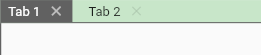
Alignment
    var tabs = [
      TabData(text: 'Tab 1'),
      TabData(text: 'Tab 2'),
    ];

    TabbedViewTheme theme = TabbedViewTheme.light();
    theme.tabsArea.tab
      ..textStyle = TextStyle(fontSize: 20)
      ..verticalAlignment = VerticalAlignment.top;

    TabbedWiew tabbedView =
        TabbedWiew(controller: TabbedWiewController(tabs), theme: theme);
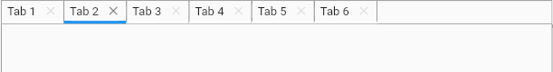
Tabs area #
Color
- The default TabsAreaTheme color is null.
    var tabs = [TabData(text: 'Tab 1'), TabData(text: 'Tab 2')];

    TabbedViewTheme theme = TabbedViewTheme.minimalist();
    theme.tabsArea.color = Colors.green[100];

    TabbedWiew tabbedView =
        TabbedWiew(controller: TabbedWiewController(tabs), theme: theme);
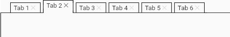
Tab gaps
- Gap before the tabs (allows negative value).
- Gap between tabs (allows negative value).
- Minimum gap after tabs. Separates the last tab and the buttons area.
    List<TabData> tabs = [];
    for (var i = 1; i < 7; i++) {
      tabs.add(
          TabData(text: 'Tab $i', content: Center(child: Text('Content $i'))));
    }

    TabbedViewTheme theme = TabbedViewTheme.light();
    theme.tabsArea
      ..initialGap = 20
      ..middleGap = 5
      ..minimalFinalGap = 5;

    TabbedWiew tabbedView =
        TabbedWiew(controller: TabbedWiewController(tabs), theme: theme);
Buttons area
Button icon for the hidden tabs menu
    List<TabData> tabs = [];
    for (var i = 1; i < 7; i++) {
      tabs.add(TabData(text: 'Tab $i'));
    }

    TabbedViewTheme theme = TabbedViewTheme.light();
    theme.tabsArea.buttonsArea.hiddenTabsMenuButtonIcon =
        Icons.arrow_drop_down_circle_outlined;

    TabbedWiew tabbedView =
        TabbedWiew(controller: TabbedWiewController(tabs), theme: theme);
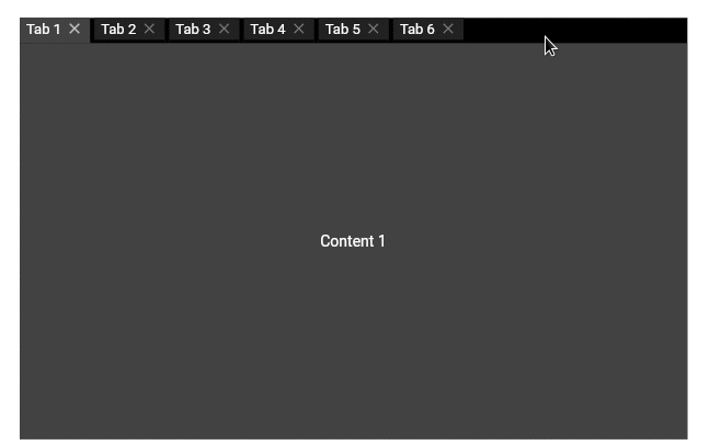
Predefined themes #
Dark theme
    TabbedWiew tabbedView =
            TabbedWiew(controller: controller, theme: TabbedViewTheme.dark());
Mobile theme
    TabbedWiew tabbedView =
        TabbedWiew(controller: controller, theme: TabbedViewTheme.mobile());
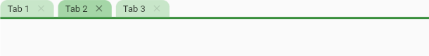
Creating new theme #
It is possible to create an entire theme from scratch.
    var tabs = [
      TabData(text: 'Tab 1'),
      TabData(text: 'Tab 2'),
      TabData(text: 'Tab 3')
    ];

    TabbedViewTheme theme = TabbedViewTheme();
    theme.tabsArea
      ..border = Border(bottom: BorderSide(color: Colors.green[700]!, width: 3))
      ..middleGap = 6;

    Radius radius = Radius.circular(10.0);
    BorderRadiusGeometry? borderRadius =
        BorderRadius.only(topLeft: radius, topRight: radius);

    theme.tabsArea.tab
      ..padding = EdgeInsets.fromLTRB(10, 4, 10, 4)
      ..buttonsOffset = 8
      ..decoration = BoxDecoration(
          shape: BoxShape.rectangle,
          color: Colors.green[100],
          borderRadius: borderRadius)
      ..selectedStatus.decoration =
          BoxDecoration(color: Colors.green[200], borderRadius: borderRadius)
      ..highlightedStatus.decoration =
          BoxDecoration(color: Colors.green[50], borderRadius: borderRadius);

    TabbedWiew tabbedView =
        TabbedWiew(controller: TabbedWiewController(tabs), theme: theme);
Agenda for the next few days #
- Complete documentation and examples to cover all available features.
- Release the final version (1.0.0). The API may have some small changes.
Metadata
105
likes
0
pub points
87%
popularity
Publisher
Metadata
Flutter widget inspired by the classic Desktop-style tab component. Supports customizable themes.
Repository (GitHub)
View/report issues
License
 unknown (license)