tab_container 1.2.0  tab_container: ^1.2.0 copied to clipboard
 precede.dev
Animated and customisable tab view widget. It's self-contained, so you can just pass in children and tabs, or also use a controller, change the tab side, add color(s), and more.
A beautiful, animated, and customisable tab view widget. This widget is self-contained, so you can just pass in a list of children and a list of tabs and it will handle the rest. You can also use a controller, change the tab side, add color(s), and much more.
Please file any potential issues.
Features #
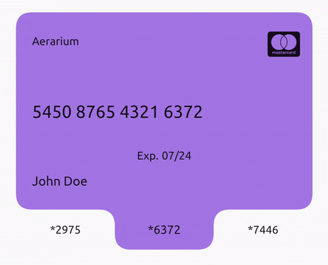

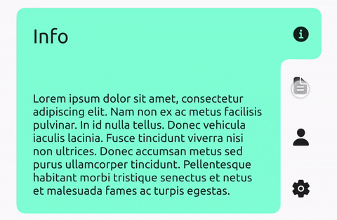
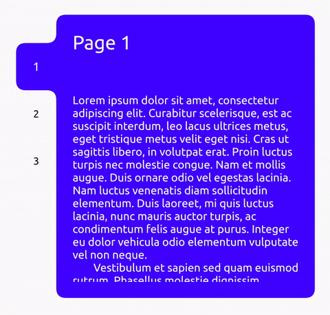
Currently available parameters:
class TabContainer extends ImplicitlyAnimatedWidget {
  /// Changes tab selection from elsewhere in your app.
  ///
  /// If you provide one, you must dispose of it.
  final TabContainerController? controller;

  /// Sets the curve radius.
  ///
  /// Defaults to 12.0.
  final double radius;

  /// Sets the padding to be applied around all [children].
  ///
  /// Defaults to [EdgeInsets.zero].
  final EdgeInsets childPadding;

  /// The list of children you want to tab through, in order.
  ///
  /// Must be equal in length to [tabs] and [colors] (if provided).
  final List<Widget> children;

  /// What will be displayed in each tab, in order.
  ///
  /// Must be equal in length to [children] and [colors] (if provided).
  final List<dynamic> tabs;

  /// Determines how much space the tabs take up.
  ///
  /// If the tabs are on the left/right then this will be the tab width, otherwise it will be the tab height.
  /// Defaults to 50.0.
  final double tabExtent;

  /// Determines which side the tabs will be on.
  ///
  /// Defaults to [TabEdge.top].
  final TabEdge tabEdge;

  /// Fraction of the way down the tab edge that the first tab should begin.
  ///
  /// Defaults to 0.0.
  final double tabStart;

  /// Fraction of the way down the tab edge that the last tab should end.
  ///
  /// Defaults to 1.0.
  final double tabEnd;

  /// The background color of this widget.
  ///
  /// Must not be set if [colors] is provided.
  final Color? color;

  /// The list of colors used for each tab, in order.
  ///
  /// The first color in the list will be the background color when tab 1 is selected and so on.
  /// Must not be set if [color] is provided.
  final List<Color>? colors;

  /// Duration for the tab indicator to slide to a new index.
  ///
  /// Provide a duration of 0 to disable tab animation.
  /// Defaults to Duration(milliseconds: 300).
  final Duration tabDuration;

  /// The curve of the animation that controls tab indicator sliding.
  ///
  /// Defaults to [Curves.easeInOut].
  final Curve tabCurve;

  /// Duration of the child transition animation when the tab selection changes.
  ///
  /// Defaults to [tabDuration].
  final Duration? childDuration;

  /// The curve of the child transition animation when the tab selection changes.
  ///
  /// Defaults to [tabCurve].
  final Curve? childCurve;

  /// Sets the child transition animation when the tab selection changes.
  ///
  /// Defaults to [AnimatedSwitcher.defaultTransitionBuilder].
  final Widget Function(Widget, Animation<double>)? transitionBuilder;

  /// The [TextStyle] applied to the text of the currently selected tab.
  ///
  /// Must specify values for the same properties as [unselectedTextStyle].
  /// Defaults to Theme.of(context).textTheme.bodyText2.
  final TextStyle? selectedTextStyle;

  /// The [TextStyle] applied to the text of currently unselected tabs.
  ///
  /// Must specify values for the same properties as [selectedTextStyle].
  /// Defaults to Theme.of(context).textTheme.bodyText2.
  final TextStyle? unselectedTextStyle;

  /// The [TextDirection] for tabs and semantics.
  ///
  /// Defaults to Directionality.of(context).
  final TextDirection? textDirection;

  /// Whether tab selection changes on tap.
  ///
  /// Defaults to true.
  final bool enabled;

  /// Whether detected gestures on tabs should provide acoustic and/or haptic feedback.
  ///
  /// Defaults to true.
  final bool enableFeedback;
}
Usage #
Check the /example folder for full examples of the above functionality.
Minimal example:
import 'package:tab_container/tab_container.dart';

//...

TabContainer(
  color: Theme.of(context).colorScheme.secondary,
  children: [
    Container(
      child: Text('Child 1'),
    ),
    Container(
      child: Text('Child 2'),
    ),
    Container(
      child: Text('Child 3'),
    ),
  ],
  tabs: [
    'Tab 1',
    'Tab 2',
    'Tab 3',
  ],
),
Additional information #
Icons used in the demo: Ionicons, FontAwesome5
Car photos used in the demo:
- https://unsplash.com/photos/eqW1MPinEV4
- https://unsplash.com/photos/N9Pf2J656aQ
- https://unsplash.com/photos/2AovfzYV3rc
This is a very new package. If you find any problems, please file an issue if one doesn't already exist.
Metadata
Publisher
Metadata
Animated and customisable tab view widget. It's self-contained, so you can just pass in children and tabs, or also use a controller, change the tab side, add color(s), and more.
Repository (GitHub)
View/report issues
License
 unknown (LICENSE)