syncfusion_flutter_sliders 25.2.7  syncfusion_flutter_sliders: ^25.2.7 copied to clipboard
A Flutter Sliders library for creating highly customizable and UI-rich slider, range slider, and range selector widgets for filtering purposes.

Flutter Sliders library #
The Flutter Sliders package is written natively in Dart for creating highly interactive and UI-rich slider widgets for filtering purposes in Flutter applications.
Overview #
This library is used to create three different types of sliders, namely slider, range slider, and range selector. All these sliders have a rich set of features such as support for both numeric and date values, tooltip, labels, and ticks. The range selector latter accepts any kind of child including Charts.
Disclaimer: This is a commercial package. To use this package, you need to have either a Syncfusion Commercial License or Free Syncfusion Community license. For more details, please check the LICENSE file.
Table of contents #
- Slider features
- Range slider features
- Range selector features
- Get the demo application
- Useful links
- Installation
- Slider getting started
- Range slider getting started
- Range selector getting started
- Support and Feedback
- About Syncfusion
Slider features #
-
Numeric and date support - Select numeric and date value. For date, support is provided up to the 'Seconds' interval.
-
Labels - Render labels for the date and numeric ranges with an option to customize formats based on the requirement.

-
Ticks and dividers - Show ticks and dividers based on the interval. Also, enable minor ticks between the ticks to indicate the selected values. These options show the selected range in a more intuitive way for the end users.

-
Tooltip - Render tooltip to show the selected value clearly. It is also possible to customize the format of the text shown in the tooltip.

-
Thumb icon support - Accepts custom widgets like icon or text inside the thumb.

-
Discrete selection - Provides an option for selecting only discrete numeric and date values.
-
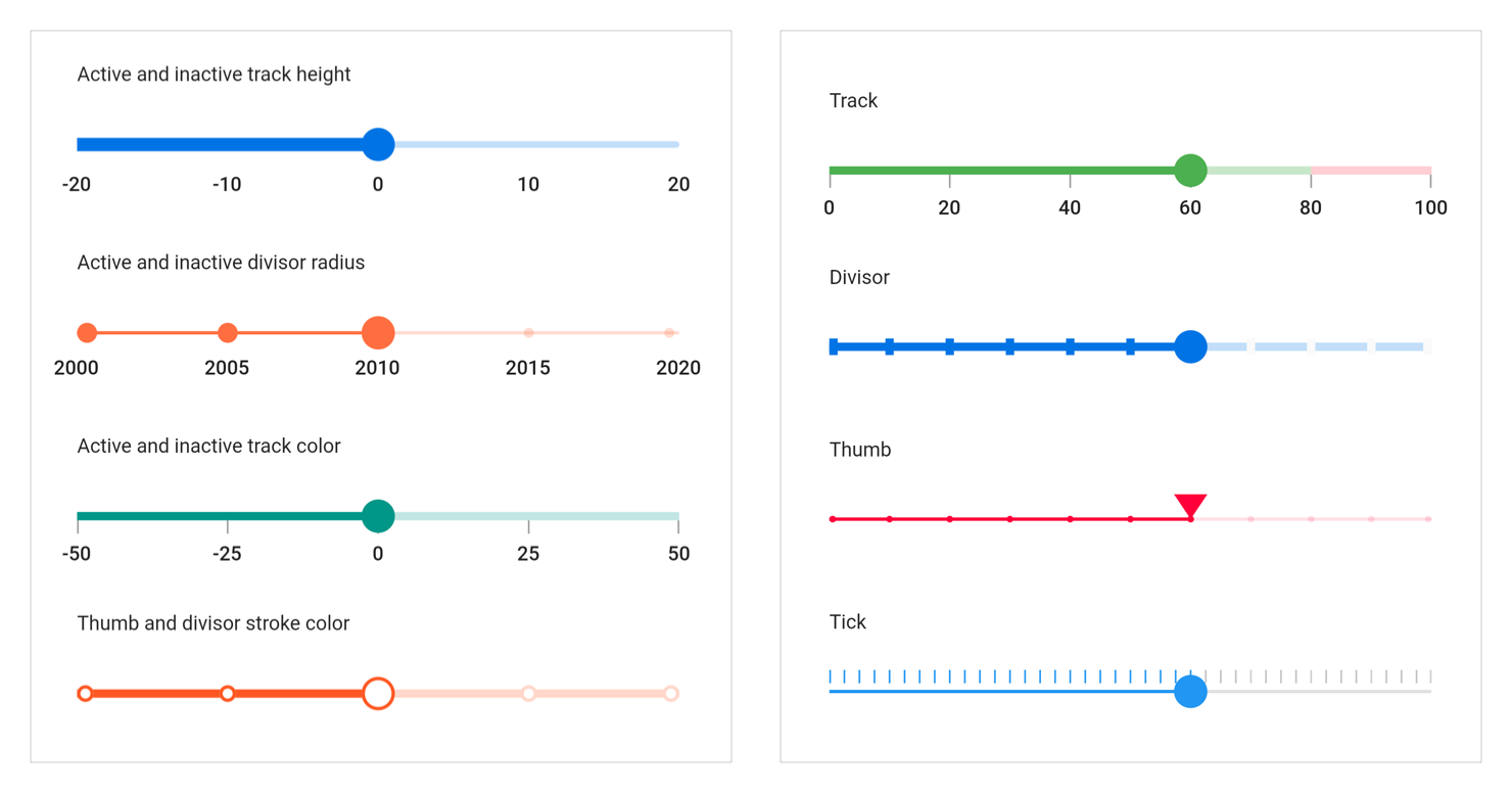
Highly customizable - In addition to the built-in rich set of features, fully customize the control easily using the wide range of provided options.
-
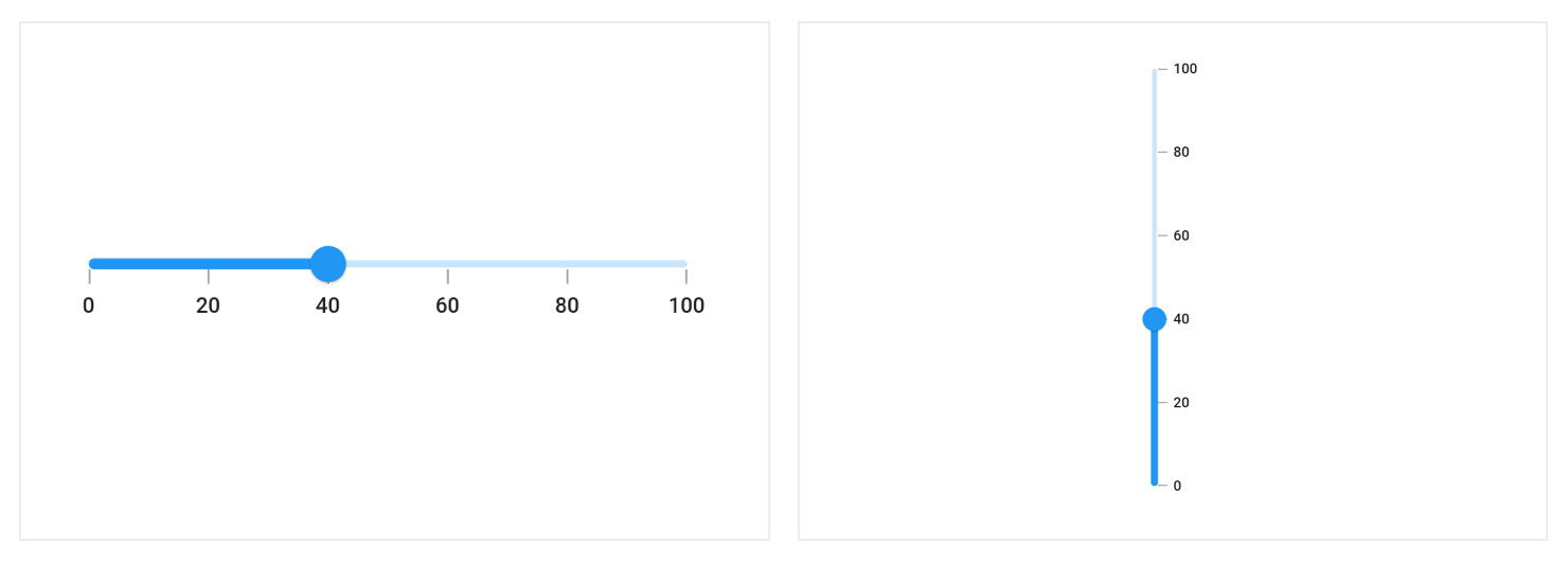
Orientation - Supports both horizontal and vertical orientations.
-
Inversed vertical slider - Provides an option to change the minimum and maximum positions of the vertical slider.
Range slider features #
Range slider supports all the above-mentioned features of the slider in addition to:
-
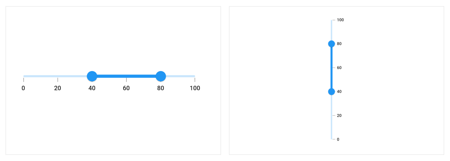
Orientation - Supports both horizontal and vertical orientations.
-
Inversed vertical range slider - Provides an option to change the minimum and maximum positions of the vertical range slider.
-
Drag mode - Various dragging options are available to control thumb dragging. The available options are
onThumb,betweenThumbs, andboth. -
Interval selection - Allows users to select a particular interval by tapping or clicking in it. Both thumbs will be moved to the current interval with animation.
Range selector features #
Range selector supports all the above-mentioned features(except orientation and inversed slider) of the range slider in addition to:
-
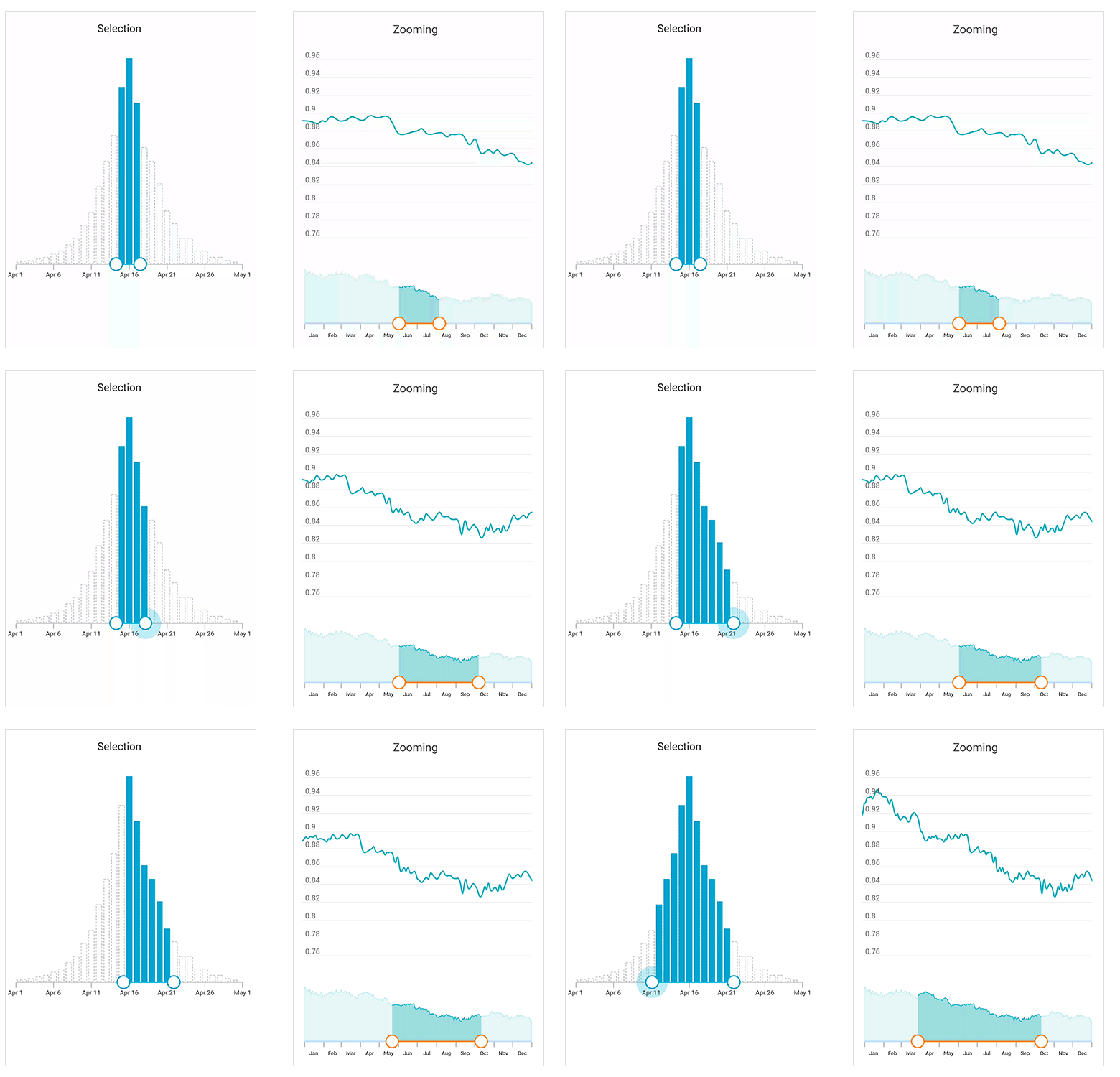
Child support - Add a child of any type inside the range selector. It is also possible to add Charts. With the built-in integration, range selector is smart enough to handle features like segment selection or zooming of a chart based on the selected range in the range selector. Similar to the range slider, it also supports both numeric and date values.
-
Deferred update - Provides an option to defer range updates, allowing you to control when dependent components are updated while thumbs are being dragged continuously.
Get the demo application #
Explore the full capability of our Flutter widgets on your device by installing our sample browser application from the following app stores. View sample codes in GitHub.
Useful links #
Take a look at the following to learn more about Syncfusion Flutter sliders:
- Syncfusion Flutter Sliders product page
- User guide documentation for Slider
- User guide documentation for Range Slider
- User guide documentation for Range Selector
- Knowledge base
Installation #
Install the latest version from pub.
Slider getting started #
Import the following package.
import 'package:syncfusion_flutter_sliders/sliders.dart';
Add slider to the widget tree #
Add the slider widget as a child of any widget. Here, the slider widget is added as a child of the center widget.
@override
Widget build(BuildContext context) {
    return MaterialApp(
        home: Scaffold(
            body: Center(
                child: SfSlider(),
              ),
          ),
      );
}
Add slider elements #
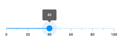
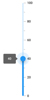
Add the slider elements such as ticks, labels, and tooltip to show the current position of the slider thumb.
Horizontal slider
double _value = 40.0;

@override
Widget build(BuildContext context) {
  return Scaffold(
     appBar: AppBar(
       title: const Text('Syncfusion Flutter Slider'),
     ),
     body: SfSlider(
       min: 0.0,
       max: 100.0,
       value: _value,
       interval: 20,
       showTicks: true,
       showLabels: true,
       enableTooltip: true,
       minorTicksPerInterval: 1,
       onChanged: (dynamic value){
         setState(() {
           _value = value;
         });
       },
     ),
   );
}
The following screenshot illustrates the result of the above code sample.
Vertical slider
double _value = 40.0;

@override
Widget build(BuildContext context) {
  return Scaffold(
    appBar: AppBar(
      title: const Text('Syncfusion Flutter Vertical Slider'),
    ),
    body: SfSlider.vertical(
      min: 0.0,
      max: 100.0,
      value: _value,
      interval: 20,
      showTicks: true,
      showLabels: true,
      enableTooltip: true,
      minorTicksPerInterval: 1,
      onChanged: (dynamic value) {
        setState(() {
          _value = value;
        });
      },
    ),
  );
}
Range slider getting started #
Import the following package.
import 'package:syncfusion_flutter_sliders/sliders.dart';
Add range slider to the widget tree #
Add the range slider widget as a child of any widget. Here, the range slider widget is added as a child of the center widget.
@override
Widget build(BuildContext context) {
    return MaterialApp(
        home: Scaffold(
            body: Center(
                child: SfRangeSlider(),
              ),
          ),
      );
}
Add range slider elements #
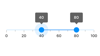
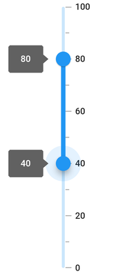
Add the range slider elements such as ticks, labels, and tooltips to show the current position of the range slider thumb.
Horizontal range slider
SfRangeValues _values = SfRangeValues(40.0, 80.0);

@override
Widget build(BuildContext context) {
   return Scaffold(
     appBar: AppBar(
       title: const Text('Syncfusion Flutter Range Slider'),
     ),
     body: SfRangeSlider(
        min: 0.0,
        max: 100.0,
        values: _values,
        interval: 20,
        showTicks: true,
        showLabels: true,
        enableTooltip: true,
        minorTicksPerInterval: 1,
        onChanged: (SfRangeValues values){
          setState(() {
            _values = values;
          });
        },
      ),
   );
}
The following screenshot illustrates the result of the above code sample.
Vertical range slider
SfRangeValues _values = SfRangeValues(40.0, 80.0);

@override
Widget build(BuildContext context) {
  return Scaffold(
    appBar: AppBar(
      title: const Text('Syncfusion Flutter Vertical Range Slider'),
    ),
    body: SfRangeSlider.vertical(
      min: 0.0,
      max: 100.0,
      values: _values,
      interval: 20,
      showTicks: true,
      showLabels: true,
      enableTooltip: true,
      minorTicksPerInterval: 1,
      onChanged: (SfRangeValues values) {
        setState(() {
          _values = values;
        });
      },
    ),
  );
}
Range selector getting started #
Import the following package.
import 'package:syncfusion_flutter_sliders/sliders.dart';
Add range selector to the widget tree #
Add the range selector widget as a child of any widget. Here, the range selector widget is added as a child of the center widget.
@override
Widget build(BuildContext context) {
    return MaterialApp(
        home: Scaffold(
            body: Center(
                child: SfRangeSelector(),
            ),
        ),
    );
}
Add range selector elements #
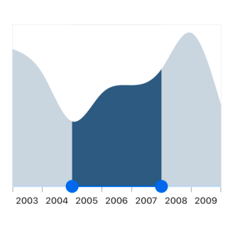
Add a child of any type inside the range selector. Here, the Charts widget is added as a child of the range selector.
final DateTime dateMin = DateTime(2003, 01, 01);
final DateTime dateMax = DateTime(2010, 01, 01);
final SfRangeValues dateValues =
            SfRangeValues(DateTime(2005, 01, 01), DateTime(2008, 01, 01));

@override
  Widget build(BuildContext context) {
    return Scaffold(
      appBar: AppBar(
        title: const Text('Syncfusion Flutter Range Selector'),
      ),
      body: Container(
          margin: const EdgeInsets.all(0),
          padding: const EdgeInsets.all(0),
          child: Stack(
            children: <Widget>[
              Padding(
                padding: const EdgeInsets.only(top: 10),
                child: Center(
                  child: SfRangeSelector(
                    min: dateMin,
                    max: dateMax,
                    initialValues: dateValues,
                    labelPlacement: LabelPlacement.betweenTicks,
                    interval: 1,
                    dateIntervalType: DateIntervalType.years,
                    dateFormat: DateFormat.y(),
                    showTicks: true,
                    showLabels: true,
                    child: Container(
                      child: SfCartesianChart(
                        margin: const EdgeInsets.all(0),
                        primaryXAxis: DateTimeAxis(
                          minimum: dateMin,
                          maximum: dateMax,
                          isVisible: false,
                        ),
                        primaryYAxis: NumericAxis(isVisible: false, maximum: 4),
                        series: <SplineAreaSeries<Data, DateTime>>[
                          SplineAreaSeries<Data, DateTime>(
                              dataSource: chartData,
                              xValueMapper: (Data sales, int index) => sales.x,
                              yValueMapper: (Data sales, int index) => sales.y)
                        ],
                      ),
                      height: 200,
                    ),
                  ),
                ),
              ),
            ],
          )),
    );
  }
The following screenshot illustrates the result of the above code sample.
Support and Feedback #
- For any other queries, reach our Syncfusion support team or post the queries through the Community forums and submit a feature request or a bug through our Feedback portal.
- To renew the subscription, click renew or contact our sales team at salessupport@syncfusion.com | Toll Free: 1-888-9 DOTNET.
About Syncfusion #
Founded in 2001 and headquartered in Research Triangle Park, N.C., Syncfusion has more than 20,000 customers and more than 1 million users, including large financial institutions, Fortune 500 companies, and global IT consultancies.
Today we provide 1,000+ controls and frameworks for web (ASP.NET Core, ASP.NET MVC, ASP.NET WebForms, JavaScript, Angular, React, Vue, Flutter, and Blazor), mobile (.NET MAUI, Xamarin, Flutter, UWP, and JavaScript), and desktop development (Flutter, .NET MAUI, WinForms, WPF, UWP, and WinUI). We provide ready-to deploy enterprise software for dashboards, reports, data integration, and big data processing. Many customers have saved millions in licensing fees by deploying our software.


