syncfusion_flutter_gauges 28.1.38  syncfusion_flutter_gauges: ^28.1.38 copied to clipboard
The Flutter gauges library includes a linear gauge and radial gauge (a.k.a. circular gauge) to create modern, interactive, animated gauges and radial sliders.

Flutter Gauges library #
The Flutter Gauges library includes the data visualization widgets Linear Gauge and Radial Gauge (a.k.a. circular gauge) to create modern, interactive, animated gauges.
Overview #
The Linear Gauge is used to display data on a linear scale, while the Radial Gauge is used to display data on a circular scale. Both gauges have a rich set of features, such as axes, ranges, pointers, smooth interactions, and animations that are fully customizable and extendable.
Disclaimer: This is a commercial package. To use this package, you need to have either Syncfusion® Commercial License or Free Syncfusion® Community license. For more details, please check the LICENSE file.
Table of contents #
- Linear gauge features
- Radial gauge features
- Get the demo application
- Other useful links
- Installation
- Getting started
- Support and Feedback
- About Syncfusion®
Linear gauge features #
-
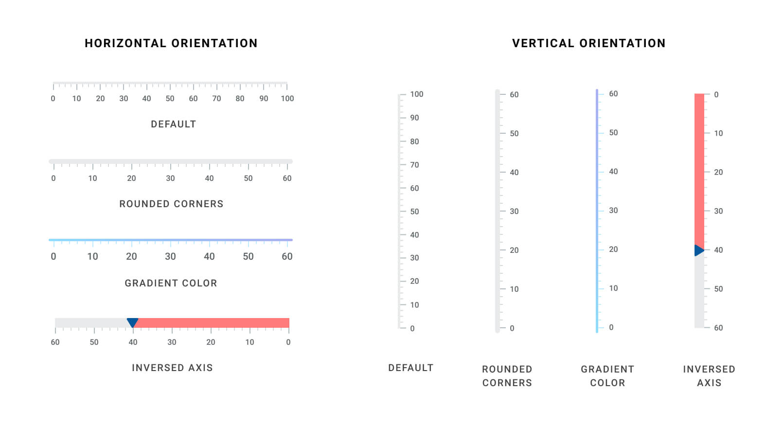
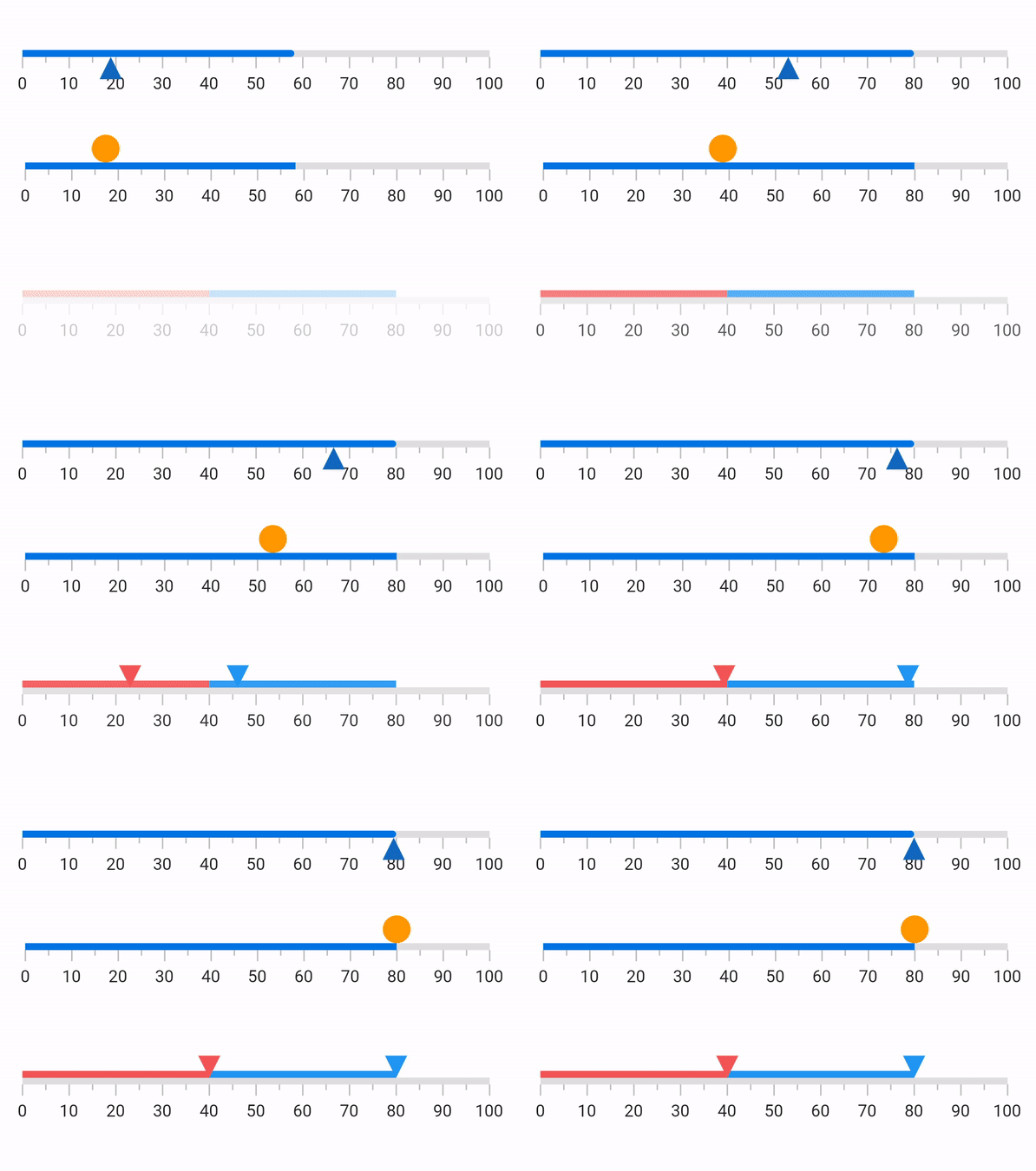
Orientation - The Linear Gauge can be set to vertical or horizontal orientation.
-
Axis - The Linear Gauge axis is a scale where a set of values can be plotted. An axis can be customized by changing the thickness and edge styles. You can also inverse the axis.
-
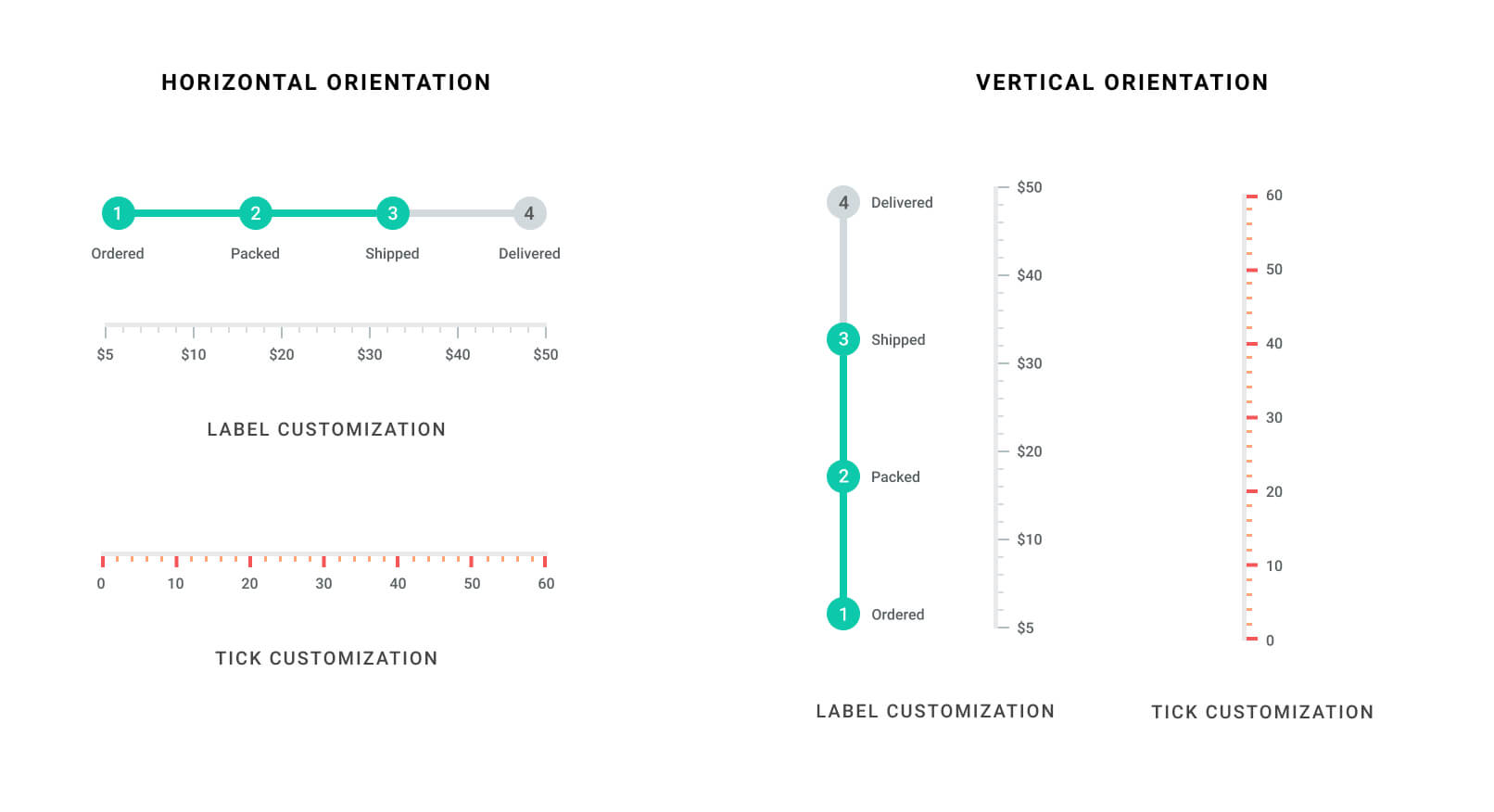
Labels and ticks - The Linear Gauge axis elements, such as labels, major ticks, and minor ticks, can be customized to different styles.
-
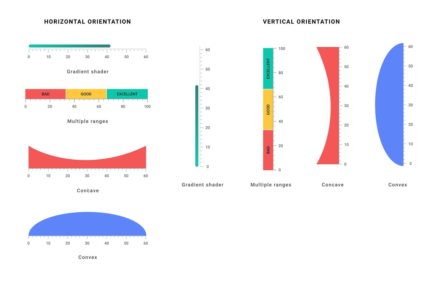
Ranges - A range is a visual element that helps you quickly visualize where a range falls on the axis track. Multiple ranges with different styles can be added to a linear gauge.
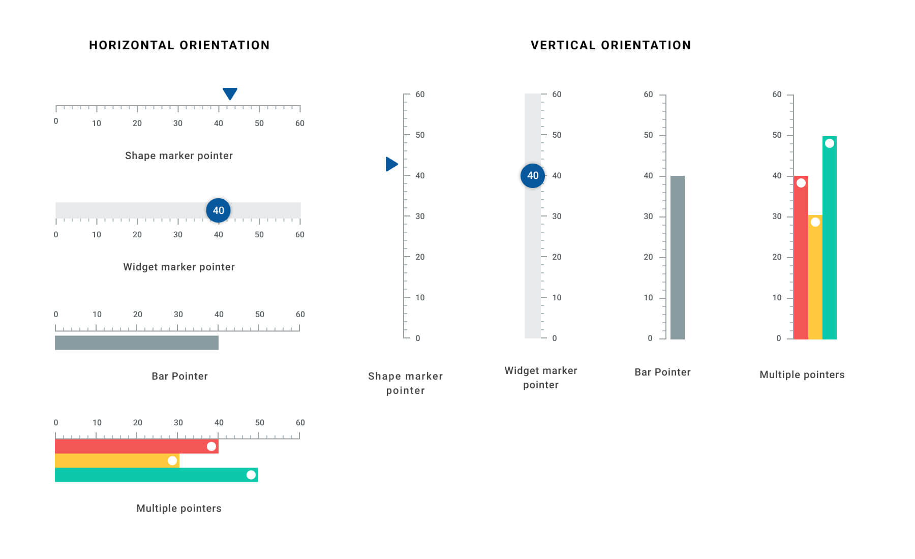
- Pointers - A pointer is used to indicate a specific value on an axis. The widget has three types of pointers: shape marker pointer, widget marker pointer, and bar pointer. All the pointers can be customized as needed. You can add multiple pointers in a linear gauge.
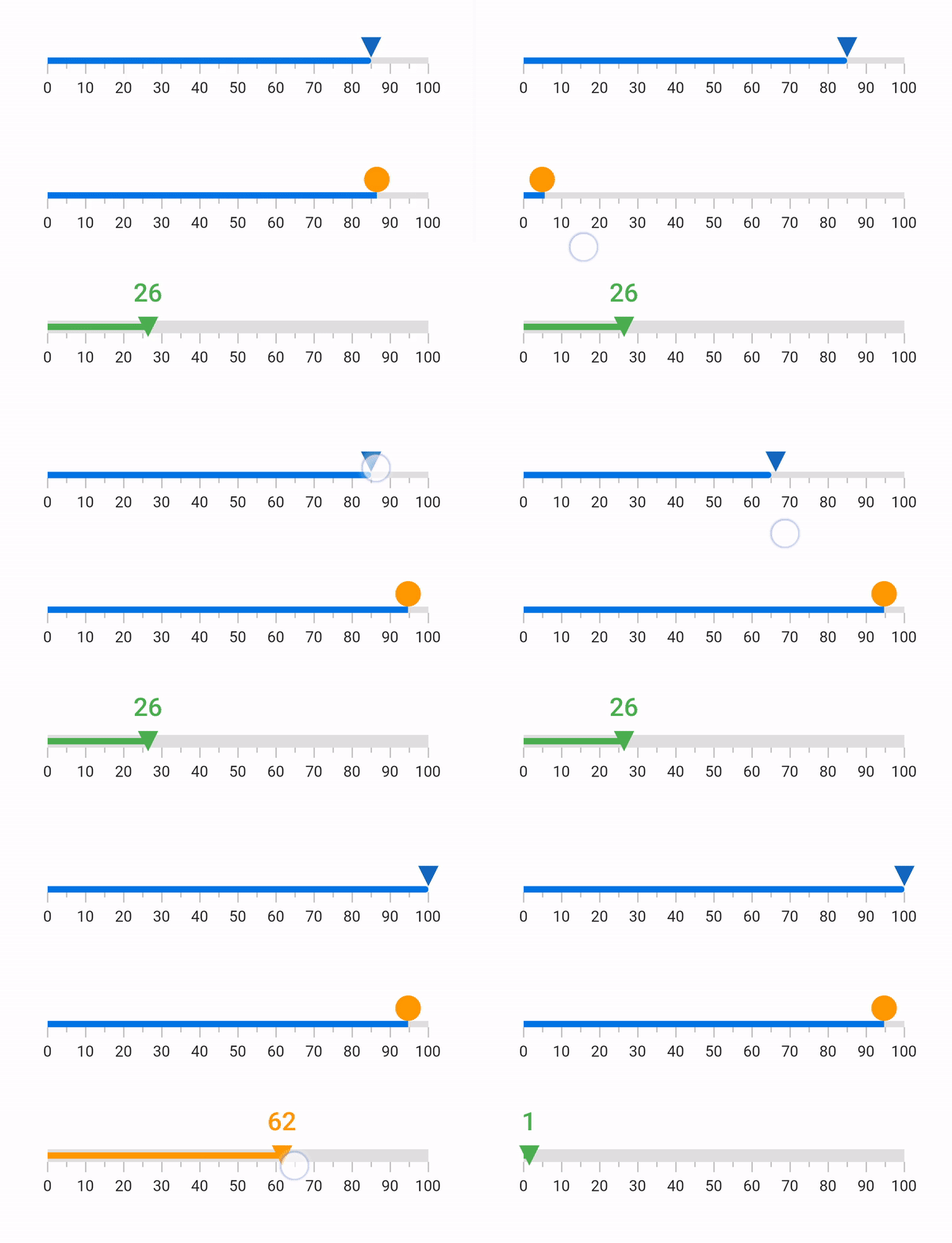
- Pointer interaction - The shape and widget marker pointers in a Linear Gauge can be moved from one value to another with swipe or drag gestures.
-
Drag behavior - Provides an option to change the dragging behavior of the marker pointers, when the linear gauge has multiple pointers. The available drag behaviors are
freeandconstraint. -
Animation - All the gauge elements can be animated in a visually appealing way. Animate the gauge elements when they are loading, or when their values change.
Radial gauge features #
-
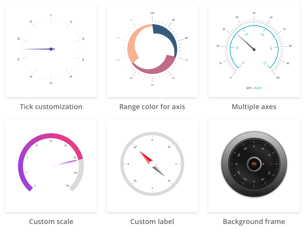
Axes - The radial gauge axis is a circular arc in which a set of values are displayed along a linear or custom scale based on the design requirements. Axis elements, such as labels, ticks, and axis line, can be easily customized with built-in properties.
-
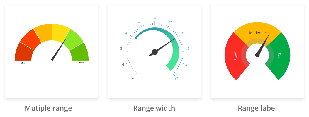
Ranges - Gauge range is a visual element that helps to quickly visualize where a value falls on the axis. The text can be easily annotated in range to improve the readability.
-
Pointers - Pointer is used to indicate values on an axis. It has four types of pointers: needle pointer, marker pointer, range pointer, and widget pointer. All the pointers can be customized as needed.
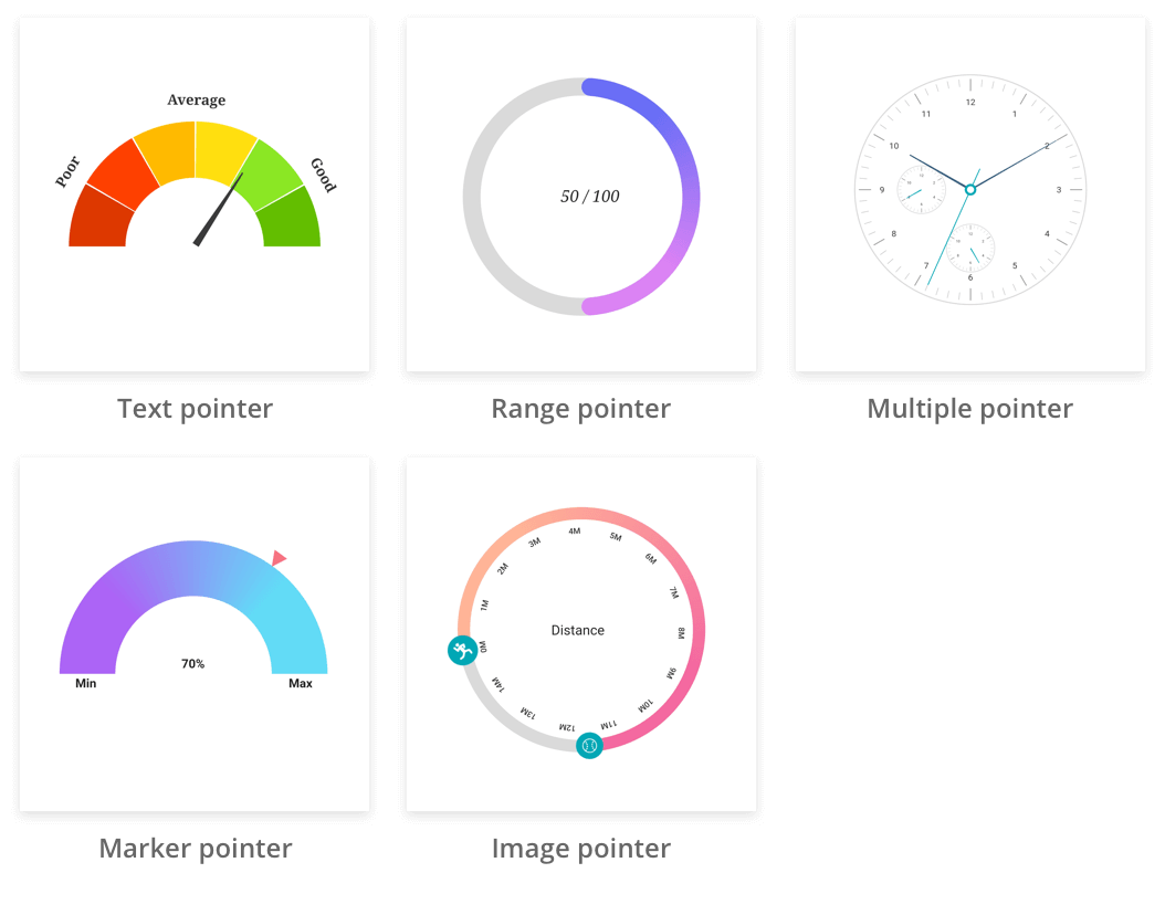
-
Animation - Animates the pointer in a visually appealing way when the pointer moves from one value to another. Gauge supports various pointer animations. It is also possible to apply initial load animation for gauge.
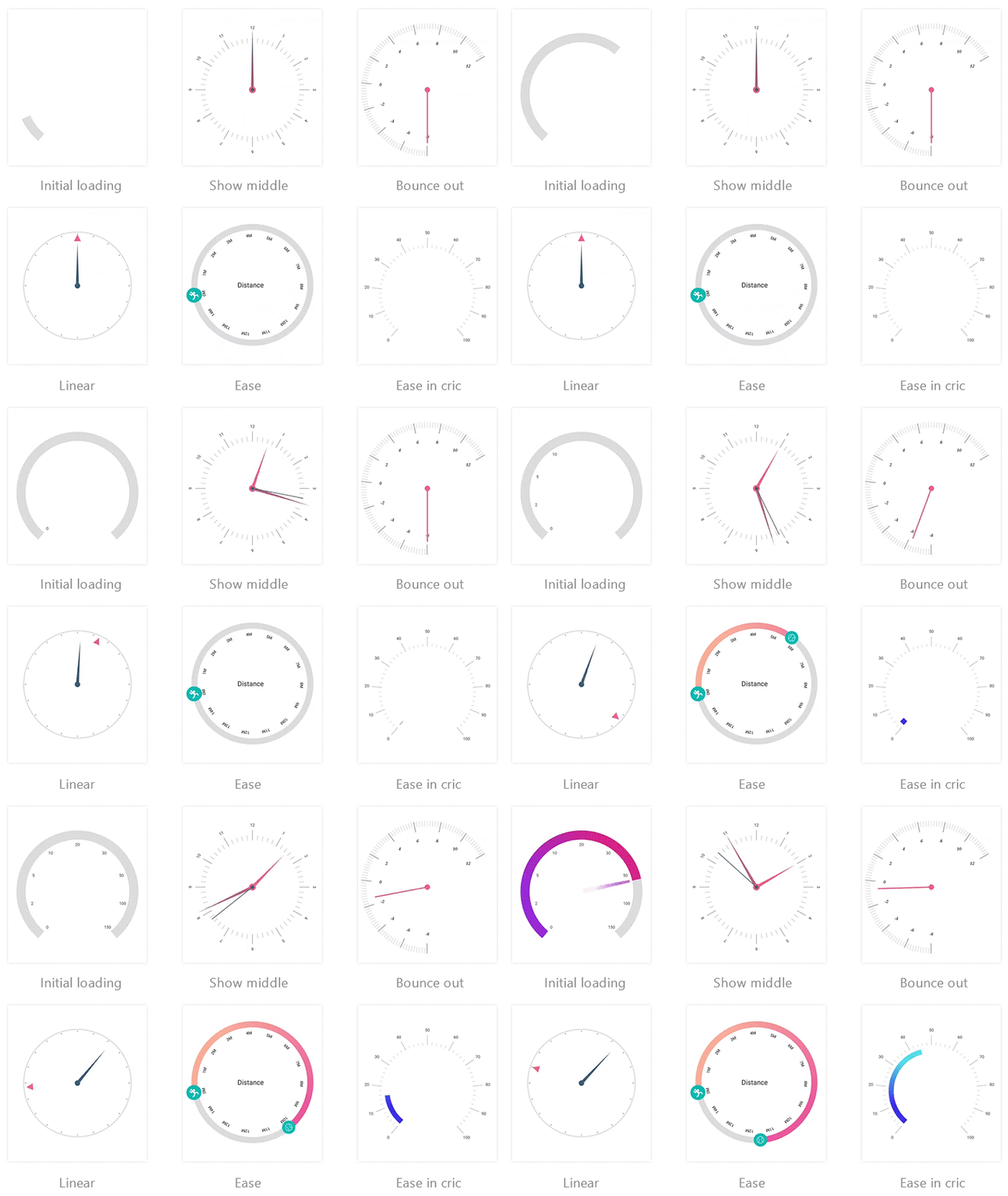
-
Pointer interaction - Radial gauge provides an option to drag a pointer from one value to another and also displays overlay while dragging. It is used to change the value at run time.
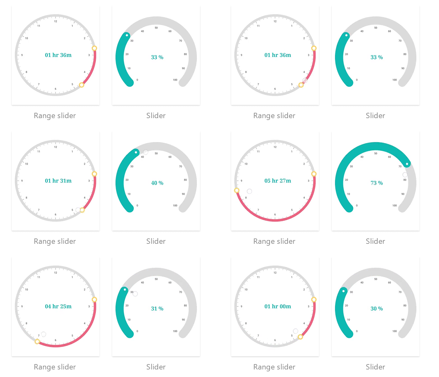
-
Annotations - Add multiple widgets such as text and image as an annotation at a specific point of interest in the radial gauge.
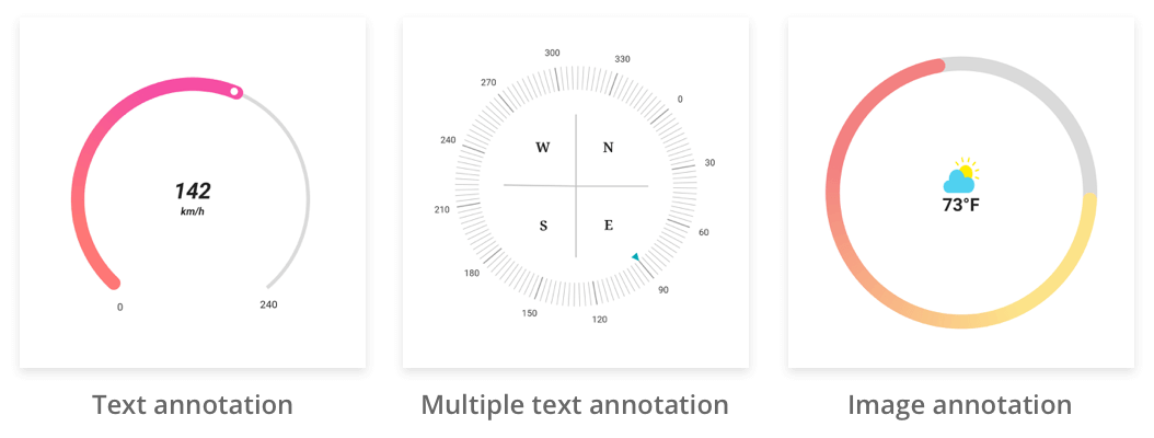
Get the demo application #
Explore the full capabilities of our Flutter widgets on your device by installing our sample browser applications from the below app stores, and view samples code in GitHub.
Other useful links #
Take a look at the following to learn more about Syncfusion® Flutter guages:
Installation #
Install the latest version from pub.
Getting started #
Import the following package.
import 'package:syncfusion_flutter_gauges/gauges.dart';
Add linear gauge to the widget tree #
Add the linear gauge widget as a child of any widget. Here, the gauge widget is added as a child of container widget.
  @override
  Widget build(BuildContext context) {
    return MaterialApp(
      home: Scaffold(
      body: Center(
        child: Container(
          child: SfLinearGauge()
      ))),
    );
  }
Add linear gauge elements #
Add the gauge elements such as axis, range, and pointers to indicate the current value.
class _DemoAppState extends State<DemoApp> {
  double _pointerValue = 45;
  @override
  Widget build(BuildContext context) {
    return MaterialApp(
      home: Scaffold(
          body: Center(
              child: Container(
        child: SfLinearGauge(
        ranges: [
          LinearGaugeRange(
            startValue: 0,
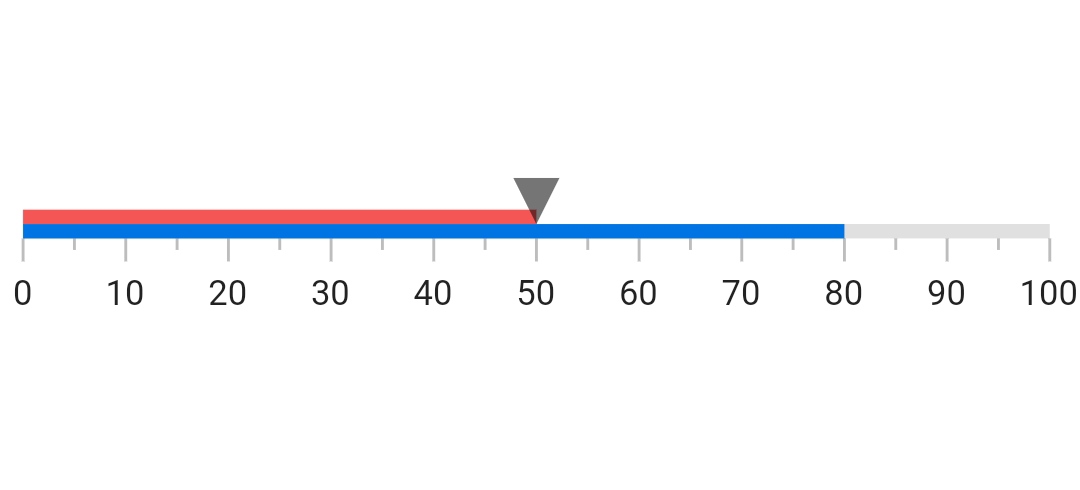
            endValue: 50,
          ),
        ],
        markerPointers: [
          LinearShapePointer(
            value: 50,
          ),
        ],
        barPointers: [LinearBarPointer(value: 80)],
      ),
      ))),
    );
  }
}
The following screenshot illustrates the result of the above code sample.
Add radial gauge to the widget tree #
Add the radial gauge widget as a child of any widget. Here, the gauge widget is added as a child of container widget.
@override
  Widget build(BuildContext context) {
    return MaterialApp(
      home: Scaffold(
      body: Center(
        child: Container(
          child: SfRadialGauge()
      ))),
    );
  }
Add radial gauge elements #
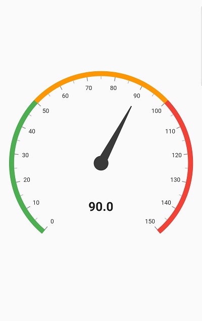
Add the gauge elements such as axis, range, pointer, and annotation to display different color ranges, add pointer to indicate the current value, and add annotation to show the current value.
  @override
  Widget build(BuildContext context) {
    return MaterialApp(
      home: Scaffold(
      body: Center(
        child: Container(
          child: SfRadialGauge(
          axes: <RadialAxis>[
            RadialAxis(minimum: 0, maximum: 150,
            ranges: <GaugeRange>[
              GaugeRange(startValue: 0, endValue: 50, color:Colors.green),
              GaugeRange(startValue: 50,endValue: 100,color: Colors.orange),
              GaugeRange(startValue: 100,endValue: 150,color: Colors.red)],
            pointers: <GaugePointer>[
              NeedlePointer(value: 90)],
            annotations: <GaugeAnnotation>[
              GaugeAnnotation(widget: Container(child:
                 Text('90.0',style: TextStyle(fontSize: 25,fontWeight: FontWeight.bold))),
                 angle: 90, positionFactor: 0.5
              )]
          )])
      ))),
    );
  }
The following screenshot illustrates the result of the above code sample.
Support and Feedback #
- For any other queries, reach our Syncfusion® support team or post the queries through the Community forums and submit a feature request or a bug through our Feedback portal.
- To renew the subscription, click renew or contact our sales team at sales@syncfusion.com | Toll Free: 1-888-9 DOTNET.
About Syncfusion® #
Founded in 2001 and headquartered in Research Triangle Park, N.C., Syncfusion® has more than 20,000 customers and more than 1 million users, including large financial institutions, Fortune 500 companies, and global IT consultancies.
Today we provide 1,000+ controls and frameworks for web (ASP.NET Core, ASP.NET MVC, ASP.NET WebForms, JavaScript, Angular, React, Vue, Flutter, and Blazor), mobile (Xamarin, .NET MAUI, Flutter, UWP, and JavaScript), and desktop development (Flutter, WinForms, WPF, UWP, .NET MAUI, and WinUI). We provide ready-to- deploy enterprise software for dashboards, reports, data integration, and big data processing. Many customers have saved millions in licensing fees by deploying our software.


