swift_field 0.1.0  swift_field: ^0.1.0 copied to clipboard
 shailendrakumar.site
Production-grade Flutter form widgets with zero external dependencies. Includes text fields, password fields, searchable dropdowns, and buttons with gradient and loading support.
swift_field #

A highly customizable Flutter UI package for building production-grade forms — includes smart text fields, password fields, dropdowns with search, and flexible buttons.
Screenshots #
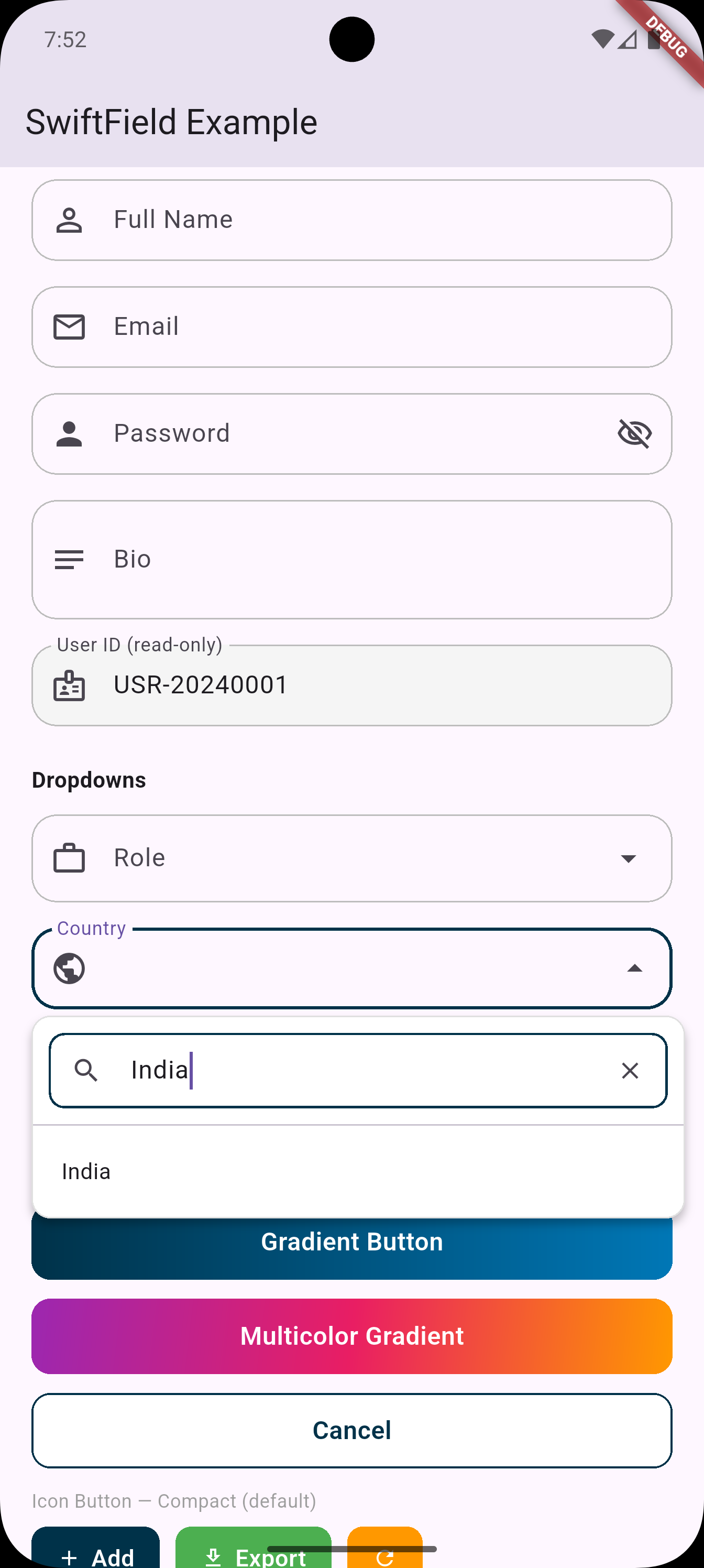 |
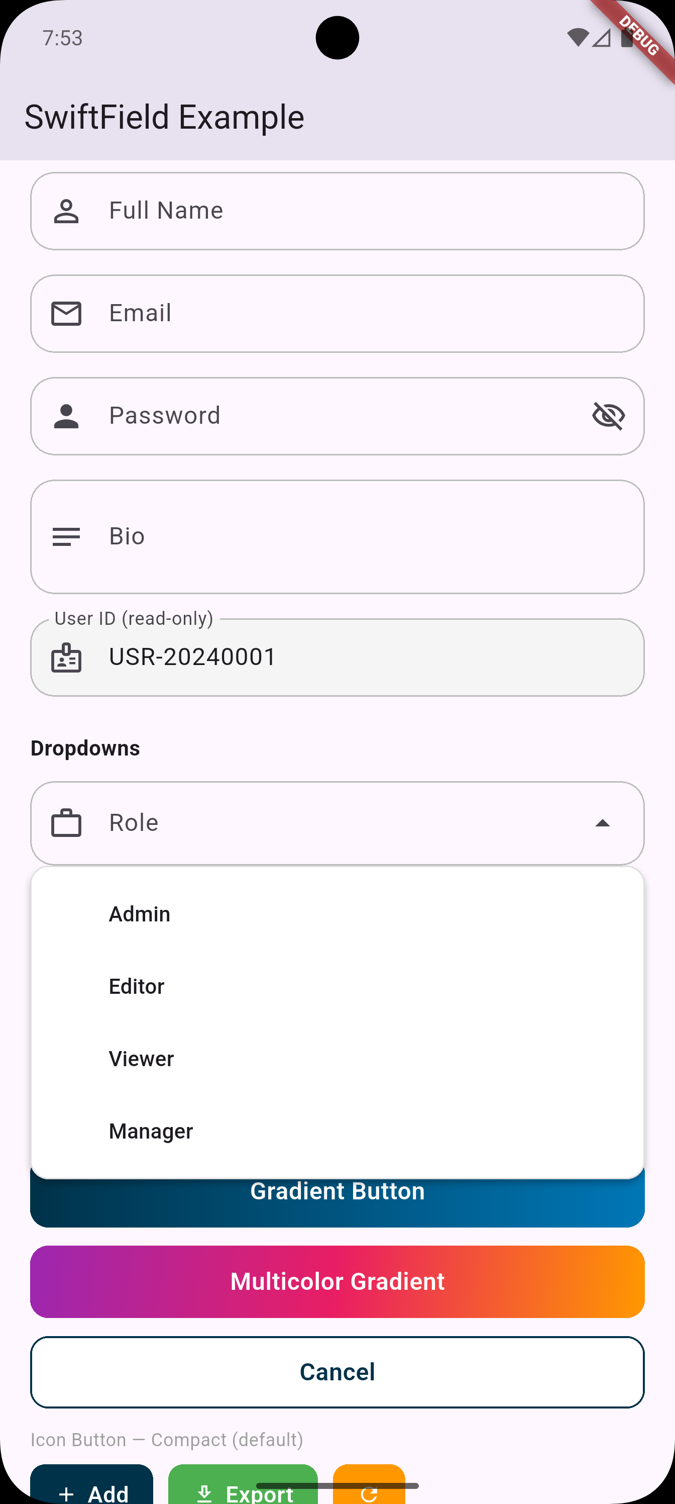 |
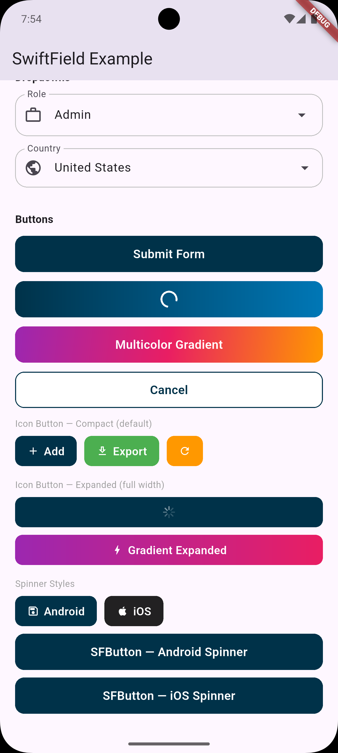 |
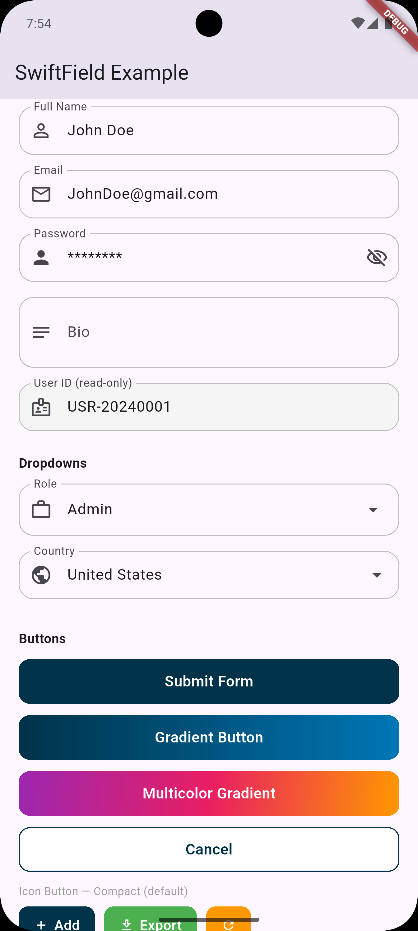 |
✨ Features #
| Widget | Description |
|---|---|
SFTextField |
Text field with full config — multiline, read-only, hints, formatters |
SFPasswordField |
Password field with built-in show/hide toggle |
SFDropdown<T> |
Styled dropdown with responsive width |
SFDropdownSearch<T> |
Dropdown with built-in search box |
SFButton |
Full-width button with loading state |
SFIconButton |
Compact icon + label button |
SFTheme |
Global theme config for colors, radius, styles |
🚀 Installation #
dependencies:
  swift_field: ^0.1.0
Then import:
import 'package:swift_field/swift_field.dart';
🎨 Global Theme #
Customize once, applied everywhere:
void main() {
  SFTheme.primaryColor = Colors.indigo;
  SFTheme.borderRadius = 12.0;
  SFTheme.buttonHeight = 52.0;
  runApp(const MyApp());
}
🧩 Widgets #
SFTextField #
SFTextField(
  controller: _nameController,
  labelText: 'Full Name',
  prefixIcon: Icons.person,
  validator: (val) => val!.isEmpty ? 'Required' : null,
)

// Multi-line
SFTextField(
  controller: _bioController,
  labelText: 'Bio',
  prefixIcon: Icons.notes,
  maxLines: 5,
  minLines: 3,
  keyboardType: TextInputType.multiline,
)

// Read-only
SFTextField(
  controller: _idController,
  labelText: 'User ID',
  prefixIcon: Icons.badge,
  readOnly: true,
)
SFPasswordField #
SFPasswordField(
  controller: _passwordController,
  labelText: 'Password',
  prefixIcon: Icons.lock,
  validator: (val) => val!.length < 8 ? 'Min 8 characters' : null,
)
Show/hide is managed internally — no setState needed.
SFDropdown #
SFDropdown<String>(
  labelText: 'Country',
  prefixIcon: Icons.flag,
  value: _selectedCountry,
  items: ['USA', 'Canada', 'UK']
      .map((c) => SFDropdownItem(value: c, label: c))
      .toList(),
  onChanged: (val) => setState(() => _selectedCountry = val),
  validator: (val) => val == null ? 'Please select' : null,
)

// With leading icons per item
SFDropdown<String>(
  labelText: 'Status',
  prefixIcon: Icons.circle_outlined,
  value: _status,
  items: [
    SFDropdownItem(
      value: 'active',
      label: 'Active',
      leadingIcon: Icon(Icons.circle, color: Colors.green, size: 12),
    ),
    SFDropdownItem(
      value: 'inactive',
      label: 'Inactive',
      leadingIcon: Icon(Icons.circle, color: Colors.grey, size: 12),
    ),
  ],
  onChanged: (val) => setState(() => _status = val),
)
SFDropdownSearch #
Built-in search — no external package needed. Uses Flutter's native DropdownMenu with enableFilter: true.
SFDropdownSearch<String>(
  labelText: 'City',
  prefixIcon: Icons.location_city,
  value: _selectedCity,
  items: cities
      .map((c) => SFDropdownItem(value: c, label: c))
      .toList(),
  onChanged: (val) => setState(() => _selectedCity = val),
  searchHintText: 'Search city...',
)
Custom filter function (e.g. search by code AND name):
SFDropdownSearch<Country>(
  labelText: 'Country',
  prefixIcon: Icons.public,
  value: _country,
  items: countries
      .map((c) => SFDropdownItem(value: c, label: c.name))
      .toList(),
  onChanged: (val) => setState(() => _country = val),
  filterFn: (item, query) =>
      item.label.toLowerCase().contains(query.toLowerCase()) ||
      item.value.code.toLowerCase().contains(query.toLowerCase()),
)
SFButton #
SFButton(
  text: 'Submit',
  onPressed: _submit,
)

// With loading
SFButton(
  text: 'Saving...',
  onPressed: _save,
  isLoading: _isSaving,
)

// Custom style
SFButton(
  text: 'Delete',
  onPressed: _delete,
  backgroundColor: Colors.red,
  borderRadius: 8,
  height: 52,
)
SFIconButton #
SFIconButton(
  text: 'Add',
  icon: Icons.add,
  onPressed: _add,
)

// Icon only
SFIconButton(
  icon: Icons.refresh,
  onPressed: _refresh,
)
📦 Dependencies #
Zero external dependencies. SwiftField uses only Flutter's built-in Material 3 widgets:
DropdownMenu(Flutter 3.7+) for dropdowns and searchTextFormField,FormField,ElevatedButtonfor everything else
📄 License #
MIT
Metadata
Documentation
Publisher
Weekly Downloads
Metadata
Production-grade Flutter form widgets with zero external dependencies. Includes text fields, password fields, searchable dropdowns, and buttons with gradient and loading support.
Repository (GitHub)
View/report issues
License
 MIT (license)