super_cupertino_navigation_bar 1.1.2  super_cupertino_navigation_bar: ^1.1.2 copied to clipboard
This is most desired plugin of Cupertino Navigation Bar With Search Field and Avatar
Super Cupertino Navigation Bar #
Customize your iOS-style navigation bar and elevate the user experience of your project.
As a developer who appreciates Cupertino's elegant design, wouldn't you want to add this custom package to your app in development? The Super Cupertino Navigation Bar helps you create an iOS-style navigation bar while allowing you to add a search field and customize avatars.
| Floated Large Title | Pinned Large Title | Only Large Title |
|---|---|---|
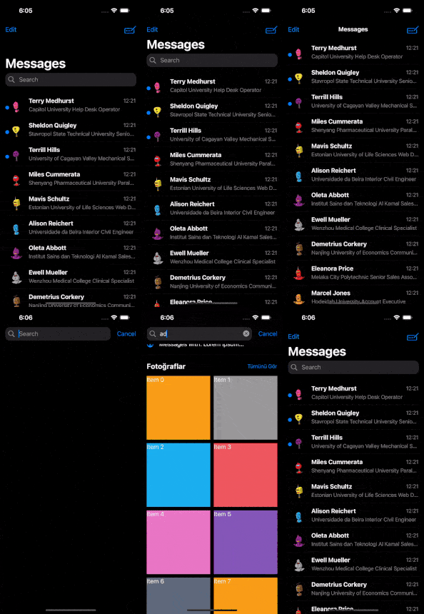 |
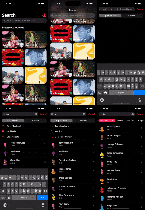 |
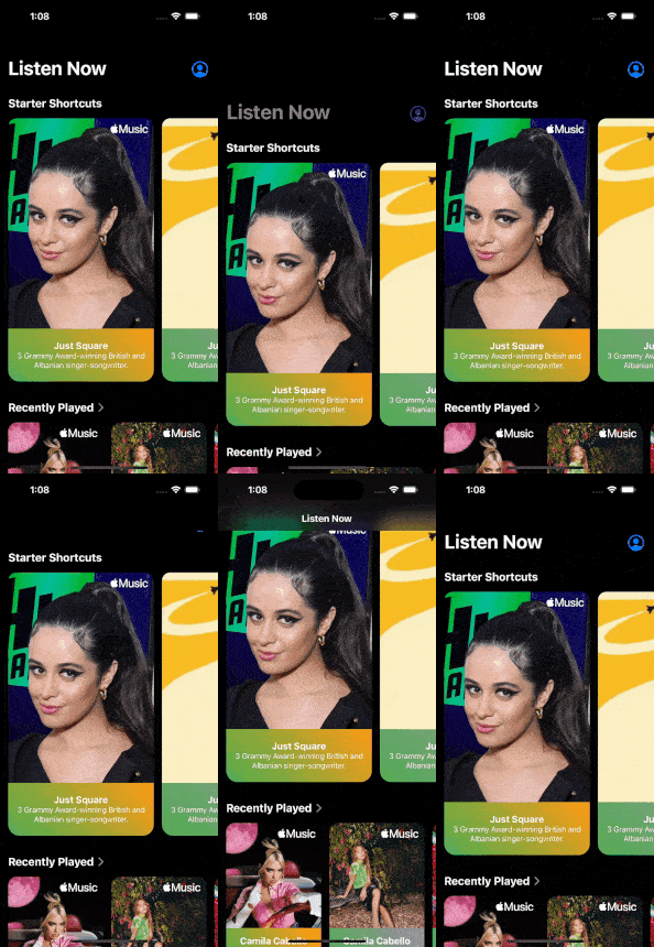 |
| Normal Navbar Floated | Normal Navbar Pinned | Only Navbar |
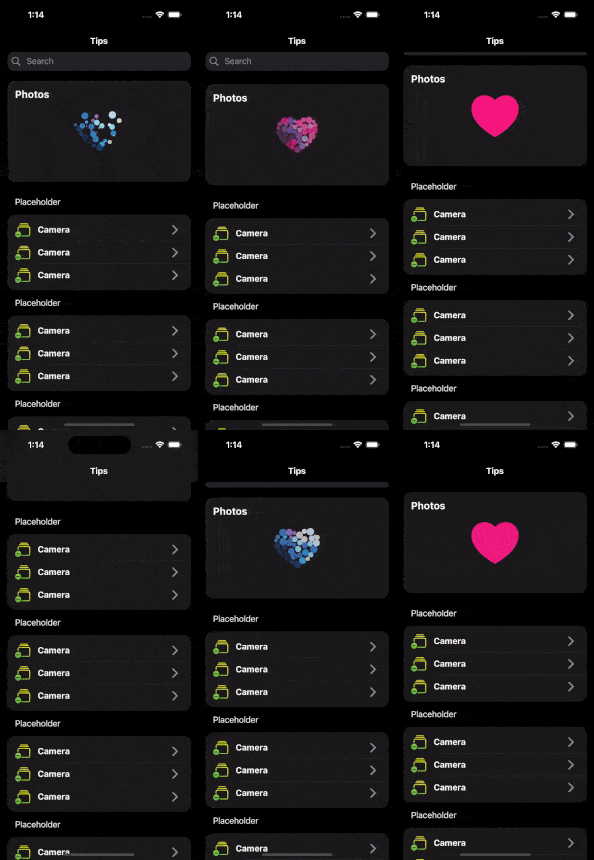 |
 |
 |
It's been necessary from the beginning, and I just did it.

Why Should You Use Super Cupertino Navigation Bar? #
-
iOS-Style Navigation Bar: Offer a more familiar experience to your iOS users. The Super Cupertino Navigation Bar reflects the native look and feel of iOS devices.
-
Search Field: Help users find content in your app more quickly and easily. Provide users with the ability to search.
-
Avatar Customization: Empower users to personalize their profiles. Customizable avatar addition is a fantastic way to recognize and customize users.
-
Perfect Compatibility: Seamlessly integrates with the Cupertino library. It works harmoniously with other components of your Flutter app.
-
Transition Animations: With this extension, you can have all transition animation on page route.
Okay! Let's dive deep! #
Examples
Before the table of content, hereby, you can find all of example from here. Enjoy!
Table of Content
- Getting Started
- SuperCupertinoNavigationBar Attributes
- SearchFieldDecoration Attributes
- AvatarModel Attributes
Getting Started #
Add dependency
dependencies:
  super_cupertino_navigation_bar: latest_version
Add import package
import 'package:super_cupertino_navigation_bar/super_cupertino_navigation_bar.dart';
Easy to use
SuperCupertinoNavigationBar widget has CustomScrollView widget in it so you should place your children in slivers key whose type List.
CupertinoPageScaffold(  //inside CupertinoPageScaffold
  child: SuperCupertinoNavigationBar(
      largeTitleType: AppBarType.LargeTitleWithFloatedSearch, // Set desired AppBarType
      avatarModel: AvatarModel(
        avatarUrl: null,
        avatarIsVisible: true, // Avatar is hidden as default, if you want to set visible, simply set true
        onTap: () => print("some event"),
      ),
      largeTitle: const Text('Home'),
      searchFieldDecoration: SearchFieldDecoration(
          hideSearchBarOnInit: true,
          searchFieldBehaviour: SearchFieldBehaviour.ShowResultScreenAfterFieldInput, // There are 3 SearchFieldBehaviour
      ),
      slivers: [
        // Any Sliver here
      ],
  ),
);
SuperCupertinoNavigationBar Attributes #
| Attribute | Type | Annotation |
|---|---|---|
| largeTitle | Widget | Supply Text widget in order to get right transition animation |
| leading | Widget | You can add desired Widget left top of Navbar |
| automaticallyImplyLeading | bool | used for removing the back button, from the second screen after navigating to route |
| automaticallyImplyTitle | bool | If true and [largeTitle] is null, automatically fill in a Text() widget with the current route's title |
| alwaysShowMiddle | bool | This should be set to false if you only want to show [largeTitle] in expanded state and [middle] in collapsed state |
| physics | ScrollPhysics | SuperCupertinoNavigationBar has CustomScrollView in it. Physic is used to set CustomScrollView's physics |
| previousPageTitle | String | Manually specify the previous route's title when automatically implying the leading back button |
| middle | Widget | Widget to place in the middle of the navigation bar. Normally a title or a segmented control. |
| trailing | Widget | Widget to place at the end of the navigation bar. Normally additional actions taken on the page such as a search or edit function. |
| border | Border | The direction in which the widget content will line up |
| backgroundColor | Color | The background color of the navigation bar. If it contains transparency, the tab bar will automatically produce a blurring effect to the content behind it. Defaults to CupertinoTheme's scaffoldBackgroundColor if null. |
| collapsedBackgroundColor | Color | The background color of the collapsed navigation bar. If it contains transparency, the tab bar will automatically produce a blurring effect to the content behind it. Defaults to CupertinoTheme's barBackgroundColor if null. |
| brightness | Brightness | The brightness of the specified backgroundColor. Setting this value changes the style of the system status bar. |
| padding | EdgeInsetsDirectional | Padding for the contents of the navigation bar. Defaults: Vertically, sized to the same height as the navigation bar itself minus the status bar. Horizontally, padding will be 16 pixels |
| transitionBetweenRoutes | bool | Set true for transition between navigation bars |
| heroTag | Object | Tag for the navigation bar's Hero widget if transitionBetweenRoutes is true |
| stretch | bool | This specifies navbar behavior when negative scroll has been done. It moves with scroll contents when it's true. But it will be static on scrolling. |
| slivers | List[Widget] | SuperCupertinoNavigationBar has CustomScrollView so place all of your children place here as Sliver Widget such as SliverToBoxAdapter etc. |
| scrollController | ScrollController | SuperCupertinoNavigationBar has own scrollController but if you want to add scrollController as custom, you can set here. this will be used as primary scrollController |
| appBarType | AppBarType (Enum) | AppBarType is an enum and it sets Appbar as Large Title or Normal Navbar and whether it has Search Bar or not. Values: LargeTitleWithPinnedSearch, LargeTitleWithFloatedSearch, LargeTitleWithoutSearch, NormalNavbarWithPinnedSearch, NormalNavbarWithFloatedSearch |
| searchFieldDecoration | SearchFieldDecoration (Model) | This is Search Field Model which you can find extended information below |
| avatarModel | AvatarModel (Model) | This is Avatar Model which you can find extended information below |
AppBarType Enum
AppBarType values below;
enum AppBarType {
  LargeTitleWithPinnedSearch,
  LargeTitleWithFloatedSearch,
  LargeTitleWithoutSearch,
  NormalNavbarWithPinnedSearch,
  NormalNavbarWithFloatedSearch,
}
SearchFieldDecoration Attributes #
| Attribute | Type | Annotation |
|---|---|---|
| controller | TextEditingController | SearchField TextEditingController |
| onChanged | ValueChanged[String] | get Text value onChange and do some Event |
| onSubmitted | ValueChanged[String] | get Text value onSubmit and do some Event |
| placeholderText | String | SearchField Placeholder Text Value |
| decoration | BoxDecoration | Style your search field |
| keyboardType | TextInputType | Select TextInputType |
| padding | EdgeInsetsGeometry | only horizontal padding is applicable |
| prefixIconColor | Color | |
| placeholderColor | Color | |
| prefixInsets | EdgeInsetsGeometry | padding around prefix icon |
| prefixIcon | Widget | Select desired Icon, default is Icon(CupertinoIcons.search) |
| suffixInsets | EdgeInsetsGeometry | padding around suffix icon |
| suffixIcon | Icon | Select desired Icon, default is Icon(CupertinoIcons.xmark_circle_fill) |
| onSuffixTap | VoidCallback | No return value supplied. Just Clears th search field and you can do some event |
| onCancelTap | VoidCallback | No return value supplied. Just Clears th search field and cancels search actions. Also you can do some event |
| paddingLeft | double | |
| paddingRight | double | |
| cancelButtonName | String | |
| cancelButtonStyle | TextStyle | |
| cursorColor | Color | |
| onFocused | ValueChanged[bool] | triggers desired event on search field focus |
| hideSearchBarOnInit | bool | this is applicable only LargeTitleWithFloatedSearch and NormalNavbarWithFloatedSearch |
| searchFieldBehaviour | SearchFieldBehaviour (Enum) | This specifies result screen behavior. 3 behaviour may be set: ShowResultScreenAfterFieldInput, ShowResultScreenAfterFieldFocused, NeverShowResultScreen. Shown below |
| searchResultHeader | SearchResultHeader (Widget) | This is just model which is required to set height and child attributes |
| searchResultChildren | List[Widget] | This appears according to SearchFieldBehaviour. You can set children here after desired action such as onChanged, onSubmitted etc. |
| actionButtons | List[SearchBarActionButton] | This is just SearchBarActionButton Widget List |
SearchFieldBehaviour Enum #
SearchFieldBehaviour values below;
enum SearchFieldBehaviour {
  ShowResultScreenAfterFieldInput,
  ShowResultScreenAfterFieldFocused,
  NeverShowResultScreen,
}
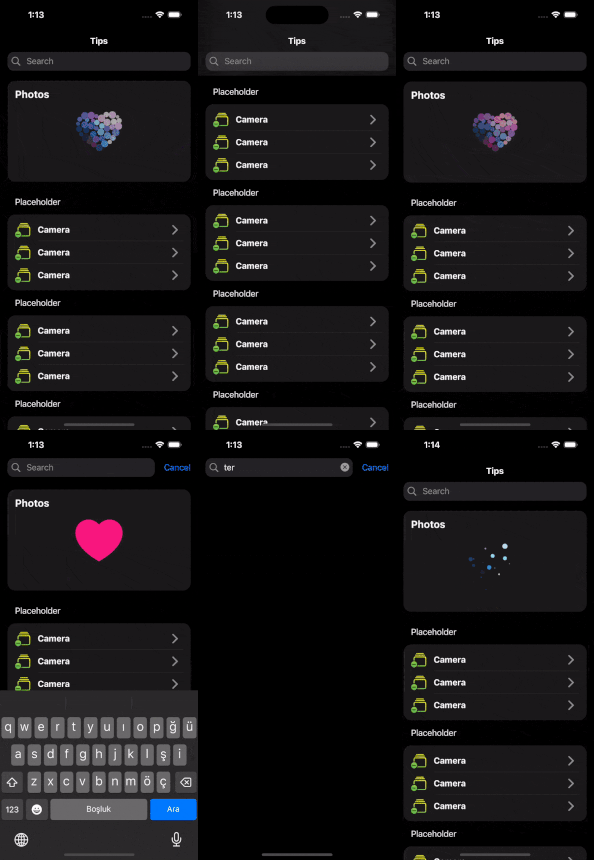
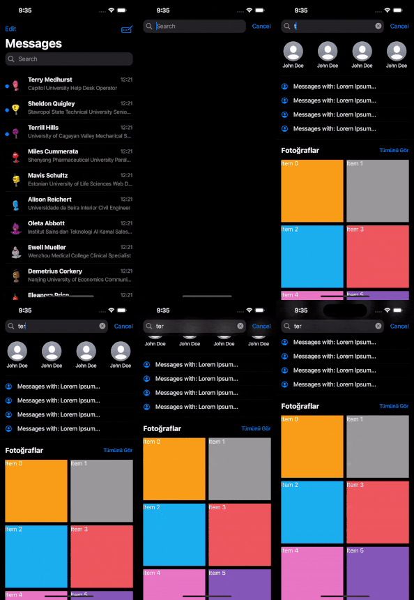
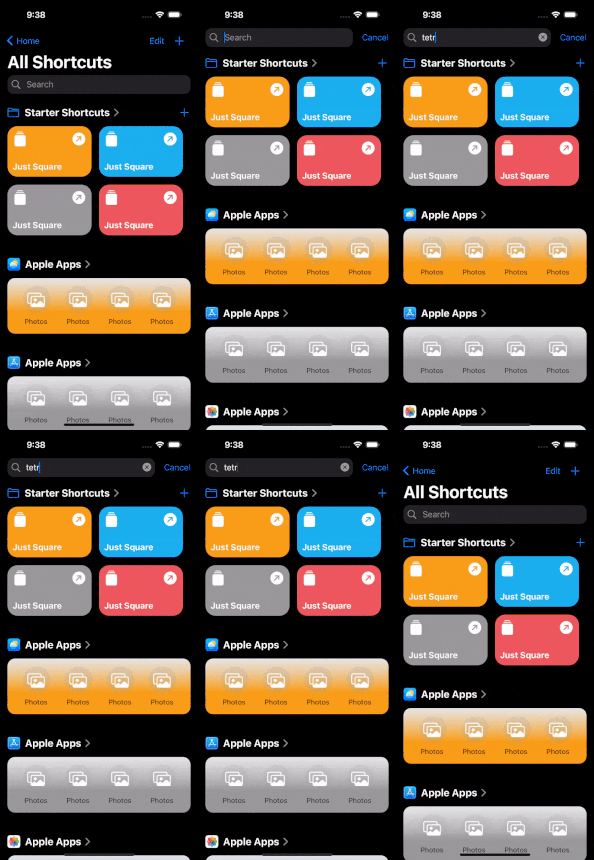
Let's look at expected behaviour;
| ShowResultScreenAfterFieldInput | ShowResultScreenAfterFieldFocused | NeverShowResultScreen |
|---|---|---|
 |
 |
 |
SearchResultHeader #
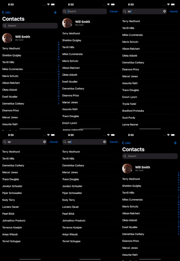
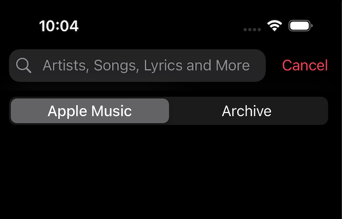
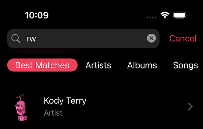
After search field action, result screen will appear and in this screen below the search bar you can place any widget you want! Let's look at picture
| Example 1 Apple Music | Example 2 Apple Music |
|---|---|
 |
 |
const SearchResultHeader({
  super.key,
  required this.height,
  required this.child,
});
Search Field Action Buttons #
There is actionButtons attribute in SearchFieldDecoration. This is List of SearchBarActionButton.
const SearchBarActionButton({
  super.key,
  required this.icon, // required attribute
  this.onPressed, // can be null
  this.actionButtonsBehaviour =
    SearchFieldActionButtonsBehaviour.VisibleOnFocus, // Default value VisibleOnFocus
});
You can select action buttons behaviors also. There are 3 types of it's behavior.
Values;
enum SearchFieldActionButtonsBehaviour {
  AlwaysVisible, // This buttons will be always visible
  VisibleOnFocus, // This buttons will be only visible on search field has focus
  VisibleOnUnFocus, // This buttons will be only visible on search field has not focus
}
You will have such kind of buttons;
| Visible On UnFocus | Visible On Focus |
|---|---|
 |
 |
AvatarModel Attributes #
You can set avatar like Apple Applications do. See the required model attributes;
| Attribute | Type | Annotation |
|---|---|---|
| avatarUrl | String | write here url string of Image.asset(url) |
| avatarIsVisible | bool | default value is false |
| onTap | VoidCallback | Callback, set event onTap |
| avatarIconColor | Color | avatar icon default color is CupertinoColors.link |
| icon | IconData | you can change default icon which is CupertinoIcons.profile_circled |
AvatarModel({
  this.avatarUrl,
  this.avatarIsVisible = false,
  this.onTap,
  this.avatarIconColor = CupertinoColors.link,
  this.icon = CupertinoIcons.profile_circled,
});
Some Notices #
- If you want to use default navigation bar, you can use simply this way;
CupertinoPageScaffold(
  navigationBar: DefaultCupertinoNavigationBar( // same as CupertinoNavigationBar but little differencies
  backgroundColor: CupertinoColors.systemGrey.withOpacity(0.5),
  middle: const Text('CupertinoNavigationBar Sample'),
  )
);
- Without using default navigation bar, You can use SuperCupertinoNavigationBar without largeTitle. Simply use this value;
CupertinoPageScaffold(  //inside CupertinoPageScaffold
  child: SuperCupertinoNavigationBar(
    largeTitleType: AppBarType.NormalNavbarWithoutSearch, // This will make appbar like CupertinoNavigationBar
    middle: Text("Home")
    slivers: [
      // Any Sliver here
    ],
  ),
);
in these case, you should be aware of you will use custom scroll view and sliver widgets.
Questions #
Ask a question and ping me "k.s poyraz"
Found an issue or have a proposal? #
Contribute and Provide Feedback #
If you wish to contribute to this project, take a look at my GitHub repository and report any issues or bugs. You can help me further improve the project!
License #
This package is licensed under the MIT License. For detailed information, check the LICENSE file.
