step_progress_indicator 0.1.1+2  step_progress_indicator: ^0.1.1+2 copied to clipboard
Bar indicator made of a series of selected and unselected steps
Step Progress Indicator #
Open source Flutter package, bar indicator made of a series of selected and unselected steps.
Made by Sandro Maglione, check out his personal official website sandromaglione.com
Check out the full step_progress_indicator tutorial
See the full example here
Check out the official dartdoc for the package here
Example #
Install and import the package. Then just customize its parameters.
| Horizontal | Vertical |
|---|---|
 |
 |
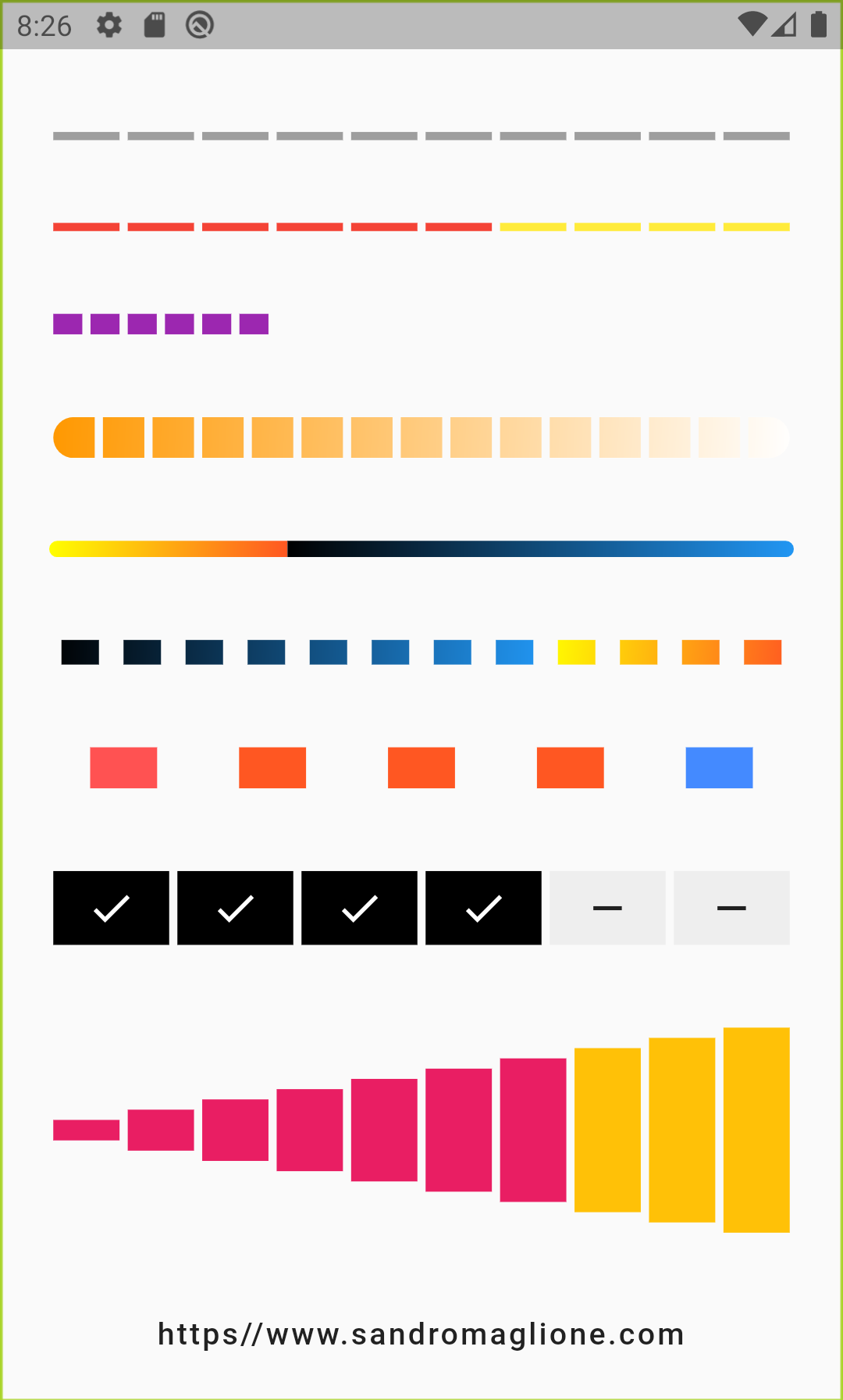
Horizontal step bar indicators examples code:
Column(
    mainAxisAlignment: MainAxisAlignment.spaceEvenly,
    children: <Widget>[
        StepProgressIndicator(
            totalSteps: 10,
            currentStep: 6,
        ),
        StepProgressIndicator(
            totalSteps: 16,
            currentStep: 10,
            unselectedColor: Colors.red,
            selectedColor: Colors.yellow,
            height: 10.0,
        ),
        StepProgressIndicator(
            totalSteps: 6,
            customColor: (index) =>
                index % 2 == 0 ? Colors.pink : Colors.black,
            height: 20.0,
        ),
        StepProgressIndicator(
            totalSteps: 10,
            currentStep: 9,
            customStep: (index, color) => Container(
                color: color,
                child: Text(
                '$index',
                textAlign: TextAlign.center,
                ),
            ),
            height: 20.0,
        ),
        StepProgressIndicator(
            totalSteps: 10,
            customColor: (index) =>
                index % 3 == 0 ? Colors.white : Colors.green,
            progressDirection: TextDirection.rtl,
            height: 6.0,
            padding: 10.0,
        ),
        StepProgressIndicator(
            totalSteps: 10,
            direction: Axis.horizontal,
            width: 30,
            progressDirection: TextDirection.rtl,
            onTap: (index) {
                return () {
                print('$index pressed');
                };
            },
            customStep: (index, color) => Container(
                color: color.withOpacity(index / 10),
                padding: EdgeInsets.symmetric(vertical: 16.0),
                child: Text(
                '$index',
                textAlign: TextAlign.center,
                style: TextStyle(
                    fontSize: 6.0 + (index * 5.2),
                    color: Colors.white,
                ),
                ),
            ),
            currentStep: 7,
            customColor: (index) => index % 2 == 0
                ? Colors.yellow[900]
                : index % 3 == 0 ? Colors.blue[900] : Colors.black54,
            padding: 6.0,
        ),
    ],
)
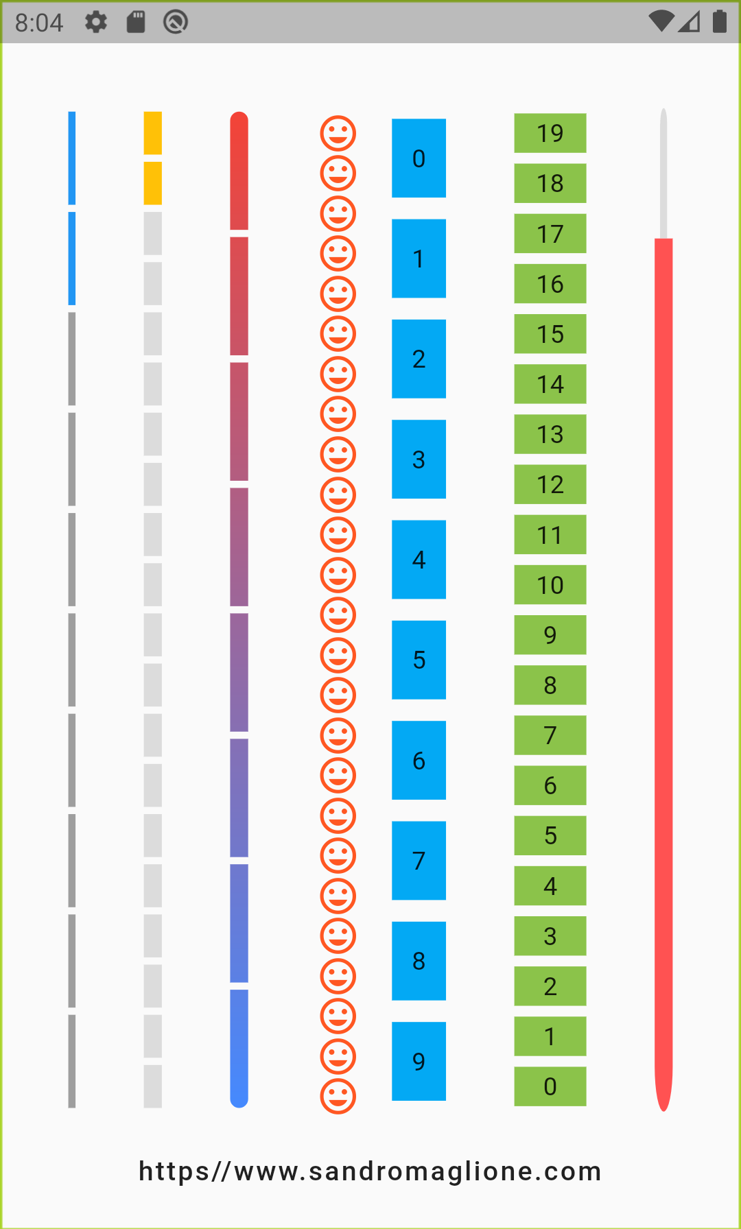
Vertical step bar indicators examples code:
Row(
    mainAxisAlignment: MainAxisAlignment.spaceEvenly,
    children: <Widget>[
        StepProgressIndicator(
            totalSteps: 10,
            direction: Axis.vertical,
            currentStep: 2,
        ),
        StepProgressIndicator(
            totalSteps: 20,
            direction: Axis.vertical,
            currentStep: 2,
            selectedColor: Colors.amber,
            unselectedColor: Colors.black12,
            width: 10.0,
        ),
        StepProgressIndicator(
            totalSteps: 25,
            direction: Axis.vertical,
            customColor: (index) => Colors.deepOrange,
            customStep: (index, color) => Icon(
                Icons.tag_faces,
                color: color,
            ),
        ),
        StepProgressIndicator(
            totalSteps: 10,
            direction: Axis.vertical,
            padding: 6.0,
            width: 30.0,
            customColor: (index) => Colors.lightBlue,
            customStep: (index, color) => Container(
                color: color,
                alignment: Alignment.center,
                child: Text('$index'),
            ),
        ),
        StepProgressIndicator(
            totalSteps: 20,
            direction: Axis.vertical,
            padding: 3.0,
            width: 40.0,
            progressDirection: TextDirection.rtl,
            customColor: (index) => Colors.lightGreen,
            customStep: (index, color) => Container(
                color: color,
                alignment: Alignment.center,
                child: Text('$index'),
            ),
        ),
    ],
)
Parameters #
| Parameter | Type | Description | Default |
|---|---|---|---|
| totalSteps | int |
Total number of step of the complete indicator. | @required |
| currentStep | int |
Number of steps to underline, all the steps with index <= currentStep will have Color equal to selectedColor. | 0 |
customStep(int, Color) |
Widget |
Defines a custom Widget to display at each step, given the current step index and the Color, which could be defined with selectedColor and unselectedColor or using customColor. | - |
onTap(int) |
void Function() |
Defines onTap function given index of the pressed step. | - |
customColor(int) |
Color |
Assign a custom Color for each step. | - |
| direction | Axis |
Defines if indicator is horizontal or vertical. | Axis.horizontal |
| progressDirection | TextDirection |
Defines if steps grow from left-to-right / top-to-bottom TextDirection.ltr or right-to-left / bottom-to-top TextDirection.rtl. |
TextDirection.ltr |
| height | double |
Height of the indicator. | 4.0 |
| width | double |
Width of the indicator. | 4.0 |
| selectedColor | Color |
Color of the selected steps. | Colors.blue |
| unselectedColor | Color |
Color of the unselected steps. | Colors.grey |
| padding | double |
Spacing between each step. | 2.0 |
Ideas #
I am always open for suggestions and ideas for possible improvements or fixes.
Here below a list of coming/future improvements:
- Adding support for animations
Versioning #
- v0.1.1+2 - 24 January 2020
- v0.1.0+1 - 23 January 2020
License #
GNU General Public License v3.0, see the LICENSE.md file for details.


