stacked_trio_carousel 1.2.0  stacked_trio_carousel: ^1.2.0 copied to clipboard
A flutter package provides a visually engaging card carousel with a stacked layout of three cards.
Stacked Trio Carousel #
A Flutter package that provides a visually engaging widget carousel with a stacked layout of three layered widgets.
Contributors #
Features #
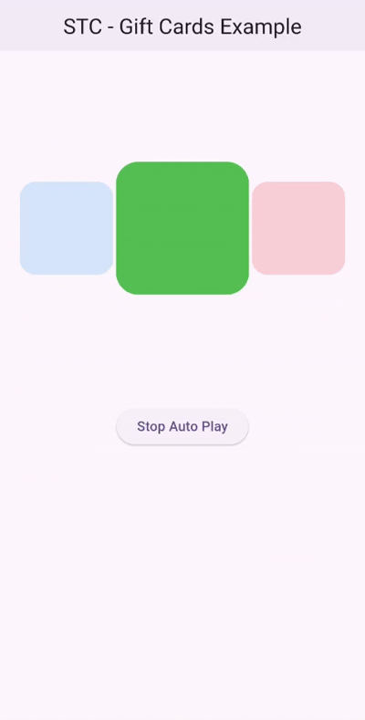
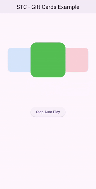
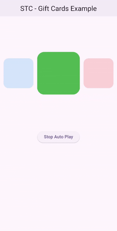
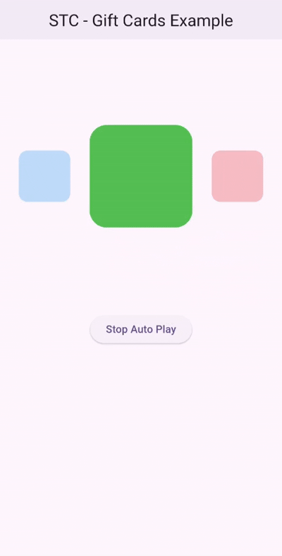
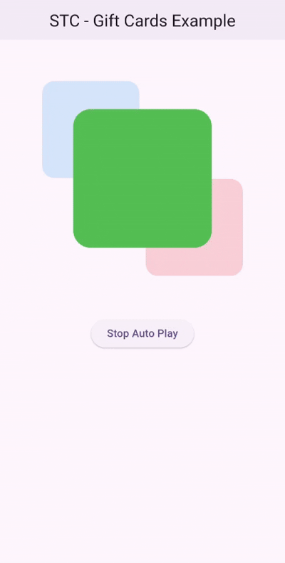
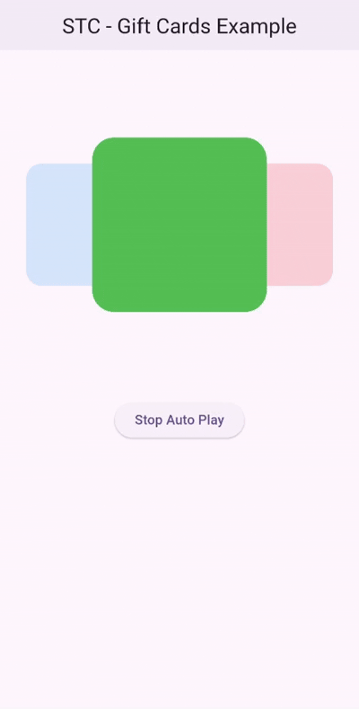
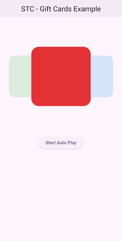
The carousel features one prominent widget in the foreground and two widgets in the background, making it perfect for showcasing content in a layered and dynamic way. With built-in animations and customizable properties, users can swipe through the widgets or enable automatic transitions for a smooth and interactive experience.

🛠 What's New #
-
Custom Animation Curves.
-
Adapt the autoplay direction to the user swipe direction option.
-
Swiping Sensitivity and Swap Confirmation Distance.
-
Bring-to-front feature for a more user-friendly experience.
-
Introduced
SwipingDirectionto support RTL and LTR animations. -
Fixed Major Bugs.
Getting Started #
To use this package, add stacked_trio_carousel as a dependency in your pubspec.yaml file. For example:
dependencies:
  stacked_trio_carousel: ^1.2.0
Usage #
Specify the background widget, and set the width and height of the widgets.
Make sure to specify the height and width of the carousel so it behaves properly when used inside a Column, Row, or ListView.
@override
Widget build(BuildContext context) {
  final List _color = [Colors.red, Colors.green, Colors.blue];
  return Scaffold(
    appBar: AppBar(
      centerTitle: true,
      elevation: 2,
      title: const Text("STC Example"),
    ),
    body: Column(
      children: [
        StackedTrioCarousel(
          height: 400,
          width: MediaQuery.of(context).size.width,
          background: Container(),
          params: StackedTrioCarouselParams(widgetHeight: 200, widgetWidth: 200),
          routeObserver: routeObserver,
          controller: _carouselController,
          onTap: (index) {
            Navigator.push(
              context,
              MaterialPageRoute(builder: (context) => const SecondScreen()),
            );
          },
          children: _color
              .map(
                (color) => Container(
                  key: ValueKey(color),
                  decoration: BoxDecoration(
                    color: color,
                    borderRadius: BorderRadius.circular(25),
                  ),
                ),
              )
              .toList(),
        ),
        ElevatedButton(
          onPressed: () {
            _carouselController.autoPlay
                ? _carouselController.stopAutoPlay()
                : _carouselController.startAutoPlay();
            setState(() {});
          },
          child: Text(
            _carouselController.autoPlay ? "Stop Auto Play" : "Start Auto Play",
          ),
        ),
      ],
    ),
  );
}
Change the Width and Height #
You can modify the dimensions of the widgets by changing the widgetHeight and widgetWidth properties.
StackedTrioCarouselParams(
  widgetHeight: 150,
  widgetWidth: 150,
)
Add Padding #
To apply padding to the background widgets, use the firstWidgetPadding and secondWidgetPadding properties.
Each property controls the padding of its corresponding background widget independently.
Note:
Don't useEdgeInsets.symmetricbecause the values will cancel out. UseEdgeInsets.onlyto move the side widgets to the desired location.
Padding from outside
StackedTrioCarouselParams(
  widgetHeight: 150,
  widgetWidth: 150,
  firstWidgetPadding: const EdgeInsets.only(left: 10),
  secondWidgetPadding: const EdgeInsets.only(right: 10),
)
Padding from inside
StackedTrioCarouselParams(
  widgetHeight: 150,
  widgetWidth: 150,
  firstWidgetPadding: const EdgeInsets.only(right: 10),
  secondWidgetPadding: const EdgeInsets.only(left: 10),
)
Change Scale and Minimum Opacity #
The scaleRatio and minimumOpacity properties affect the background widgets only.
StackedTrioCarouselParams(
  widgetHeight: 150,
  widgetWidth: 150,
  firstWidgetPadding: const EdgeInsets.only(right: 10),
  secondWidgetPadding: const EdgeInsets.only(left: 10),
  scaleRatio: 0.5,
  minimumOpacity: 0.3,
)
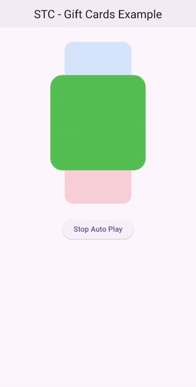
Dynamic Angle #
The angle property allows you to control the rotation angle of the widgets.
45° Example
StackedTrioCarouselParams(
  widgetHeight: 200,
  widgetWidth: 200,
  angle: pi / 4,
),
90° Example
StackedTrioCarouselParams(
  widgetHeight: 200,
  widgetWidth: 200,
  angle: pi / 2,
),
Add a Controller #
Adding a controller will give you more settings to tweak.
late StackedTrioCarouselController _carouselController;

@override
void initState() {
  _carouselController = StackedTrioCarouselController(tickerProvider: this);
  super.initState();
}
StackedTrioCarousel(
  controller: _carouselController,
  ...
);
Add Curves
You can customize how the animation accelerates and decelerates by using the animationCurve property.
This allows you to control the feel of the animation, whether it’s smooth, sharp, or more elastic.
Note: Use a single-direction curve, symmetry is handled automatically.
_carouselController = StackedTrioCarouselController(
  tickerProvider: this,
  animationCurve: Easing.legacy,
);

Change Swap Confirmation Distance
The swapConfirmationDistance defines the minimum percentage of distance from the center required to confirm a swap.
_carouselController = StackedTrioCarouselController(
    tickerProvider: this,
    animationCurve: Easing.legacy,
    swapConfirmationDistance: 0.2,
);
Change Animation speed
You can modify the animation speed and the delay between animations.
_carouselController = StackedTrioCarouselController(
    tickerProvider: this,
    animationDuration: const Duration(seconds: 1),
    autoPlayInterval: const Duration(seconds: 1),
);

Stop Automatic Animation
To stop the automatic animation, set autoPlay to false.
_carouselController = StackedTrioCarouselController(
    tickerProvider: this,
    animationDuration: const Duration(seconds: 1),
    autoPlayInterval: const Duration(seconds: 1),
    autoPlay: false
);
You can also use the startAutoPlay and stopAutoPlay functions.
ElevatedButton(
    onPressed: () {
        _carouselController.autoPlay ? _carouselController.stopAutoPlay() : _carouselController.startAutoPlay();
        setState(() {});
    },
    child: Text(
        _carouselController.autoPlay ? "Stop Auto Play" : "Start Auto Play",
        style: const TextStyle(color: Colors.black),
    ),
)
Change Animation Direction
You can use the swipingDirection parameter in the StackedTrioCarouselController constructor to change the animation direction.
SwipingDirection.rtlfor right-to-leftSwipingDirection.ltrfor left-to-right
_carouselController = StackedTrioCarouselController(
    tickerProvider: this,
    animationDuration: const Duration(milliseconds: 1000),
    autoPlayInterval: const Duration(seconds: 1),
    swipingDirection: .ltr,
);
Manual Swiping #
Manual swiping is supported:
Reveal Back Layer Widgets #
You can interact with the back layer widgets by tapping on them to bring them to the front.
Note: The
onTapcallback is only triggered when tapping the front widget.

Examples #
-
For a full example, check out the Example page.
-
For more advanced and visually rich animation examples, check out the Gift Cards Example and the Yu-Gi-Oh Cards Example on Github
Metadata
Publisher
unverified uploader
Weekly Downloads
Metadata
A flutter package provides a visually engaging card carousel with a stacked layout of three cards.
Repository (GitHub)
View/report issues
Documentation
License
 MIT (license)