smart_page_navigation 1.0.11  smart_page_navigation: ^1.0.11 copied to clipboard
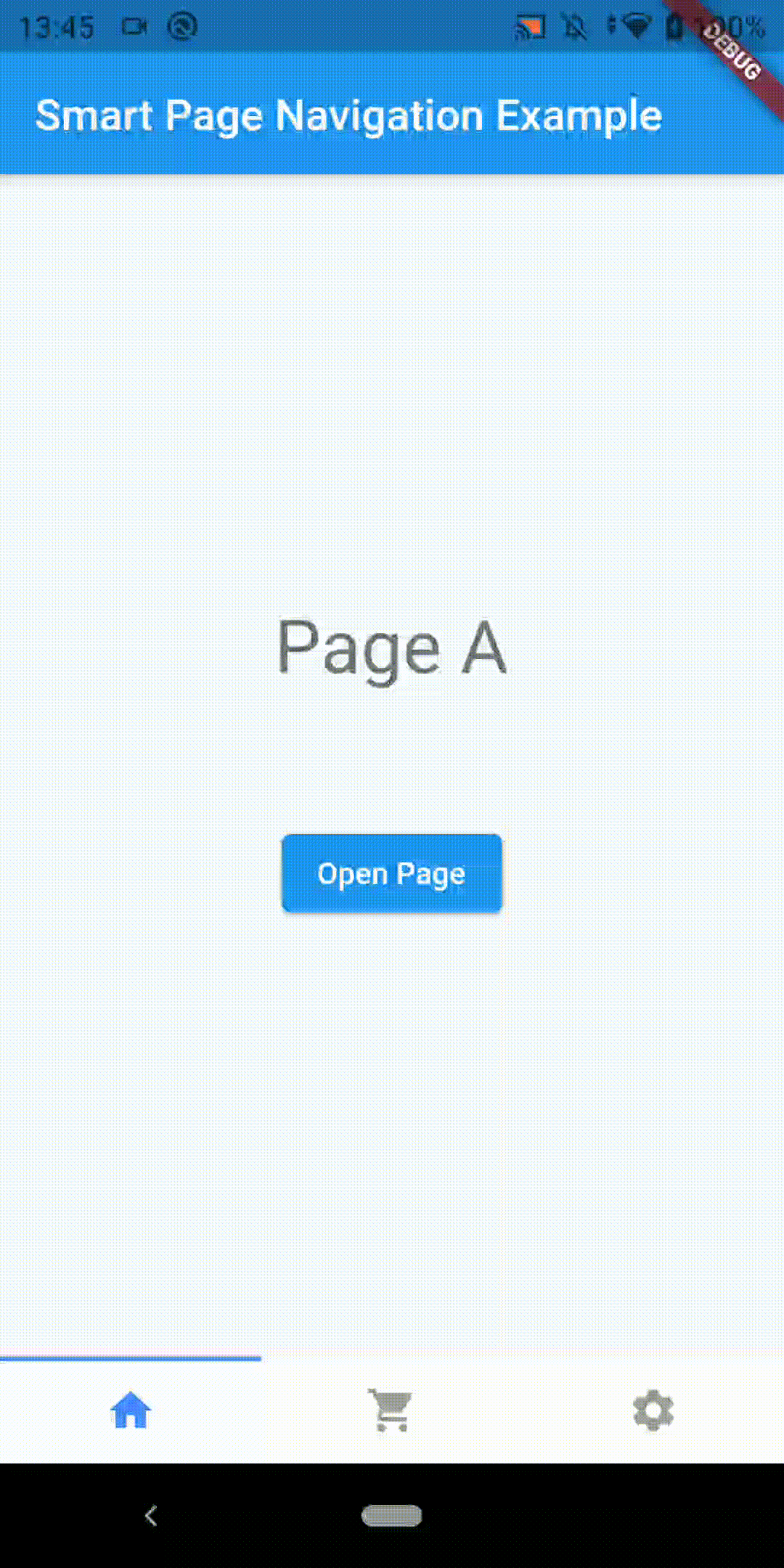
This package will provide a full navigation through tabs at the bottom of the application screen.
smart_page_navigation #
In this Flutter package you will have full navigation with bottom navigation bar exactly like the way Instagram works.
Created by Claudio Oliveira (https://twitter.com/cldlvr)
Add dependency #
dependencies:
  smart_page_navigation: ^1.0.11 #latest version
Easy to use #
void main() {
  runApp(
    SmartPageController(
      child: MyApp(),
    ),
  );
}

class MyApp extends StatelessWidget {
  @override
  Widget build(BuildContext context) {
    return MaterialApp(
      title: "Smart Page Navigation Example",
      home: MyHomePage(),
    );
  }
}

class MyHomePage extends StatefulWidget {
  MyHomePage({Key? key}) : super(key: key);

  @override
  _MyHomePageState createState() => _MyHomePageState();
}

class _MyHomePageState extends State<MyHomePage> {
  late SmartPageController controller;
  List<StatefulWidget> pages = [
    PageA(),
    PageB(),
    PageC(),
  ];

  @override
  void initState() {
    super.initState();
  }

  @override
  Widget build(BuildContext context) {
    controller = SmartPageController.of(context).init(
      initialPages: pages,
    );
    return WillPopScope(
      onWillPop: () async => controller.back(),
      child: Scaffold(
        appBar: AppBar(
          title: Text("Smart Page Navigation Example"),
        ),
        body: SmartPageNavigation(
          controller: controller,
        ),
        bottomNavigationBar: SmartPageBottomNavigationBar(
          controller: controller,
          children: [
            BottomIcon(icon: Icons.home),
            BottomIcon(icon: Icons.shopping_cart),
            BottomIcon(icon: Icons.settings),
          ],
          onTap: (int index) {
            print("Clicked at index $index");
            return true;
          },
        ),
      ),
    );
  }
}
Controller Initialization #
initialPages: List of StatefulWidgets (pages of your app)
initialPage: index of first page of initialPages
Bottom Navigation Bar #
controller: Instance of SmartPageController
children: List of BottomIcon
onTap(int index): Callback method when a bottom bar button is pressed
options: SmartPageBottomNavigationOptions instance with styling options
SmartPageBottomNavigationOptions #
height: (double) Widget height
showIndicator: (bool) Show/hide top indicator of selected option
indicatorColor: (Color) Top indicator color
backgroundColor: (Color) Widget background color
showBorder: (bool) Show/hide border
borderColor: (Color) Border color
selectedColor: (Color) Icon and text color when option is selected
unselectedColor: (Color) Icon and text color when the option is not selected
Metadata
Publisher
unverified uploader
Weekly Downloads
Metadata
This package will provide a full navigation through tabs at the bottom of the application screen.
Homepage
Repository (GitHub)
View/report issues
License
 unknown (license)