sliver_tools 0.1.4  sliver_tools: ^0.1.4 copied to clipboard
 pietervanloon.com
A set of useful sliver tools that are missing from the flutter framework
sliver_tools #

A set of useful sliver tools that are missing from the flutter framework.
Here is a taste what you can make using this package
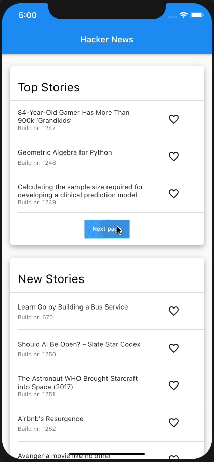
The structure of this app:
class Section extends State {
  @override
  Widget build(BuildContext context) {
    return MultiSliver(
      pushPinnedChildren: true,
      children: <Widget>[
        SliverPersistentHeader(
          pinned: true,
          ...
        ),
        if (!infinite)
          SliverAnimatedPaintExtent(
            child: SliverList(...),
          )
        else
          SliverList(...),
      ],
    );
  }
}

class NewsPage extends StatelessWidget {
  @override
  Widget build(BuildContext context) {
    return CustomScrollView(
      slivers: <Widget>[
        Section(infinite: false),
        Section(infinite: true),
      ],
    );
  }
}
MultiSliver #
The MultiSliver widget allows for grouping of multiple slivers together such that they can be returned as a single widget. For instance when one wants to wrap a few slivers with some padding or an inherited widget.
Example #
class WidgetThatReturnsASliver extends StatelessWidget {
  @override
  Widget build(BuildContext context) {
    return MultiSliver(
      pushPinnedChildren: false, // defaults to false
      children: <Widget>[
        SliverPersistentHeader(...),
        SliverList(...),
      ],
    );
  }
}
The pushPinnedChildren parameter allows for achieving a 'sticky header' effect by simply using pinned SliverPersistentHeader widgets (or any custom sliver that paints beyond its layoutExtent).
SliverStack #
The SliverStack widget allows for stacking of both slivers and box widgets. This can be useful for adding some decoration to a sliver. Which is what some of the other widgets in this package use to get their desired effects.
Example #
class WidgetThatReturnsASliver extends StatelessWidget {
  @override
  Widget build(BuildContext context) {
    return SliverStack(
      insetOnOverlap: false, // defaults to false
      children: <Widget>[
        SliverPositioned.fill(
          child: Container(
            decoration: BoxDecoration(
              color: Colors.white,
              boxShadow: const <BoxShadow>[
                BoxShadow(
                  offset: Offset(0, 4),
                  blurRadius: 8,
                  color: Colors.black26,
                )
              ],
              borderRadius: BorderRadius.circular(8),
            ),
          ),
        )
        SliverList(...),
      ],
    );
  }
}
The insetOnOverlap handles whether the positioned children should be inset (made smaller) when the sliver has overlap from a previous sliver.
SliverClip #
The SliverClip widget will add a clip around its child from the child's paintOrigin to its paintExtent. This is very useful and most likely what you want when using a pinned SliverPersistentHeader as child of the stack.
Example #
class WidgetThatReturnsASliver extends StatelessWidget {
  @override
  Widget build(BuildContext context) {
    return SliverClip(
      clipOverlap: true, // defaults to true
      child: SliverList(...),
    );
  }
}
The clipOverlap parameter allows for configuring whether any overlap with the previous child should be clipped.
This can be useful when one has a SliverPersitentHeader above a SliverList and does not want to give the header an opaque background but also prevent the list from drawing underneath the header.
SliverAnimatedPaintExtent #
The SliverAnimatedPaintExtent widget allows for having a smooth transition when a sliver changes the space it will occupy inside the viewport. For instance when using a SliverList with a button below it that loads the next few items.
Example #
class WidgetThatReturnsASliver extends StatelessWidget {
  @override
  Widget build(BuildContext context) {
    return SliverAnimatedPaintExtent(
      duration: const Duration(milliseconds: 150),
      child: SliverList(...),
    );
  }
}
SliverAnimatedSwitcher #
The SliverAnimatedSwitcher widget is simply a pre-configured AnimatedSwitcher widget.
If one needs more options than supplied by this widget a regular AnimatedSwitcher can be used by giving it the defaultLayoutBuilder and defaultTransitionBuilder of SliverAnimatedSwitcher.
SliverCrossAxisConstrained #
The SliverCrossAxisConstrained widget allows for limiting the cross axis extent of a sliver to a maximum value given by the maxCrossAxisExtent.
For instance a long list of text items on an iPad would be too wide to read so one can wrap the SliverList in a SliverCrossAxisConstrained and limit its width to something more reasonable.
Example #
class WidgetThatReturnsASliver extends StatelessWidget {
  @override
  Widget build(BuildContext context) {
    return SliverCrossAxisConstrained(
      maxCrossAxisExtent: 700,
      child: SliverList(...),
    );
  }
}
SliverCrossAxisPadded #
The SliverCrossAxisPadded widget allows for adding padding to the cross axis of a sliver.
This can be done either by passing a paddingStart and/or paddingEnd or by using the symmetric constructor which takes a single padding value.
When using paddingStart and paddingEnd in a vertical sliver it will depend on the TextDirection whether start is left or right.
Example #
class WidgetThatReturnsASliver extends StatelessWidget {
  @override
  Widget build(BuildContext context) {
    return SliverCrossAxisPadded(
      paddingStart: 24,
      paddingEnd: 48,
		textDirection: TextDirection.ltr, // optional, defaults to the Directionality specified by the context
      child: SliverList(...),
    );
  }
}
Metadata
Publisher
Metadata
A set of useful sliver tools that are missing from the flutter framework
Homepage
Repository (GitHub)
View/report issues
License
 unknown (LICENSE)