sliver_sticky_collapsable_panel 1.1.0  sliver_sticky_collapsable_panel: ^1.1.0 copied to clipboard
A Sliver implementation of sticky collapsable panel, with a box header rebuild on status and a sliver child as panel content.
sliver_sticky_collapsable_panel #
A Sliver implementation of sticky collapsable panel, with a box header rebuild on status and a sliver child as panel content.
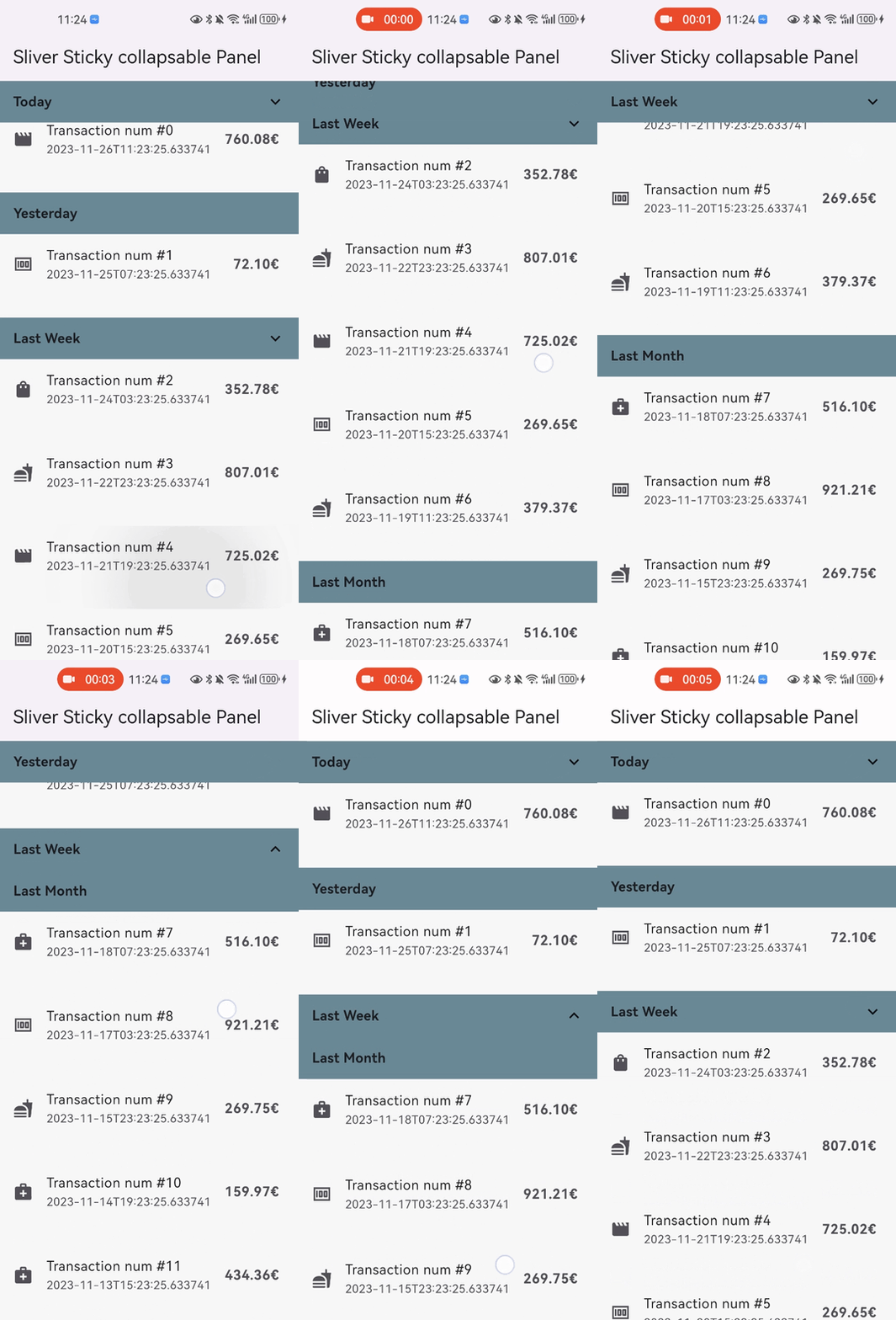
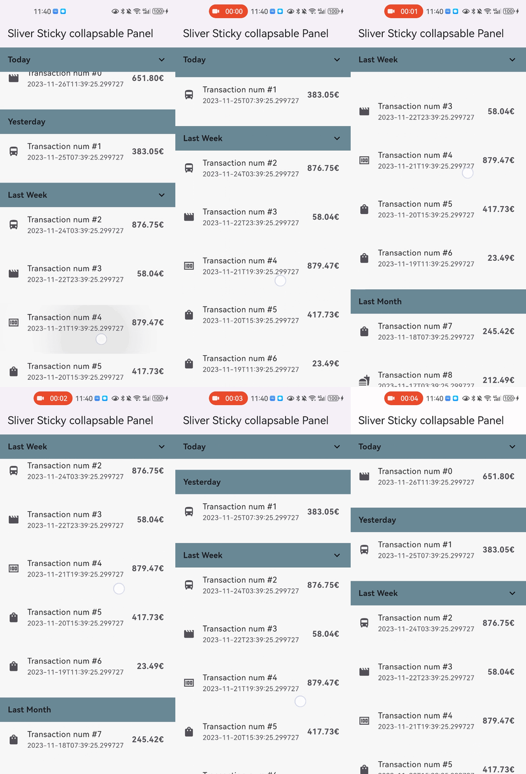
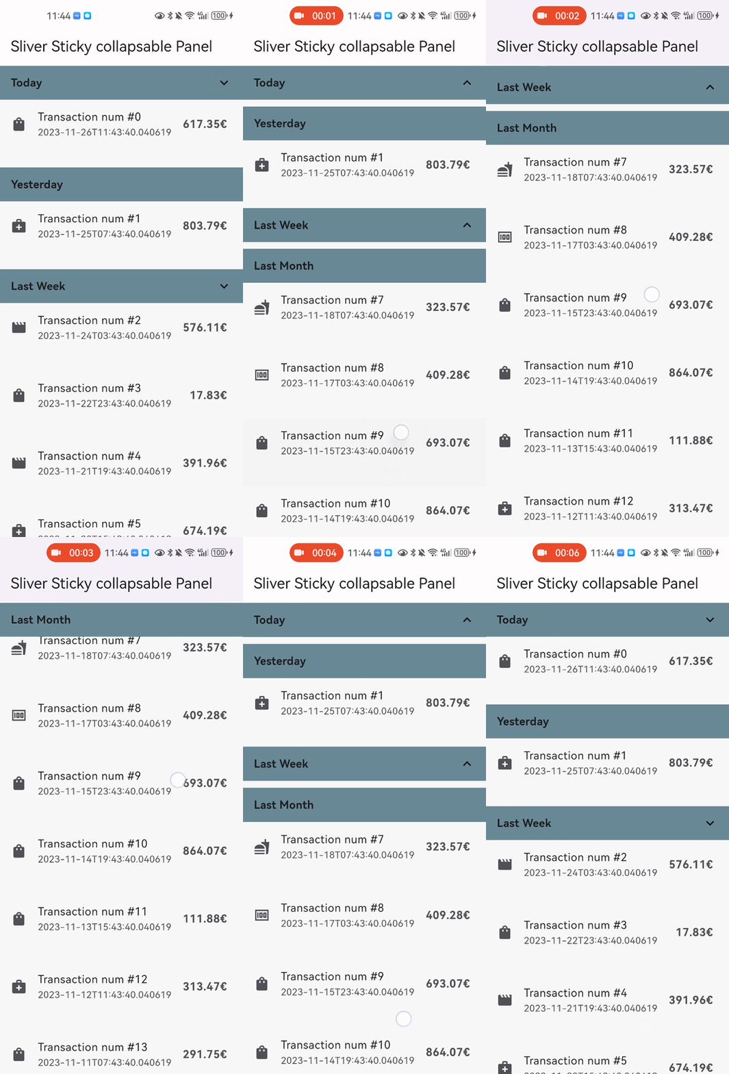
Snap Shot #

Features #
- Relying solely on the Flutter framework itself.
- Accept one box child as header and one sliver child as panel content.
- Header can overlap panel content (useful for sticky side header for example).
- Notify and rebuild the header when status changed (scroll outside the viewport for example).
- Support not sticky headers (with
sticky: falseparameter). - Support a controller which notifies the scroll offset of the current sticky header.
- Support click the header to collapse the panel, or disable collapse (with
disableCollapsable = trueparameter). - Support iOS style sticky header, just like iOS's system contact app (with
iOSStyleSticky = trueparameter). - Support add padding for sliver child (with
paddingBeforeCollapseparameter). - Support add padding after the header even the panel collapsed (with
paddingAfterCollapseparameter).
Getting started #
- In the
pubspec.yamlof your flutter project, add the following dependency:
dependencies:
  sliver_sticky_collapsable_panel: ^1.1.0
- In your library add the following import:
import 'package:sliver_sticky_collapsable_panel/sliver_sticky_collapsable_panel.dart';
- In your code, use the sliver like this:
CustomScrollView(
  controller: _scrollController,
  slivers: [
    SliverStickyCollapsablePanel.builder(
      scrollController: _scrollController,
      controller: StickyCollapsablePanelController(key:'key_1'),
      headerBuilder: (context, status) => SizedBox.fromSize(size: Size.fromHeight(48)),
      sliver: SliverList.list(children: [...]),
    ),
    SliverStickyCollapsablePanel.builder(
      scrollController: _scrollController,
      controller: StickyCollapsablePanelController(key:'key_2'),
      headerBuilder: (context, status) => SizedBox.fromSize(size: Size.fromHeight(48)),
      sliver: SliverList.list(children: [...]),
    ),
    ...,
  ],
);
More Advanced Feature: #
- you can disable collapse for any sliver you wanted just add
disableCollapsable = true.
CustomScrollView(
  controller: _scrollController,
  slivers: [
    SliverStickyCollapsablePanel.builder(
      scrollController: _scrollController,
      controller: StickyCollapsablePanelController(key:'key_1'),
      headerBuilder: (context, status) => SizedBox.fromSize(size: Size.fromHeight(48)),
      disableCollapsable = true
      sliver: SliverList.list(children: [...]),
    ),
    ...,
  ],
);
- you can also enable iOS style sticky header, just like the system's contact app with just one parameter
iOSStyleSticky = true.
CustomScrollView(
  controller: _scrollController,
  slivers: [
    SliverStickyCollapsablePanel.builder(
      scrollController: _scrollController,
      controller: StickyCollapsablePanelController(key:'key_1'),
      iOSStyleSticky: true,
      headerBuilder: (context, status) => SizedBox.fromSize(size: Size.fromHeight(48)),
      sliver: SliverList.list(children: [...]),
    ),
    ...,
  ],
);

- you can also add padding for sliver child (with
paddingBeforeCollapse), even if the panel is collapsed, the padding still works between headers withpaddingAfterCollapse.
CustomScrollView(
  controller: _scrollController,
  slivers: [
    SliverStickyCollapsablePanel.builder(
      scrollController: _scrollController,
      controller: StickyCollapsablePanelController(key:'key_1'),
      paddingBeforeCollapse: const EdgeInsets.all(16),
      paddingAfterCollapse: const EdgeInsets.only(bottom: 10),
      headerBuilder: (context, status) => SizedBox.fromSize(size: Size.fromHeight(48)),
      sliver: SliverList.list(children: [...]),
    ),
    ...,
  ],
);

Thanks #
Thanks to letsar with it's flutter_sticky_header which provide solid foundation for this project.