sliding_clipped_nav_bar 2.0.0  sliding_clipped_nav_bar: ^2.0.0 copied to clipboard
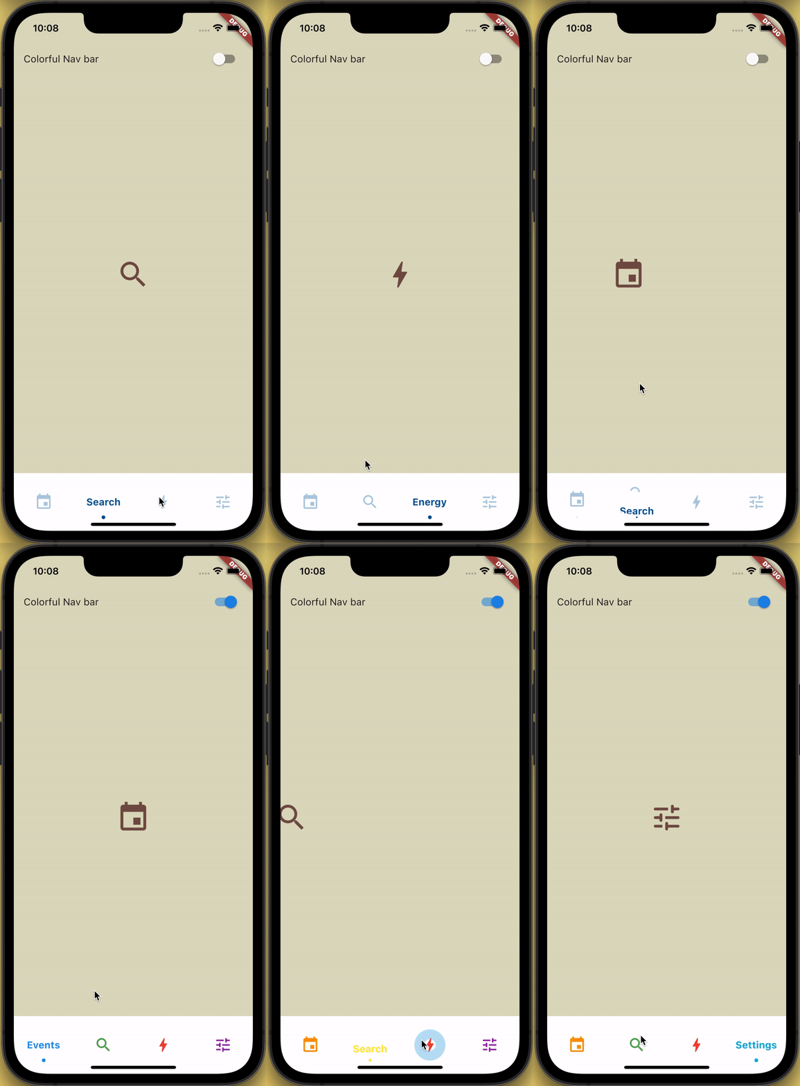
Bottom Navigation Bar with sliding menu icon and text with clipping effect, it also has ripple effect when tapped.

How to use? #
Add sliding_clipped_nav_bar: to your pubspec.yaml dependencies then run flutter pub get
 dependencies:
  sliding_clipped_nav_bar:
Then import the package to use
import 'package:sliding_clipped_nav_bar/sliding_clipped_nav_bar.dart';
Add SlidingClippedNavBar() to bottomNavigationBar property of Scaffold() and add PageView() to body with NeverScrollableScrollPhysics() don't try to upate the seleted index from onPageChanged or will see some weird behaviour. You can use Stack() or AnimatedSwitcher() for custom page transition animation.
API reference
barItems → List<BarItem>
- List of bar items that shows horizontally, Minimum 2 and maximum 4 items.
required
selectedIndex → int
- Selected index of the bar items.
required
iconSize → double
- Size of all icons (inactive items), don't make it too big or will be clipped.
optional [30]
activeColor → Color
- Color of the selected item which indicate selected.
required
inactiveColor → Color?
- Inactive color of item, which actually color icons.
nullable
onButtonPressed → OnButtonPressCallback
- Callback when item is pressed.
required
backgroundColor → Color
- background color of the bar.
optional [Colors.white]
Design Credit & screen recording #
Toolbar icons animation by Cuberto

Do and don't #
-
Don't make icon size too big.
- FontAwesomeIcons: 24
- MaterialIcons: 30
-
Using
SlidingClippedNavBar()when you want global active and inactive color.
 return Scaffold(

      body: PageView(
      physics: NeverScrollableScrollPhysics(),
      controller: controller,
...
      ),
      bottomNavigationBar: SlidingClippedNavBar(
        backgroundColor: Colors.white,
        onButtonPressed: (index) {
          setState(() {
            selectedIndex = index;
          });
          controller.animateToPage(selectedIndex,
              duration: const Duration(milliseconds: 400),
              curve: Curves.easeOutQuad);
        },
        iconSize: 30,
        activeColor: Color(0xFF01579B),
        selectedIndex: selectedIndex,
        barItems: [
          BarItem(
            icon: Icons.event,
            title: 'Events',
          ),
          BarItem(
            icon: Icons.search_rounded,
            title: 'Search',
          ),
           /// Add more BarItem if you want
        ],
      ),
    );
- Using
SlidingClippedNavBar.colorful()when you want to set individual item active & inactive color.
return Scaffold(

     body: PageView(
     physics: NeverScrollableScrollPhysics(),
     controller: controller,
...
     ),
     bottomNavigationBar: SlidingClippedNavBar.colorful(
       backgroundColor: Colors.white,
       onButtonPressed: (index) {
         setState(() {
           selectedIndex = index;
         });
         controller.animateToPage(selectedIndex,
             duration: const Duration(milliseconds: 400),
             curve: Curves.easeOutQuad);
       },
       iconSize: 30,
       selectedIndex: selectedIndex,
       barItems: [
         BarItem(
           icon: Icons.event,
           title: 'Events',
           activeColor: Colors.amber,
           inactiveColor: Colors.red,
         ),
         BarItem(
           icon: Icons.search_rounded,
           title: 'Search',
           activeColor: Colors.red,
           inactiveColor: Colors.green,
         ),
        /// Add more BarItem if you want

       ],
     ),
   );
FAQ #
-
How do I change the height?
The height must be static because the animation is in vertical direction. It was like 100 then I reduced it to 60 now. And this removed the issue with the android device, previously looked huge & ugly. Now according to me should not be an issue. But if you still think needs to be reduced then please file an issue with a screenshot. I will see if I can do something.
-
There is no API to change
TextStyleof title.You don't need any API to change
TextStyleof title. Wrap theSlidingClippedNavBarwith DefaultTextStyle and provide yourTextStyleand this will be only applied toSlidingClippedNavBar
DefaultTextStyle(
    style: TextStyle(),
    child: SlidingClippedNavBar(),
)
-
How do I add drop shadow?
Wrap SlidingClippedNavBar with DecoratedBox or Container and pass BoxDecoration to decoration property. BoxDecoration takes list of boxShadow there you can pass your drop shadow.
DecoratedBox(
    decoration: BoxDecoration(
      boxShadow: [
        BoxShadow(
            color: Colors.black.withOpacity(0.2),
            offset: Offset(0, 4),
            blurRadius: 8.0)
      ],
    ),
    child: SlidingClippedNavBar()
)
-
How do I change the corner radius of the navigation bar?
WrapSlidingClippedNavBarwith ClipRRect and passBorderRadiustoborderRadiusproperty.
  ClipRRect(
      borderRadius: const BorderRadius.vertical(
        top: Radius.circular(16),
      ),
      child: SlidingClippedNavBar(
    )
All package list
➜ Sliding Clipped Nav Bar
● Water Drop Nav Bar
● Swipeable Tile
● Loading Animation Widget