sliding_clipped_nav_bar 1.0.2  sliding_clipped_nav_bar: ^1.0.2 copied to clipboard
 waterydesert.com
Bottom Navigation Bar with sliding menu icon and text with clipping effect, also ripple effect when tapped.
sliding_clipped_nav_bar #
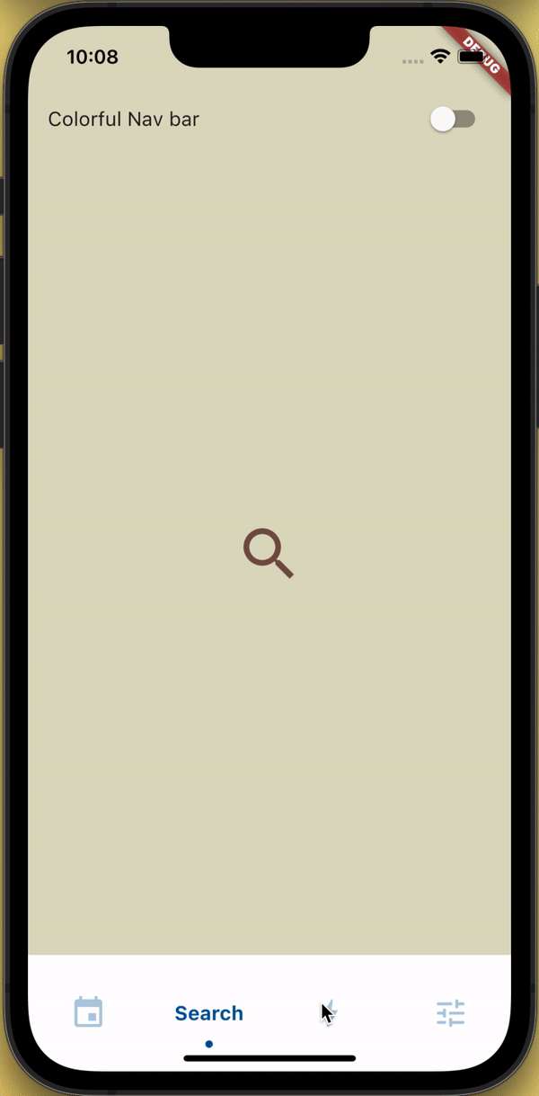
Demo Screen Recording #
Design Credit #
Toolbar icons animation by Cuberto
Disclaimer #
The bar height is taller than normal and might not be suitable for small devices. Also don't make the icon size too big or they will be clipped.
Suitable icon size
- FontAwesomeIcons: 24
- MaterialIcons: 30
API reference #
barItems → List<BarItem>
- List of bar items that shows horizontally.
required
selectedIndex → int
- Selected index of the bar items.
required
iconSize → double
- Size of all icons (inactive items), don't make it too big or will be clipped.
optional [30]
activeColor → Color
- Color of the selected item which indicate selected.
required
inactiveColor → Color?
- Inactive color of item, which actually color icons.
nullable
onButtonPressed → OnButtonPressCallback
- Callback when item is pressed.
required
backgroundColor → Color
- background color of the bar.
optional [Colors.white]
How to use? #
- Using
SlidingClippedNavBar()when you want global active and inactive color.
 return Scaffold(

      body: PageView(
      physics: NeverScrollableScrollPhysics(),
      controller: controller,
...
      ),
      bottomNavigationBar: SlidingClippedNavBar(
        backgroundColor: Colors.white,
        onButtonPressed: (index) {
          setState(() {
            selectedIndex = index;
          });
          controller.animateToPage(selectedIndex,
              duration: const Duration(milliseconds: 400),
              curve: Curves.easeOutQuad);
        },
        iconSize: 30,
        activeColor: Color(0xFF01579B),
        selectedIndex: selectedIndex,
        barItems: [
          BarItem(
            icon: Icons.event,
            title: 'Events',
          ),
          BarItem(
            icon: Icons.search_rounded,
            title: 'Search',
          ),
          BarItem(
            icon: Icons.bolt_rounded,
            title: 'Energy',
          ),
          BarItem(
            icon: Icons.tune_rounded,
            title: 'Settings',
          ),
        ],
      ),
    );
- Using
SlidingClippedNavBar.colorful()when you want to set individual item active & inactive color.
return Scaffold(

     body: PageView(
     physics: NeverScrollableScrollPhysics(),
     controller: controller,
...
     ),
     bottomNavigationBar: SlidingClippedNavBar.colorful(
       backgroundColor: Colors.white,
       onButtonPressed: (index) {
         setState(() {
           selectedIndex = index;
         });
         controller.animateToPage(selectedIndex,
             duration: const Duration(milliseconds: 400),
             curve: Curves.easeOutQuad);
       },
       iconSize: 30,
       selectedIndex: selectedIndex,
       barItems: [
         BarItem(
           icon: Icons.event,
           title: 'Events',
           activeColor: Colors.amber,
           inactiveColor: Colors.red,
         ),
         BarItem(
           icon: Icons.search_rounded,
           title: 'Search',
           activeColor: Colors.red,
           inactiveColor: Colors.green,
         ),
         BarItem(
           icon: Icons.bolt_rounded,
           title: 'Energy',
           activeColor: Colors.green,
           inactiveColor: Colors.blue,
         ),
         BarItem(
           icon: Icons.tune_rounded,
           title: 'Settings',
           activeColor: Colors.purple,
           inactiveColor: Colors.brown,
         ),
       ],
     ),
   );
Feel free to report issue even if you are using a another icon pack and see some problem. Check the example app the implementation is pretty straightforward. Please consider giving me star and see my other repositories. This will motivate me to keep working.
Follow me on social media #
Metadata
Publisher
Metadata
Bottom Navigation Bar with sliding menu icon and text with clipping effect, also ripple effect when tapped.
Repository (GitHub)
View/report issues
License
 unknown (license)