simple_grid 0.0.5  simple_grid: ^0.0.5 copied to clipboard
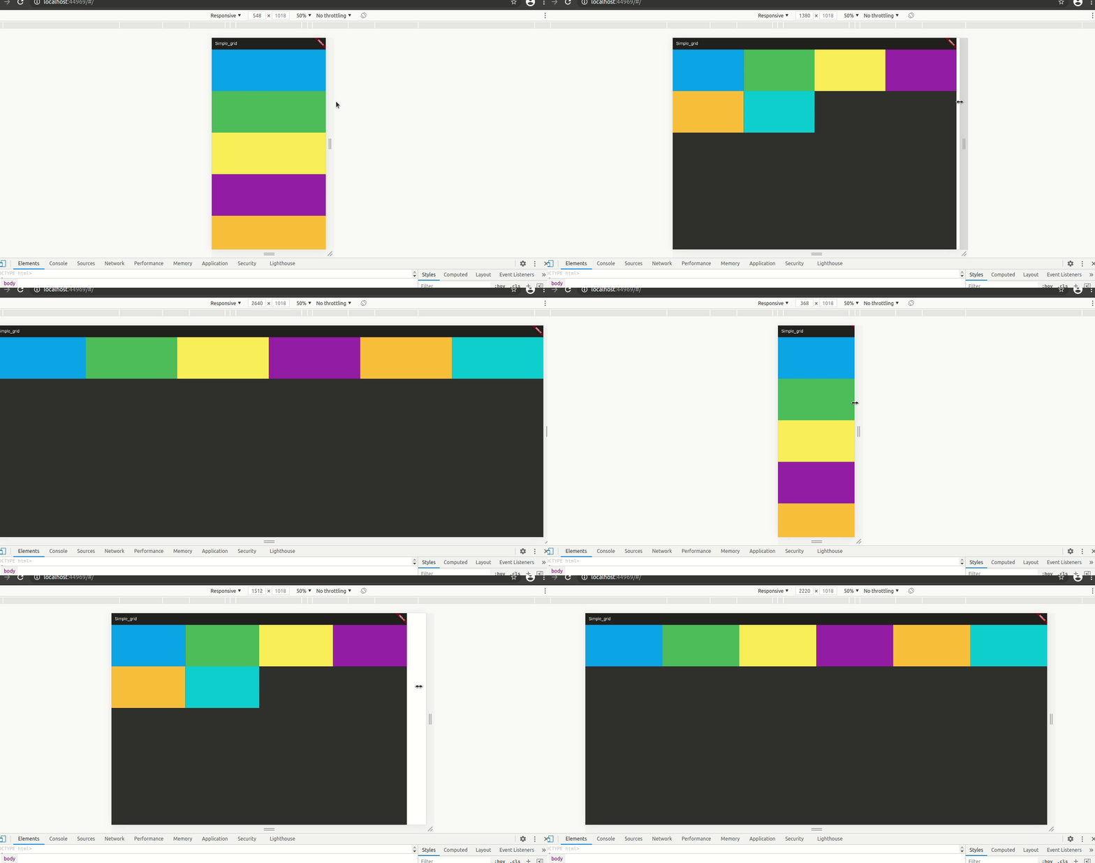
A dynamic grid inspired by boostrap, you can use it to describe your grid layout. This package purely using mediaquery, don't worry about the render.
simple_grid #
Inspired by bootstrap , This is dynamic grid layout that you can use Like a bootstrap grid, but the size following material UI break points. You can also customize your break point like here. This package purely using mediaquery, don't worry about the render.

Explanation #
There are 3 classes that you have to now, these are:
SpGridis the container of grid, more information hereSpGridItemis the children ofSpGrid, more information hereSpGridSizeis the class that you can declare the maximum of the screen size, more information here
Example #
SpGrid(width: MediaQuery.of(context).size.width, children: [
  SpGridItem(
    xs: 12,
    sm: 6,
    md: 4,
    lg: 3,
    child: Container(
      color: Colors.blue,
      height: 200,
    ),
  ),
  SpGridItem(
    xs: 12,
    sm: 6,
    md: 4,
    lg: 3,
    child: Container(
      color: Colors.green,
      height: 200,
    ),
  ),
  SpGridItem(
    xs: 12,
    sm: 6,
    md: 4,
    lg: 3,
    child: Container(
      color: Colors.yellow,
      height: 200,
    ),
  ),
  SpGridItem(
    xs: 12,
    sm: 6,
    md: 4,
    lg: 3,
    child: Container(
      color: Colors.purple,
      height: 200,
    ),
  ),
]);
Customize Break Point #
SpGrid(
  width: MediaQuery.of(context).size.width,
  gridSize: SpGridSize(xs: 0, sm: 500, md: 768, lg: 980, xl: 1200),
  children:[],
)
