simple_fontellico_progress_dialog 0.1.3  simple_fontellico_progress_dialog: ^0.1.3 copied to clipboard
 ajomuch92.site
This package helps you to render a progress dialog with different types of loading indicator.
Simple Fontellico Progress Dialog ⌛ #
This package helps to render a progress dialog window with different types of loading indicator.
New Features 💥 #
- Property hideText to hide the text (and spacer) to only show loading indicator
- The custom type added. When the type is set to custom, you require to add a loadingIndicator widget
- Method updateMessageText to update the message text on dialog while is showing
- Property horizontal to show the loading on this mode
Instalation #
Include simple_fontellico_progress_dialog in your pubspec.yaml file:
dependencies:
  flutter:
    sdk: flutter
  simple_fontellico_progress_dialog: version
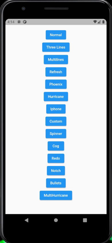
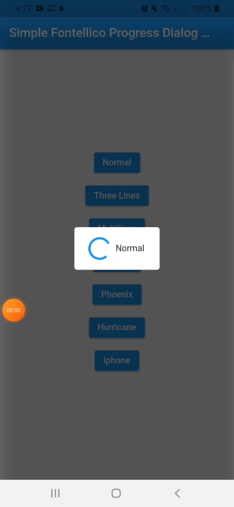
Demo Vertical Mode #
Demo Horizontal Mode #
Usage #
To use this package, just import it into your file, create a new instance, pass the context as parameter.
import 'package:simple_fontellico_progress_dialog/simple_fontico_loading.dart';

...

SimpleFontelicoProgressDialog _dialog = SimpleFontelicoProgressDialog(context: context, barrierDimisable:  false);
...

void showDialog() async{
  _dialog.show(message: 'Loading...', type: type);
  await Future.delayed(Duration(seconds: 1));
  _dialog.hide();
}

...
Constructor #
| Name | Description | Required | Default |
|---|---|---|---|
| context | Buildcontext to render the dialog | True | |
| barrierDimisable | Boolean value to indicate barrierDimisable on dialog | True |
To show a dialog, use the show method, to hide it, use the hide method. Simple like that.
Properties used on show method #
| Name | Description | Required | Default |
|---|---|---|---|
| message | String to indicate a message into the dialog | True | |
| type | Simple dialog type (normal, threeline, multiline, refresh, hurricane, phoenix, iphone) | False | normal |
| width | Double value to indicate the dialog width | False | 100 |
| height | Double value to indicate the dialog height | False | 120 |
| elevation | Double value to indicate the dialog elevation | False | 5.0 |
| radius | Double value to indicate the dialog border radius | False | 5.0 |
| backgroundColor | Double value to indicate the dialog background color | False | Colors.white |
| duration | Duration value to animate loading indicator | False | 1000 miliseconds |
| horizontal | Boolean value to indicate if loading has to show on horizontal | False | false |
| separation | Double value to indicate the separation between loading and text | False | 10.0 |
| textStyle | Style to customize the text inside dialog | False | TextStyle(fontSize: 14) |
| hideText | Boolean value to hide the text widget | False | false |
| loadingIndicator | Widget to use when type is set on custom. | False (Required when type is custom) |
Properties used on updateMessageText method #
| Name | Description | Required | Default |
|---|---|---|---|
| message | String to update the message inside an opened dialgo | True |
Metadata
59
likes
0
pub points
92%
popularity
Publisher
Metadata
This package helps you to render a progress dialog with different types of loading indicator.
Repository (GitHub)
View/report issues
License
 unknown (license)