simple_accordion 0.1.4  simple_accordion: ^0.1.4 copied to clipboard
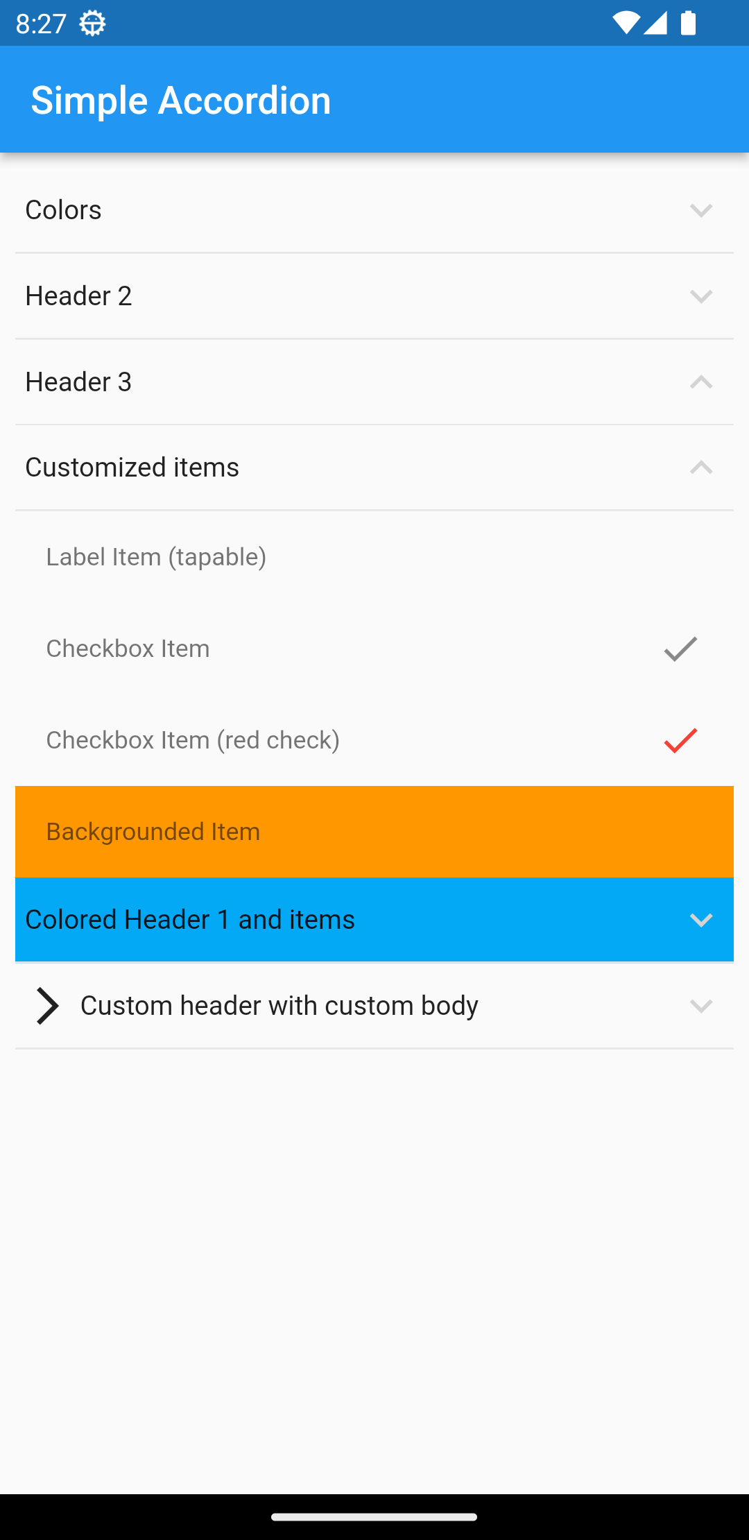
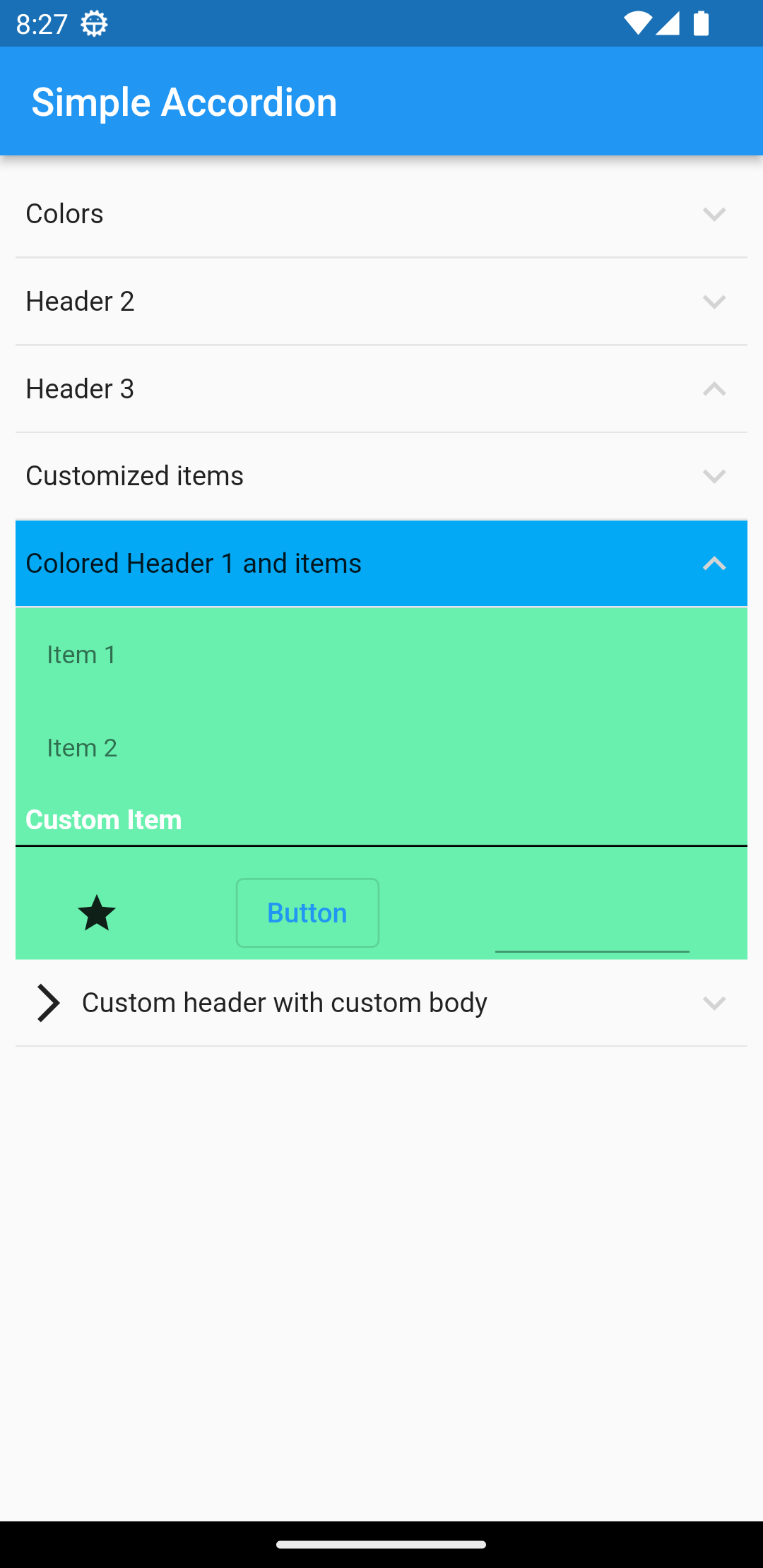
Accordion widget, easy to use, advanced customization
simple_accordion #
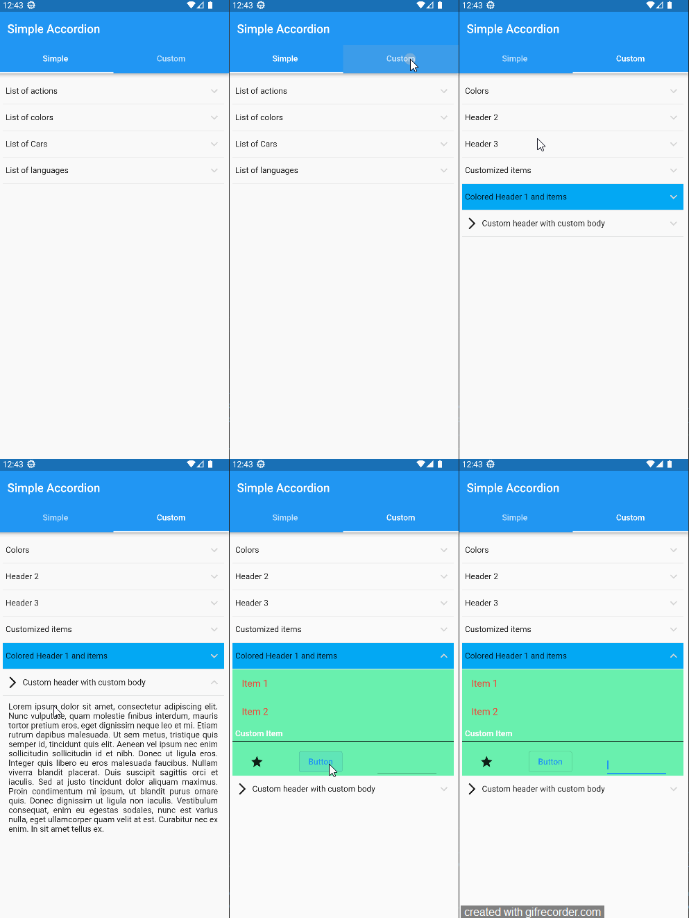 |
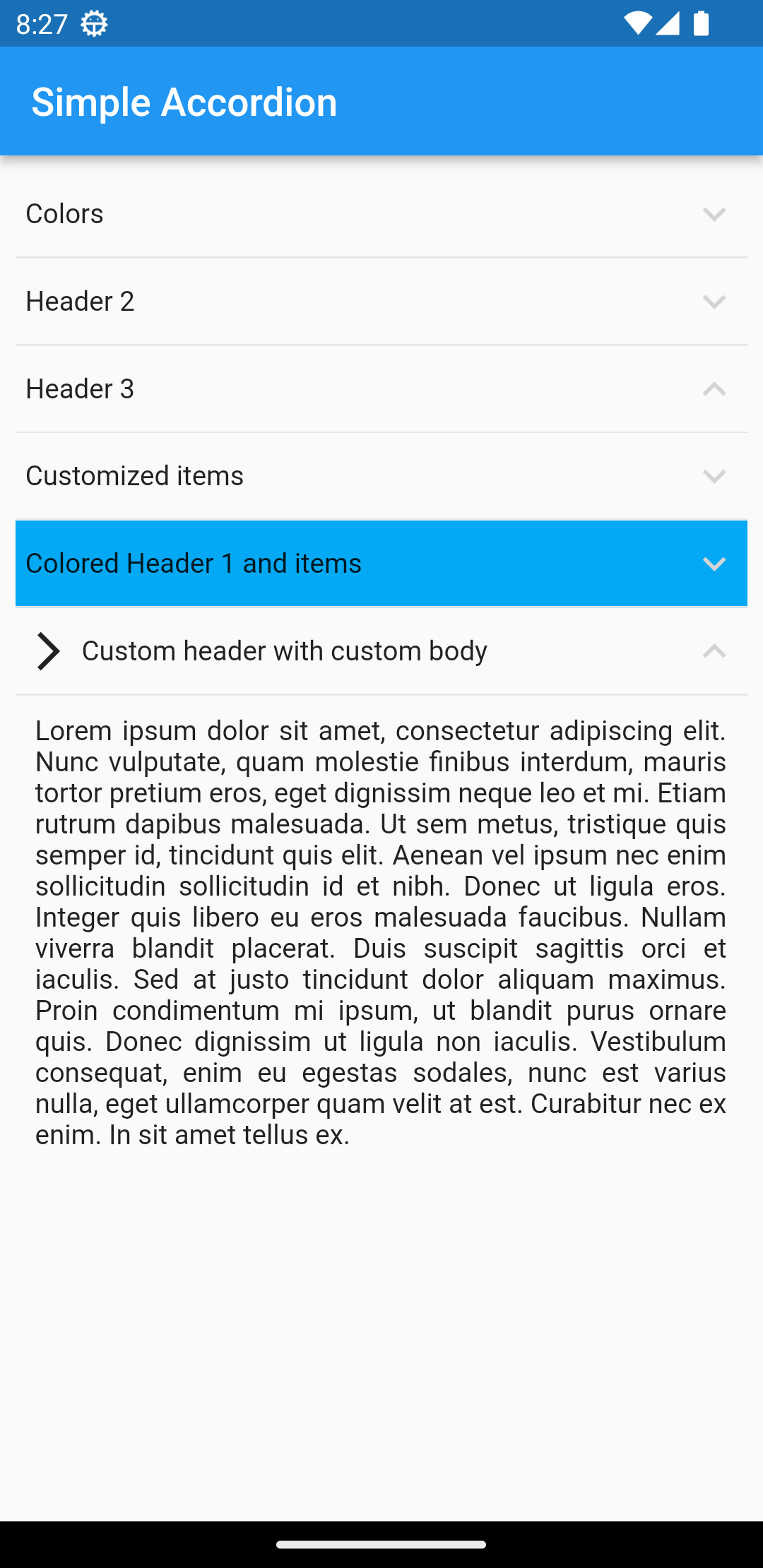 |
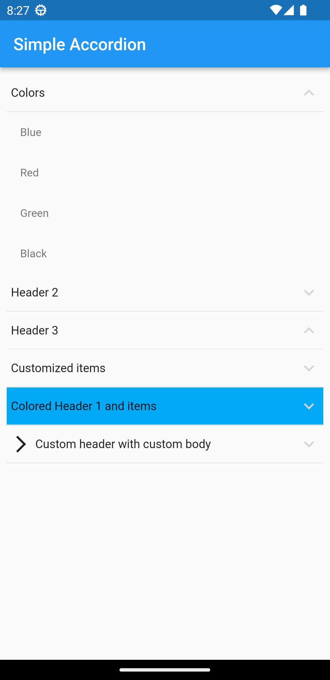 |
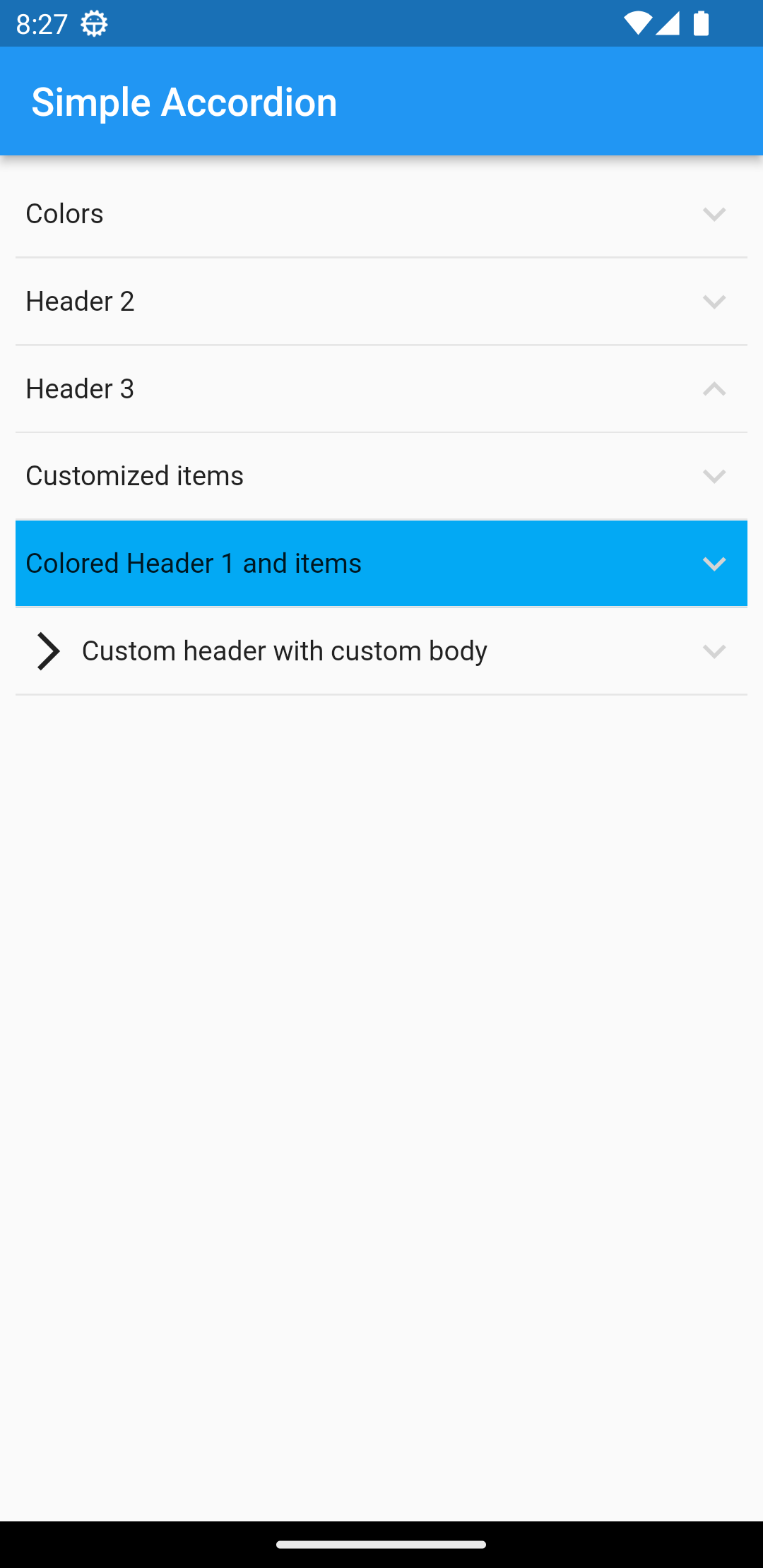 |
 |
 |
If you like, you can contribute to this repository by making PR.
About Widget #
this is an accordion widget that supports usual types of an accordion widget and easy to use! view in pub.dev
Add to your project #
flutter pub add simple_accordion
Import and use it! #
import 'package:simple_accordion/simple_accordion.dart';
How to use #
The main widget is SimpleAccordion and it has children parameter that you can pass accrodion items as AccordionHeaderItem array to that like below:
SimpleAccordion(
              children: [
                AccordionHeaderItem(
                  title: "Colors",
                  children: [
                    AccordionItem(title: "Blue"),
                    AccordionItem(title: "Red"),
                    AccordionItem(title: "Green"),
                    AccordionItem(title: "Black"),
                  ],
                ),
              ],
)
Usage Tree #
SimpleAccordion
	-AccordionHeaderItem
		-AccordionItem
		-AccordionItem
		-AccordionItem
	-AccordionHeaderItem
		-AccordionItem
		...
Properies of SimpleAccordion #
| Parameter | Description |
|---|---|
| children | Array of AccordionHeaderItem |
| headerColor | set the color of all headers background |
| itemColor | set the color of all Items background |
| maxSelectCount | Maximum possible selection for user |
| headerTextStyle | set the style of all headers title |
| itemTextStyle | set the style of all items title of headers |
| onSelectedChanged | return all checked items changes |
| selectedItems | default selected items |
Properies of AccordionHeaderItem #
| Parameter | Description |
|---|---|
| isOpen | initial state of a header (open/close) |
| title | header title |
| child | header child as widget |
| children | array of AccordionItem |
| headerColor | set the color of header's background |
| itemColor | set the color of all Items of current header background |
| headerTextStyle | set the style of header's title |
| itemTextStyle | set the style of all items title of current header |
Properies of AccordionItem #
| Parameter | Description |
|---|---|
| title | header title |
| child | header child as widget |
| onChange | used to handle CheckBox mode value |
| checked | initial state of Checkbox |
| checkColor | set the color of Checkbox |
| itemColor | set the backcolor of item |
| accrodionItemType | set the mode of item (lable, checkbox). you can place everything in label mode |
| itemTextStyle | set the style of current item |
all of customizations are available in example file.