side_navigation 0.0.7  side_navigation: ^0.0.7 copied to clipboard
Provides Flutter navigation by using a sidemenu similar to Drawer or ButtomNavigationBar.
Flutter Side Navigation #
This package provides support to navigate on your app. It was inspired from both the BottomNavigationBar and Drawer. You can think of it as a drawer which is always open. Kind of like a CEO dashboard web application.
NOTE: If you are looking for a Flutter implementation of this navigation approach check out
NavigationRailwhich I recently stumbled upon after publishing this package.
Table of contents #
Preview #
Getting started #
First add the dependency into your pubspec.yaml:
dependencies:
    side_navigation: ^0.0.7
OR Add the dependency via terminal:
flutter pub add side_navigation
When making use of the package:
import 'package:side_navigation/side_navigation.dart';
Usage #
Right now it is recommended to wrap the SideNavigationBar in a Row and put an Expanded widget around the content to make it expand the rest of the available width. You can also use an AppBar within the Scaffold.
Minimal Example: #
class MainView extends StatefulWidget {
  const MainView({Key? key}) : super(key: key);

  @override
  _MainViewState createState() => _MainViewState();
}

class _MainViewState extends State<MainView> {
  /// Views to display
  List<Widget> views = const [
    Center(
      child: Text('Dashboard'),
    ),
    Center(
      child: Text('Account'),
    ),
    Center(
      child: Text('Settings'),
    ),
  ];

  /// The currently selected index of the bar
  int selectedIndex = 0;

  @override
  Widget build(BuildContext context) {
    return Scaffold(
      /// You can use an AppBar if you want to
      //appBar: AppBar(
      //  title: const Text('App'),
      //),

      // The row is needed to display the current view
      body: Row(
        children: [
          /// Pretty similar to the BottomNavigationBar!
          SideNavigationBar(
            selectedIndex: selectedIndex,
            items: const [
              SideNavigationBarItem(
                icon: Icons.dashboard,
                label: 'Dashboard',
              ),
              SideNavigationBarItem(
                icon: Icons.person,
                label: 'Account',
              ),
              SideNavigationBarItem(
                icon: Icons.settings,
                label: 'Settings',
              ),
            ],
            onTap: (index) {
              setState(() {
                selectedIndex = index;
              });
            },
          ),

          /// Make it take the rest of the available width
          Expanded(
            child: views.elementAt(selectedIndex),
          )
        ],
      ),
    );
  }
}
SideNavigationBar Fields #
Apart from the fields you saw in the minimal example above there exist following more fields:
| Field | Description |
|---|---|
header |
A SideNavigationBarHeader displayed above the items |
footer |
A SideNavigationBarFooter displayed below the items and above toggler |
toggler |
A SideBarToggler to toggle the bars state |
theme |
SideBarNavigationBarTheme provides customizations. Default is SideNavigationBarTheme.standard() |
expandable |
Whether the bar should be expandable at all. If this is false no toggler will be displayed. Default true |
initiallyExpanded |
If the bar should be expanded on startup. Default true |
SideNavigationBarTheme Fields #
| Field | Description |
|---|---|
backgroundColor |
The color of the bar. Defaults to parent containers color |
itemTheme |
Item style customizations. Defaults to ItemTheme.standard() |
togglerTheme |
Toggler style customizations. Defaults to TogglerTheme.standard() |
showHeaderDivider |
Show divider between header and items. Default true |
showMainDivider |
Show divider between bar and main content. Default true |
showFooterDivider |
Show divider between items and footer. Default true |
ItemTheme Fields
| Field | Description |
|---|---|
selectedItemColor |
Color of SideNavigationBarItem.icon and SideNavigationBarItem.label when selected. Default is native brightness color |
unselectedItemColor |
Color of SideNavigationBarItem.icon and SideNavigationBarItem.label when not selected. Default is native brightness color |
TogglerTheme Fields
| Field | Description |
|---|---|
expandIconColor |
Color of SideBarToggler.expandIcon when bar is shrinked. Default is native brightness color |
shrinkIconColor |
Color of SideBarToggler.shrinkIcon when bar is expanded. Default is native brightness color |
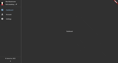
Showcase #
Desktop:
Personally on Desktop I like it more without the AppBar
 Android Tablet:
On the tablet on the other hand an AppBar blends right in!
 Android Phone:
For phones, I would recommend only using this type of navigation when the device is in landscape mode. Since the content is displayed very small when in portrait

Future Updates #
Currently, the plan is to add support for
- Choosable position of the toggler
- Divider more style customizations
- Maybe let header and footer be normal widget: Github Issue
Bugs, Errors etc. #
If you find any weird behaviour, bugs or errors please let me know. Also, an image or a gif will help a lot if the UI behaves differently.
Metadata
Publisher
unverified uploader
Metadata
Provides Flutter navigation by using a sidemenu similar to Drawer or ButtomNavigationBar.
Repository (GitHub)
View/report issues
License
 unknown (license)