shaped_bottom_bar 1.0.0  shaped_bottom_bar: ^1.0.0 copied to clipboard
 badrkouki.dev
Fully customizable bottom navigation bar with multiple built-in shapes and support custom shapes also with built-in transition animations
shaped bottom bar #
A new bottom bar in Flutter! a shaped bottom bar. Choose your shape and your animation and let us do the work.
 |
 |
|---|---|
 |
 |
 |
 |
 |
 |
|---|---|---|---|
 |
 |
 |
 |
-
Installation
-
Widgets introduction
-
Example
Installing #
Add this line to pubspec
dependencies:
	shaped_bottom_bar: ^1.0.0
Widgets #
ShapedBottomBar This the main widget that will create the bottom bar.
With just two required parameters you get a full bottom bar.
required parameters
-
onItemChangedfunction that trigger every time you switch between items -
listItemslist of typeShapedItemObjectthat will be rendered in the bottom bar
this will create a simple bottom bar without any shape with just a different color for the selected item
Other parameters
-
shapevariable of typeShapeTypeenum contains all available shapes, by default it's set to None -
shapeColorthe color of the shape once it selected, by default it's null -
customShapea CustomPaint type passed to the bottom bar to render a custom shape other than the built-in shapes, to use the customShape you need to setshapetoShapeType.CUSTOM
PS: if you are using customShape the shapeColor parameter won't have any effect on your shape.
-
selectedIconColorthe selected icon color, by default it's white -
backgroundColorthe background of the shaped bottom bar, by default it's blue -
selectedItemIndexthe default selected item, by default it's the first one (index 0) -
textStylethe text style you want to have on the items text (color, size, font family...) -
animationTypeattribute of typeANIMATION_TYPElet you choose the animation type possible values: - NONE - ROTATE - FADE - SLIDE_VERTICALLY
ShapedBottomBarItem the widget that will be used in the listItems parameters in the ShapedBottomBar widget
This widget contains just four parameters.
required parameters
iconvariable of typeIconDatait represent the icon that the item will get
Other parameters
-
textthe item text, by default it's an empty text. -
themeColorcolor that will be set to the icon. by default it's black -
renderWithTextby default it's false, this will indicate whether the widget will render the text or not.
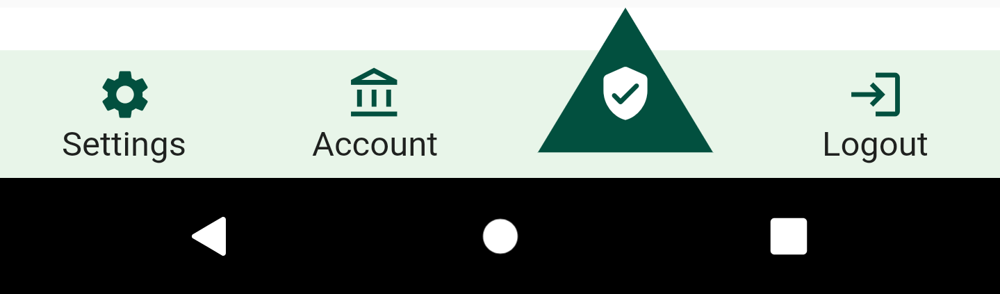
Example #
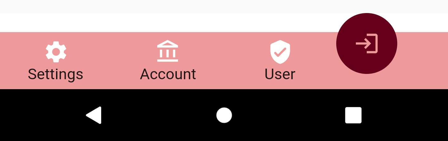
this will generate a normale bottom bar without any shape.
	ShapedBottomBar(
		backgroundColor: Colors.grey,
		listItems: [
			ShapedItemObject(iconData: Icons.settings, title: "Settings"),
			ShapedItemObject(iconData: Icons.account_balance_outlined, title: "Account"),
			ShapedItemObject(iconData: Icons.verified_user_rounded, title: "User"),
			ShapedItemObject(iconData: Icons.login, title: "Logout")
		],
		onItemChanged: (position) {
			setState(() {
				this.selectedItem = position;
			});
		},
		selectedIconColor: Colors.white
	)
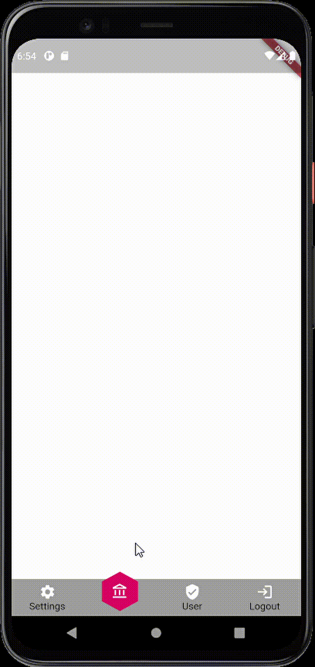
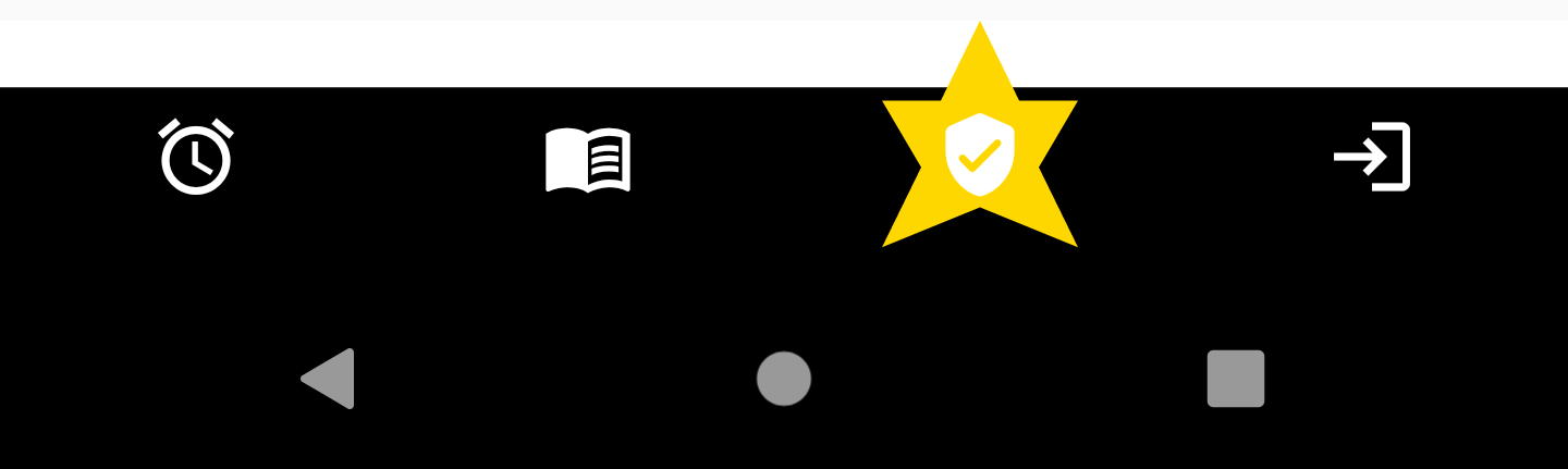
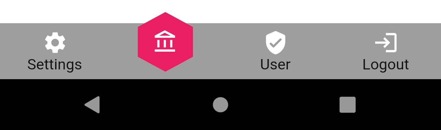
And the example below will generate a bottom bar with an hexagon shape
	ShapedBottomBar(
		backgroundColor: Colors.grey,
		iconsColor: Colors.white,
		listItems: [
			ShapedItemObject(iconData: Icons.settings, title: "Settings"),
			ShapedItemObject(iconData: Icons.account_balance_outlined, title: "Account"),
			ShapedItemObject(iconData: Icons.verified_user_rounded, title: "User"),
			ShapedItemObject(iconData: Icons.login, title: "Logout"),
		],
		onItemChanged: (position) {
			setState(() {
				this.selectedItem = position;
			});
		},
		shapeColor: Colors.pink,
		selectedIconColor: Colors.white,
		shape: ShapeType.HEXAGONE
	)
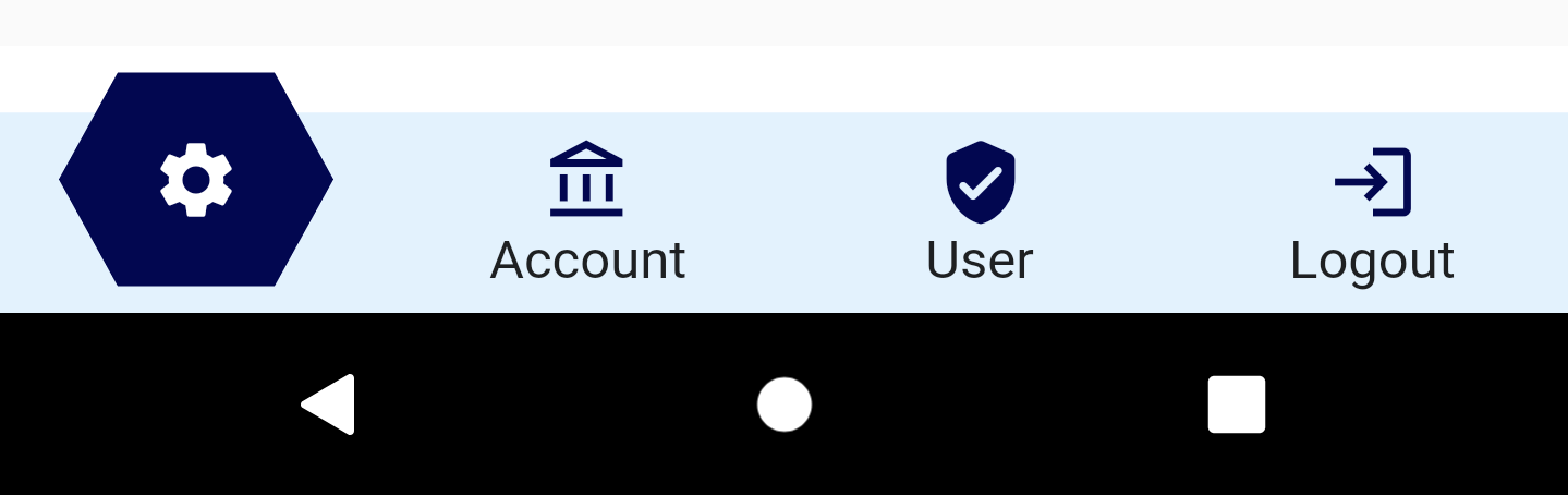
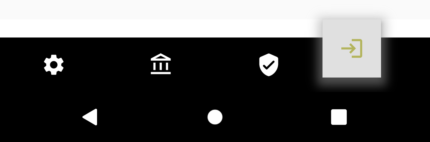
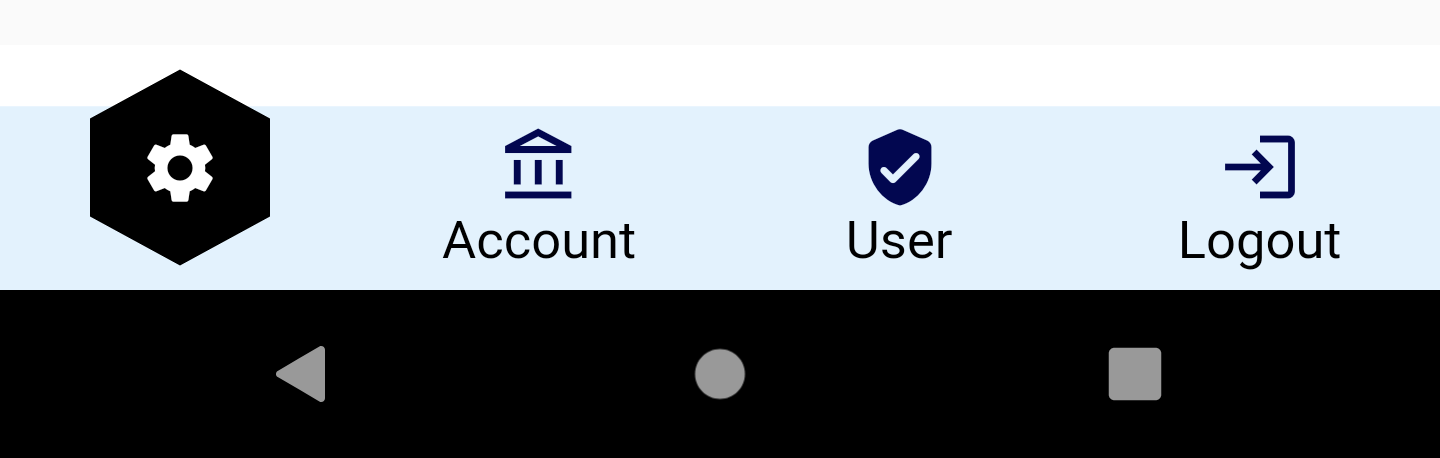
Use your own custom shape #
In order to create the shaped bottom bar with your own custom shape you need to use the parameter customShape with shape set to ShapeType.CUSTOM, as it shown below:
ShapedBottomBar(
	backgroundColor: Colors.blue[50],
	iconsColor: Color(0xFF020750),
	listItems: [
		ShapedItembject(iconData: Icons.settings, title: "Settings"),
		ShapedItemObject(iconData: Icons.account_balance_outlined, title: "Account"),
		ShapedItemObject(iconData: Icons.verified_user_rounded, title: "User"),
		ShapedItemObject(iconData: Icons.login, title: "Logout"),
	],
onItemChanged: (position) {
	setState(() {
		this.selectedItem = position;
	});
},
textStyle: TextStyle(color: Colors.black, fontSize: 15),
shape: ShapeType.CUSTOM,
customShape: CustomPaint(
	painter: MyShape(),
))
 *
*
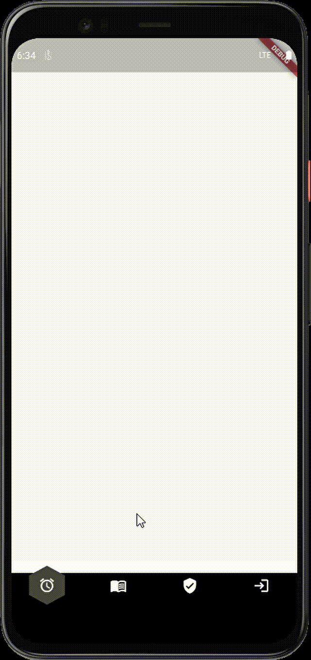
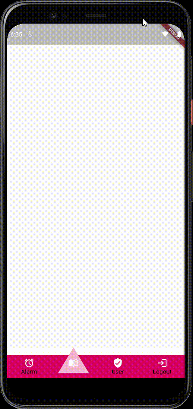
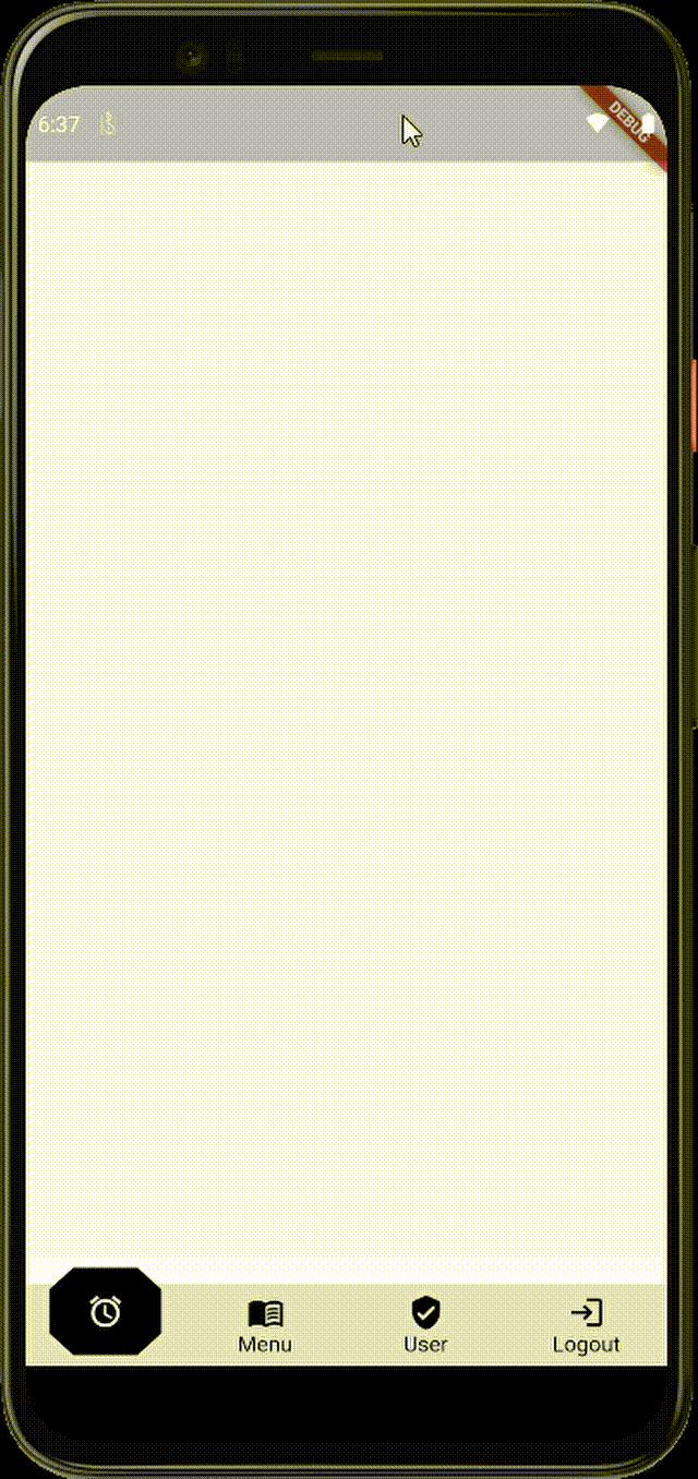
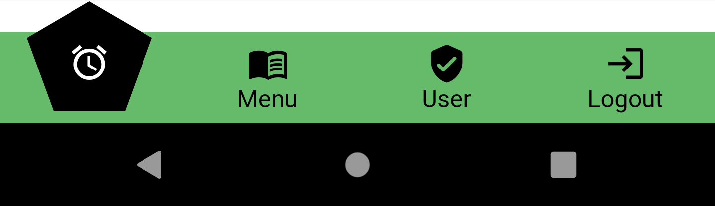
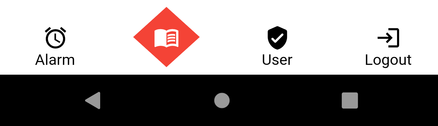
Use built-in animations #
	ShapedBottomBar(
		backgroundColor:  Colors.black12,
		iconsColor:  Colors.black,
		listItems: [
			ShapedItemObject(iconData:  Icons.alarm, title:  "Alarm"),
			ShapedItemObject(iconData:  Icons.menu_book, title:  "Menu"),
			ShapedItemObject(
				iconData:  Icons.verified_user_rounded, title:  "User"),
			ShapedItemObject(iconData:  Icons.login, title:  "Logout"),
		],
		onItemChanged: (position) {
			setState(() {
				this.selectedItem = position;
			});
		},
		shape:  ShapeType.OCATGON,
		shapeColor:  Colors.black,
		selectedIconColor:  Colors.white,
		animationType:  ANIMATION_TYPE.ROTATE,
)
And the result:
Metadata
Publisher
Metadata
Fully customizable bottom navigation bar with multiple built-in shapes and support custom shapes also with built-in transition animations
Repository (GitHub)
View/report issues
Documentation
License
 GPL-3.0 (LICENSE)