select_searchable_list 0.2.1  select_searchable_list: ^0.2.1 copied to clipboard
A very useful Flutter widget for searching through single or multiple options from a drop-down list.
Dropdown Searchable List Choices #
A very useful widget for searching through single or multiple options from a drop-down list.
Platforms #
This plugin has been successfully tested on iOS, Android & web.
Examples #
The following examples are extracted from the example project available in the repository. More examples are available in this project.
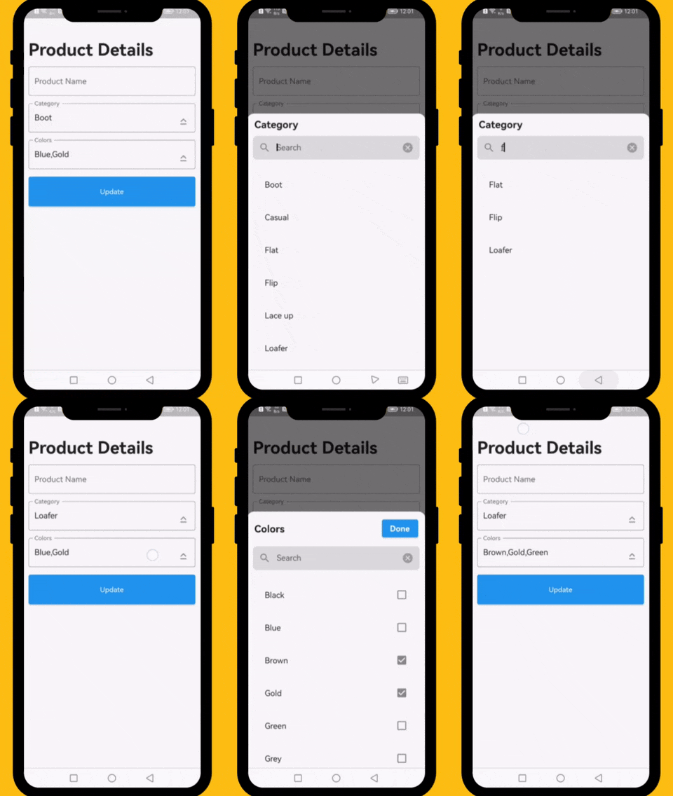
Demo of Dropdown Searchable list with choices #

How to Use #
          // ####### Data Sample (API Response)
          // Data value Api
          final Map<int, String> _listCategories = {1:'Boot', 2: 'Casual', 3: 'Flat', 4: 'Flip',  5: 'Lace up', 6: 'Loafer', 7: 'Slip-on', 8: 'Moccasins'};
          // Default value
          final List<int> _selectedCategory = [1];
          // Data value Api
          final Map<int, String> _listColors = {1:'Black', 2: 'Blue', 3: 'Brown', 4: 'Gold',  5: 'Green', 6: 'Grey', 7: 'Orange', 8: 'Pink', 9: 'Purple', 10: 'Red'};
          // Default value
          final List<int> _selectedColors = [2,4];

          // ####### Category Select List
          DropDownTextField(
            textEditingController: _categoryTextEditingController,
            title: 'Category',
            hint: 'Select Category',
            options: _listCategories,
            selectedOptions: _selectedCategory,
            onChanged: (selectedIds) {
              // setState(() => selectedIds);
            },
          ),

          // ####### Colors Select List
          DropDownTextField(
            textEditingController: _colorsTextEditingController,
            title: 'Colors',
            hint: 'Select Colors',
            options: _listColors,
            selectedOptions: _selectedColors,
            onChanged: (selectedIds) {
              // setState(() => selectedIds);
            },
            multiple: true,
          ),
Required parameters #
data:
This property takes List
Optional parameters #
listBuilder:
This property takes int value as a parameter. This is use to set the initial segment from [segmentNames].
enableMultipleSelection:
This property takes Color value as a parameter. You can change the background color of animated segment.
bottomSheetTitle:
This gives the bottom sheet title.
submitButtonChild:
You can set your custom submit button when the multiple selection is enabled.
selectedItems:
This will give the call back to the selected items from list.
dropDownBackgroundColor:
This will set the background color to the Dropdown Searchable.
searchWidget:
This property takes TextFormField value as a parameter. [searchWidget] is use to show the text box for the searching. If you are passing your own widget then you must have to add [TextEditingController] for the [TextFormField].
isSearchVisible:
This property takes bool value as a parameter. [isSearchVisible] is use to manage the search widget visibility. by default it is [True] so widget will be visible.
LICENSE! #
Dropdown Searchable list is MIT-licensed.
Let us know! #
I would be happy if you send us feedback on your projects where you use our component. Just email amir.email@gmail.com and let me know if you have any questions or suggestions about my work.