sdga_design_system 0.0.1  sdga_design_system: ^0.0.1 copied to clipboard
A comprehensive set of UI components and design principles that adhere to the Saudi Digital Government Authority (SDGA) design guidelines.
sdga_design_system #
This package provides a comprehensive set of UI components and design principles that adhere to the Saudi Digital Government Authority (SDGA) design guidelines. By leveraging this design system, developers can create consistent, user-friendly, and visually appealing interfaces.
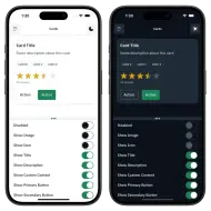
Screenshots #


Installation #
In the dependencies: section of your pubspec.yaml, add the following line:
sdga_design_system: <latest_version>
Then, in your main app code, you need to apply the SDGATheme as an extension to the ThemeData using the ThemeData.copyWith method
return MaterialApp(
  theme: ThemeData.light().copyWith(extensions: [SDGATheme.light()]),
  darkTheme: ThemeData.dark().copyWith(extensions: [SDGATheme.dark()]),
  Other MaterialApp properties...
);
Or using the extension method applySDGATheme()
return MaterialApp(
  theme: ThemeData.light().applySDGATheme(),
  darkTheme: ThemeData.dark().applySDGATheme(),
  Other MaterialApp properties...
);
Key Features #
Widgets #
The design system provides a vast range of widgets, prefixed with SDGA. These include:
- Actions:
SDGAButton,SDGALink. - Content Display:
SDGAAccordionList,SDGACard,SDGAListTile,SDGACheckboxListTile,SDGARadioListTile,SDGASwitchListTile. - Data Display:
SDGAAvatar,SDGAContentSwitcher. - Feedback:
SDGAModal,SDGANotificationToast,SDGARatingBar,SDGATooltip. - Forms:
SDGACheckbox,SDGARadio,SDGASwitch,SDGAFileInput,SDGATextField. - Navigational:
SDGADrawer,SDGAMenu,SDGAPagination,SDGATabBar. - Loading Indicators:
SDGASpinner. - Search and Other Elements:
SDGATag,SDGABanner,SDGAInlineAlert.
Note: Several widgets are still in progress, such as Dropdown, Date Picker, AppBar, and BottomNavigationBar.
Colors #
The design system provides a light and dark palette of colors that adhere to the SDGA brand guidelines. These colors are designed to be accessible and visually appealing, ensuring a consistent look and feel across all applications.
You can access these colors using SDGAColors or using SDGAColorScheme.of(context) for the light/dark version
Styles #
The design system defines a set of styles that govern typography, spacing, and layout. These styles ensure consistency and readability across different screen sizes and devices.
- Typography: Access font families, sizes, and line heights via
SDGATextStylesfor headings, body text, etc. - Spacing: Managed through
SDGANumbersto ensure consistency in layouts across different devices and screen sizes.
Shadows #
Predefined shadow styles can be used for UI elements like cards and menus, accessible via SDGAShadows.
Usage #
After installing and configuring the SDGATheme, you can start using the SDGA UI components in your Flutter app. Below are a few examples demonstrating the usage of different widgets:
Example 1: Using SDGA Button
// Regular button
SDGAButton(
  style: SDGAButtonStyle.primaryBrand,
  onPressed: () {
    // Handle button press
  },
  child: Text('Click me'),
)
// Destructive button
SDGAButton.destructive(
  style: SDGADestructiveButtonStyle.primary,
  onPressed: () {
    // Handle destructive action
  },
  child: Text('Delete'),
)
// Icon button
SDGAButton.icon(
  icon: Icon(Icons.add),
  onPressed: () {
    // Handle icon button press
  },
)
// Floating action button
SDGAButton.fab(
  style: SDGAFabButtonStyle.primaryBrand,
  icon: Icon(Icons.camera),
  onPressed: () {
    // Handle FAB press
  },
)
// Close button
SDGAButton.close(
  onPressed: () {
    // Handle close button press
  },
)
Example 2: Using SDGA Card
SDGACard(
  title: Text('Card Title'),
  padChildHorizontally: false,
  child: Column(
    mainAxisSize: MainAxisSize.min,
    children: [
      SizedBox(
        height: 24,
        child: ListView.separated(
          padding: const EdgeInsetsDirectional.only(
            start: SDGANumbers.spacingXL,
          ),
          scrollDirection: Axis.horizontal,
          itemCount: 3,
          itemBuilder: (context, index) => SDGATag(
            size: SDGATagSize.small,
            label: Text('Label $index'),
          ),
          separatorBuilder: (context, index) =>
              const SizedBox(width: SDGANumbers.spacingMD),
        ),
      ),
      const SizedBox(height: SDGANumbers.spacing3XL),
      Padding(
        padding: const EdgeInsets.symmetric(
          horizontal: SDGANumbers.spacingXL,
        ),
        child: Column(
          crossAxisAlignment: CrossAxisAlignment.stretch,
          children: [
            const SDGARatingBar(
              size: SDGAWidgetSize.small,
              useBrandColors: false,
              value: 3.5,
            ),
            const SizedBox(height: SDGANumbers.spacingXS),
            Text(
              '12 reviews',
              style: SDGATextStyles.textExtraSmallRegular.copyWith(
                color: SDGAColorScheme.of(context)
                    .links
                    .iconNeutralVisited,
              ),
            ),
          ],
        ),
      ),
    ],
  ),
);
Example 3: Using SDGA Drawer
SDGADrawer(
  header: const SDGADrawerHeader(
    title: Text('Username', maxLines: 1),
    description: Text(
      'user@example.com',
      overflow: TextOverflow.ellipsis,
      maxLines: 1,
    ),
  ),
  items: [
    SDGADrawerItem(
      label: 'Home',
      leading: Icon(Icons.home),
      onTap: () {
        // Handle drawer item tap
      },
    ),
    SDGADrawerItem(
      label: 'Settings',
      leading: Icon(Icons.settings),
      onTap: () {
        // Handle drawer item tap
      },
    ),
  ],
);
Example 4: Using SDGA Text Field
const SDGATextField(
  decoration: SDGAInputDecoration(
    helperText: 'Help Text',
    hintText: 'Search...',
    prefix: SDGAInputAffix.text('Prefix'),
    prefixIcon: Icon(Icons.search),
  ),
);
By incorporating these widgets, your app will adhere to the SDGA design principles, ensuring a consistent and standardized user interface.
Migrating from Material #
All widgets in this library begin with SDGA, facilitating a smooth transition from the Material Design system. Most components share similar properties to their Material Design counterparts, with exceptions for properties that are inapplicable or would impact the unique SDGA style.
For example:
TextFieldbecomesSDGATextFieldButtonbecomesSDGAButton
Example App #
Explore the full range of widgets and their variations in our interactive example app. This serves as a live storybook where you can edit properties and instantly see the results.
To get started:
- Clone the repository:
git clone https://github.com/oghareeb/sdga_design_system - Navigate to the example project:
cd sdga_design_system/example - Run the example app:
flutter pub get
flutter run
