responsiveapp 0.0.2  responsiveapp: ^0.0.2 copied to clipboard
A simple Flutter package to make your app responsive across different screen sizes using `MediaQuery`. This package provides helper functions for responsive width, height, font size, and padding based [...]
Responsive UI Helper #
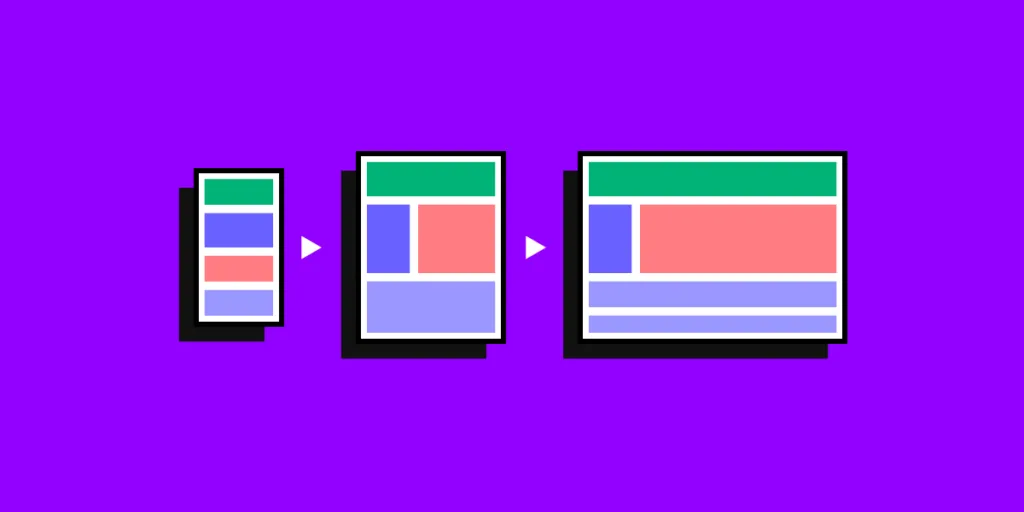
A simple Flutter package to make your app responsive across different screen sizes using MediaQuery. This package provides helper functions for responsive width, height, font size, and padding based on the screen size.
Features #
- Responsive Width and Height
- Responsive Font Size
- Responsive Padding and Margins
How Use #
- height and width
Container(
  width: ResponsiveHelper.responsiveWidth(context, 200),  // 200 is the base width in design
  height: ResponsiveHelper.responsiveHeight(context, 100), // 100 is the base height in design
  color: Colors.blue,
)
- font size
Text(
  'Responsive Text',
  style: TextStyle(
    fontSize: ResponsiveHelper.responsiveFontSize(context, 18), // 18 is the base font size in design
  ),
)
- padding
Container(
  padding: ResponsiveHelper.responsivePadding(
    context,
    left: 10,  // base left padding in design
    right: 10, // base right padding in design
    top: 5,    // base top padding in design
    bottom: 5, // base bottom padding in design
  ),
  child: Text('Responsive Padding'),
)
Metadata
0
likes
125
points
8
downloads
Publisher
unverified uploader
Weekly Downloads
Metadata
A simple Flutter package to make your app responsive across different screen sizes using `MediaQuery`. This package provides helper functions for responsive width, height, font size, and padding based on the screen size.
Documentation
License
 BSD-3-Clause (license)