responsive_ui 1.1.0+1  responsive_ui: ^1.1.0+1 copied to clipboard
resposive_ui Flutter package helps you to create a responsive and Nested responsive widget. Works on all flutter platform (android, iOs ,web) with both portrait and landscape mode.
Responsive UI #

responsive_ui package helps you to create a responsive widget and Nested responsive widget too. Works on all flutter platform (android, iOs ,web ) with both Portrait and LandScape mode. #
sample video #
Getting Started #
It works as same as Bootstrap Row Column method, Splitting screen into 12 columns and placing widget by combining column based on screen size.
Screens #
For mobiles ( screen size <= 600px wide ) #

For tablets ( screen size > 600px wide && <= 990 px wide ) #

For laptops ( screen size > 990px wide ) #

Widgets #
The Responsive UI Package contains two simple widgets.
- Responsive()
- ResponsiveChild()
(s = small, m = medium, l = large)
1. Responsive() #
Responsive intakes List<ResponsiveChild> with default column/screen size for each widget can be declared.
    Responsive(
        defaultColS : 12,//default column size for Small screen 12
        defaultColM : 6, //default column size for Medium screen 12
        defaultColL : 4, //default column size for Large screen 12
        children:<Widget>[
          ResponsiveChild(
            child:Container(
                    color: Colors.amber,
                    alignment: Alignment.center,
                    child: Padding(
                    padding: const EdgeInsets.all(8.0),
                    child: Text('child 1'),
                    ),
                  ),
          ),
          ResponsiveChild(
            child:Container(
                    color: Colors.blue,
                    alignment: Alignment.center,
                    child: Padding(
                    padding: const EdgeInsets.all(8.0),
                    child: Text('child 2'),
                    ),
                  ),
          ),
        ]
    )
defaultColS, defaultColM, defaultColL default to 12 & various from [0-12]
0 - 0.0 width (gone)
12 - full width (provided by parent widget not screen width)
2. ResponsiveChild() #
To Override the defaultCol size use ResponsiveChild() col value.
ResponsiveChild() intakes child & column sizes.
Offset #
To offset, simply add offsetS /offsetM /offsetL to the ResponsiveChild() widget with respective size.
Lite Example #
    Responsive(
        defaultColS : 12, //defaults to 12
        defaultColM : 6, //defaults to 12
        defaultColL : 4, //defaults to 12
        children:<Widget>[
          ResponsiveChild(
            colS: 10,  // colS & ColL override the defaultCol size
            colL: 3,
            offsetS :2 // added offset
            child:  Container(
              color: Colors.amber,
              alignment: Alignment.center,
              child: Padding(
                  padding: const EdgeInsets.all(8.0),
                  child: Text('child 1'),
              ),
            ),
          ),
          ResponsiveChild(           // as colM not mentioned, it takes the defaulColM size
            colS: 10,
            colL: 3,
            child: Container(
            alignment: Alignment.center,
            color: Colors.redAccent,
                child: Padding(
                    padding: const EdgeInsets.all(8.0),
                    child: Text('Column Child'),
                ),
            ),
          ),
        ]
    )
ResponsiveChild() works only as direct child of Responsive() widget #
Nested Responsive #
Placing a Responsive() widget into a Responsive().
The child Responsive() widget takes a width provided by Parent Responsive() widget and not the screen width
Complete Example #
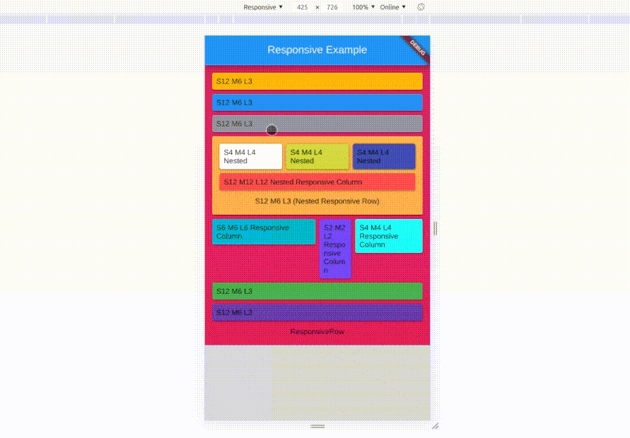
class ResponsiveExample extends StatelessWidget {
  @override
  Widget build(BuildContext context) {
    return Scaffold(
        backgroundColor: Colors.grey[350],
        appBar: AppBar(
          title: Text('Responsive Example'),
          centerTitle: true,
        ),
        body: Container(
          color: Colors.pink,
          width: MediaQuery.of(context).size.width,
          padding: EdgeInsets.all(10),
          child: Column(
            mainAxisSize: MainAxisSize.min,
            children: <Widget>[
              Responsive(
                  defaultColS: 12,
                  defaultColM: 6,
                  defaultColL: 3,
                  children: <ResponsiveChild>[
                    ResponsiveChild(
                      child: Card(
                        color: Colors.amber,
                        child: Padding(
                          padding: const EdgeInsets.all(8.0),
                          child: Text('S12 M6 L3'),
                        ),
                      ),
                    ),
                    ResponsiveChild(
                      child: Card(
                        color: Colors.blue,
                        child: Padding(
                          padding: const EdgeInsets.all(8.0),
                          child: Text('S12 M6 L3'),
                        ),
                      ),
                    ),
                    ResponsiveChild(
                      child: Card(
                        color: Colors.grey,
                        child: Padding(
                          padding: const EdgeInsets.all(8.0),
                          child: Text('S12 M6 L3'),
                        ),
                      ),
                    ),
                    ResponsiveChild(
                      child: Card(
                        child: Container(
                            padding: EdgeInsets.all(10),
                            color: Colors.orangeAccent,
                            child: Column(
                              children: <Widget>[
                                Responsive(
                                  // nested Col12 widget
                                  defaultColS: 4,
                                  defaultColM: 4,
                                  defaultColL: 4,
                                  children: <ResponsiveChild>[
                                    ResponsiveChild(
                                      child: Card(
                                        color: Colors.white,
                                        child: Padding(
                                          padding: const EdgeInsets.all(8.0),
                                          child: Text('S4 M4 L4 Nested'),
                                        ),
                                      ),
                                    ),
                                    ResponsiveChild(
                                      child: Card(
                                        color: Colors.lime,
                                        child: Padding(
                                          padding: const EdgeInsets.all(8.0),
                                          child: Text('S4 M4 L4 Nested'),
                                        ),
                                      ),
                                    ),
                                    ResponsiveChild(
                                      child: Card(
                                        color: Colors.indigo,
                                        child: Padding(
                                          padding: const EdgeInsets.all(8.0),
                                          child: Text('S4 M4 L4 Nested'),
                                        ),
                                      ),
                                    ),
                                    ResponsiveChild(
                                      colS: 12,
                                      colM: 12,
                                      colL: 12,
                                      child: Card(
                                        color: Colors.redAccent,
                                        child: Padding(
                                          padding: const EdgeInsets.all(8.0),
                                          child: Text('S12 M7 L12 Nested'),
                                        ),
                                      ),
                                    )
                                  ],
                                ),
                                Padding(
                                  padding: const EdgeInsets.all(8.0),
                                  child:
                                      Text('S12 M6 L3 (Nested Responsive Row)'),
                                )
                              ],
                            )),
                      ),
                    ),
                    ResponsiveChild(
                      colL: 4,
                      colS: 2,
                      colM: 5,
                      offsetS: 4,
                      offsetM: 1,
                      offsetL: 2,
                      child: Card(
                        color: Colors.cyan,
                        child: Padding(
                          padding: const EdgeInsets.all(8.0),
                          child: Text('S2 M5 L4 \noffset S4 M1 L2 '),
                        ),
                      ),
                    ),
                    ResponsiveChild(
                      colL: 2,
                      colS: 2,
                      colM: 2,
                      child: Card(
                        color: Colors.deepPurpleAccent,
                        child: Padding(
                          padding: const EdgeInsets.all(8.0),
                          child: Text('S2 M2 L2'),
                        ),
                      ),
                    ),
                    ResponsiveChild(
                      colL: 4,
                      colS: 4,
                      colM: 4,
                      child: Card(
                        color: Colors.cyanAccent,
                        child: Padding(
                          padding: const EdgeInsets.all(8.0),
                          child: Text('S4 M4 L4'),
                        ),
                      ),
                    ),
                    ResponsiveChild(
                      child: Card(
                        color: Colors.green,
                        child: Padding(
                          padding: const EdgeInsets.all(8.0),
                          child: Text('S12 M6 L3'),
                        ),
                      ),
                    ),
                    ResponsiveChild(
                      child: Card(
                        color: Colors.deepPurple,
                        child: Padding(
                          padding: const EdgeInsets.all(8.0),
                          child: Text('S12 M6 L3'),
                        ),
                      ),
                    ),
                  ]),
              Padding(
                padding: const EdgeInsets.all(8.0),
                child: Text('Responsive'),
              )
            ],
          ),
        ));
  }
}
responsive_ui is made simply using Wrap() and LayoutBuilder() with a bits of logics.
Metadata
Publisher
unverified uploader
Metadata
resposive_ui Flutter package helps you to create a responsive and Nested responsive widget. Works on all flutter platform (android, iOs ,web) with both portrait and landscape mode.
Repository (GitHub)
View/report issues
License
 unknown (license)