responsive_spacing 0.1.2  responsive_spacing: ^0.1.2 copied to clipboard
 thiele.dev
Make your app responsive with dynamic margin, padding, gutter, body-size & columns.
This plugin helps to design and develop beautiful responsive and adaptive flutter apps.
Lightweight, Responsive Spacing #
All design principles have roughly the same elements. For example, Material Design has a responsive 12 column system that works with margin, gutter & body.
We have developed this plugin so that you can easily create your own responsive app.
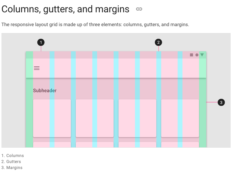
Columns, Gutters & Margins #
The responsive layout grid is made up of three elements: columns, gutters, and margins. Read everything about Columns, Gutters & Margins on the material guidelines responsive layout page.
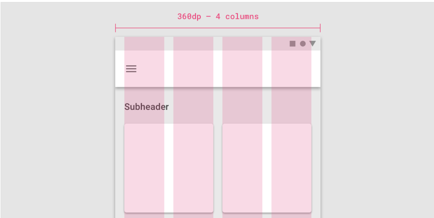
Default Sizes #
The Material Breakpoints are used for all default values.
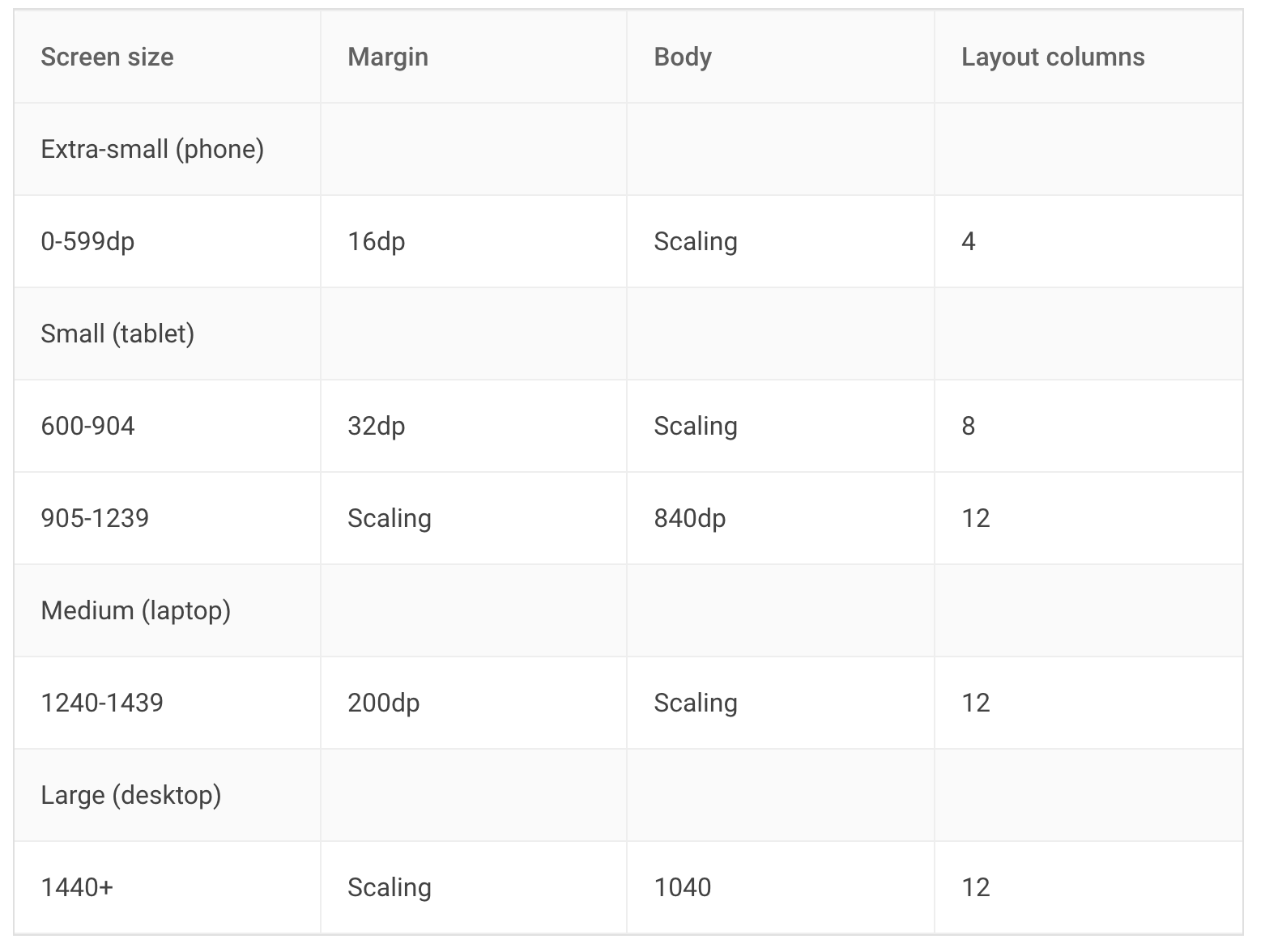
As an example, the 360 size display has 4 columns, a margin of 16, padding of 8 & gutters of 8.
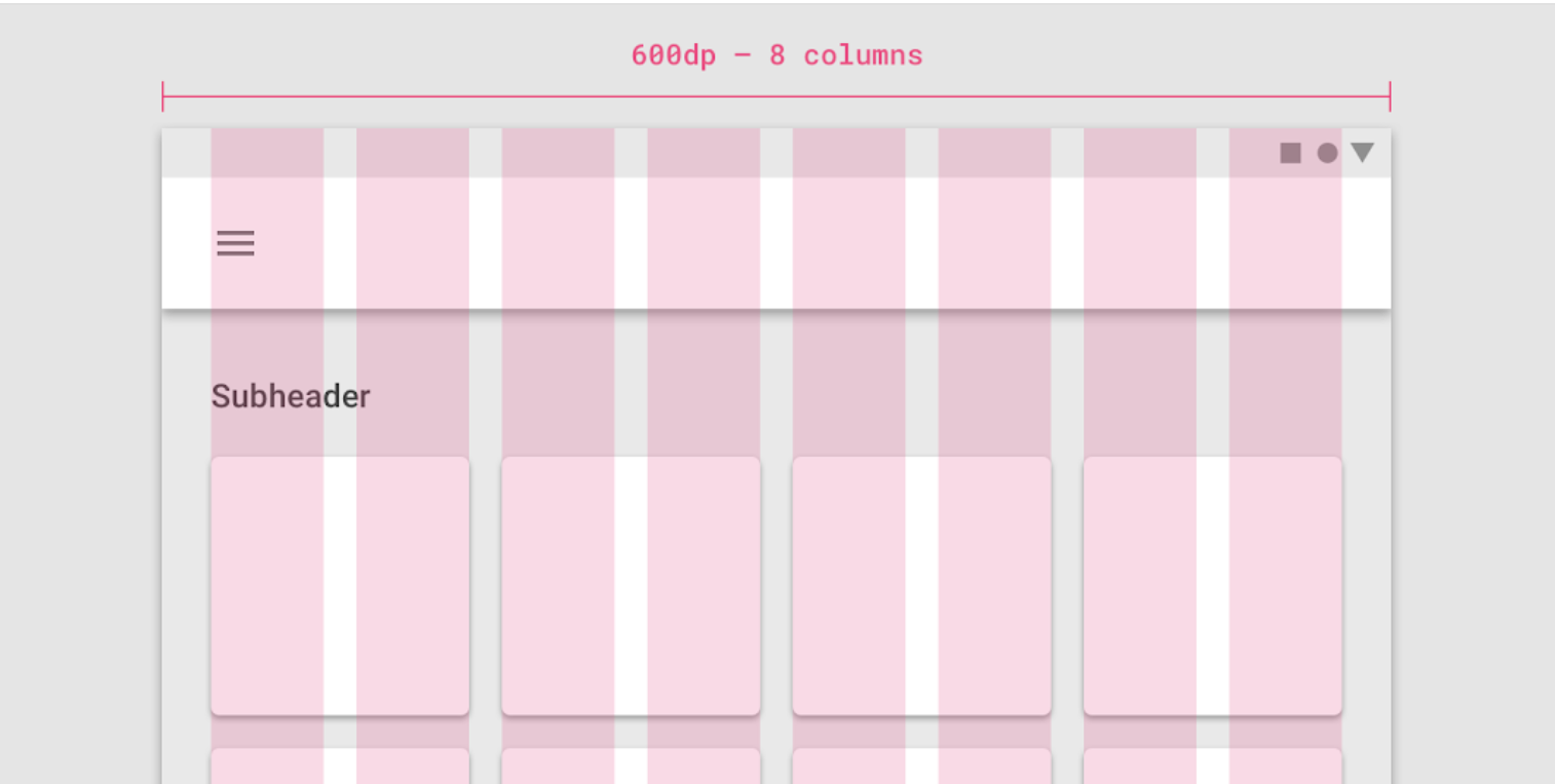
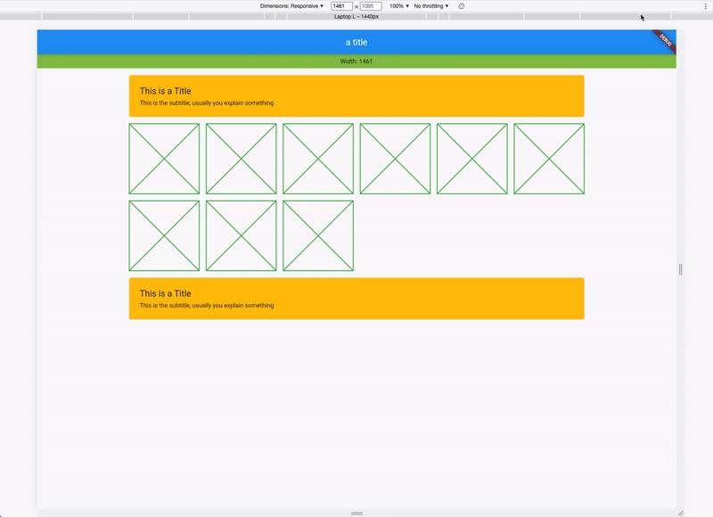
If you combine this now, you get a responsive layout. See it in action:
Data #
Everything you need is stored in the ResponsiveData class which is accessible via the context.
class ResponsiveData {
  final ScaledSize margin;
  final ScaledSize padding;
  final ScaledSize gutter;
  final ScaledSize body;
  final LayoutColumns layoutColumns;
  // ...
}
Usage #
Instead of using a Scaffold, use the ResponsiveScaffold:
ResponsiveScaffold(
  appBar: AppBar(
    title: const Text("The Title"),
  ),
  body: YourWidget()
);
And in your Widget, access the Spacing class with Spacing.of(context) which returns an object of ResponsiveData. The object has all necessary spacings.
ResponsiveData responsiveData = Spacing.of(context);
For example with a Card:
Card(
  /// Spacing outside the card
  margin: Spacing.of(context).margin.horizontalEdgeInsets,
  child: Padding(
  /// Spacing inside the card
    padding: Spacing.of(context).padding.allEdgeInsets,
    child: Column(
      crossAxisAlignment: CrossAxisAlignment.start,
      children: [
        Text("This is a Title"),
        Text("This is the subtitle, usually you explain something")
      ],
    ),
  ),
)
Available Responsive Widgets #
There are two types of widgets, the data widgets that create the spacing context and widgets that use the spacing context.
Data Widgets #
Data widgets create the spacing context and provide responsive values to all widgets created in the tree below. if there are multiple data widgets in the tree, the closest one is taken.
- ResponsiveScaffold
Widgets #
- ResponsiveCard
- ResponsiveGrid
Metadata
Publisher
Metadata
Make your app responsive with dynamic margin, padding, gutter, body-size & columns.
License
 unknown (LICENSE)