responsive_sliding_drawer 1.4.0  responsive_sliding_drawer: ^1.4.0 copied to clipboard
A responsive sliding drawer widget inspired by the official ChatGPT Android app
Responsive Sliding Drawer Flutter Widget #
A responsive sliding drawer for Flutter inspired by the official ChatGPT Android app. This widget adapts to both mobile and desktop layouts, providing smooth sliding animations and customizable behavior based on your design requirements.
Features #
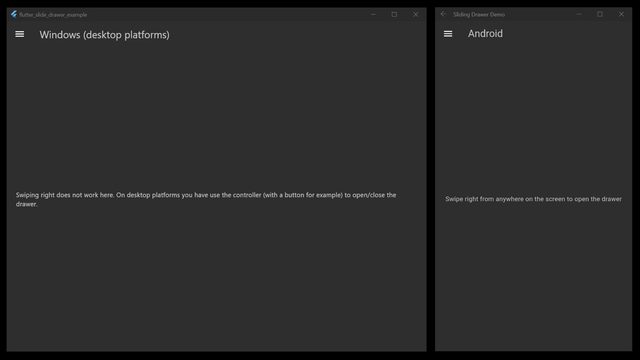
- Responsive Layout: Automatically adjusts behavior for mobile (gestures on the entire screen) and desktop (resizable drawer and distinct drag areas).
- Smooth Animations: Customizable animation duration and swipe thresholds for a fluid experience.
- Gesture Support: Easily open/close the drawer with horizontal drag gestures.
- Resizable Desktop Drawer: Drag the divider on desktop to resize the drawer within defined minimum and maximum widths.
- Custom Callbacks: Execute actions when the drawer animation completes.
Getting Started #
Prerequisites #
- Flutter 2.0 or higher
- A basic understanding of Flutter widgets and state management
Installation #
Add this package to your pubspec.yaml:
dependencies:
  sliding_drawer: ^1.0.0
Note: Replace
^1.0.0with the latest version or the version you need.
Then run:
flutter pub get
Usage #
To use the SlidingDrawer widget in your Flutter project, simply wrap your main content and drawer content shown in the example below:
import 'package:flutter/material.dart';
import 'package:responsive_sliding_drawer/responsive_sliding_drawer.dart';

void main() {
  runApp(const MyApp());
}

class MyApp extends StatelessWidget {
  const MyApp({Key? key}) : super(key: key);

  @override
  Widget build(BuildContext context) {
    return MaterialApp(
      title: 'Sliding Drawer Demo',
      theme: ThemeData(primarySwatch: Colors.blue, useMaterial3: true),
      home: const HomeScreen(),
    );
  }
}

class HomeScreen extends StatelessWidget {
  const HomeScreen({Key? key}) : super(key: key);

  @override
  Widget build(BuildContext context) {
    return SlidingDrawer(
      drawer: const DrawerContent(),
      body: const MainContent(),
    );
  }
}

class DrawerContent extends StatelessWidget {
  const DrawerContent({Key? key}) : super(key: key);

  @override
  Widget build(BuildContext context) {
    // Wrap the entire drawer content in a Material widget.
    return Material(
      child: Container(
        color: Colors.blueGrey[100],
        child: ListView(
          children: [
            DrawerHeader(
              decoration: const BoxDecoration(color: Colors.blue),
              child: Text(
                'Drawer Header',
                style: Theme.of(
                  context,
                ).textTheme.titleLarge?.copyWith(color: Colors.white),
              ),
            ),
            ListTile(
              leading: const Icon(Icons.home),
              title: const Text('Home'),
              onTap: () {
              },
            ),
            ListTile(
              leading: const Icon(Icons.settings),
              title: const Text('Settings'),
              onTap: () {
              },
            ),
          ],
        ),
      ),
    );
  }
}

class MainContent extends StatelessWidget {
  const MainContent({Key? key}) : super(key: key);

  @override
  Widget build(BuildContext context) {
    return Scaffold(
      appBar: AppBar(title: const Text('Sliding Drawer Example')),
      body: const Center(
        child: Text('Swipe right from the left edge to open the drawer'),
      ),
    );
  }
}
Customization Options #
When creating a SlidingDrawer, you can customize its behavior and appearance using the following parameters:
animationDuration: The duration of the open/close animation.openRatio: The fraction of the screen width that the drawer covers when fully open on mobile.desktopOpenRatio: The fraction of the screen width for the open drawer on desktop devices.desktopMinDrawerWidth&desktopMaxDrawerWidth: The minimum and maximum widths allowed for the drawer on desktop devices.swipeVelocityThreshold: The minimum swipe velocity required to trigger the open/close action.dragPercentageThreshold: The drag percentage needed to complete an open/close action if the swipe velocity is low.onAnimationComplete: A callback function that is called once the drawer has finished animating.dividerWidth: The width of the draggable divider between the drawer and the body on desktop devices.centerDivider: A boolean that determines whether the divider is centered along the edge of the open drawer.controller: An optionalSlidingDrawerControllerthat allows you to programmatically open, close, or toggle the drawer.desktopDragAreaWidth: The width of the draggable area on desktop devices, allowing you to customize the zone from which you can swipe to open the drawer.scrimColor: The base color used for the scrim overlay on mobile devices.scrimColorOpacity: The maximum opacity (0.0 to 1.0) of the uniform scrim overlay when the drawer is fully open.scrimGradientStartOpacity: The opacity (0.0 to 1.0) at the left edge of the scrim overlay gradient, which creates the hovering effect.scrimGradientWidth: The width of the left-edge gradient strip on mobile devices.
Additional Information #
- Issues: If you encounter any problems or have suggestions, please open an issue on the issue tracker.
- License: This project is licensed under the MIT License - see the
LICENSEfile for details.
Feel free to open a pull request if you’d like to add more features or improve the widget. Happy coding!
Metadata
Publisher
unverified uploader
Weekly Downloads
Metadata
A responsive sliding drawer widget inspired by the official ChatGPT Android app
Repository (GitHub)
View/report issues
License
 unknown (license)