radial_progress 0.1.0  radial_progress: ^0.1.0 copied to clipboard
A Flutter library for displaying progress as a circle chart with the ability to dynamize the percentage of progress and personalization

Radial Progress #

Use radial_progress package to display pie charts with dynamic progress percentage by enabling animation
Where is it used? #
- In applications that display currency and gold rates to the user
- In sports applications that calculate the length of a period of time
- In applications that provide diet to the user
- In educational applications in order to display the student's academic progress
- In store applications in the shopping cart section
- ...
📈 📉 🎛 📱
Install Package #
Add the following line to your pubspec.yaml under dependencies:
dependencies:
  radial_progress: ^0.1.0
Then run:
flutter pub get
Usage #
Import it
import 'package:radial_progress/radial_progress.dart';
Now in your flutter code, you can use:
- The
percentshould be between 0.0 and 1.0. - If you don't specify the
diameter, it defaults to 80. - By default, the
progressLineWidthis 10. You can change it, but the maximum limit is up to one third of the diameter. - Animation is enabled by default. You can set a duration for it or disable it.
- Feature
progressLineColorsis nullable. For the color of the progress line, you can consider a list of colors. Depending on thepercentfeature, this line can take one of the colors from the list. If the progress rate is 0%, the color in zeroth index will be taken, and if the progress percentage is 100%, the color of the last index will be taken. - The
startAngleattribute specifies the starting point or the angle of drawing the progress line. That is a enum.
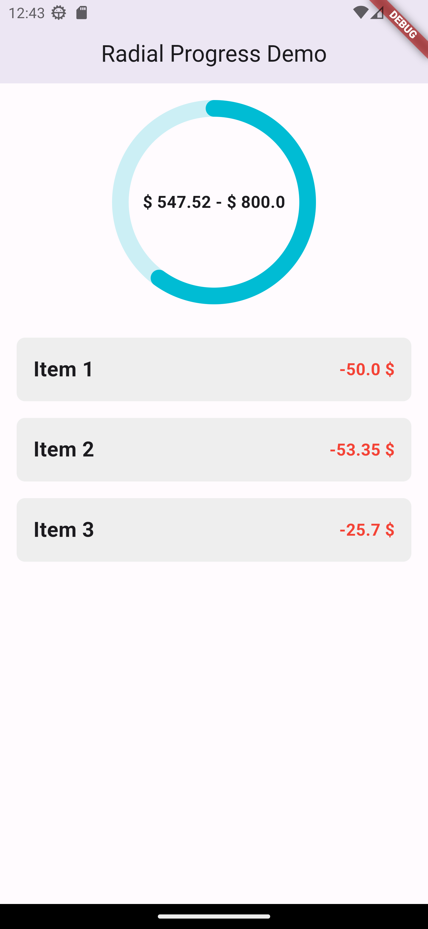
RadialProgressWidget(
  percent: 0.35,
  diameter: 180,
  bgLineColor: Colors.cyan.withOpacity(0.2),
  progressLineWidth: 16,
  startAngle: StartAngle.top,
  centerChild: const Text(
    '\$ 547.52 - \$ 800.0',
    maxLines: 1,
    style: TextStyle(
      fontSize: 16,
      fontWeight: FontWeight.bold,
    ),
  ),
);
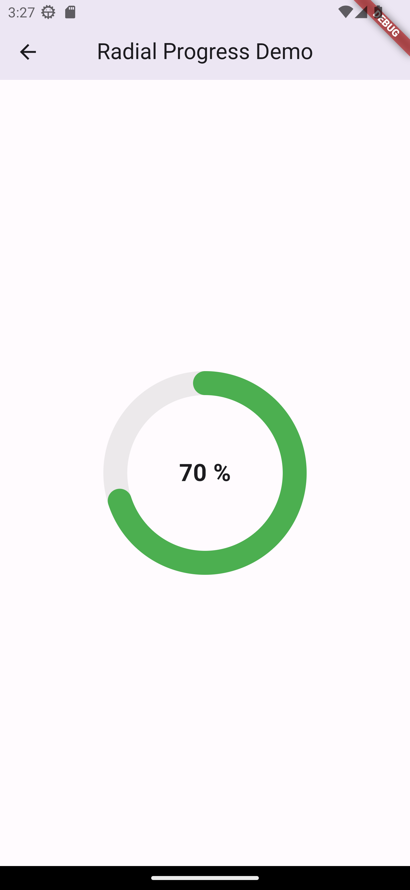
RadialProgressWidget(
  percent: 0.7,
  diameter: 180,
  bgLineColor: Colors.grey.withOpacity(0.2),
  progressLineWidth: 24,
  startAngle: StartAngle.top,
  progressLineColors: const [
    Colors.green,
  ],
  centerChild: const Text(
    '70 %',
    maxLines: 1,
      style: TextStyle(
        fontSize: 24,
        fontWeight: FontWeight.bold,
      ),
  ),
);
by Shervin Hassanzadeh #
Contact me at
Metadata
3
likes
140
pub points
68%
popularity
Publisher
unverified uploader
Metadata
A Flutter library for displaying progress as a circle chart with the ability to dynamize the percentage of progress and personalization
Repository (GitHub)
View/report issues
Documentation
License
 MIT (LICENSE)