pretty_button 0.0.2  pretty_button: ^0.0.2 copied to clipboard
 dhartichauhan.blogspot.com
A pretty and customizable button for your flutter project. Flutter 3d button with minimal design and highly customizable. It can be use as a 3d button and also you can customize it.
pretty_button #
pretty_button a pretty and customizable 3D button for your flutter project.
Platform Support #
| Android | iOS | Web | MacOS | Linux | Windows |
|---|---|---|---|---|---|
| ✅ | ✅ | ✅ | ✅ | ✅ | ✅ |
 android |
 ios |
 macos |
 web |
Installation #
Add it as a dependency in their pubspec.yaml:
- Add the latest version of package to your pubspec.yaml (and run
dart pub get):
dependencies:
pretty_button: ^0.0.2
- Import the package and use it in your Flutter App.
import 'package:fancy_containers/fancy_containers.dart';
Customizations #
| Attribute | Type | Default | Description |
|---|---|---|---|
topShadowColor |
Color |
onPrimary |
shadow color of top and left side, defaults to onPrimary |
bottomShadowColor |
Color |
primary |
Shadow color of bottom and right side, defaults to primary |
backgroundColor |
Color |
outlineVariant |
The background color of button, defaults to outlineVariant |
innerPadding |
Double |
8 |
Padding of child widget, defaults to 8 |
outerPadding |
Double |
8 |
Padding of button widget, defaults to 8 |
blurRadius |
Double |
8 |
The blur radius of the button, defaults to 8 |
spreadRadius |
Double |
2 |
The spread radius of the button, defaults to 2 |
height |
Double |
50 |
Height of the button, defaults to 50 |
width |
Double |
150 |
Width of the button defaults to 150, |
borderRadius |
Double |
15 |
The border radius of the button, defaults to 15 |
isDisable |
Bool |
false |
You can make button disable by making it true, defaults to false |
onTap |
Function |
Button press handler, required* | |
child |
Widget |
Inner content for the button, required* |
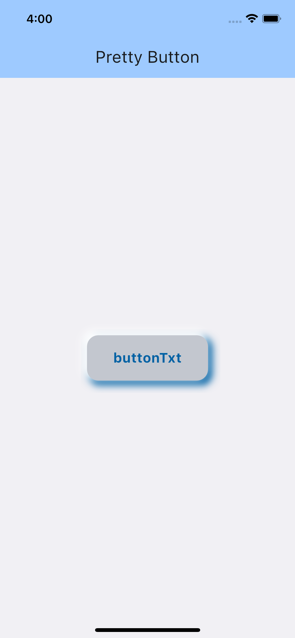
Usage #
...
import 'package:pretty_button/pretty_button.dart';
...
PrettyButton(
  innerPadding: const EdgeInsets.all(8.0),
  outerPadding: const EdgeInsets.all(8.0),
  width: 150,
  height: 50,
  blurRadius: 8,
  spreadRadius: 2,
  borderRadius: 15,
  topShadowColor: Theme.of(context).colorScheme.onPrimary,
  bottomShadowColor: Theme.of(context).colorScheme.primary,
  backgroundColor: Theme.of(context).colorScheme.outlineVariant,
  onTap: (finish) {
    print('On tap called');
  },
  child: Text(
    'buttonTxt',
    style: TextStyle(color: Theme.of(context).colorScheme.primary, fontSize: 18,fontWeight: FontWeight.bold),
  ),
);
Check example folder for more.
Main Contributors #
 Dharti Chauhan |
Metadata
21
likes
0
points
45
downloads
Publisher
Weekly Downloads
Metadata
A pretty and customizable button for your flutter project. Flutter 3d button with minimal design and highly customizable. It can be use as a 3d button and also you can customize it.
Homepage
Repository (GitHub)
View/report issues
License
 unknown (license)
Dependencies
flutter, flutter_web_plugins, plugin_platform_interface