pie_timer 1.0.0  pie_timer: ^1.0.0 copied to clipboard
Customizable Timer package with a pie animation.
Customizable Timer package with a pie animation for Flutter.
This package can render a circular countdown timer with animated pie-shaped progress.
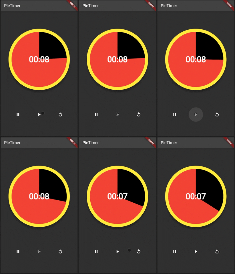
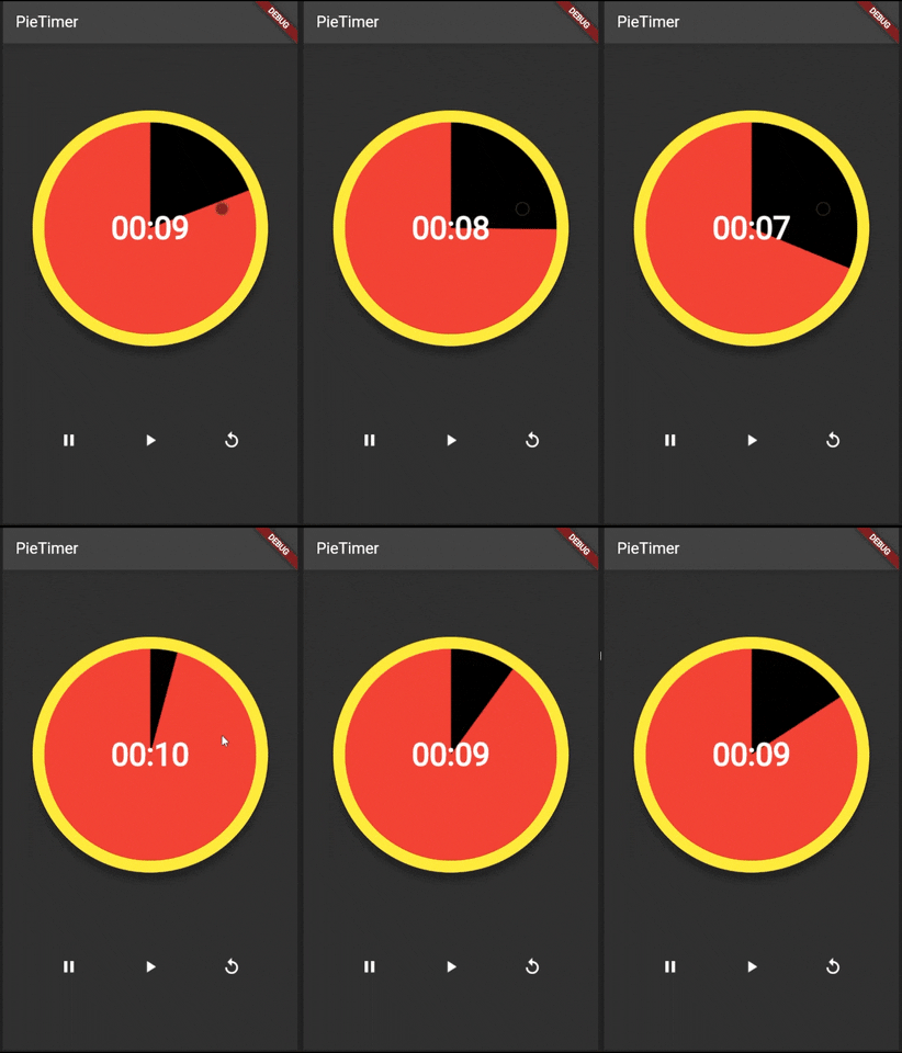
Preview #
Please check the bottom for more previews.
Features #
- Countdown any duration.
- Change progress direction, forward or reverse.
- Customizable colors, widths, radius, shadow and text style.
- Callback functions when animation is completed or dismissed.
- Custom AnimationController to reach the controller functions.
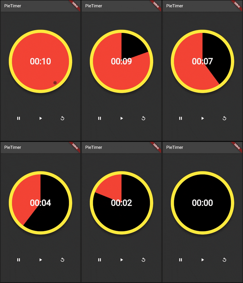
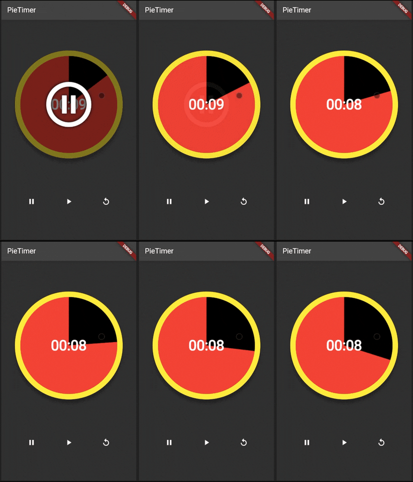
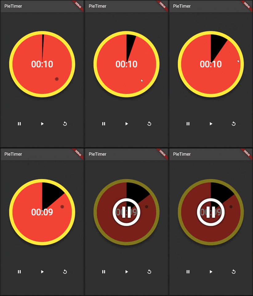
- Built-in GestureDetector. Tap to alternate between play and pause. Long tap to reset the animation.
Parameters #
| Name | Type | Default Value | Description |
|---|---|---|---|
key |
Key |
null |
Key for PieTimer. |
pieAnimationController |
PieAnimationController? |
null |
Controls (Start, Pause, Restart) for external buttons. |
duration |
Duration |
required |
Countdown duration. |
radius |
double |
required |
To determine the size of the pie. |
pieColor |
Color |
required |
Background (fill) color of the pie. |
fillColor |
Color |
required |
Pie progress color. |
borderColor |
Color? |
null |
Sets borderColor. If null then there will be no border. |
borderWidth |
double? |
null |
Sets borderWidth. If null then there will be no border |
enableShadow |
bool? |
false |
If this option enabled only, defult shadow values are used |
shadowColor |
Color? |
Colors.black |
Sets shadowColor. |
shadowBlur |
double? |
5.0 |
Sets shadowBlur. |
shadowRadius |
double? |
0.0 |
Sets shadowRadius. Adds extra radius to original radius of the pie. |
isReverse |
bool |
false |
Sets the direction of pie progress. False is Clockwise, True is Anti-Clockwise. |
textStyle |
TextStyle? |
null |
TextStyle of timer text. |
enableTouchControls |
bool? |
false |
Enable start, stop, etc. on touch of Pie Widget. |
onCompleted |
VoidCallback? |
null |
Function to run when animation status is completed. |
onDismissed |
VoidCallback? |
null |
Function to run when animation status is dismissed. |
Getting started #
Add pie_timer as a dependency in your pubspec.yaml file.
Usage #
Without the PieAnimationController. #
PieTimer(
    duration: const Duration(seconds: 10),
    radius: 150,
    fillColor: Colors.red,
    pieColor: Colors.black,
    borderColor: Colors.yellow,
    borderWidth: 15,
    enableShadow: true,
    shadowColor: Colors.black,
    shadowBlur: 5.0,
    shadowRadius: 1.0,
    textStyle: const TextStyle(
        color: Colors.white,
        fontSize: 40,
        fontWeight: FontWeight.bold,
    ),
    isReverse: false,
    onCompleted: () => {},
    onDismissed: () => {},
    enableTouchControls: true,
),
With PieAnimationController #
Please refer to /example folder to see how to use.
Additional information #
Please feel free to contribute.
A video on how did this package is developed will be uploaded on Youtube soon.
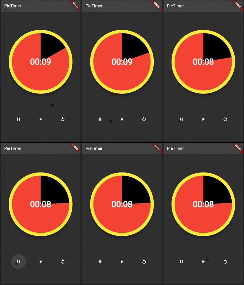
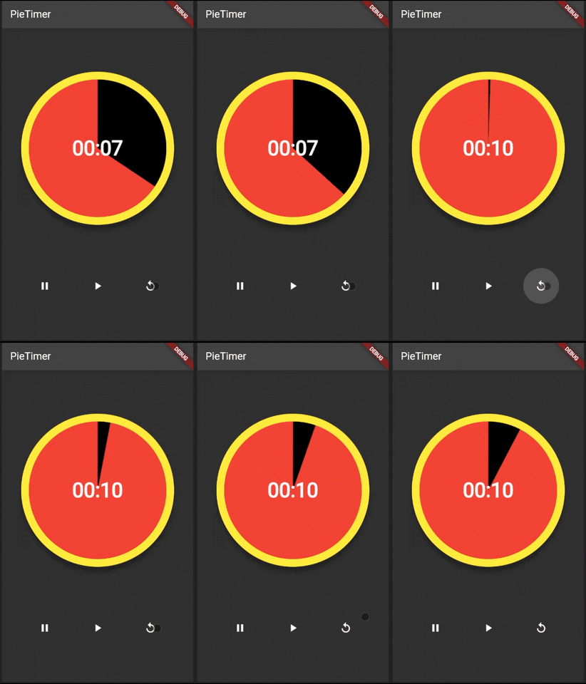
Previews With Controllers #
GestureDetector Preview #
Controls With Buttons Preview #
