pie_menu 2.0.0  pie_menu: ^2.0.0 copied to clipboard
A Flutter package that provides a highly customizable circular/radial context menu
Flutter Pie Menu 🥧 #

A Flutter package that provides a highly customizable circular/radial context menu similar to Pinterest's
Click here to try Flutter Pie Menu online!
 |
 |
 |
|---|
Usage #
Wrap the widget that should respond to gestures with the PieMenu widget, and provide the menu with an array of PieActions to display as menu buttons.
PieMenu(
  onPressed: () => print('pressed'),
  actions: [
    PieAction(
      tooltip: const Text('like'),
      onSelect: () => print('liked'),
      child: const Icon(Icons.favorite), // Can be any widget
    ),
  ],
  child: ChildWidget(),
),
Then wrap your page (or any other desired widget for drawing pie buttons and a background overlay) with PieCanvas widget.
💡 Note that you can only use the
PieMenuwithin the sub-hierarchy of aPieCanvaswidget.
For instance, if you want the menu to be displayed at the forefront, you can wrap your Scaffold with a PieCanvas like following:
PieCanvas(
  child: Scaffold(
    body: YourScaffoldBody(
      ...
        PieMenu(),
      ...
    ),
  ),
),
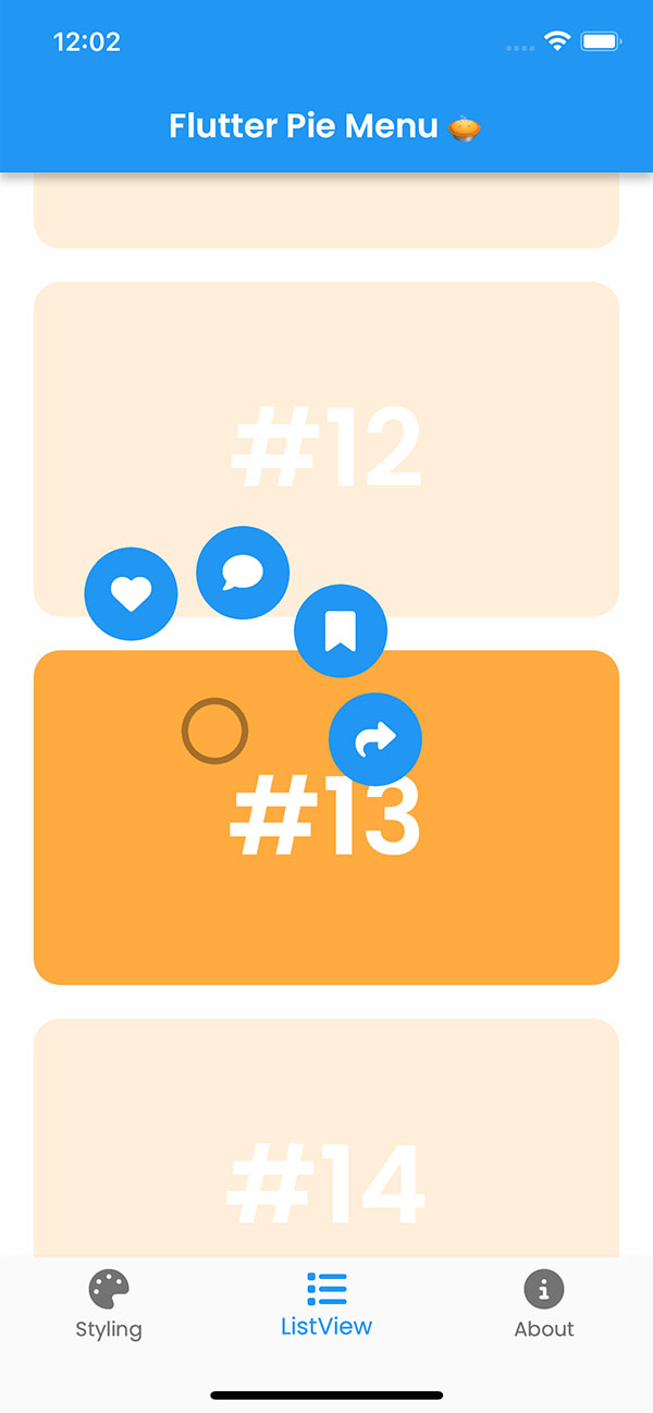
Using with scrollable and interactive widgets #
⚠️ If you want to use
PieMenuinside a scrollable view like aListView, or your widget is already interactive with other gestures, you might need to pay attention to this section.
PieCanvas and PieMenu widgets have functional callbacks named onMenuToggle and onToggle respectively, which are triggered when PieMenu visibility changed. Using these callbacks, you can prevent your scrollable or interactive widget's default behavior in order to give the control to PieMenu.
💡 You can utilize the
onPressedcallback defined inPieMenuto manage tap events without the need for an extra widget such asGestureDetector.
💡 As for the scrollables, there is an issue with Flutter framework related to
ScrollConfiguration, so automatically disabling scroll may not be an option until this issue is resolved.
Store the active parameter of the callbacks in your state and use it whenever you need to.
bool _menuActive = false;

@override
Widget build(BuildContext context) {
  return PieCanvas(
    onMenuToggle: (active) {
      setState(() => _menuActive = active);
    },
    ...
  );
}
For example, you can decide whether scrolling should be enabled or not using this variable.
ListView(
  // Disable scrolling if a PieMenu is active
  physics: _menuActive
      ? NeverScrollableScrollPhysics()
      : null, // Uses the default physics
  ...
);
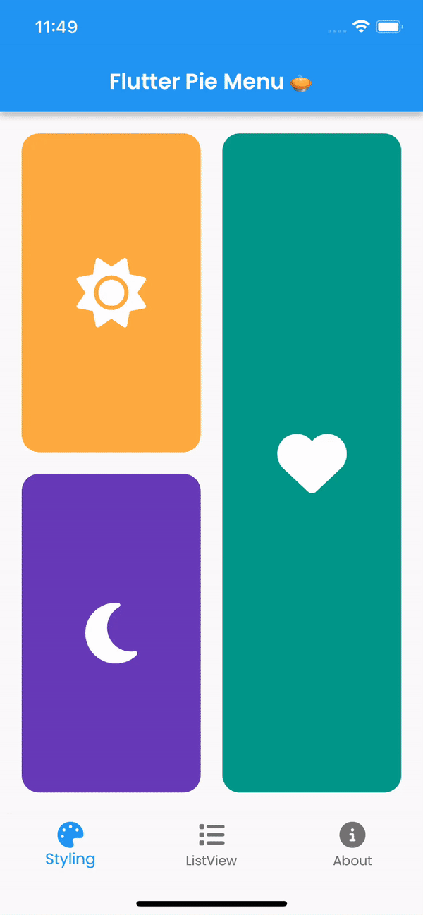
Customization #
You can customize the appearance and behavior of menus using PieTheme.
Using the theme attribute of PieCanvas widget, you can specify a theme for all the PieMenu widgets that inherit the canvas.
PieCanvas(
  theme: PieTheme(),
  ...
    PieMenu(), // Uses the canvas theme
  ...
    PieMenu(), // Uses the canvas theme
  ...
),
But if you want to specify menu specific themes, you can also use the theme attribute of PieMenu widget.
PieMenu(
  theme: PieTheme(), // Overrides the canvas theme
),
It is also possible to copy the canvas theme with additional parameters, but make sure you are accessing it with the right context.
PieMenu(
  theme: PieTheme.of(context).copyWith(
    ...
  ),
),
Button themes #
Buttons' background and icon colors are defined by theme's buttonTheme and buttonThemeHovered. You can create a custom PieButtonTheme instances for your canvas and menu themes.
PieTheme(
  buttonTheme: PieButtonTheme(),
  buttonThemeHovered: PieButtonTheme(),
),
You can even give the buttons custom styles using decoration property of PieButtonTheme.
PieButtonTheme(
  decoration: BoxDecoration(),
),
Custom button widgets #
If you wish to use custom widgets inside buttons instead of just icons, it is recommended to use PieAction.builder() with a builder which provides whether the action is hovered or not.
PieAction.builder(
  tooltip: const Text('like'),
  onSelect: () => print('liked'),
  builder: (hovered) {
    return Text(
      '<3',
      style: TextStyle(
        color: hovered ? Colors.green : Colors.red,
      ),
    );
  },
),
Display the menu on tap instead of long press #
If you wish to show the menu as soon as the child is pressed, you may set delayDuration of your theme to Duration.zero.
PieTheme(
  delayDuration: Duration.zero,
),
Display the menu on right click #
Using rightClickShowsMenu and leftClickShowsMenu attributes of PieTheme, you can customize the mouse button behavior.
PieTheme(
  rightClickShowsMenu: true,
  leftClickShowsMenu: false,
),
Adjust display angle of menu buttons #
If you don't want the dynamic angle calculation and have the menu appear at a fixed angle, you can set customAngle and customAngleAnchor attributes of PieTheme.
PieTheme(
  customAngle: 90, // In degrees
  customAngleAnchor: PieAnchor.center, // start, center, end
),
You can also use customAngleDiff or spacing to adjust the angle between buttons, and angleOffset to rotate the menu.
Contributing #
Pull requests are welcome. For major changes, please open an issue first to discuss what you would like to change.
Metadata
Publisher
unverified uploader
Weekly Downloads
Metadata
A Flutter package that provides a highly customizable circular/radial context menu
Repository (GitHub)
View/report issues
Funding
Consider supporting this project:
buymeacoffee.com
License
 unknown (license)