persian_modal_date_picker 0.0.3  persian_modal_date_picker: ^0.0.3 copied to clipboard
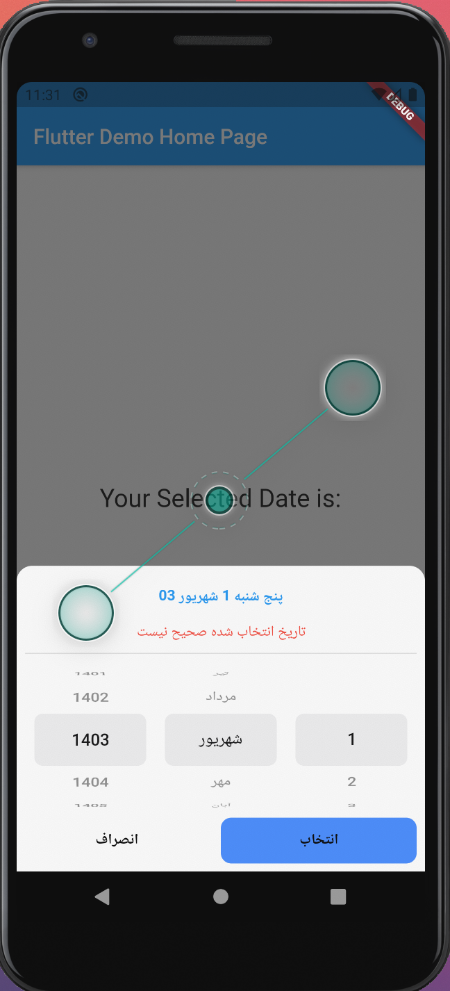
Persian modal date picker. You can use this package to select Jalali date using `BottomModalSheet`
Persian Modal Date Picker #
Persian_Modal_Date_Picker is a modal date picker which is used to select Jalali date.
- Jalali Date
- Set initial date
- Forward/backward selector
- Use custom validator for date

Usage #
await showPersianDatePicker(
      context,
      (context, Date date) async {
        setState(() {
          _selectedDate = date;
        });
        Navigator.of(context).pop();
      },
      forwardYear: true,
      border: BorderRadius.only(
          topRight: Radius.circular(15), topLeft: Radius.circular(15)),
      validate: (ctx, date) {
        return date.year < 1402;
      },
      submitButtonStyle: defaultButtonsStyle.copyWith(
        text: 'انتخاب',
        backgroundColor: Colors.blueAccent,
        radius: 10,
      ),
    );
Parameters #
showPersianDatePicker(context, onSubmit, {/* ohter optional parameter*/});
| Parameters | Type | Is Required | Description |
|---|---|---|---|
| context | BuildContext | Yes | |
| onSubmit | Future | Yes | Callback function when a date is selected |
| initYear | int | No | Initial the Date Picker with optional date. Note that, this works when initMonth and initDay are provided. |
| initMonth | int | No | As the same as initYear |
| initDay | int | No | As the same as initYear |
| border | BorderRadiusGeometry | No | Optional BorderRadius |
| yearDirection | YearDirection | No | select year direction. Values are YearDirection.backward, YearDirection.forward and YearDirection.both |
| backgroundColor | Color | No | |
| margin | EdgeInsets | No | Date Picker margin |
| submitButtonStyle | ButtonsStyle | No | Style of submit bottom |
| cancelButtonStyle | ButtonsStyle | No | Style of cancel bottom |
| validate | bool Function(BuildContext context, Jalali date) | No | You can provide a validate function to check if the selected date is correct or not |
The ButtonsStyle class
| Parameters | Type | Is Required | Description |
|---|---|---|---|
| backgroundColor | Color | No | Default value is Colors.white |
| textColor | Color | No | Default value is Colors.black |
| radius | double | No | Default value is 5.0 |
| visible | bool | No | Default value is true |
| text | String | Yes | Default value is '' |
Getting Started #
This project is a starting point for a Dart package, a library module containing code that can be shared easily across multiple Flutter or Dart projects.
For help getting started with Flutter, view our online documentation, which offers tutorials, samples, guidance on mobile development, and a full API reference.