pencil_field 0.1.2  pencil_field: ^0.1.2 copied to clipboard
 smarterthanpaper.com
Widget for pencil / stylus input on different devices and platforms. It is intended for any freehand input like signatures or drawings and supports full persistence of the input.
FLUTTER PENCIL FIELD
pencil_field #
Widget for pencil / stylus input on different devices and platforms. This widget is intended for any freehand input like signatures or drawings.
How to use #
The PencilField can be embedded in any screen (in this case in a StatefulWidget):
PencilField(
  controller: widget.controller,
  pencilPaint: pencilPaint,
  onPencilDrawingChanged: widget.onPencilDrawingChanged,
  decoration: PencilDecoration(
    type: PencilDecorationType.chequered,
    backgroundColor: Colors.white,
    patternColor: Colors.grey[300]!,
    numberOfLines: 10,
    lineWidth: 2,
    padding: const EdgeInsets.all(10),
  ),
  pencilOnly: true,
)
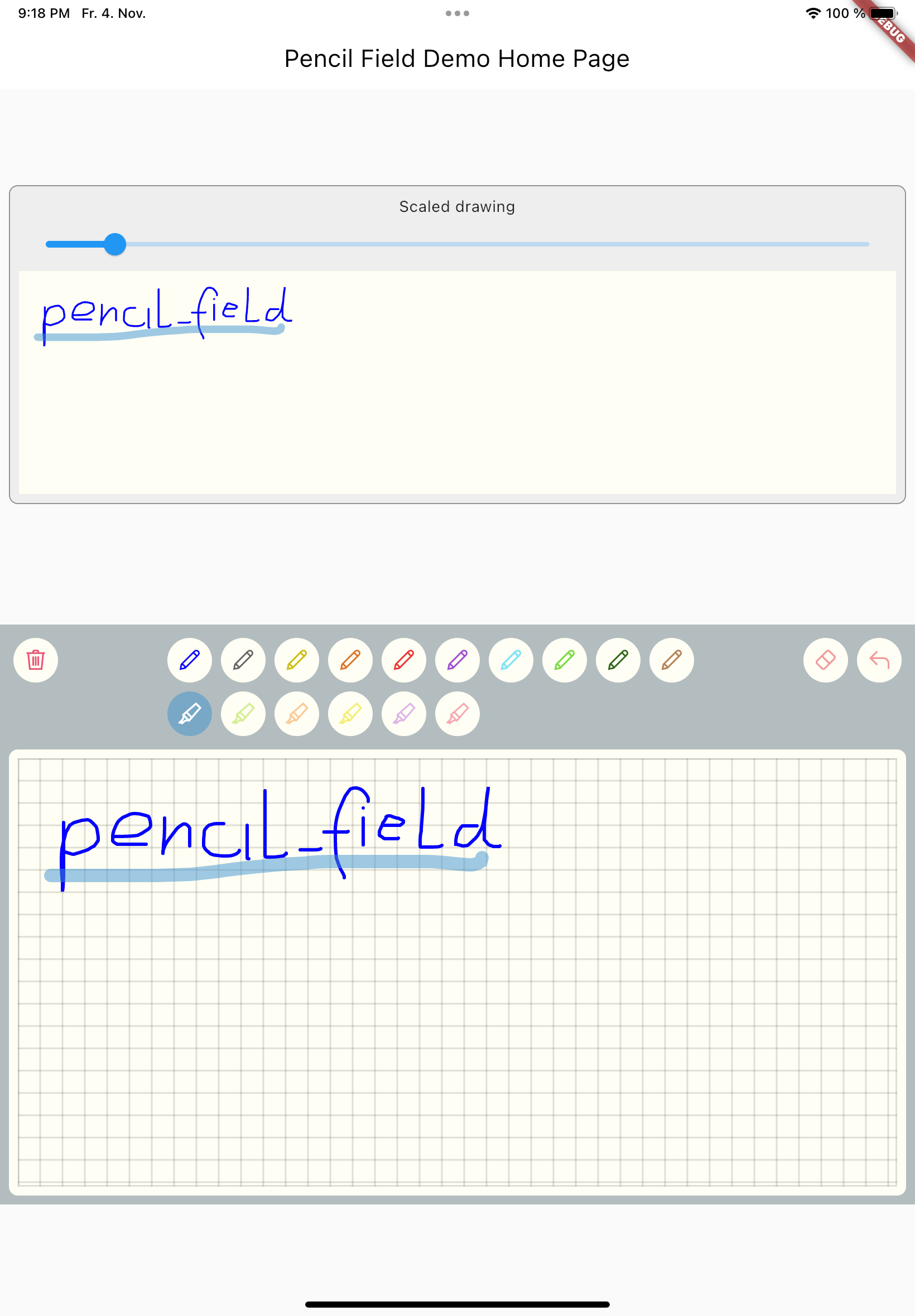
And resulting input can be displayed like so (also embedded in a StatefulWidget). As everything is stored in vector format scaling (e.g. for creating previews) is easy:
PencilDisplay(
  pencilDrawing: widget.controller.drawing.scale(
    scale: scale,
  ),
  decoration: PencilDecoration(backgroundColor: Colors.white),
)
Features #
PencilField #
| Name | Type | Default | Description |
|---|---|---|---|
| key | Key? |
Assign key to PencilField widget | |
| controller | PencilController |
Always required | Controller to interact with the widget during user input |
| pencilPaint | PencilPaint |
Always required | The paint that will be used for the current interaction |
| decoration | PencilDecoration? |
Blank decoration | Style of the background (see below) |
| onPencilDrawingChanged | OnPencilDrawingChanged? |
Callback when the content of the drawing changes | |
| pencilOnly | bool |
false | If set to true only input from pen devices is used |
PencilFieldDecoration #
| Name | Type | Default | Description |
|---|---|---|---|
| type | PencilDeorationType |
blank | Type of decoration. It can either be blank, chequered, lines, dots. Examples can be found in test folder. |
| padding | EdgeInsets |
EdgeInsets.all(0) | Inner space of the decoration. The pattern will only be drawn inside |
| backgroundColor | Color |
Colors.transparent | Color of the background. |
| patternColor | Color |
Colors.black54 | Color of the pattern |
| lineWidth | double |
1.0 | Line width for the pattern. In case of dots this is used for the radius. |
| numberOfLines | int |
0 | Number of lines. In case of the chequered pattern the vertical distance is used for the horizontal distance as well. |
PencilDisplay #
| Name | Type | Default | Description |
|---|---|---|---|
| key | Key? |
Assign key to PencilField widget | |
| pencilDrawing | PencilDrawing |
Always required | The drawing that shall be displayed |
| decoration | PencilDecoration? |
Style of the background. | |
PencilDrawing #
| Name | Type | Default | Description |
|---|---|---|---|
| strokes | <PencilStrokes>[] |
Always required | Initial set of strokes. Can be an empty array. |
PencilDrawing also lets you save (toJson) and load (fromJson) a drawing. It also provides its own versioning mechanism to ensure
compatibility with future version.
Additional information #
A full example is provided in the repository.
Upcoming features #
- Additional eraser that only erases strokes within a circle
- Pan support for the input widget and the display widget
- Pinch support for the display widget
- Input widget decoration that supports images as background
Metadata
Publisher
Weekly Downloads
Metadata
Widget for pencil / stylus input on different devices and platforms. It is intended for any freehand input like signatures or drawings and supports full persistence of the input.
Repository (GitHub)
View/report issues
License
 unknown (license)
Dependencies
More
Packages that depend on pencil_field
Packages that implement pencil_field