otp_plus 1.0.1  otp_plus: ^1.0.1 copied to clipboard
A Flutter package that auto-fills OTPs from SMS or other sources into text fields, enabling seamless user authentication and improving the sign-in experience.
otp_plus #
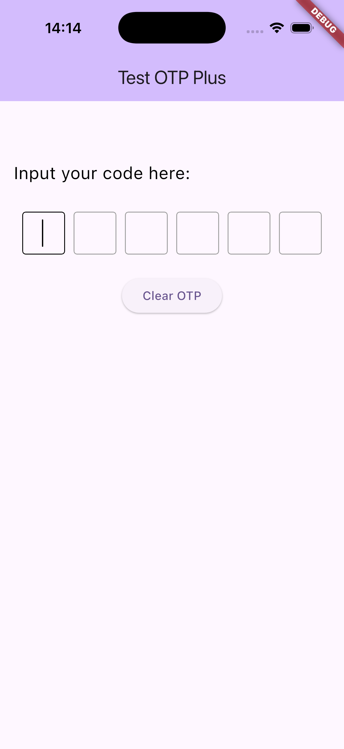
A customizable Flutter OTP (One-Time Password) input widget package inspired by popular pin code
fields libraries. otp_plus offers enhanced flexibility, styling, and input management for OTP or
PIN entry, supporting both individual input boxes and paste detection with seamless input
distribution.
Features #
- Multiple OTP input fields with customizable length
- Paste support with automatic digit splitting across fields
- Obscured input option (e.g., for password-style OTP)
- Flexible styling: shape (square, underline, circle), size, spacing
- Keyboard navigation and backspace focus handling
- Customizable cursor appearance and behavior
- RTL and LTR text direction support
- Complete control over input decoration and text style
- Callback on OTP completion to easily handle entered codes
![OTP Plus Demo]
Installation #
Add this to your pubspec.yaml:
dependencies:
  otp_plus: ^1.0.1
Then run:
flutter pub get
Usage #
import 'package:flutter/material.dart';
import 'package:otp_plus/otp_plus_inputs.dart'; // Adjust the import path accordingly

class MyOtpScreen extends StatelessWidget {
  @override
  Widget build(BuildContext context) {
    return Scaffold(
      appBar: AppBar(title: Text('Enter OTP')),
      body: Center(
        child: OtpPlusInputs(
          size: 50,
          length: 6,
          shape: OtpFieldShape.square,
          textDirection: TextDirection.ltr,
          onChanged: (code) {
            debugPrint('On Changed : $code');
          },
          onSubmit: (code) {
            debugPrint('On Submit : $code');
          },
          //Add optional values here
          onCompleted: (code) {
            // Add OTP verification logic here
            debugPrint('OTP entered: $code');
          },
        ),
      ),
    );
  }
}
API Reference #
OtpPlusInputs #
| Parameter | Type | Description | Default |
|---|---|---|---|
shape |
OtpFieldShape |
Shape of each OTP input field (square, underline, circle). |
Required |
length |
int |
Number of OTP digits to input. | Required |
textStyle |
TextStyle? |
Custom text style for digits. | null |
decoration |
InputDecoration? |
Custom decoration for each field. | Defaults based on shape |
obscureText |
bool |
Whether to obscure text input. | false |
obscuringCharacter |
String |
Character to show when obscuring input. | '*' |
spacing |
double |
Horizontal spacing between fields. | 12 |
size |
double |
Width and height of each input box. | 50 |
runSpacing |
double |
Vertical spacing when inputs wrap to the next line. | 12 |
textDirection |
TextDirection |
Text direction (LTR or RTL). | TextDirection.ltr |
cursorColor |
Color |
Color of the input cursor. | Colors.black |
enabled |
bool? |
Enable or disable input fields. | true |
ignorePointers |
bool? |
Ignore pointer events on input fields. | false |
cursorWidth |
double |
Width of the input cursor. | 1.5 |
cursorHeight |
double? |
Height of the input cursor. | null |
cursorRadius |
Radius? |
Radius of cursor corners. | null |
cursorOpacityAnimates |
bool? |
Animate cursor opacity. | null |
undoController |
UndoHistoryController? |
Undo history controller. | null |
textInputAction |
TextInputAction? |
Keyboard action button type (next/done). | null |
textCapitalization |
TextCapitalization |
Capitalization behavior for input. | TextCapitalization.none |
style |
TextStyle? |
Override text style for input. | null |
strutStyle |
StrutStyle? |
Override strut style for input. | null |
textAlign |
TextAlign |
Text alignment within each input box. | TextAlign.center |
textAlignVertical |
TextAlignVertical |
Vertical text alignment within each box. | TextAlignVertical.center |
contentPadding |
EdgeInsets? |
Inner padding for input fields. | Default symmetric padding |
onCompleted |
void Function(String)? |
Callback when all OTP digits are entered. | null |
borderColor |
Color? |
Border color in default state. | Colors.grey |
focusedBorderColor |
Color? |
Border color when focused. | Colors.black |
errorBorderColor |
Color? |
Border color when error occurs. | Colors.red |
OtpFieldShape #
Defines the visual style of the OTP input fields:
square: Square bordered fieldsunderline: Underline stylecircle: Circular bordered fields
Notes #
- Paste handling currently does not support web platform due to clipboard API limitations.
- The widget automatically manages focus navigation between fields on input and backspace key presses.
- Use
onCompletedto capture the final OTP code when all fields are filled. - The widget uses
TextInputFormatterto restrict input to single digits.
Contribution #
Contributions and improvements are welcome! Feel free to open issues or pull requests.
License #
This project is licensed under the MIT License.
Metadata
Publisher
unverified uploader
Weekly Downloads
Metadata
A Flutter package that auto-fills OTPs from SMS or other sources into text fields, enabling seamless user authentication and improving the sign-in experience.
Repository (GitHub)
View/report issues
License
 unknown (license)