orient_ui 0.7.0  orient_ui: ^0.7.0 copied to clipboard
 userorient.com
Theming and components for Flutter. Works with Material, Cupertino, or on its own.
Orient UI
Theming and widgets for Flutter. Works with Material, Cupertino, or on its own.
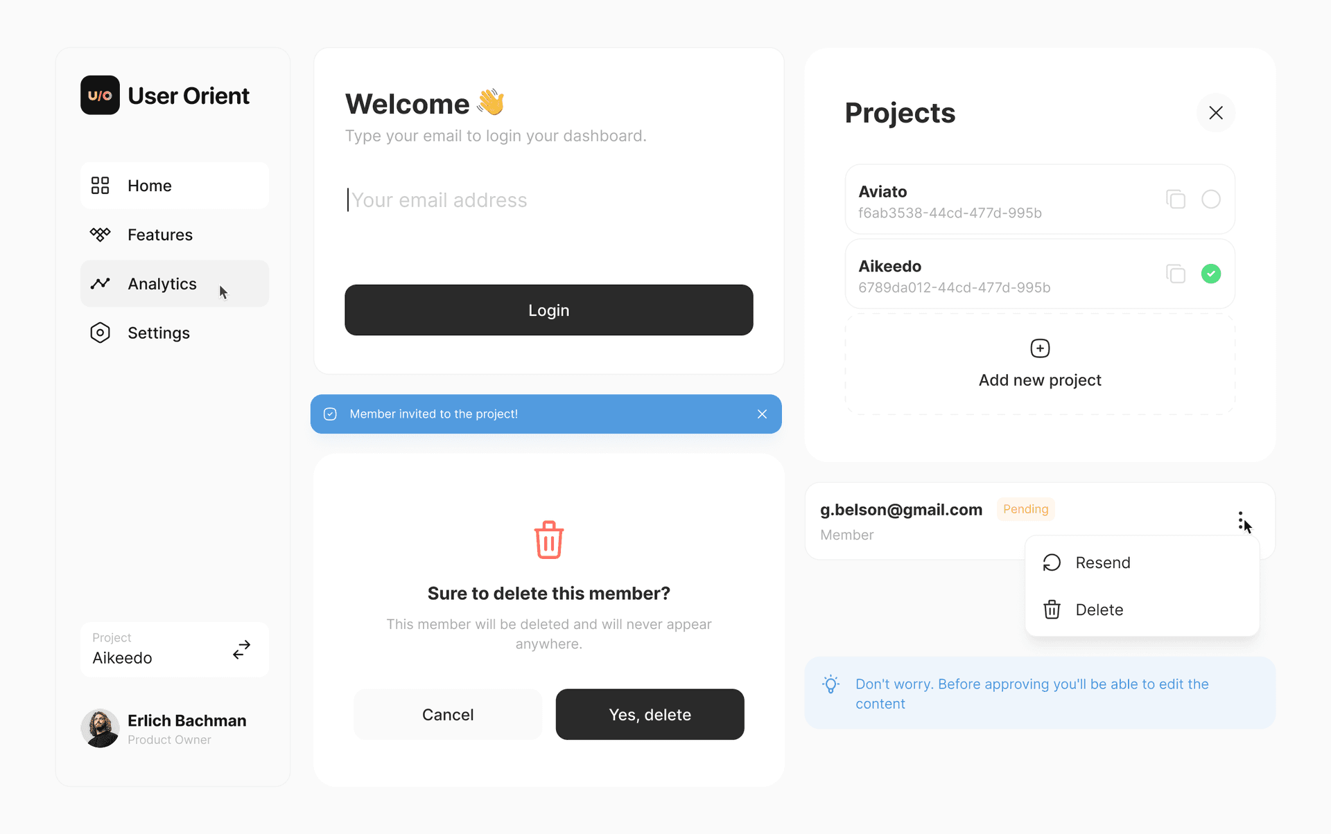
Live Demo • See in Production • Pub.dev


🧩 What is Orient UI? #
Orient UI gives you two things:
Styleis a simple, Material-independent theming system. Colors, typography, radii, durations, breakpoints. All in one file you own. NoThemeExtension, no boilerplate.- Widgets are neutral widgets (buttons, toggles, popovers, navigation, and more) that work on mobile, web, and desktop.
Use both, or just the theming. Your call.
🪩 Why Orient UI? #
- Nothing to replace. Keep your
MaterialApp, yourScaffold, your existing widgets. Orient UI sits alongside them. - You own the code. Every file lives in your project. Change anything you want. No package lock-in.
- Cross-platform. Responsive layouts, hover states, keyboard navigation. Mobile, web, and desktop.
- Zero dependencies. Nothing added to your pubspec.
🏁 Getting Started #
1. Install the CLI #
dart pub global activate orient_ui
2. Add theming #
orient_ui init
This creates lib/style.dart with light/dark colors, typography, radii, durations, and breakpoints. You own this file. Move it, rename it, extend it.
Use it anywhere:
final ColorTokens colors = context.style.colors;
final TextStyle heading = context.typography.heading;
That's it. If all you need is theming, you're done.
3. Add widgets (optional) #
orient_ui add button
This creates lib/button.dart. Update the style import to match where you placed style.dart:
import 'package:your_app/style.dart'; // adjust to your path
Button(
  label: 'Click me',
  onPressed: () {},
)
Dark Mode #
Widgets follow system brightness by default. To control it manually:
Style(
  brightness: Brightness.dark,
  child: MaterialApp(
    home: MyHomePage(),
  ),
)
🧬 Customizing #
Open style.dart and make it yours. Add color tokens, change typography scales, adjust breakpoints.
final ColorTokens _colorsLight = ColorTokens(
  background: Color(0xFFFFFFFF),
  foreground: Color(0xFF2A2A2A),
  accent: Color(0xFF18181B),
  // ... change these to match your brand
);
🗺️ Roadmap #
Available Now #
- ✅ Button (6 variants)
- ✅ Spinner
- ✅ NavBar (Navigation Rail + Bottom Bar)
- ✅ Toast
- ✅ EmptyState
- ✅ CopyButton
- ✅ Popup
- ✅ AlertPopup
- ✅ ConfirmationPopup
- ✅ SearchField
- ✅ CardBox
- ✅ Tile
- ✅ Toggle
- ✅ ToggleTile
- ✅ SingleChoice
- ✅ SingleChoiceTile
- ✅ MultiChoice
- ✅ MultiChoiceTile
- ✅ Typography
- ✅ Picker
- ✅ InfoBanner
- ✅ PopoverMenu
- ✅ TappableIcon
- ✅ SegmentBar
- ✅ Tag
- ✅ Tabs
Coming Soon #
- ❌ TextField
- ❌ VerticalTile
- ❌ AdaptivePageTransition
- ❌ DashedBorder
Try them at the interactive demo.
🧪 Quality #
All widgets are tested.
License #
Built by UserOrient
Metadata
Documentation
Publisher
Weekly Downloads
Metadata
Theming and components for Flutter. Works with Material, Cupertino, or on its own.
Homepage
Repository (GitHub)
View/report issues
License
 MIT (license)