orient_ui 0.4.0  orient_ui: ^0.4.0 copied to clipboard
 userorient.com
Beautiful building block Flutter widgets without Material or Cupertino
Orient UI
The missing pieces for Flutter Web & Desktop. Finally!
Beautiful widgets with zero dependencies.
Live Demo • See in Production • Pub.dev


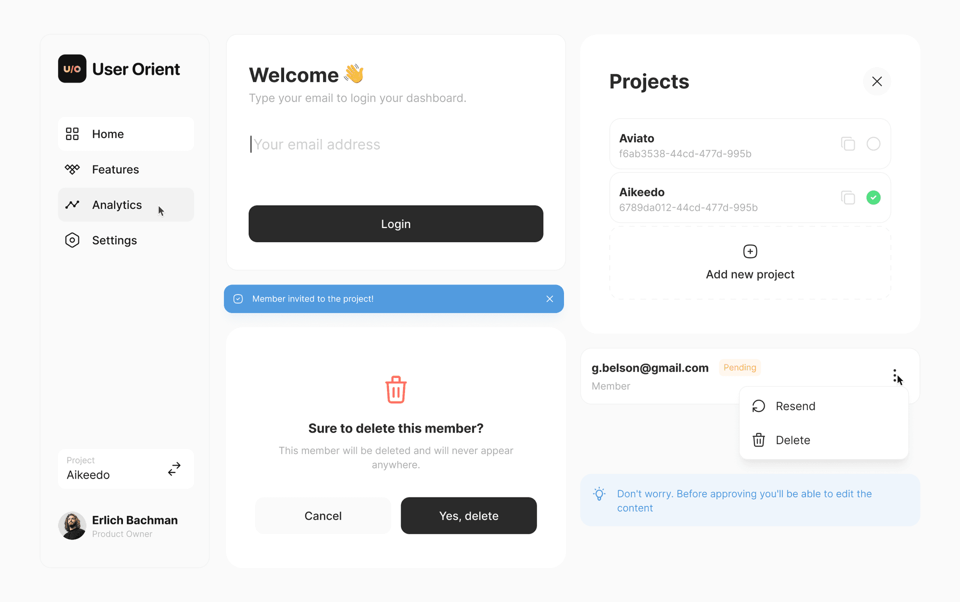
Features #
- 🧩 Works alongside Material. Add one widget today. No rewrite needed.
- 📦 You own the code. Every widget is a file in your project. Edit it however you want.
- 🖥️ Built for web & desktop. Hover states, keyboard navigation, responsive out of the box.
- 🔓 Zero dependencies. Nothing in your pubspec. No lock-in.
- 🎨 14 widgets and growing. Buttons, toggles, popups, navigation, toasts, and more.
🎬 Getting Started #
1. Install the CLI #
dart pub global activate orient_ui
2. Initialize #
Navigate to your Flutter project and run:
orient_ui init
This creates lib/style.dart in your project. You own this file: move it wherever you want (e.g., lib/core/style.dart).
3. Add Components #
orient_ui add button
This creates lib/button.dart. Move it wherever you want (e.g., lib/widgets/button.dart).
Important: Update the import inside the component file to match where you placed style.dart:
// In button.dart, update this line:
import 'package:your_app/style.dart'; // adjust to your path
4. Use #
Button(
  label: 'Click me',
  onPressed: () {},
)

// Access your theme anywhere
final ColorTokens colors = context.style.colors;
Widgets follow system brightness by default. No wrapping needed.
Dark Mode #
To control dark mode manually, wrap your app with Style:
Style(
  brightness: Brightness.dark,
  child: MaterialApp(
    home: MyHomePage(),
  ),
)
🎨 Components #
Available Now #
- ✅ Button (6 variants)
- ✅ Spinner
- ✅ NavBar (Navigation Rail + Bottom Bar)
- ✅ Toast
- ✅ EmptyState
- ✅ CopyButton
- ✅ Popup
- ✅ AlertPopup
- ✅ ConfirmationPopup
- ✅ SearchField
- ✅ CardBox
- ✅ Tile
- ✅ Toggle
- ✅ ToggleTile
- ✅ SingleChoice
- ✅ SingleChoiceTile
- ✅ MultiChoice
- ✅ MultiChoiceTile
Coming Soon #
- ❌ Typography
- ❌ TextField
- ❌ Dropdown
- ❌ Tabs
- ❌ InlineTabs
- ❌ Checkbox
- ❌ Label
- ❌ Tip
- ❌ PopoverMenu
- ❌ PickerPopup
- ❌ VerticalTile
- ❌ SocialButton
- ❌ AdaptivePageTransition
Check them out at interactive web demo.
✅ Quality #
All widgets are tested.
✨ Customizing Colors #
Open style.dart and edit the values at the top. That's it. You own the file.
// Light Theme
final ColorTokens _colorsLight = ColorTokens(
  background: Color(0xFFFFFFFF),
  border: Color(0xFFE4E4E7),
  foreground: Color(0xFF2A2A2A),
  // ... change these to match your brand
);
📄 License #
Built by the team at UserOrient
Metadata
Publisher
Weekly Downloads
Metadata
Beautiful building block Flutter widgets without Material or Cupertino
Homepage
Repository (GitHub)
View/report issues
License
 unknown (license)