optimized_search_field 0.0.1+2  optimized_search_field: ^0.0.1+2 copied to clipboard
 codinghouse.biz
A Flutter package with customizable search fields for large lists, models, and rich content. Includes single and multi-search options with various optimizations.
Flutter Optimized Search Field #
A Flutter package that provides optimized search fields with various customization options. This package offers four distinct widgets designed to cover different search needs:
-
OptimizedSearchField
A search field specifically designed for text-based searches. It is highly optimized for large lists, offering excellent performance with minimal configuration. While not highly customizable, it’s perfect for quick implementations. -
BasicSearchField
A more customizable version of OptimizedSearchField. It retains all its performance benefits and extends functionality by supporting model-based data. Each search result can include descriptions, images, or other elements, though it requires more parameters for setup. -
MultiSearchField
A specialized search field designed for array-based searches. Unlike traditional text search fields that update in real time, MultiSearchField only triggers a search after the user presses enter—adding the item to the selected items. -
BasicMultiSearchField
A highly customizable version of MultiSearchField. It includes all the benefits of MultiSearchField and supports complex data types (models), where each search result can contain rich content like descriptions or images. This version requires additional parameters, trading ease of use for flexibility.
Preview #
Below are some previews demonstrating the key features of the package:
Search Field #
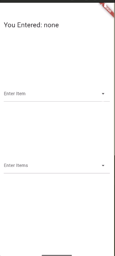
Multi Search #

Adaptive Menu Position #
- This gif shows that if there isn’t enough space above the widget, the menu will adapt and display from the bottom—even if the top position is selected. First has position up and second has down*
Features #
-
Optimized for Performance:
Designed to handle large data sets efficiently, making it ideal for applications with extensive lists. -
Customizability:
Choose between simple, easy-to-integrate fields and highly customizable widgets that support complex data types and rich content. -
Adaptive UI:
The options menu intelligently adapts to available screen space, ensuring an optimal user experience regardless of device orientation or screen size.
Detailed Widget Descriptions #
OptimizedSearchField #
Description:
A search field created for text searches. It is highly optimized for large lists and provides an easy start with minimal configuration, though customization is limited.
Pros:
- Excellent performance with large data sets
- Easy to integrate
Cons:
- Limited customization options
Example Usage:
OptimizedSearchField(
  onChanged: (text) => setState(() {
    currentItem = text;
  }),
  labelText: 'Enter Item',
  dropDownList: List.generate(
    100000,
    (index) => 'item ${index + 1}',
  ),
  itemStyle: const ButtonStyle(
    shape: WidgetStatePropertyAll(
      RoundedRectangleBorder(borderRadius: BorderRadius.zero),
    ),
    padding: WidgetStatePropertyAll(
      EdgeInsets.symmetric(vertical: 16),
    ),
  ),
  menuMaxHeight: 200,
  optionsViewOpenDirection: OptionsViewOpenDirection.up,
)
BasicSearchField #
BasicSearchField
Description: A much more customizable version of OptimizedSearchField. While it requires more parameters for setup, it supports both text and model-based searches—allowing each search result to include descriptions, images, or other elements.
Pros:
- Extensive customization options
- Supports complex data types
Cons:
- More complex setup compared to OptimizedSearchField
Example Usage
BasicSearchField<MyModel>(
  labelText: 'Search',
  optionsBuilder: (TextEditingValue textEditingValue) {
    if (textEditingValue.text.isEmpty) {
      return myModelList;
    }
    return myModelList.where((model) {
      return model.name.toLowerCase().contains(textEditingValue.text.toLowerCase());
    });
  },
  items: (model) => ListTile(
    title: Text(model.name),
    subtitle: Text(model.description),
    leading: Image.network(model.imageUrl),
  ),
  onSelected: (model) {
    print('Selected: ${model.name}');
  },
)
MultiSearchField #
Description: A search field tailored for array-based searches. It does not trigger actions on every keystroke. Instead, it waits until the user presses enter to trigger a method that adds the typed element to the selected items.
Pros:
- Ideal for building multi-selection inputs
- Prevents premature search triggering
Cons:
- Not suitable for real-time search feedback
Example Usage
MultiSearchField(
  labelText: 'Enter Items',
  dropDownList: List.generate(
    100000,
    (index) => 'item ${index + 1}',
  ),
  removeEvent: (value) => setState(() {
    currentItems.remove(value);
  }),
  values: currentItems,
  onChanged: (text) => setState(() {
    currentItems.add(text);
  }),
  menuMaxHeight: 400,
)
BasicMultiSearchField #
Description: A highly customizable version of MultiSearchField that supports model-based searches. Each search result can include rich content such as descriptions and images, offering greater flexibility at the cost of a more complex configuration.
Pros:
- High customizability for multi-selection scenarios
- Supports detailed and complex data representations
Cons:
- Increased configuration complexity
Example Usage
BasicMultiSearchField<MyModel>(
  labelText: 'Search Items',
  dropDownList: myModelList,
  values: selectedModels,
  removeEvent: (model) => setState(() {
    selectedModels.remove(model);
  }),
  onChanged: (text) {
    final model = MyModel(name: text, description: '', imageUrl: '');
    setState(() {
      selectedModels.add(model);
    });
  },
  optionsBuilder: (TextEditingValue textEditingValue) {
    if (textEditingValue.text.isEmpty) {
      return myModelList;
    }
    return myModelList.where((model) {
      return model.name.toLowerCase().contains(textEditingValue.text.toLowerCase());
    });
  },
  item: (model) => ListTile(
    title: Text(model.name),
    subtitle: Text(model.description),
    leading: Image.network(model.imageUrl),
  ),
  selectedWidget: (model) => Chip(
    label: Text(model.name),
    onDeleted: () => setState(() {
      selectedModels.remove(model);
    }),
  ),
)
Metadata
Publisher
Weekly Downloads
Metadata
A Flutter package with customizable search fields for large lists, models, and rich content. Includes single and multi-search options with various optimizations.
Repository (GitHub)
View/report issues
License
 unknown (license)