onboardly 1.0.1  onboardly: ^1.0.1 copied to clipboard
A Flutter package for creating beautiful and customizable onboarding experiences with spotlight effects and interactive tooltips.
Onboardly #
A Flutter package for creating beautiful and customizable onboarding experiences with spotlight effects and interactive tooltips.
Features #
- ✅ Spotlight Effect - Highlight specific UI elements with customizable overlays
- ✅ Interactive Tooltips - Show descriptive tooltips with customizable positioning
- ✅ Step-by-step Onboarding - Guide users through multiple steps
- ✅ Provider-based State Management - Clean and testable architecture
- ✅ Fully Customizable - Custom styles, colors, animations, and layouts
- ✅ Skip Confirmation - Built-in bottom sheet for skip confirmation
- ✅ Callbacks - Track onboarding progress with callbacks
- ✅ Zero External Dependencies - Only uses Provider and Flutter SDK
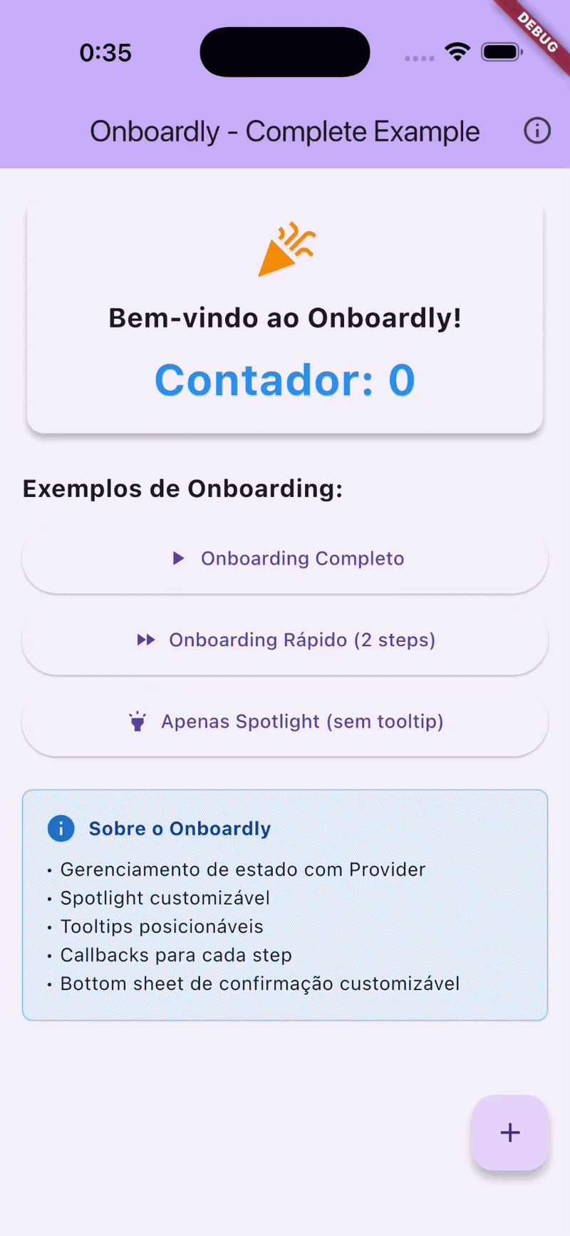
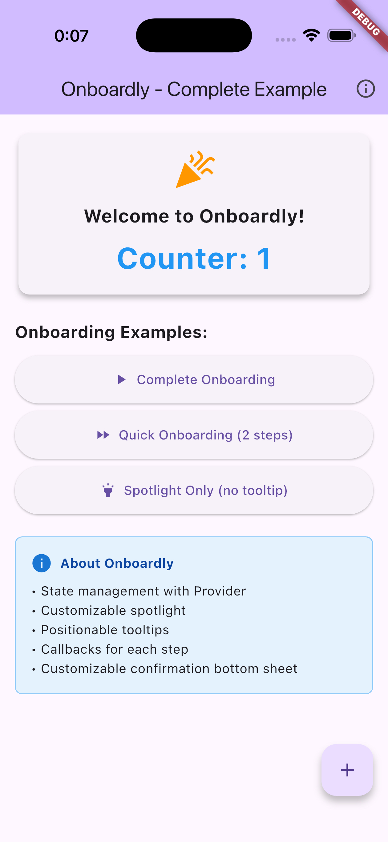
Demo #
Installation #
Add this to your package's pubspec.yaml file:
dependencies:
  onboardly: ^0.0.1
  provider: ^6.1.2
Getting Started #
1. Setup Providers #
Wrap your MaterialApp with MultiProvider:
import 'package:provider/provider.dart';
import 'package:onboardly/spotlight/spotlight_controller.dart';
import 'package:onboardly/onboarding/onboarding_controller.dart';

void main() {
  runApp(
    MultiProvider(
      providers: [
        ChangeNotifierProvider(create: (_) => SpotlightService()),
        ChangeNotifierProvider(
          create: (context) => OnboardingService(
            context.read<SpotlightService>(),
          ),
        ),
      ],
      child: MyApp(),
    ),
  );
}
2. Create GlobalKeys #
Create GlobalKeys for the widgets you want to highlight:
class MyScreen extends StatefulWidget {
  @override
  State<MyScreen> createState() => _MyScreenState();
}

class _MyScreenState extends State<MyScreen> {
  final GlobalKey _buttonKey = GlobalKey();
  final GlobalKey _titleKey = GlobalKey();

  // ... rest of your code
}
3. Start Onboarding #
void _startOnboarding() {
  final onboardingService = context.read<OnboardingService>();

  final steps = [
    OnboardingStep(
      targetKey: _titleKey,
      description: 'This is the app title!',
      position: OnboardingTooltipPosition.below,
    ),
    OnboardingStep(
      targetKey: _buttonKey,
      description: 'Click here to continue.',
      position: OnboardingTooltipPosition.above,
    ),
  ];

  onboardingService.start(
    context,
    steps,
    onFinish: () => print('Onboarding finished!'),
    onSkip: () => print('Onboarding skipped!'),
  );
}
Usage #
Basic Onboarding #
import 'package:onboardly/onboarding/onboarding_step.dart';

final steps = [
  OnboardingStep(
    targetKey: _myWidgetKey,
    description: 'Welcome to our app!',
    position: OnboardingTooltipPosition.below,
  ),
];

context.read<OnboardingService>().start(context, steps);
With Callbacks #
onboardingService.start(
  context,
  steps,
  onStepChanged: (index) {
    print('Current step: $index');
  },
  onFinish: () {
    print('User completed the onboarding');
  },
  onSkip: () {
    print('User skipped the onboarding');
  },
);
Spotlight Only (without tooltips) #
final spotlightService = context.read<SpotlightService>();

final targets = [
  SpotlightTarget.fromKey(
    _myWidgetKey,
    padding: EdgeInsets.all(8),
    borderRadius: 12,
  ),
];

await spotlightService.show(
  context,
  targets: targets,
  style: SpotlightStyle(
    scrimColor: Color.fromRGBO(0, 0, 0, 0.8),
    blurSigma: 3,
  ),
);
Custom Skip Sheet #
You can customize the skip confirmation sheet texts directly when starting the onboarding:
onboardingService.start(
  context,
  steps,
  skipSheetTitle: 'Are you sure you want to skip?',
  skipSheetContinueButtonText: 'Continue tutorial',
  skipSheetSkipButtonText: 'Skip tutorial',
);
Or provide custom widgets by creating your own skip sheet:
// In your own skip sheet widget
OnboardingSkipSheet(
  titleWidget: MyCustomTitle(),
  continueButtonWidget: MyCustomButton(),
  skipButtonWidget: MyCustomButton(),
)
API Reference #
OnboardingService #
Main service for managing onboarding flows.
Methods:
start(BuildContext, List<OnboardingStep>, {...})- Start the onboardingonStepChanged: (int index) => void- Callback when step changesonFinish: () => void- Callback when onboarding finishesonSkip: () => void- Callback when onboarding is skippeddefaultSpotlightHorizontalPadding: double- Default horizontal padding for spotlightskipSheetTitle: String?- Custom title for skip confirmation sheetskipSheetContinueButtonText: String?- Custom text for continue buttonskipSheetSkipButtonText: String?- Custom text for skip button
next()- Move to next stepskip()- Skip onboarding with confirmationfinish()- Complete onboardingdismissSilently()- Dismiss without callbacks
Properties:
isActive- Whether onboarding is currently activecurrentIndex- Current step indexcurrentStep- Current OnboardingStep
SpotlightService #
Service for showing spotlight effects.
Methods:
show(BuildContext, {targets, extraHoles, style})- Show spotlighthide()- Hide spotlight
Properties:
isShowing- Whether spotlight is currently visible
OnboardingStep #
Configuration for each onboarding step.
OnboardingStep(
  targetKey: GlobalKey,           // Required: Widget to highlight
  description: String,             // Required: Description text
  position: OnboardingTooltipPosition, // Required: Tooltip position
)
Tooltip Positions:
OnboardingTooltipPosition.aboveOnboardingTooltipPosition.below
SpotlightTarget #
Configuration for spotlight targets.
SpotlightTarget.fromKey(
  GlobalKey,                    // Required: Widget to highlight
  padding: EdgeInsets,         // Optional: Padding around target
  borderRadius: double,        // Optional: Border radius
  customBorderRadius: BorderRadius?, // Optional: Custom border radius
  customPath: Path?,           // Optional: Custom shape path
  maxHeight: double?,          // Optional: Maximum height
  customWidth: double?,        // Optional: Custom width
  allowTouchThrough: bool,     // Optional: Allow touches through (default: true)
)
SpotlightStyle #
Customize the spotlight appearance.
SpotlightStyle(
  blurSigma: 2.0,                           // Blur intensity
  scrimColor: Color.fromARGB(60, 0, 0, 0), // Overlay color
  animationDuration: Duration(milliseconds: 300), // Animation duration
)
Examples #
Check the example folder for a complete working example with:
- Full onboarding flow with 6 steps
- Quick onboarding with 2 steps
- Spotlight-only mode
- Custom callbacks and styling
Migration from GetX #
If you're upgrading from a previous version that used GetX, please see the MIGRATION_GUIDE.md for detailed migration instructions.
Contributing #
Contributions are welcome! Please feel free to submit a Pull Request.
License #
This project is licensed under the MIT License - see the LICENSE file for details.
Metadata
Publisher
unverified uploader
Weekly Downloads
Metadata
A Flutter package for creating beautiful and customizable onboarding experiences with spotlight effects and interactive tooltips.
Repository (GitHub)
View/report issues
Topics
#onboarding #spotlight #tutorial #tooltip #user-experience
License
 unknown (license)