neon_widgets 0.1.1  neon_widgets: ^0.1.1 copied to clipboard
The complete neon solution. This package provides Neon widgets with and without flicker effect.

Neon Widgets💡
Most commonly used flutter widgets in neon version.
Live Example : https://myportfolio-67882.web.app/#/ #
Getting started #
Readme Changelog Installing Versions Scores Admin Activity log Use this package as a library Depend on it Run this command:
Run this command:
With Dart:
$ dart pub add neon_widgets
With Flutter:
$ flutter pub add neon_widgets
This will add a line like this to your package's pubspec.yaml (and run an implicit dart pub get):
dependencies:
  neon_widgets: ^0.1.1
Alternatively, your editor might support dart pub get or flutter pub get. Check the docs for your editor to learn more.
Import it Now in your Dart code, you can use:
import 'package:neon_widgets/neon_widgets.dart';
Features #
ExampleApp #
Neon Widgets :
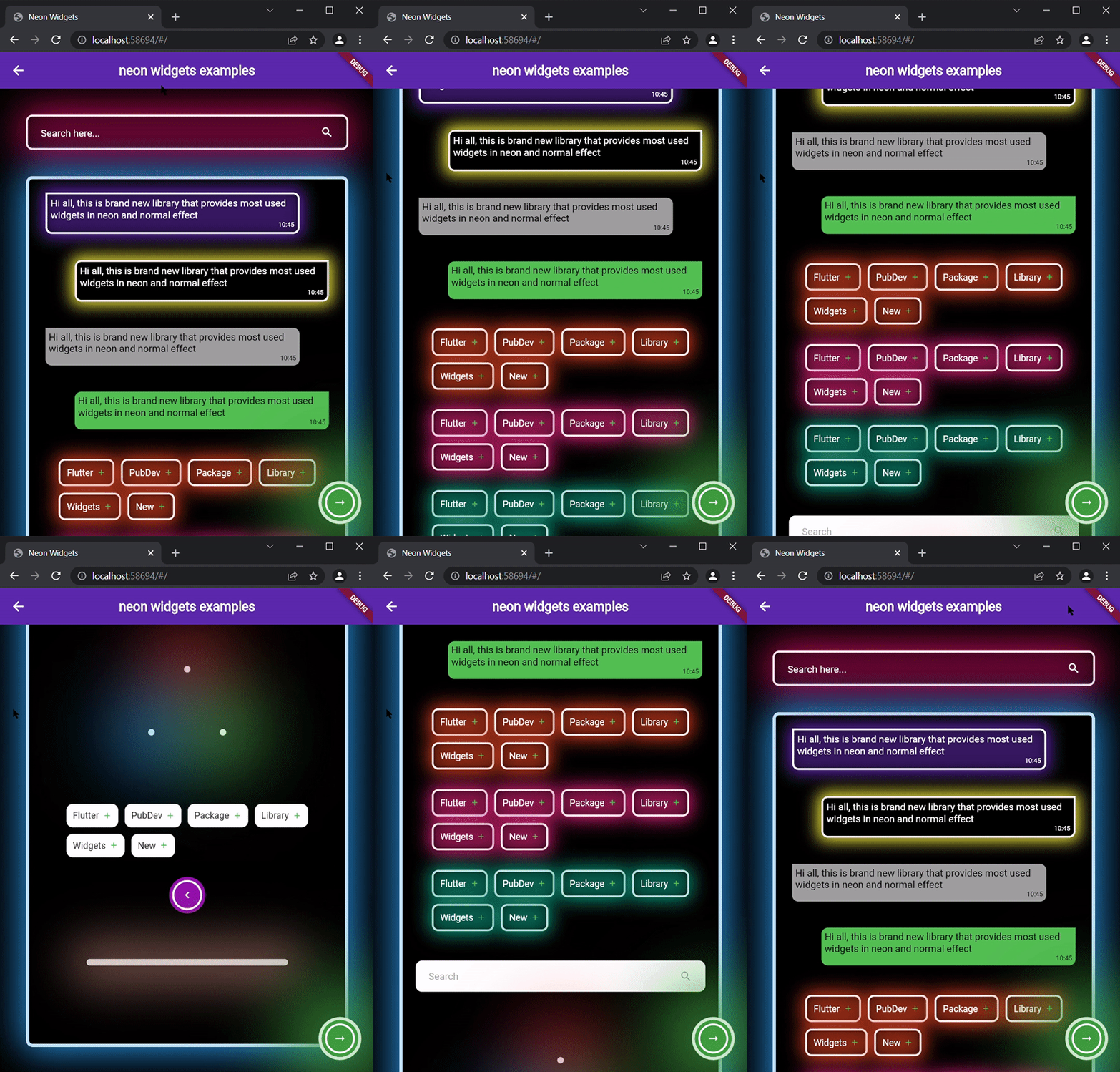
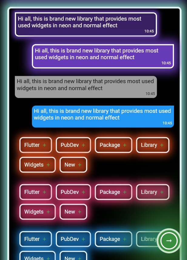
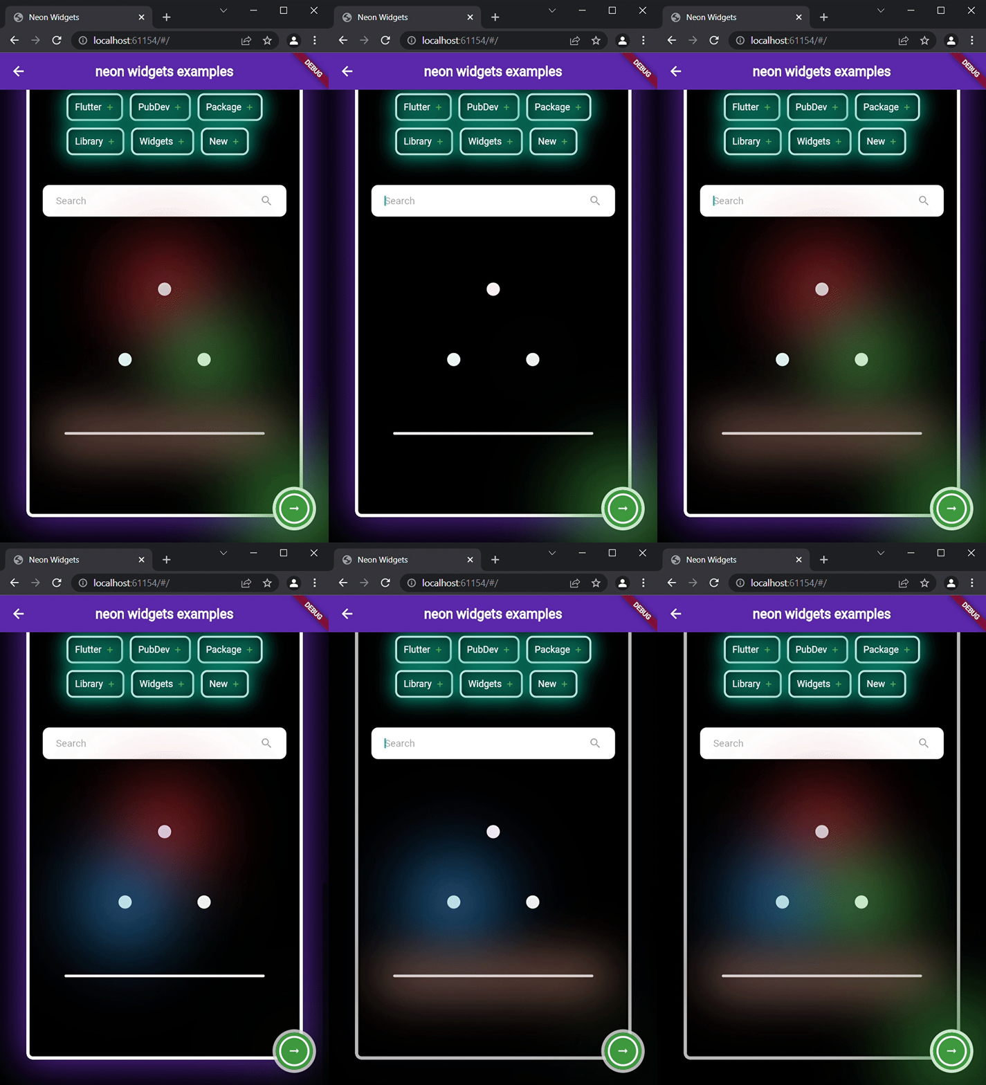
Flickering Neon Widgets (with random flicker rate) :
Loaders :
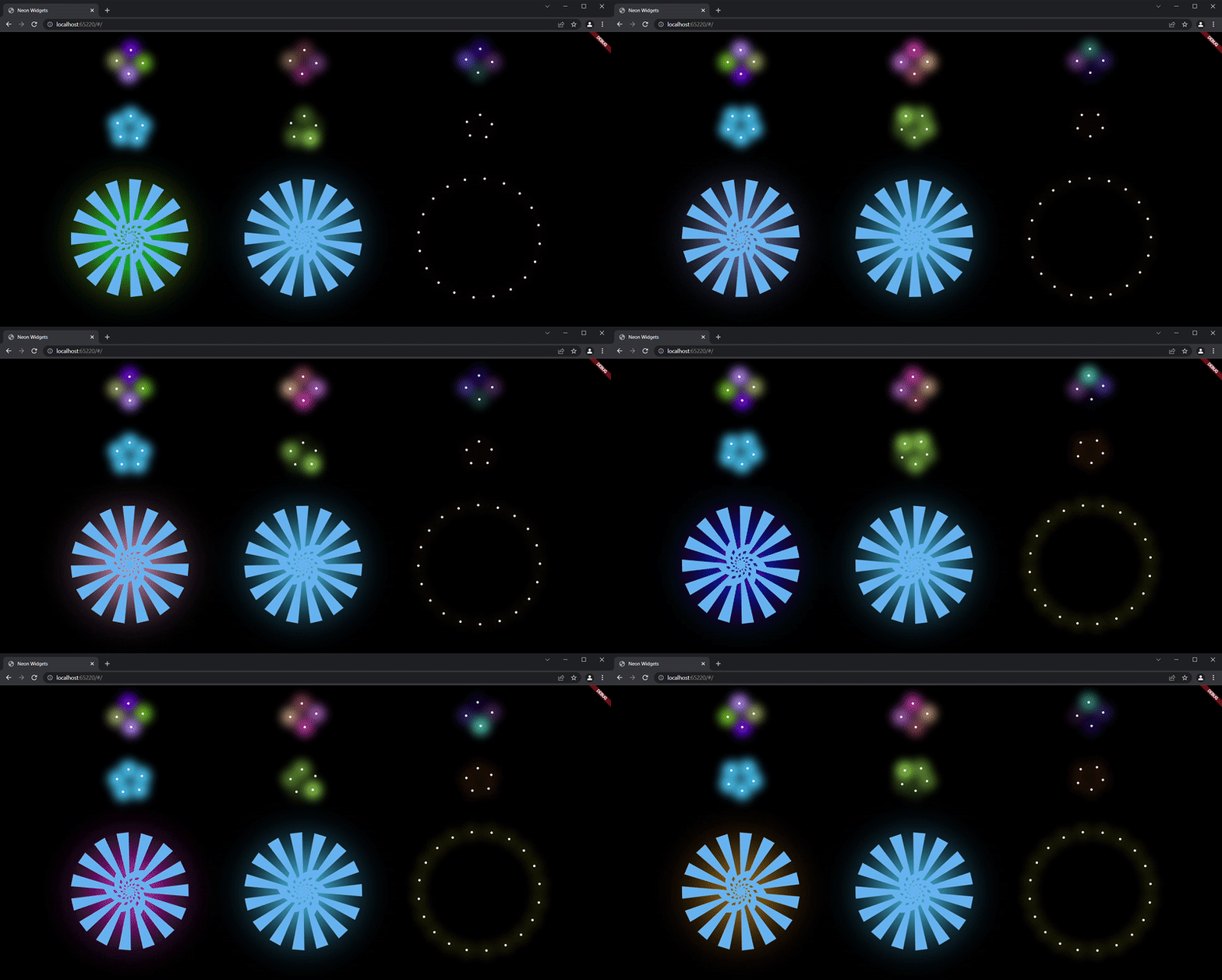
Widgets #
neonText :

// neon text

 oNeonText(
   text: "Neon text",
   spreadColor: Colors.pink,
   blurRadius: 20,
   textSize: 74,
   textColor: Colors.white,
 ),

// flickering neon text

 oFlickerNeonText(
   text: "Flicker neon text",
   flickerTimeInMilliSeconds: 600,
   spreadColor: Colors.blue,
   blurRadius: 20,
   textSize: 74,
 ),
neonSearchBar :

oNeonSearchBar()
Chat widgets :
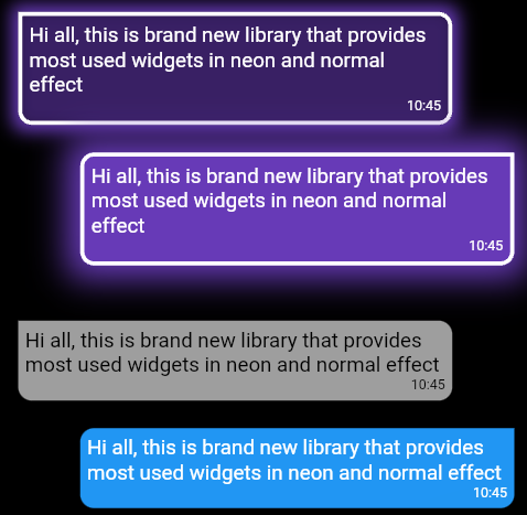
// Left message card in neon theme
oNeonLeftMsgCard(
  lightBlurRadius: 20,
  lightSpreadRadius: 5,
  msg:
      "Hi all, this is brand new library that provides most used widgets in neon and normal effect",
  time: "10:45",
),

const SizedBox(
  height: 20,
),

// Right message card in neon theme
oNeonRightMsgCard(
    lightBlurRadius: 20,
    lightSpreadRadius: 10,
    backgroundColor: Colors.deepPurple,
    msg:
    "Hi all, this is brand new library that provides most used widgets in neon and normal effect",
    time: "10:45",
 ),

const SizedBox(
  height: 20,
),

// Left massage card

oLeftMsgCard(
    msg:
    "Hi all, this is brand new library that provides most used widgets in neon and normal effect",
    time: "10:45",
),

const SizedBox(
  height: 20,
),

// Right massage card

oRightMsgCard(
    msg:
    "Hi all, this is brand new library that provides most used widgets in neon and normal effect",
    time: "10:45",
),

const SizedBox(
  height: 20,
),
Add items widget :
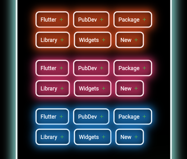
Wrap(
direction: Axis.horizontal,
children: <Widget>[
  ...(searchedResults.map((e) =>
      oNeonAddItemButton(
          data: e,
          borderColor: Colors.deepOrange.shade50,
          spreadColor: Colors.deepOrange,
          lightSpreadRadius: 3,
          lightBlurRadius: 18))),
],
),
oNeonPoint widget :
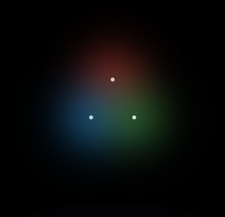
oNeonPoint(
  pointSize: 00,
  pointColor: Colors.red.shade100,
  spreadColor: Colors.red,
),
oNeonLine widget :
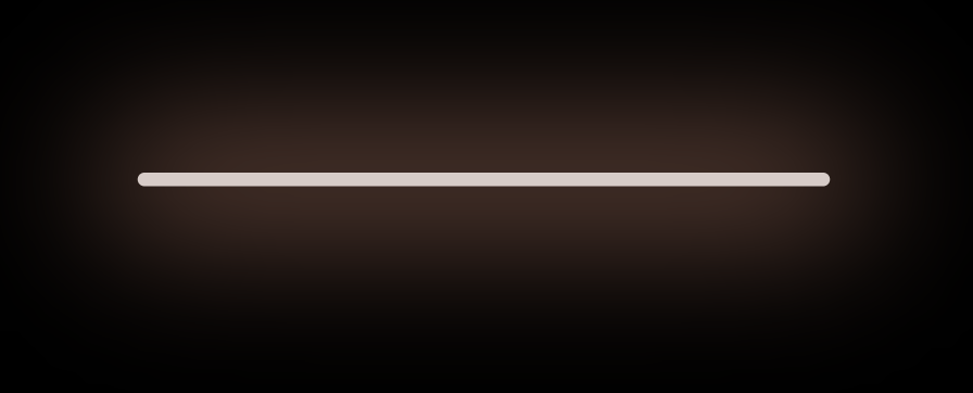
oNeonLine(
  spreadColor: Colors.brown,
  lightSpreadRadius: 30,
  lightBlurRadius: 90,
  lineWidth: 400,
  lineHeight: 0.02,
  lineColor: Colors.brown.shade100,
),
Flickering Neon widgets :
// Flickering neon line
oFlickerNeonLine(
  spreadColor: Colors.brown,
  lightSpreadRadius: 30,
  lightBlurRadius: 60,
  lineWidth: 300,
  lineHeight: 2,
  lineColor: Colors.brown.shade100,

  // flicker rate which is selects a random value by default
  randomFlicker: false,
  flickerTimeInMilliSeconds: 1000,
),
// Flickering neon point
oFlickerNeonPoint(
  pointSize: 010,
  pointColor: Colors.blue.shade100,
  spreadColor: Colors.blue,
),
// Flickering neon container
oFlickerNeonContainer(
    spreadColor: Colors.green.shade700,
    child: WIDGET
),
Loaders :
 //loader type 1 : loader made of polynomial of n number of side
 oNeonShapeVerticesProgressBar(number: 4)

 //loader type 2 : triangle shape with all colors customizable
 oNeonTriangleVerticesProgressBar()

 //loader type 3 : square shape with all colors customizable
 oNeonSquareVerticesProgressBar()

 //loader type 4 : image
 oImageProgressBar(image : "assets/images/abc.png")
Non Neon widgets :
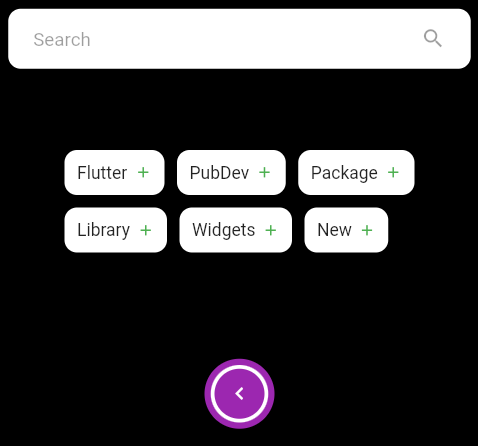
oSearchBar(),
const SizedBox(
  height: 20,
),
Wrap(
  direction: Axis.horizontal,
  children: <Widget>[
    ...(searchedResults
        .map((e) => oAddItemButton(data: e))),
  ],
),
const SizedBox(
  height: 20,
),
Container(
  padding: const EdgeInsets.all(20),
  child: oCircumscribingIconButton(
      icon: Icons.keyboard_arrow_left_sharp,
      onTap: () {},
      backgroundColor: Colors.purple),
),
Usage #
Example code provided
oNeonContainer(
  spreadColor: Colors.green.shade700,
  child: oCircumscribingIconButton(
        icon: Icons.arrow_right_alt_sharp,
        onTap: () {},
        backgroundColor: Colors.green.shade700),
    borderRadius: BorderRadius.circular(100),
    lightBlurRadius: 100,
    lightSpreadRadius: 50,
  borderColor: Colors.green.shade100
)
Additional information #
Wanna improve this package? Contribute to project on
github : https://github.com/ojasjain24/neon_widgets_flutter
create issue : https://github.com/ojasjain24/neon_widgets_flutter/issues
Contributing rules : #
1 : create an issue describing the feature.
2 : comment on this issue that you are interested in resolving this issue.


