neon_circular_timer 0.0.7  neon_circular_timer: ^0.0.7 copied to clipboard
A package that helps you to build a timer quickly with a beautiful UI, it's highly customizable you can change the color,the thickness of the timer,the clock text style.
neon_circular_timer #
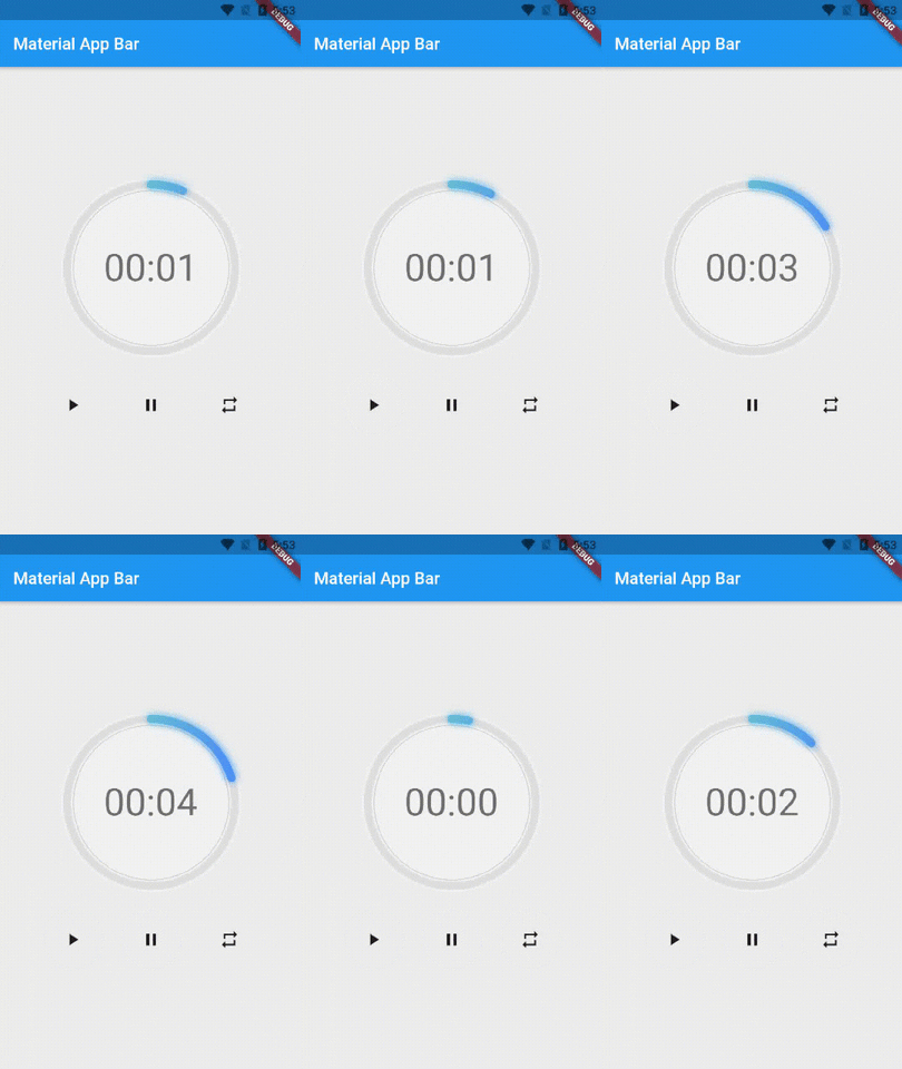
Make a timer application with a fancy neon effect and beautiful UI
v0.0.3 and above now the timer has also a neumorphic border
Preview of example #

Usage #
Use neumorphicEffect to show or hide the neumorphic border
Use isTimerTextShown to show or hide the text
With neumorphicEffect is true and isTimerTextShown is false
  NeonCircularTimer(
                width: 200,
                    duration: 20,
                    controller : your_controller
                    isTimerTextShown: false,
                    neumorphicEffect: true,
                    innerFillGradient: LinearGradient(colors: [
                      Colors.greenAccent.shade200,
                      Colors.blueAccent.shade400
                    ]),
                    neonGradient: LinearGradient(colors: [
                      Colors.greenAccent.shade200,
                      Colors.blueAccent.shade400
                    ]),
                   ),

with neumorphicEffect is false and isTimerTextShown is false
  NeonCircularTimer(
                width: 200,
                    duration: 20,
                    controller : your_controller
                    isTimerTextShown: false,
                    neumorphicEffect: false,
                    innerFillGradient: LinearGradient(colors: [
                      Colors.greenAccent.shade200,
                      Colors.blueAccent.shade400
                    ]),
                    neonGradient: LinearGradient(colors: [
                      Colors.greenAccent.shade200,
                      Colors.blueAccent.shade400
                    ]),
                   ),

Parameters #
| Name | Type | Default Value | Description |
|---|---|---|---|
key |
Key |
null | Key for Countdown Timer. |
neon |
double |
4.0 | The itensity of the neon |
duration |
int |
required | Countdown duration in Seconds. |
initialDuration |
int |
0 | Countdown initial elapsed Duration in Seconds. |
controller |
CountDownController |
required | Controls (i.e Start, Pause, Resume, Restart) the Countdown Timer. |
width |
double |
required | Width of the rectangle that surrounds the circle ( Diameter of the Countdown Timer). |
neonColor |
Color |
Colors.white54 | neon Color for Countdown Widget. |
neonGradient |
Gradient |
null | neon Gradient for Countdown Widget. Note that neonColor will not be effective if gradient is provided. |
neumorphicEffect |
bool |
true | show neumorphic border |
innerFillColor |
Color |
Colors.black12 | Filling Color for Countdown Widget. |
innerFillGradient |
Gradient |
null | Filling Gradient for Countdown Widget. Note that fillColor will not be effective if gradient is provided. |
outerStrokeColor |
Color |
Colors.white | border Color for Countdown Widget. |
backgroundColor |
Color |
Colors.white54 | must be provided if you choose to use neumorphic effect . |
outerStrokeGradient |
Gradient |
null | border Gradient for Countdown Widget. Note that backgroundColor will not be effective if gradient is provided. |
strokeWidth |
double |
10.0 | Border Thickness of the Countdown Ring. |
strokeCap |
StrokeCap |
StrokeCap.round | Begin and end contours with a flat edge and no extension. |
textStyle |
TextStyle |
Theme.of(context).textTheme.headline3 | Text Style for Countdown Text. |
textFormat |
String |
TextFormat.MM_SS | Format for the Countdown Text. |
isReverse |
bool |
false | Handles Countdown Timer (true for Reverse Countdown (max to 0), false for Forward Countdown (0 to max)). |
isReverseAnimation |
bool |
false | Handles Animation Direction (true for Reverse Animation, false for Forward Animation). |
isTimerTextShown |
bool |
true | Handles visibility of the Countdown Text. |
autoStart |
bool |
true | Handles the timer start. |
onStart |
VoidCallback |
null | This Callback will execute when the Countdown Starts. |
onComplete |
VoidCallback |
null | This Callback will execute when the Countdown Ends. |
About the Controller #
to get the time in seconds use :
controller.getCurrentTimeInSeconds();
to get the time formated into the selected TextFormat use:
controller.getTime();
to control the timer use :
controller.restart(); // to reset the timer
controller.start(); // to start the timer from 0
controller.pause(); // to pause the timer
controller.resume(); // to continue from the value where the timer stopped