neon_circular_timer 0.0.3  neon_circular_timer: ^0.0.3 copied to clipboard
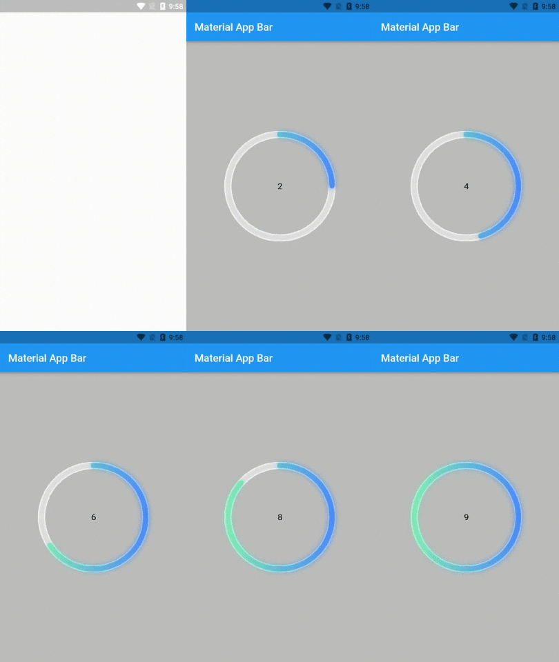
A package that helps you to build a timer quickly with a beautiful UI, it's highly customizable you can change the color,the thickness of the timer,the clock text style.
neon_circular_timer #
If you need to make a timer application with a fancy neon effect then this package is for you
Usage #
  NeonCircularTimer(
                width: 200,
                duration: 10,
                strokeWidth: 10,
                outerStrokeColor: Colors.grey.shade100,
                fillGradient: LinearGradient(colors: [
                  Colors.greenAccent.shade200,
                  Colors.blueAccent.shade400
                ]),
                neonGradient: LinearGradient(colors: [
                  Colors.greenAccent.shade200,
                  Colors.blueAccent.shade400
                ]),
                strokeCap: StrokeCap.round ),
Parameters #
| Name | Type | Default Value | Description |
|---|---|---|---|
key |
Key |
null | Key for Countdown Timer. |
duration |
int |
null | Countdown duration in Seconds. |
initialDuration |
int |
0 | Countdown initial elapsed Duration in Seconds. |
controller |
CountDownController |
null | Controls (i.e Start, Pause, Resume, Restart) the Countdown Timer. |
width |
double |
null | Width of the rectangle that surrounds the circle ( Diameter of the Countdown Timer). |
neonColor |
Color |
null | neon Color for Countdown Widget. |
neonGradient |
Gradient |
null | neon Gradient for Countdown Widget. Note that ringColor will not be effective if gradient is provided. |
fillColor |
Color |
null | Filling Color for Countdown Widget. |
fillGradient |
Gradient |
null | Filling Gradient for Countdown Widget. Note that fillColor will not be effective if gradient is provided. |
outerStrokeColor |
Color |
null | border Color for Countdown Widget. |
outerStrokeGradient |
Gradient |
null | border Gradient for Countdown Widget. Note that backgroundColor will not be effective if gradient is provided. |
strokeWidth |
double |
5.0 | Border Thickness of the Countdown Ring. |
strokeCap |
StrokeCap |
StrokeCap.butt | Begin and end contours with a flat edge and no extension. |
textStyle |
TextStyle |
TextStyle(fontSize: 16.0,color: Colors.black,) | Text Style for Countdown Text. |
textFormat |
String |
null | Format for the Countdown Text. |
isReverse |
bool |
false | Handles Countdown Timer (true for Reverse Countdown (max to 0), false for Forward Countdown (0 to max)). |
isReverseAnimation |
bool |
false | Handles Animation Direction (true for Reverse Animation, false for Forward Animation). |
isTimerTextShown |
bool |
true | Handles visibility of the Countdown Text. |
autoStart |
bool |
true | Handles the timer start. |
onStart |
VoidCallback |
null | This Callback will execute when the Countdown Starts. |
onComplete |
VoidCallback |
null | This Callback will execute when the Countdown Ends. |
Preview #
