motion_toast 2.10.0  motion_toast: ^2.10.0 copied to clipboard
 badrkouki.dev
A beautiful designed toast with animations, contains multiple built in designs and let you design your toast
Motion Toast #

A well designed toast with animations for all platforms
Support material3 themes
 |
 |
|---|---|
 |
 |
Features #
- Animated toasts with animated icons
- Support dark and light mode
- Built-in types (Success, Warning, Error, Info, Delete)
- Possibility to design your own toast
- Different color themes (mutliple colors support)
- Support null safety
- Heartbeat animations
- Full customized text
- Built in animations
- Customize toast layout (LTR/RTL)
- Customize toast duration
- Customize Motion toast position (Center, Bottom, Top)
- Support long text
- Background style customization
- Display simultaneous toasts
- Customizable barrier color
- Enable dismiss when toast is displayed (top, center, bottom)
- Responsive toast according to device size
- Customizable width and height
- Customizable box constraints
- Customizable toast padding
- Customizable border display
- Customizable sidebar widget display
Getting Started #
In order to add motion toast to your project add this line to your pubspec.yaml file
dependencies:
	motion_toast: ^2.10.0
Or you can reference the main repository directly by adding those lines
dependencies:
	motion_toast:
		git: https://github.com/koukibadr/Motion-Toast.git
Attributes #
/// the text widget used for description message
  final Widget description;

  /// The title of the motion toast
  /// if it's null it will not be rendered in the widget
  final Widget? title;

  /// The motion toast icon, for types other than custom
  /// the icon will get the default type icon
  ///
  /// if [motionToastType] set to [MotionToastType.custom] the icon parameter is required
  late final IconData? icon;

  /// The motion toast background color
  /// if `motionToastType == MOTION_TOAST_TYPE.CUSTOM` color parameter is required
  /// else the color will get the default type color from [motionToastColors]
  late final Color primaryColor;

  /// Color applied on the motion toast side widget (sidebar) and the icon
  /// if it's null secondary color will be the primary color
  /// can be customized when using the default constructor
  late final Color? secondaryColor;

  /// The motion toast width by default it's set to 250
  final double? width;

  /// define the height of the motion toast
  final double? height;

  /// The constraint of the motion toast to size itself to the content
  /// for responsive design
  /// If it's `null`, then [width] and [height] will be used as it is.
  final BoxConstraints? constraints;

  /// the motion toast icon size
  /// by default it's 40
  final double iconSize;

  /// disable or enable the heartbeat animation on the icon
  /// by default the animation is enabled
  final bool enableAnimation;

  /// The layout ToastOrientation (from right to left or from left to right)
  /// ```dart
  /// {
  /// LTR,
  /// RTL
  /// }
  /// ```
  final ToastOrientation layoutOrientation;

  /// The type of animation, by default it's [AnimationType.fromBottom]
  /// ```dart
  /// {
  /// FROM_BOTTOM,
  /// FROM_LEFT,
  /// FROM_RIGHT
  /// }
  /// ```
  late AnimationType animationType;

  /// the Duration of the toast animation
  /// by default it's 1.5 seconds
  final Duration animationDuration;

  /// How long the toast will be shown
  /// by default it's 3 seconds.
  final Duration toastDuration;

  /// The toast animation curve
  /// by default it's `Curves.ease`
  final Curve animationCurve;

  /// The position where the motion toast will be displayed
  /// possible values
  /// ```dart
  /// {
  /// CENTER,
  /// TOP,
  /// BOTTOM
  /// }
  /// ```
  final MotionToastPosition position;

  /// Define the border radius of the toast
  /// by default it's 20
  final double borderRadius;

  /// Function invoked when the toast is closed
  final Function? onClose;

  /// define whether the motion toast can be dismissed or not
  /// applied on bottom motion toast
  final bool dismissable;

  /// The barrier color applied to the dialog display
  /// by default the barrier is transparent [Colors.transparent]
  final Color barrierColor;

  ///padding added to the main widget motion taost
  ///by default the padding is set to 0
  final EdgeInsets margin;

  ///padding added under the main widget
  ///by default the padding is set to 0
  final EdgeInsets contentPadding;

  /// define whether the borders are rendered or not
  /// by default  `= false`
  final bool displayBorder;

  /// define whether the side bar is displayed or not
  /// default `= true`
  final bool displaySideBar;

  /// motion toast background opacity
  /// by default opacity is set to .9
  final double opacity;
Implementation #
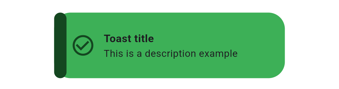
- Success Motion Toast
MotionToast.success(
	title:  Text("Success Motion Toast"),
	description:  Text("Example of success motion toast"),
).show(context);
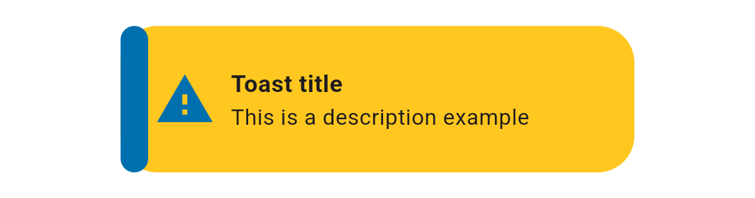
- Warning Motion Toast
MotionToast.warning(
	title:  Text("Warning Motion Toast"),
	description:  Text("This is a Warning")
).show(context);
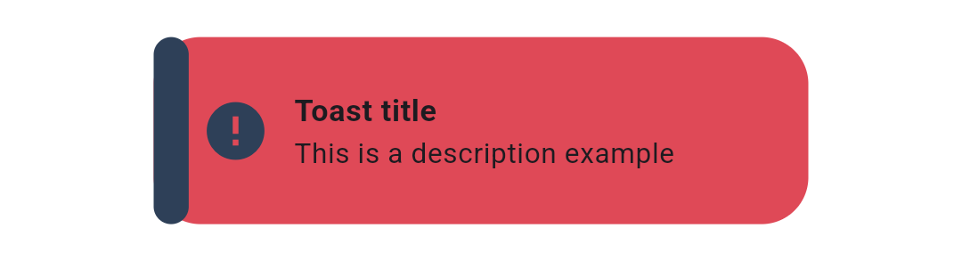
- Error Motion Toast
MotionToast.error(
	title:  Text("Error"),
	description:  Text("Please enter your name")
).show(context);
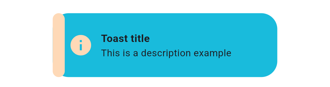
- Info Motion Toast
MotionToast.info(
	title:  Text("Info Motion Toast"),
	description:  Text("Example of Info Toast")
).show(context);
- Custom Motion Toast
To create your custom toast just use the default constructor,
icon description and color are required
MotionToast(
	icon:  Icons.alarm,
	primaryColor:  Colors.pink,
	title:  Text("Custom Toast"),
	description:  Text("You can customize the toast!"),
	width:  300,
	height:  100,
).show(context);
- Right-Designed Motion Toast
To change the toast layout you need to use layoutOrientation,
icon description and color are required
MotionToast.success(
	title:  Text("من اليمين"),
	description:  Text("هذا مثال بالعربية"),
	layoutOrientation:  ToastOrientation.rtl,
	animationType:  AnimationType.fromRight,width:  300,
).show(context);
- Top-displayed Motion Toast
To change the display position of the motion toast use position attribute
MotionToast(
	icon:  Icons.zoom_out,
	color:  Colors.deepOrange,
	title:  Text("Top Motion Toast"),
	description:  Text("Another motion toast example"),
	position: MotionToastPosition.top,
	animationType:  AnimationType.fromTop,
).show(context);
- Center-displayed Motion Toast
MotionToast(
	icon:  Icons.zoom_out,
	color:  Colors.deepOrange,
	title:  Text("Center Motion Toast"),
	description:  Text("Another motion toast example"),
	position:  MotionToastPosition.center
).show(context);
- Using onClose parameter (display two successive toasts)
MotionToast.success(
	title:  Text("User Data"),
	description:  Text("Your data has been deleted"),
	onClose: (){
		MotionToast.error(
			title:  Text("User Data"),
			description:  Text("Your data has been deleted"),
		).show(context);
	},
).show(context);
- Two-Colors Motion Toast
MotionToast(
	icon:  Icons.zoom_out,
	primaryColor:  Colors.orange[500]!,
	secondaryColor:  Colors.grey,
	title:  Text('Two Color Motion Toast'),
	description:  Text('Another motion toast example'),
	position:  MotionToastPosition.top,
	animationType:  AnimationType.fromTop,
	height:  100,
	width:  300,
).show(context);
- Transparent background motion toast
MotionToast(
	icon:  Icons.zoom_out,
	primaryColor:  Colors.grey[400]!,
	secondaryColor:  Colors.yellow,
	opacity:  0.4,
	title:  Text('Two Color Motion Toast'),
	description:  Text('Another motion toast example'),
	position:  MotionToastPosition.center,
	height:  100,
	width:  300,
).show(context);
- Motion toast without sidebar and with border
MotionToast(
	icon:  Icons.zoom_out,
	primaryColor:  Colors.orange[500]!,
	secondaryColor:  Colors.grey,
	title:  Text('Two Color Motion Toast'),
	description:  Text('Another motion toast example'),
	displayBorder: true,
	displaySideBar: false,
).show(context);
- Dismiss the toast from your UI screen
MotionToast toast = MotionToast(
	icon:  Icons.zoom_out,
	primaryColor:  Colors.orange[500]!,
	secondaryColor:  Colors.grey,
	title:  Text('Two Color Motion Toast'),
	description:  Text('Another motion toast example'),
	displayBorder: true,
	displaySideBar: false,
).show(context);
toast.dismiss();
Contribution #
Of course the project is open source, and you can contribute to it repository link
-
If you found a bug, open an issue.
-
If you have a feature request, open an issue.
-
If you want to contribute, submit a pull request.
Contributors #
Metadata

Publisher
Metadata
A beautiful designed toast with animations, contains multiple built in designs and let you design your toast
Repository (GitHub)
View/report issues
Documentation
Funding
Consider supporting this project:
www.buymeacoffee.com
License
 MIT (LICENSE)