mobikul_suggest_field 0.0.4  mobikul_suggest_field: ^0.0.4 copied to clipboard
 mobikul.com
A powerful and customizable suggestion field for Flutter, supporting dynamic filtering, styling, and interactive UI enhancements for better user experience.
Mobikul Suggest Field Flutter Package #
The MobikulSuggestField is a highly customizable Flutter widget designed to provide a suggestion input field with features like search-as-you-type, auto-completion, and dynamic suggestions based on user input. This widget is perfect for enhancing user experience when inputting search queries or selecting from a list of suggestions.
To find out more: https://mobikul.com/
Features #
- Search-as-you-type: Automatically provides suggestions based on user input.
- Custom Suggestions: You can display custom suggestions with any widget (like icons, text, etc.).
- Auto-completion: Provides suggested text that automatically fills in the input field as you type.
- Theme Customization: Supports full customization for the appearance of the suggestion field.
- Multiple Input Types: Works well with text, numbers, and custom widgets.
Installation #
To add MobikulSuggestField to your project, include the following in your pubspec.yaml file:
dependencies:
  mobikul_suggest_field: # ^latest version
Usage #
Import the Package #
import 'package:mobikul_suggest_field/mobikul_suggest_field.dart';
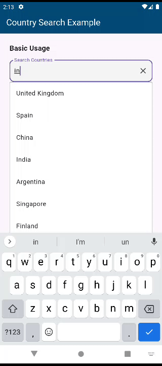
Basic Suggest Field Example #
MobikulSuggestField(
suggestions: _countries,
decoration: InputDecoration(
labelText: 'Search Countries',
border: OutlineInputBorder(),
filled: true,
fillColor: Colors.grey[100],
),
onSelected: (value) {
setState(() {
_selectedCountry = value;
});
ScaffoldMessenger.of(context).showSnackBar(
SnackBar(content: Text('Selected: $value')),
);
},
hintText: 'Search for a country...',
)
Customize Suggest Field Example #
MobikulSuggestField(
suggestions: _countries,
recentSearches: _recentSearches,
onSelected: (value) {
setState(() {
_selectedCountry = value;
});
},
onSubmitted: (value) {
print('Submitted: $value');
},
onChanged: (value) {
print('Changed: $value');
},
decoration: InputDecoration(
labelText: 'Search Countries',
border: OutlineInputBorder(),
filled: true,
fillColor: Colors.grey[100],
),
maxSuggestions: 5,
backgroundColor: Theme.of(context).cardColor,
highlightColor: Theme.of(context).primaryColor,
textStyle: TextStyle(fontSize: 16, fontWeight: FontWeight.w500),
suggestionStyle: TextStyle(fontSize: 14, color: Colors.grey[800]),
enableHistory: true,
displayStyle: SuggestionDisplayStyle.list,
showClearButton: true,
autoCorrect: false,
debounceTime: Duration(milliseconds: 300),
suggestionItemHeight: 50.0,
prefixIcon: Icon(Icons.search),
enableVoiceInput: true,
enableEmoji: true,
caseSensitive: false,
)
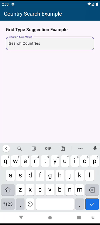
Example for grid display style #
MobikulSuggestField(
suggestions: _countries,
displayStyle: SuggestionDisplayStyle.grid,
onSelected: (value) {
setState(() {
_selectedCountry = value;
});
},
decoration: InputDecoration(
labelText: 'Grid View Search',
border: OutlineInputBorder(),
),
)
Output #
Here’s an example of the MobikulSuggestField in action:
Basic MobikulSuggestField #
Customize MobikulSuggestField #
MobikulSuggestField with Grid #
MobikulSuggestField with Chip #

Start building amazing SuggestField today with the MobikulSuggestField package! 🚀
Metadata
Publisher
Weekly Downloads
Metadata
A powerful and customizable suggestion field for Flutter, supporting dynamic filtering, styling, and interactive UI enhancements for better user experience.
Repository (GitHub)
View/report issues
License
 unknown (license)