mobikul_carousel_slider 0.0.4  mobikul_carousel_slider: ^0.0.4 copied to clipboard
A feature-rich and customizable carousel slider package for Flutter.
Mobikul Carousel Slider Flutter Package #
The MobikulCarouselSlider is a fully customizable Flutter widget designed to create stunning carousels with features like auto-play, looping, and custom indicators. It offers a flexible way to showcase images, widgets, or any content with a smooth and elegant user experience.
To find out more: https://mobikul.com/
Features #
- Auto-play: Automatically transitions through carousel items at specified intervals.
- Looping: Infinite scrolling capability to keep the carousel cycling.
- Custom Indicators: Build unique indicator styles or use default animated dots.
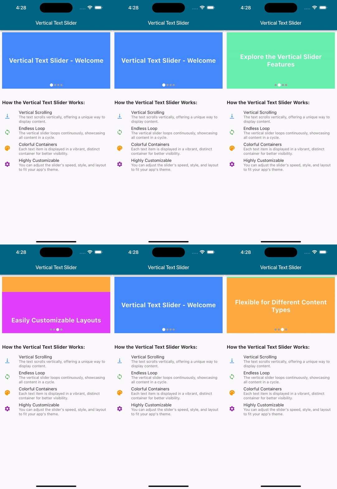
- Horizontal & Vertical Scrolling: Switch between horizontal or vertical carousel layouts.
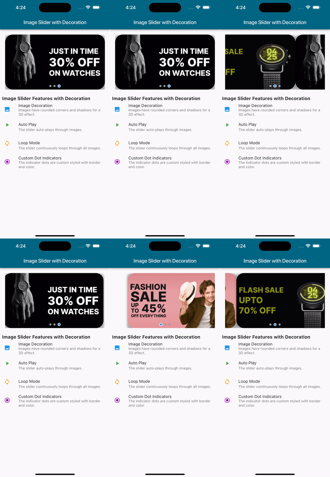
- Custom Decorations: Add rounded corners, shadows, or gradients to carousel items.
- Padding Support: Add spacing around each carousel item for enhanced design.
- Background Options: Supports solid colors and gradients for the carousel container.
Installation #
To add MobikulCarouselSlider to your project, include the following in your pubspec.yaml file:
dependencies:
  mobikul_carousel_slider: # ^latest version
Then, fetch the package using the command:
flutter pub get
Usage #
Import the Package #
import 'package:mobikul_carousel_slider/mobikul_carousel_slider.dart';
Basic Carousel Example #
MobikulCarouselSlider(
  items: [
    Image.asset('assets/image1.png'),
    Image.asset('assets/image2.png'),
    Image.asset('assets/image3.png'),
  ],
  autoPlay: true,
  loop: true,
  showIndicators: true,
);
Carousel with Custom Indicators #
MobikulCarouselSlider(
  items: [
    Image.network('https://example.com/image1.png'),
    Image.network('https://example.com/image2.png'),
    Image.network('https://example.com/image3.png'),
  ],
  autoPlay: true,
  loop: true,
  showIndicators: true,
  indicatorBuilder: (context, index, isActive) {
    return AnimatedContainer(
      duration: const Duration(milliseconds: 300),
      margin: const EdgeInsets.symmetric(horizontal: 4.0),
      width: isActive ? 12.0 : 8.0,
      height: 8.0,
      decoration: BoxDecoration(
        color: isActive ? Colors.blue : Colors.grey,
        borderRadius: BorderRadius.circular(4.0),
      ),
    );
  },
);
Advanced Example with Item Decorations #
MobikulCarouselSlider(
  items: [
    Container(color: Colors.red),
    Container(color: Colors.green),
    Container(color: Colors.blue),
  ],
  itemDecoration: BoxDecoration(
    borderRadius: BorderRadius.circular(12),
    boxShadow: [
      BoxShadow(
        color: Colors.black26,
        blurRadius: 6.0,
        offset: Offset(0, 3),
      ),
    ],
  ),
  itemPadding: const EdgeInsets.all(8.0),
  showIndicators: true,
);
Parameters #
| Property | Type | Default | Description |
|---|---|---|---|
items |
List<Widget> |
[] |
The widgets to display in the carousel. |
autoPlay |
bool |
false |
Whether the carousel should auto-play. |
loop |
bool |
false |
Whether the carousel should loop infinitely. |
transitionDuration |
Duration |
300 milliseconds |
Duration of the transition animation. |
showIndicators |
bool |
false |
Whether to display page indicators. |
indicatorBuilder |
IndicatorBuilder? |
null |
Custom builder for page indicators. |
backgroundColor |
Color? |
null |
Background color for the carousel container. |
backgroundGradient |
Gradient? |
null |
Background gradient for the carousel container. Overrides backgroundColor. |
Output #
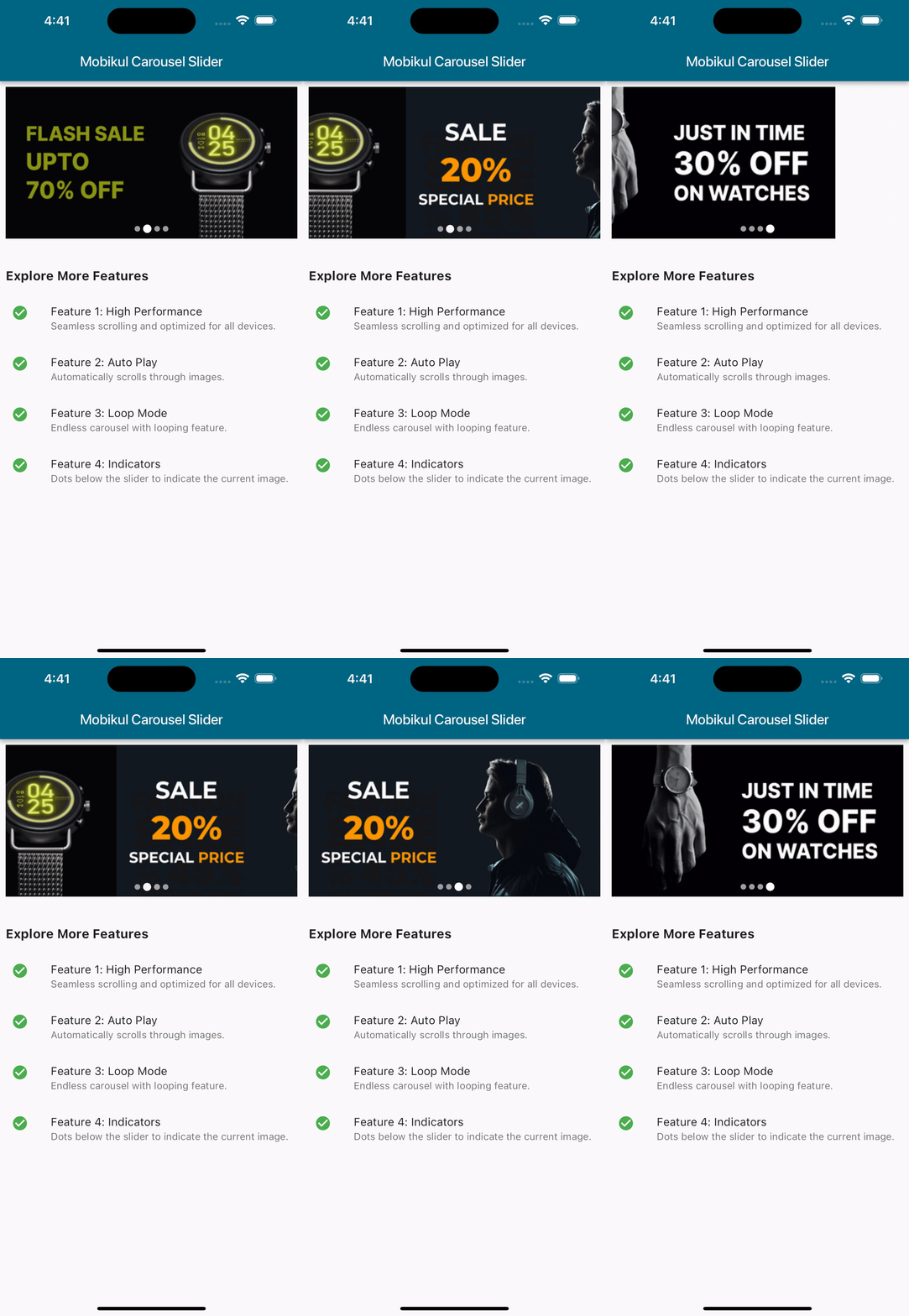
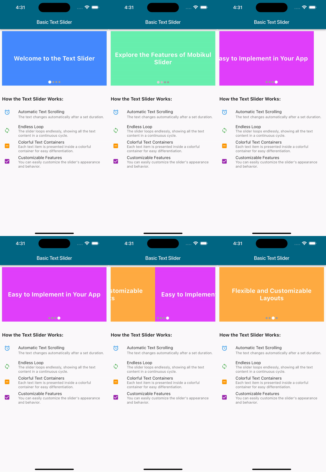
Here’s an example of the MobikulCarouselSlider in action:
Basic Carousel #

Image Decoration #

Text Slider #

Vertical Slider #

Start building amazing carousels today with the MobikulCarouselSlider package! 🚀