menu_bar 0.4.0  menu_bar: ^0.4.0 copied to clipboard
A customizable application menu bar with submenus for your Flutter Desktop apps.
A customizable application menu bar with submenus for your Flutter Desktop apps.
The menu bar is rendered inside your Flutter app (i.e. not as a native menu bar like in macOS). Native menu bars (at least for macOS) are currently in development by Flutter, see #23600. In the future, a native option in this plugin could get added.
Table of Contents #
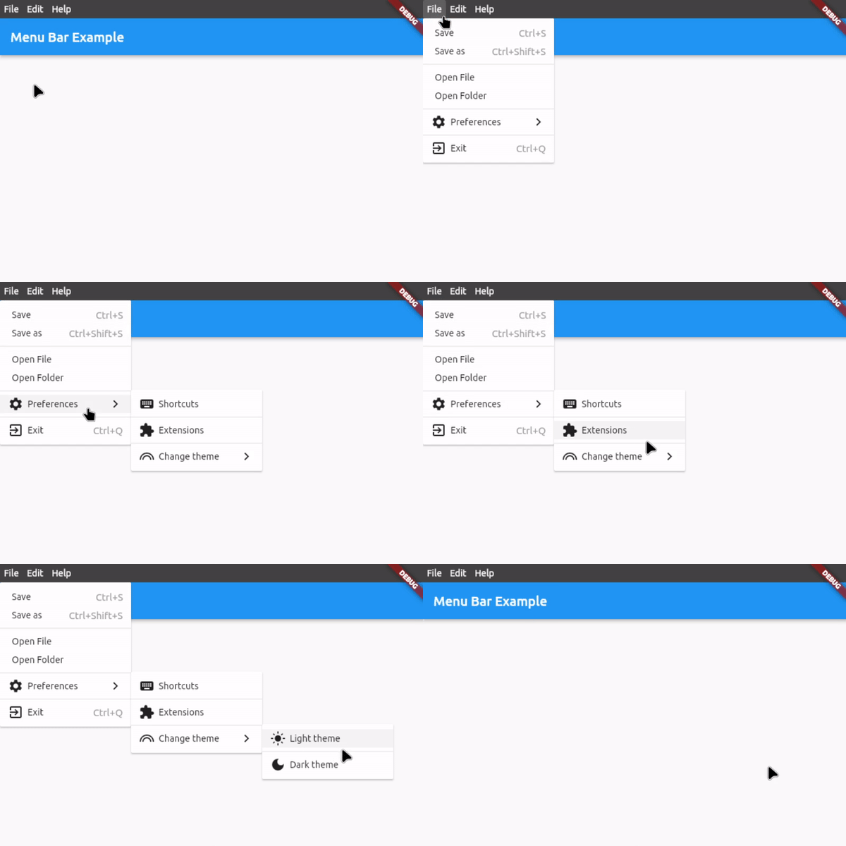
Preview #
Features #
- Application menu bar for Flutter Desktop
- Nested submenus support
- Dividers to structure submenus
- Icon in submenu buttons (optional)
- Shortcut text in submenu buttons (optional)
- Open menus and submenus on hover or on click
- Fully customizable
- Easy to implement
- Rich widget documentation
Usage #
First, download and import the package:
import 'package:menu_bar/menu_bar.dart';
Secondly, hide the MenuBar and MenuStyle widgets from the material package:
import 'package:flutter/material.dart' hide MenuBar hide MenuStyle;
1. Integrate the menu bar #
Wrap your application around the MenuBar widget and add an empty list to barButtons so that you have assigned the 2 necessary fields. The child is your application under the menu bar:
MenuBar(
    barButtons: [],
    child: Scaffold(...),
),
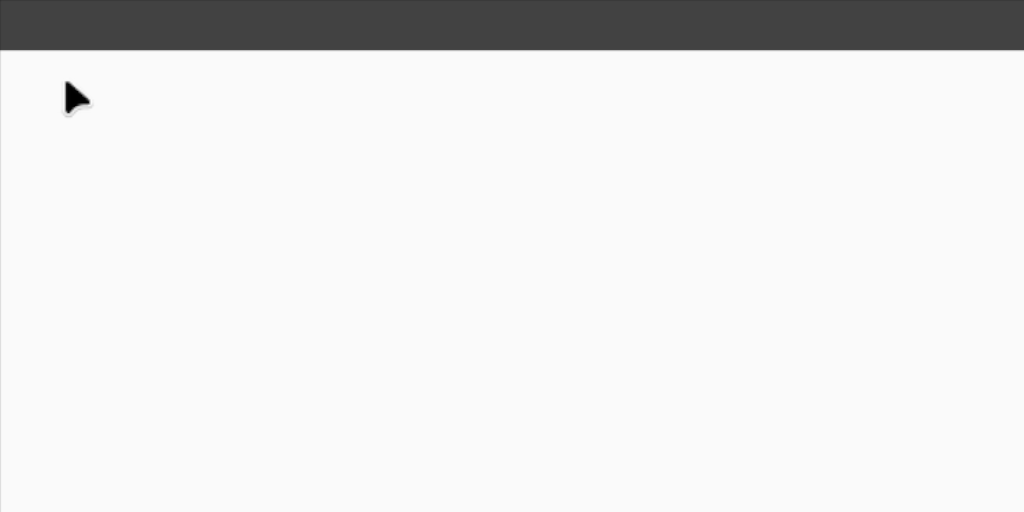
You should now see an empty menu bar above your application (see picture below). To add buttons with menus, proceed to step 2.
2. Create your menus #
To add buttons with menus, use the following widget structure:
MenuBar
    BarButton
        SubMenu
            MenuButton
            MenuButton
            ...
    BarButton
        SubMenu
            MenuButton
            MenuButton
            ...
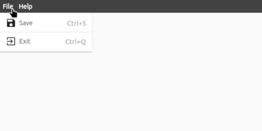
In this example, we will add the following menu bar:
MenuBar(
    // The buttons in this List are displayed as the buttons on the bar itself
    barButtons: [
        BarButton(
            text: const Text('File', style: TextStyle(color: Colors.white)),
            submenu: SubMenu(
                menuItems: [
                    MenuButton(
                        text: const Text('Save'),
                        onTap: () {},
                        icon: const Icon(Icons.save),
                        shortcutText: 'Ctrl+S',
                    ),
                    const MenuDivider(),
                    MenuButton(
                        text: const Text('Exit'),
                        onTap: () {},
                        icon: const Icon(Icons.exit_to_app),
                        shortcutText: 'Ctrl+Q',
                    ),
                ],
            ),
        ),
        BarButton(
            text: const Text('Help', style: TextStyle(color: Colors.white)),
            submenu: SubMenu(
                menuItems: [
                    MenuButton(
                      text: const Text('View License'),
                      onTap: () {},
                    ),
                    MenuButton(
                      text: const Text('About'),
                      onTap: () {},
                      icon: const Icon(Icons.info),
                    ),
                ],
            ),
        ),
    ],

    // Set the child, i.e. the application under the menu bar
    child: Scaffold(...),
),
3. Customize the menu bar #
For customization options, see #Customization below or hover over the widgets for all the options in your preferred IDE when integrating the menu bar.
For a complete example, check out example.dart
Customization #
Bar customization #
| Property | Type | Default | Description |
|---|---|---|---|
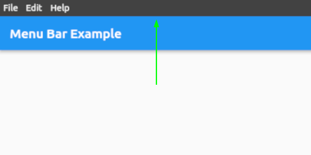
| height | double | 28.0 | Height of the menu bar |
| mainAxisAlignment | MainAxisAlignment | MainAxisAlignment.start | Horizontal alignment of the bar buttons |
| backgroundColor | Color | Color(0xFF424242) | Background color of the bar |
| gap | double | 0.0 | Gap between the bar buttons |
| padding | EdgeInsets | EdgeInsets.symmetric(horizontal: 0.0) | Padding inside the bar row |
| closeMenuOnHoverLeave | bool | true | Close the all menus on hover leave |
| openMenuOnHover | bool | false | Open the bar button menus on hover |
| closeMenuOnHoverDelay | Duration | Duration(milliseconds: 400) | Close duration on hover leave |
Bar button customization #
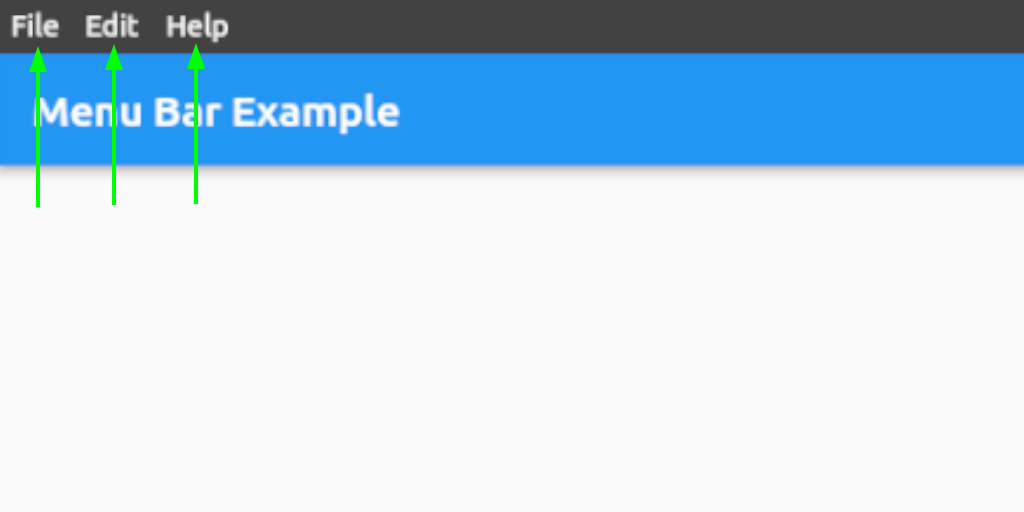
| Property | Type | Default | Description |
|---|---|---|---|
| backgroundColor | Color | Colors.transparent | Bar button background color |
| padding | EdgeInsets | EdgeInsets.symmetric(horizontal: 6.0) | Padding inside the bar buttons |
Menu and submenu customization #
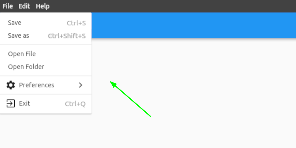
| Property | Type | Default | Description |
|---|---|---|---|
| width | double | 200.0 | Width of the menus and submenus |
| openSubmenusOnHover | bool | true | Open the submenus on hover |
| backgroundColor | Color | Colors.white | Background color of the menus and submenus |
| padding | EdgeInsets | EdgeInsets.symmetric(vertical: 8.0) | Padding inside the menus and submenus |
Menu and submenu buttons customization #
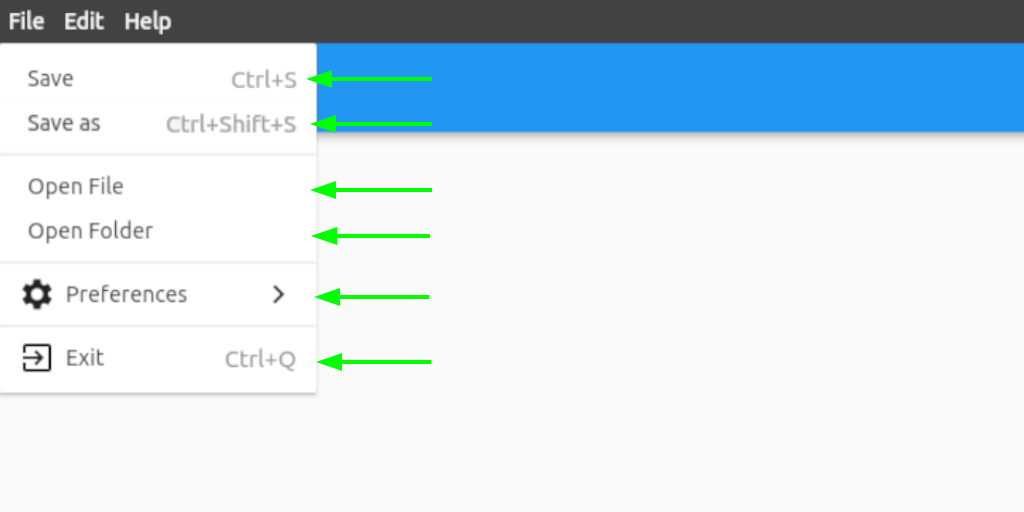
| Property | Type | Default | Description |
|---|---|---|---|
| closeMenuOnClick | bool | true | Close the all menus on a menu button click |
| backgroundColor | Color | Colors.white | Background color of the submenu buttons |
| height | double | 28.0 | Height of the submenu buttons |
| padding | EdgeInsets | EdgeInsets.symmetric(horizontal: 12.0) | Padding inside the submenu buttons |
| shortcutTextStyle | TextStyle | TextStyle(fontSize: 15.0, color: Colors.grey) | Shortcut text style |
| showSubmenuIcon | bool | true | Show a submenu icon if a submenu is assigned |
| submenuIcon | Widget | Icon(Icons.keyboard_arrow_right) | Set the submenu icon if showSubmenuIcon is true and a submenu is assigned |
Contact #
If you want to report a bug, request a feature or improve something, feel free to file an issue in the GitHub repository.


