material_charts 0.0.12  material_charts: ^0.0.12 copied to clipboard
A flutter library for creating and manage industrial standard charts
Here is the complete README with the Bar Chart added while retaining all the styling, usage, and feature information you provided.
Material Charts #
A comprehensive Flutter package offering a collection of customizable, animated charts with Material Design aesthetics. Perfect for data visualization in modern Flutter applications.
Available Charts #
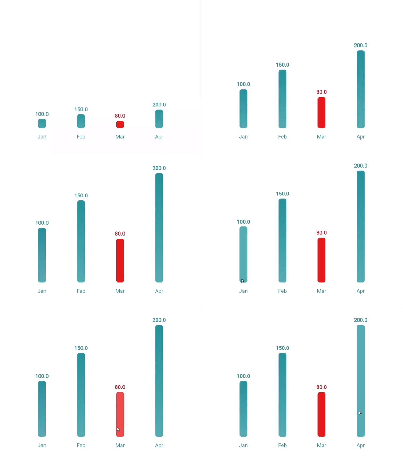
1. Bar Chart #
A beautiful, interactive, and animated bar chart, ideal for visualizing discrete data categories and comparisons.

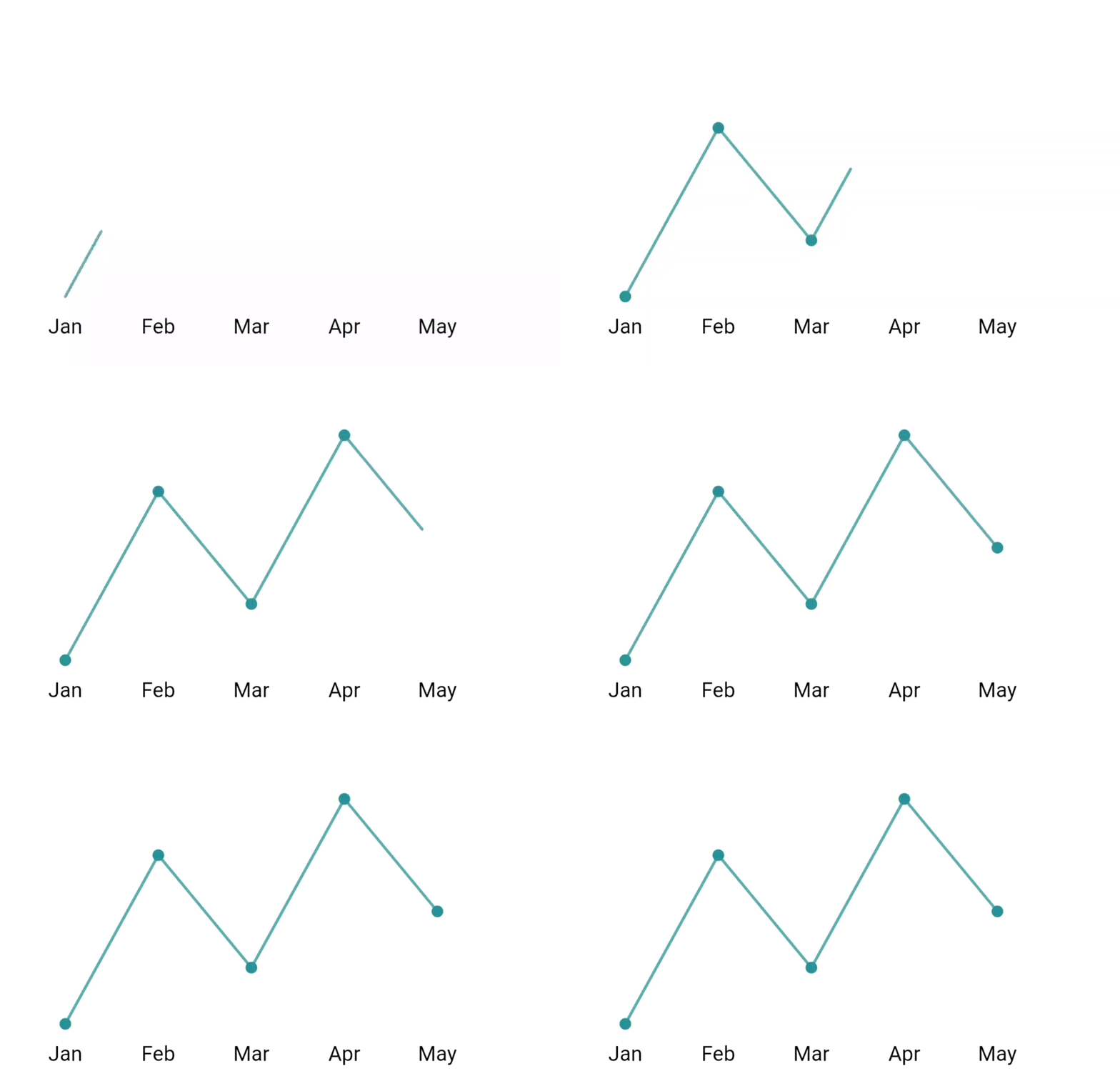
2. Line Chart #
An animated line chart with customizable styling, perfect for showing trends and time series data.

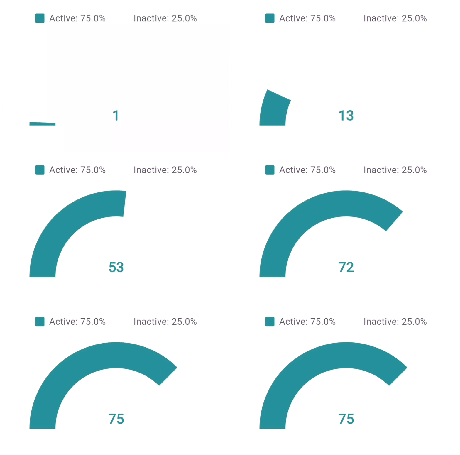
3. Hollow Semi Circle #
A customizable progress meter in a hollow semi-circle format, ideal for displaying percentages and progress.

Features #
Common Features Across All Charts #
- 🎨 Material Design aesthetics
- ✨ Smooth animations with configurable duration and curves
- 📊 Responsive and adaptive layouts
- 🎭 Customizable color schemes
- 💫 Animation completion callbacks
- 📱 Mobile-friendly design
- ♿ Accessibility support
Bar Chart Features #
- 📊 Animated bars with hover and tap interactions
- 🏷️ Customizable bar colors and labels
- 📏 Optional gridlines and padding
- 🕒 Animation support with curve control
- 🌈 Gradient or solid color options
Line Chart Features #
- 📈 Interactive data points
- 📏 Optional gridlines
- 🏷️ Customizable labels
- 📊 Automatic scaling
- 🎯 Point highlighting
Hollow Semi Circle Features #
- 📊 Percentage display
- 🎯 Legend support
- 📏 Adjustable hollow radius
- 🎨 Active/inactive segment styling
- 📝 Custom formatters
Installation #
Add this to your package's pubspec.yaml file:
dependencies:
  material_charts: ^1.0.0
Usage #
Bar Chart #
final data = [
  BarChartData(value: 10, label: 'Apples', color: Colors.red),
  BarChartData(value: 20, label: 'Bananas', color: Colors.yellow),
  BarChartData(value: 15, label: 'Grapes', color: Colors.purple),
];

MaterialBarChart(
  data: data,
  width: 300,
  height: 200,
  style: BarChartStyle(
    barColor: Colors.blue,
    gradientEffect: true,
    gradientColors: [Colors.blue, Colors.lightBlueAccent],
    animationCurve: Curves.easeOutBack,
  ),
  showGrid: true,
  interactive: true,
  onAnimationComplete: () {
    print('Bar chart animation completed');
  },
);
Line Chart #
final data = [
  ChartData(label: 'Jan', value: 30),
  ChartData(label: 'Feb', value: 45),
  ChartData(label: 'Mar', value: 35),
  ChartData(label: 'Apr', value: 60),
];

MaterialChartLine(
  data: data,
  width: 350,
  height: 200,
  style: LineChartStyle(
    lineColor: Colors.blue,
    pointColor: Colors.blue,
    strokeWidth: 2.0,
  ),
);
Hollow Semi Circle #
MaterialChartHollowSemiCircle(
  percentage: 75,
  size: 300,
  hollowRadius: 0.7,
  style: ChartStyle(
    activeColor: Colors.green,
    inactiveColor: Colors.grey.shade200,
    textColor: Colors.green,
  ),
);
Styling #
Common Style Properties #
All charts support a base set of style properties through the ChartStyle class:
ChartStyle(
  animationDuration: Duration(milliseconds: 1500),
  animationCurve: Curves.easeInOut,
  // Chart-specific properties...
);
Bar Chart Style #
BarChartStyle(
  barColor: Colors.teal,
  gridColor: Colors.grey.shade300,
  backgroundColor: Colors.white,
  cornerRadius: 8.0,
  barSpacing: 0.1, // 10% spacing between bars
  animationDuration: Duration(milliseconds: 1200),
  animationCurve: Curves.easeInOut,
  gradientEffect: true,
  gradientColors: [Colors.teal, Colors.cyan],
  labelStyle: TextStyle(fontSize: 12, color: Colors.black),
  valueStyle: TextStyle(fontSize: 10, color: Colors.black87),
);
Line Chart Style #
LineChartStyle(
  lineColor: Colors.blue,
  gridColor: Colors.grey.withOpacity(0.2),
  pointColor: Colors.blue,
  backgroundColor: Colors.white,
  labelStyle: TextStyle(fontSize: 12),
  strokeWidth: 2.0,
  pointRadius: 4.0,
);
Hollow Semi Circle Style #
ChartStyle(
  activeColor: Colors.green,
  inactiveColor: Colors.grey.shade200,
  textColor: Colors.green,
  percentageStyle: TextStyle(fontSize: 24),
  legendStyle: TextStyle(fontSize: 16),
);
Advanced Usage #
Custom Data Models #
Convert your data models into chart-compatible formats.
Bar Chart Example:
List<BarChartData> convertToBarData(List<MyModel> data) {
  return data.map((item) => BarChartData(
    value: item.value,
    label: item.name,
    color: item.color,
  )).toList();
}
Line Chart Example:
List<ChartData> convertToLineData(List<MyModel> data) {
  return data.map((item) => ChartData(
    label: item.label,
    value: item.value,
  )).toList();
}
Examples #
Bar Chart: Product Sales #
MaterialBarChart(
  data: salesData,
  width: 400,
  height: 300,
  style: BarChartStyle(
    barColor: Colors.orange,
    gridColor: Colors.grey.shade300,
  ),
);
Line Chart: Stock Prices #
MaterialChartLine(
  data: stockPrices,
  style: LineChartStyle(
    lineColor: priceChange >= 0 ? Colors.green : Colors.red,
  ),
);
Best Practices #
-
Responsive Design
- Use flexible widths and heights.
- Test on multiple screen sizes and orientations.
-
Performance
- Avoid datasets larger than 100 bars.
- Use smooth animations to improve UX.
-
Accessibility
- Provide labels and colors with proper contrast.
- Add meaningful alt-text where applicable.
Troubleshooting #
Common Issues #
-
Chart Not Rendering
- Verify that the
datalist is not empty. - Ensure valid size parameters are provided.
- Verify that the
-
Animation Issues
- Check if animation duration is reasonable.
- Confirm that the widget is disposed correctly.
-
Style Not Applying
- Verify the style properties and parent widget constraints.
Contributing #
We welcome contributions! Follow these steps:
- Fork the repository.
- Create a feature branch.
- Commit your changes.
- Push to your branch.
- Open a Pull Request.
Refer to our Contributing Guide for details.
Future Charts (Coming Soon) #
- 🥧 Pie Chart
- 📈 Area Chart
- 🎯 Radar Chart
- 📊 Scatter Plot
- 📈 Candlestick Chart
License #
BSD 3-Clause License

Copyright (c) 2024, Material Charts
All rights reserved.
Support #
Credits #
Developed with 💙 by [vishnudas-bluefox]
Special thanks to all contributors!
This version includes all charts' information and styling details, ensuring completeness and consistency.

