
m3_floating_toolbar 0.2.0  m3_floating_toolbar: ^0.2.0 copied to clipboard
 abrah.am
A Material Design 3 floating toolbar widget for Flutter.
M3 Floating Toolbar #
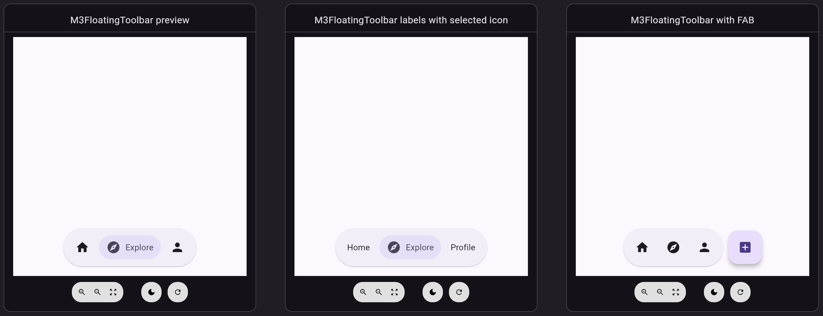
A Flutter package that provides a Material Design 3 floating pill-style toolbar widget. Perfect for creating action bars with icon-only or labeled buttons that follow Material You design principles.
Features #
- 🎨 Material Design 3 styling with automatic theming
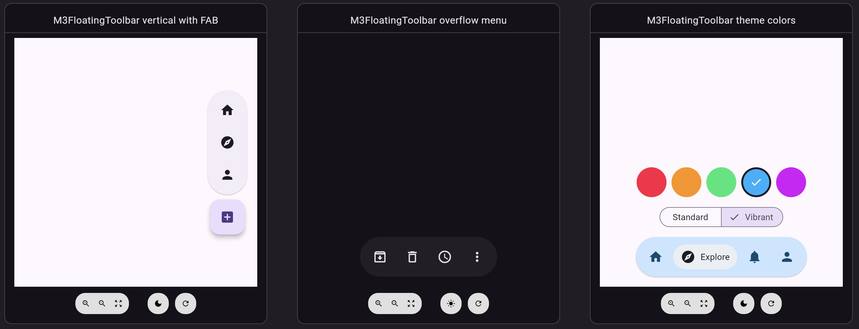
- 🎛️ Standard and vibrant color configurations
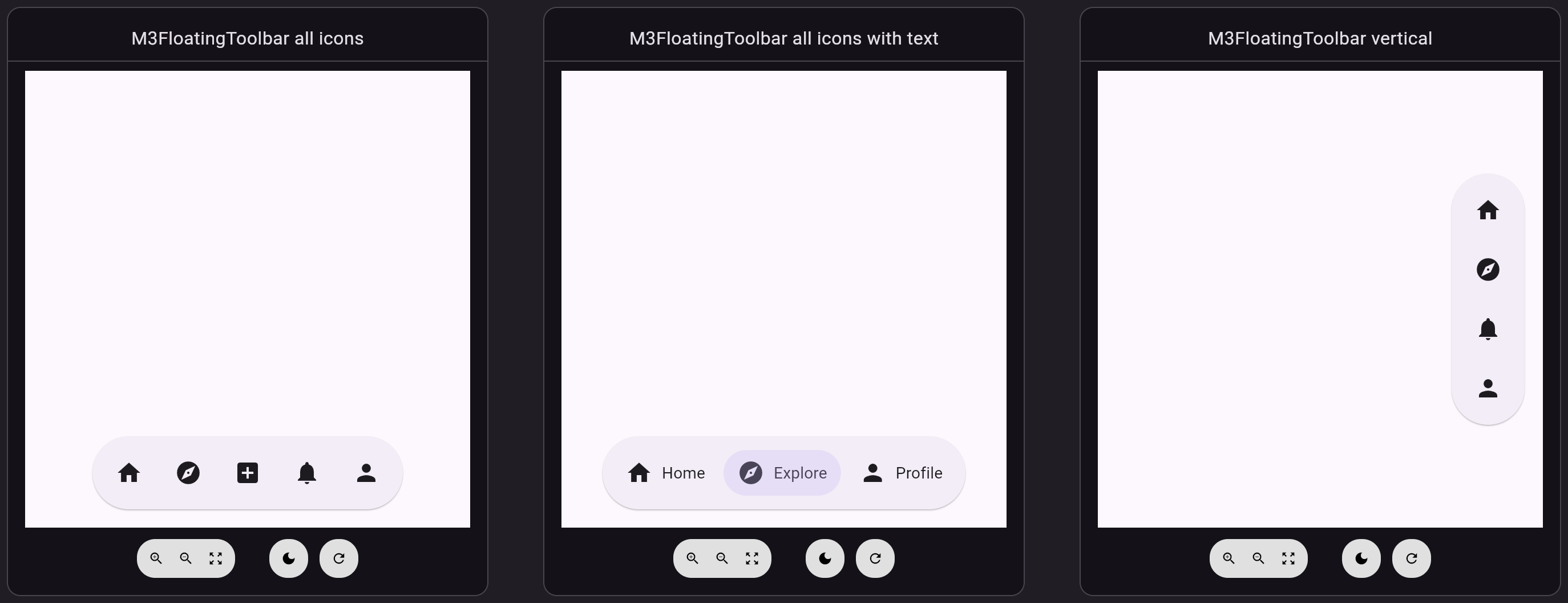
- ↔️ Horizontal and vertical layouts
- 🔘 Support for both icon-only and labeled action buttons
- ♿ Built-in accessibility with semantic labels, tooltips, and 48dp touch targets
- 🎯 Optional FloatingActionButton integration
- ⚙️ Customizable elevation, padding, spacing, and colors
- 📱 Responsive layout that adapts to content
Getting started #
Add this package to your pubspec.yaml:
dependencies:
  m3_floating_toolbar: ^0.1.0
Then run:
flutter pub get
Import the package in your Dart code:
import 'package:m3_floating_toolbar/m3_floating_toolbar.dart';
import 'package:m3_floating_toolbar/m3_floating_toolbar_action.dart';
Usage #
Basic toolbar with icon-only buttons #
M3FloatingToolbar(
  actions: [
    M3FloatingToolbarAction(
      icon: Icons.home,
      semanticLabel: 'Home',
      tooltip: 'Home',
      onPressed: () => print('Home pressed'),
    ),
    M3FloatingToolbarAction(
      icon: Icons.explore,
      semanticLabel: 'Explore',
      tooltip: 'Explore',
      onPressed: () => print('Explore pressed'),
    ),
    M3FloatingToolbarAction(
      icon: Icons.person,
      semanticLabel: 'Profile',
      tooltip: 'Profile',
      onPressed: () => print('Profile pressed'),
    ),
  ],
)
Toolbar with labeled buttons #
M3FloatingToolbar(
  actions: [
    M3FloatingToolbarAction(
      icon: Icons.home,
      label: 'Home',
      semanticLabel: 'Home tab',
      onPressed: () => print('Home pressed'),
    ),
    M3FloatingToolbarAction(
      icon: Icons.explore,
      label: 'Explore',
      semanticLabel: 'Explore tab',
      onPressed: () => print('Explore pressed'),
    ),
    M3FloatingToolbarAction(
      icon: Icons.person,
      label: 'Profile',
      semanticLabel: 'Profile tab',
      onPressed: () => print('Profile pressed'),
    ),
  ],
)
With FloatingActionButton #
M3FloatingToolbar(
  actions: [
    M3FloatingToolbarAction(
      icon: Icons.home,
      semanticLabel: 'Home',
      onPressed: () => print('Home pressed'),
    ),
    M3FloatingToolbarAction(
      icon: Icons.explore,
      semanticLabel: 'Explore',
      onPressed: () => print('Explore pressed'),
    ),
    M3FloatingToolbarAction(
      icon: Icons.notifications,
      semanticLabel: 'Notifications',
      onPressed: () => print('Notifications pressed'),
    ),
  ],
  floatingActionButton: FloatingActionButton(
    onPressed: () => print('Create post pressed'),
    child: Icon(Icons.add_box),
  ),
)
Vertical layout #
Set direction to Axis.vertical for the vertical floating toolbar
configuration, typically anchored to a side edge of the screen.
M3FloatingToolbar(
  direction: Axis.vertical,
  actions: [
    M3FloatingToolbarAction(
      icon: Icons.home,
      semanticLabel: 'Home',
      tooltip: 'Home',
      onPressed: () => print('Home pressed'),
    ),
    M3FloatingToolbarAction(
      icon: Icons.explore,
      semanticLabel: 'Explore',
      tooltip: 'Explore',
      onPressed: () => print('Explore pressed'),
    ),
    M3FloatingToolbarAction(
      icon: Icons.person,
      semanticLabel: 'Profile',
      tooltip: 'Profile',
      onPressed: () => print('Profile pressed'),
    ),
  ],
)
When a floatingActionButton is provided, it is placed below the toolbar.
Color variants #
The toolbar follows the Material Design 3 toolbar color configurations. The
standard variant (default) uses surfaceContainer, and vibrant uses
primaryContainer.
M3FloatingToolbar(
  variant: M3FloatingToolbarVariant.vibrant,
  actions: [...],
)
Customization #
Defaults follow the Material Design 3 specs: 64dp container height, full (stadium) corner shape, 8dp internal padding, 4dp between items, and a 16dp minimum margin from the screen edge.
Floating toolbars are elevated by default. Set elevation: 0 when the content
beneath the toolbar is already visually distinct.
M3FloatingToolbar(
  actions: [...],
  elevation: 4,
  internalPadding: EdgeInsets.symmetric(horizontal: 20, vertical: 16),
  spacing: 12,
  color: Colors.blue.shade100,
  foregroundColor: Colors.blue.shade900,
)
Additional information #
For a complete working example, see the example directory.
VS Code command for Flutter previews #
This workspace includes a VS Code launch configuration named Launch Flutter Previews.
Open Run and Debug and select:
Launch Flutter Previews- Start debugging
This runs:
flutter widget-preview start
To report issues or contribute to this package, visit the GitHub repository.
Metadata
Documentation
Publisher
Weekly Downloads
Metadata
A Material Design 3 floating toolbar widget for Flutter.
Repository (GitHub)
View/report issues
Topics
#material-design #material3 #material #buttons #widget
License
 MIT (license)