loader_search_bar 1.0.3+3  loader_search_bar: ^1.0.3+3 copied to clipboard
Flutter widget integrating search field feature into app bar.
Loader SearchBar #
This package's been discontinued #
Due to a hacky way this widget uses to display search results, it's become difficult to maintain and add new features. While it won't be developed anymore, you can still fork/use it in your Flutter project. As a replacement, take a look at Flutter framework showSearch method or other community packages.

Flutter widget integrating search field feature into app bar, allowing to receive query change callbacks and automatically load new data set into ListView. It replaces standard AppBar widget and needs to be placed underneath Scaffold element in the widget tree to work properly.

Getting started #
To start using SearchBar insert it in place of an AppBar element in the Scaffold widget. Regardless of the use case, defaultBar named argument has to be specified, which basically is a widget that will be displayed whenever SearchBar is not in activated state:
@override
Widget build(BuildContext context) {
   return Scaffold(
     appBar: SearchBar(
       defaultBar: AppBar(
         leading: IconButton(
           icon: Icon(Icons.menu),
           onPressed: _openDrawer,
         ),
         title: Text('Default app bar title'),
       ),
       ...
     ),
     body: _body,
     drawer: _drawer,
   );
}
Optional attributes #
- searchHint - hint string being displayed until user inputs any text,
- initialQuery - query value displayed for the first time in search field,
- iconified - boolean value indicating way of representing non-activated SearchBar:
- true if widget should be showed as an action item in defaultBar,
- false if widget should be merged with defaultBar (only leading icon of the default widget and search input field are displayed in such case),
- autofocus - boolean value determining if search text field should get focus whenever it becomes visible,
- autoActive - ,
- attrs - SearchBarAttrs class instance allowing to specify part of exact values used during widget building (e.g. search bar colors, text size, border radius),
- controller - SearchBarController object that provides a way of interacing with current state of the widget,
- searchItem - defining how to build and position search item widget in app bar,
- overlayStyle - status bar overlay brightness applied when widget is activated.
Query callbacks #
To get notified about user input specify onQueryChanged and/or onQuerySubmitted callback functions that receive current query string as an argument:
appBar: SearchBar(
   ...
   onQueryChanged: (query) => _handleQueryChanged(context, query),
   onQuerySubmitted: (query) => _handleQuerySubmitted(context, query),
),
QuerySetLoader #
By passing QuerySetLoader object as an argument one can additionally benefit from search results being automatically built as ListView widget whenever search query changes:
appBar: SearchBar(
  ...
  loader: QuerySetLoader<Item>(
     querySetCall: _getItemListForQuery,
     itemBuilder: _buildItemWidget,
     loadOnEachChange: true,
     animateChanges: true,
  ),
),

List<Item> _getItemListForQuery(String query) { ... }

Widget _buildItemWidget(Item item) { ... }
- querySetCall - function transforming search query into list of items being then rendered in ListView (required),
- itemBuilder - function creating Widget object for received item, called during ListView building for each element of the results set (required),
- loadOnEachChange - boolean value indicating whether querySetCall should be triggered on each query change; if false query set is loaded once user submits query,
- animateChanges - determines whether ListView's insert and remove operations should be animated.
SearchItem #
Specifying this parameter allows to customize how search item should be built and positioned in app bar. It can be either action or menu widget. No matter which of these two is picked, two constructor arguments can be passed:
- builder - function receiving current
BuildContextand returningWidgetfor action orPopupMenuItemfor menu item, - gravity - can be one of
SearchItemGravityvalues: start, end or exactly. If no arguments are passed, SearchBar will create default item which is search action icon with start gravity.
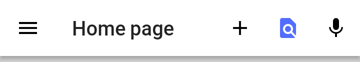
SearchItem.action
appBar: SearchBar(
  // ...
  searchItem: SearchItem.action(
    builder: (_) => Padding(
      padding: EdgeInsets.all(12.0),
      child: Icon(
        Icons.find_in_page,
        color: Colors.indigoAccent,
      ),
    ),
    gravity: SearchItemGravity.exactly(1),
  ),
)
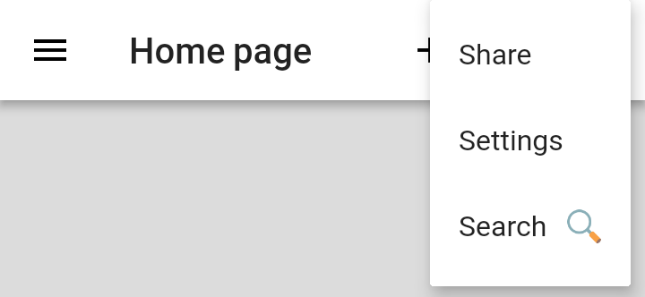
SearchItem.menu
appBar: SearchBar(
  // ...
  searchItem: SearchItem.menu(
    builder: (_) => PopupMenuItem(
      child: Text("Search  🔍"),
      value: "search",
    ),
    gravity: SearchItemGravity.end,
  ),
)
Also, bear in mind that SearchBar will prevent built item widget from receiving tap events and will begin search action rather than that.
Metadata
Publisher
unverified uploader
Weekly Downloads
Metadata
Flutter widget integrating search field feature into app bar.
License
 MIT (license)